Blog 5: Burton Kramer

 Despite being born in New York, Burton Kramer has been a prominent figure in Canadian graphic design. He began his design career in New York for a few years before working as an art director in Zurich, Switzerland. There he received awards for his work which included the Swiss Poster Award and the Swiss Packaging award as well as becoming the first foreign member invited to join the Swiss Professional Graphic Design Society. 

Poster created in 1978

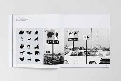
When he moved to Toronto in 1965, he brought Modernist design with him, becoming a pioneer in modernism in Canadian graphic design. He had been exposed to the style while he was studying at Chicago’s Institute of Design, which was dubbed as the ‘New Bauhaus’ as well as studying under Swiss design masters such as Paul Rand and Herbert Matter while he completed his MFA in graphic design. He is best known for designing the logo and corporate identity program for the Canadian Broadcasting Corporation (CBC) and for his work in Expo ‘67, which was considered to be the most successful World’s Fair of the 20th century. 

“To say it disgusts me would be a mild reaction…” was Burton’s response to the CBC logo being changed in the 90’s from having a C to a closed circle in the center.
Signage icons for Expo ’67

Sources:

http://canadiandesignresource.ca/graphics/burton-kramer-expo-67/

Blog 4: Herb Lubalin

American graphic designer Herb Lubalin was known for being a typographic GOD. He began working at S&H, a healthcare advertising agency, where he quickly became known for his work with type. He became one of the pioneers of expressive typography, or word pictures, as he called it. He left the company to pursue graphic design instead of continuing to create advertisements. 

Like other postmodernists, he rejected modernism, deeming the style too plain and bare, which did not fit the American essence. In response, he created a new conceptual style called ‘graphic expressionism’, which was the use of text in a creative and expressive way instead of the conventional way it is normally used, which was to simply have them be placed on the page with no other purpose.

He created many typefaces, one of which was called Avant Garde. Based off the logo font of the magazine Avant Garde, this font was different and innovative. As it was so unique and interesting, the font became widely used, but it was not used correctly, and so the font became stereotypical of the 1970’s.


Sources:

Blog 3: Paula Scher

Known as one of the most influential graphic designers in the world, Paula Scher has spent her 40-year career developing brand identities, advertisements and packaging with her keen eye for all things eye-pleasing and interesting. She started off her career working at CBS records, designing album covers and magazines, then went on to become the first female principal at Pentagram, the world’s largest independent design firm. Scher has done a wide range of work, but she is most known for creating brand identities and logos for companies such as Citi. 

“…Scher designed the logo during an initial client meeting, later admitting that it took only a few seconds to sketch the initial idea for the logo on a napkin. ”

Although not as well known as her other works, her supergraphics cover the walls of rooms and building exteriors in many public structures and are just as marvellous as her other works.

Paula Scher for the Queens Metropolitan Campus.

Scher calls these ‘environmental graphics’, although they hold the same definition as supergraphics, which are used to describe graphics that are put up over large surfaces to decorate and brighten up buildings, spaces in rooms, or halls.

Supergraphics on the walls of The New Victory Theatre, located in New York.
Environmental graphics for the agency’s headquarters in New York.
Restrooms at Grey Group on the second and third floors feature superscale male and female icons that appear “correct” at their respective entrances but then graphically stretch down the halls.

Typography on the New Jersey Performing Arts Centre’s exterior.

It is amazing how she can have such a diverse portfolio of work when it comes to design, there is no distinct style in her works, which makes it hard to tell what exactly she has done- but she has done just about everything there is.

Supergraphics on put up in a Brooklyn public high school.

Sources:

www.fastcompany.com/90471135/back-in-the-1996-presidential-race-the-world-wide-web-was-a-flashy-novelty

www.pentagram.com/about/paula-scher

Blog 2: Wes Wilson

Robert Wesley Wilson, also known as Wes Wilson, was a pioneer for psychedelic posters.


Grateful Dead poster by Wes Wilson. (1966)

He is credited for launching the psychedelic art movement as well as for popularizing the psychedelic font, which emulated the trippy LSD experience with its shape which made it look like it was moving.

Van Morrison at the Avalon Ballroom, by Wes Wilson, 1967

I like how the font on this poster looks like flames, although it is a little hard to read, haha

His work is associated with the 1960’s, a time that was defined by the peace movement and psychedelic era. Although he essentially created the style, there were many people who imitated his work and he became easily replaceable. Apparently, his posters were so coveted that they would be stolen not long after they were put up.

Wonderland (Grass Roots, Daily Flash…Avalon Ballroom, San Francisco, California
(1966)

We can see elements of the Art Nouveau movement in his work. Wilson’s bold use of colour comes from his experience with LSD.

Poster for the Grateful Dead, 1967. Fillmore, San Francisco

He recently passed away in January, but his legacy will be immortalized- his works have been put up in museums like the New York’s Metropolitan Museum of Art and Museum of Modern Art.

The Association at the Fillmore Auditorium, by Wes Wilson, 1966. Courtesy of Wes Wilson.  This is considered to be the original psychedelic rock concert poster

Sources:

www.datebook.sfchronicle.com/art-exhibits/wes-wilson-creator-of-psychedelic-rock-posters-dies-at-82

www.wes-wilson.com/the-psychedelic-poster-art-of-wes-wilson-by-colin-brignall.html

Blog 1: Paul Rand

Paul Rand was an American Advertising art director known for designing logos for major companies such as IBM, UPS and ABC.

Some logos designed by Paul Rand

Born in 1914, he grew up with an avid interest in art. His early job was designing product spreads and magazine covers before he moved on to designing corporate logos.

Dubonnet advertisement by Paul Rand in Time Magazine (November 10, 1947)
Jacqueline Cochran facial oil advertisement by Paul Rand
(1950)

He was greatly inspired by Modernist and European design, and is one of the first American designers to utilize its style in his work. He looked to Paul Klee for inspiration, and we can see his influence in his early work. I find it so amazing how elements of modern design have come back and designs made by designers who were active in the 50’s and 60’s look as if they were made today. 

Cummins Engines annual reports and quarterly brochures by Paul Rand
(USA, 1987-1994)

It’s fascinating to see companies such as Google and Apple have their logo changed over time, embracing the simple sans-serif, flat, limited colour palette that are characteristic of the Swiss style. While logo designs by Rand have changed very little as they are timeless.

Sources:

www.famousgraphicdesigners.org/paul-rand

www.artsy.net/artist/paul-rand