text and arrow story images (above)emoji story images (above)
THE PROCESS:
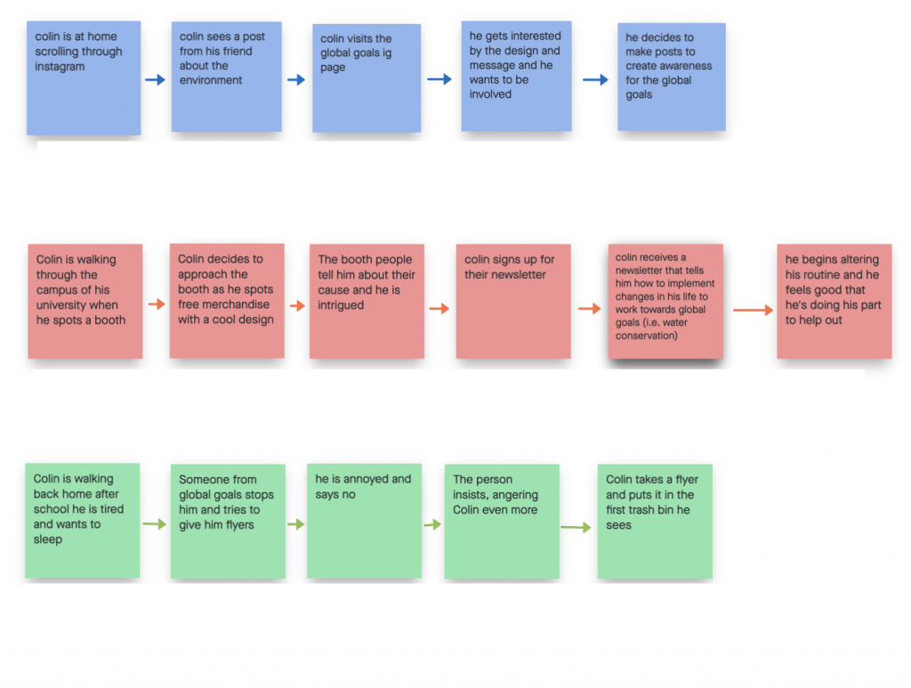
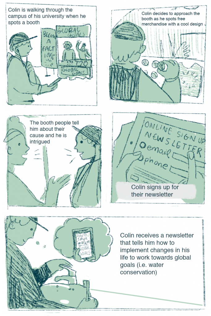
The user our group chose was Colin Jones, who is a graphic design student. His user profile states that he is an active Instagram user and wants to make positive impacts on the world and solve bigger problems, so we took those aspects of him into consideration to create these three stories.
For the first story, we wanted to do something that was relatable to many teens and young adults these days, which was addressing online activism, where people post about things going on in the world on their “instagram stories”. Since Colin is a university student, we had the second story be set on campus, where people often have booths set up to create awareness for movements or clubs. These booths often give out cool little items in order to draw people in, and often, those people are too polite to leave right after getting a piece of merch, so they would usually listen to what the people at the booth have to say before going on with their day, which is relatable for many university students such as Colin himself. For the last one, we wanted to do something different and show what might happen if a message was not conveyed in an appropriate way and how that would affect how someone might take it.
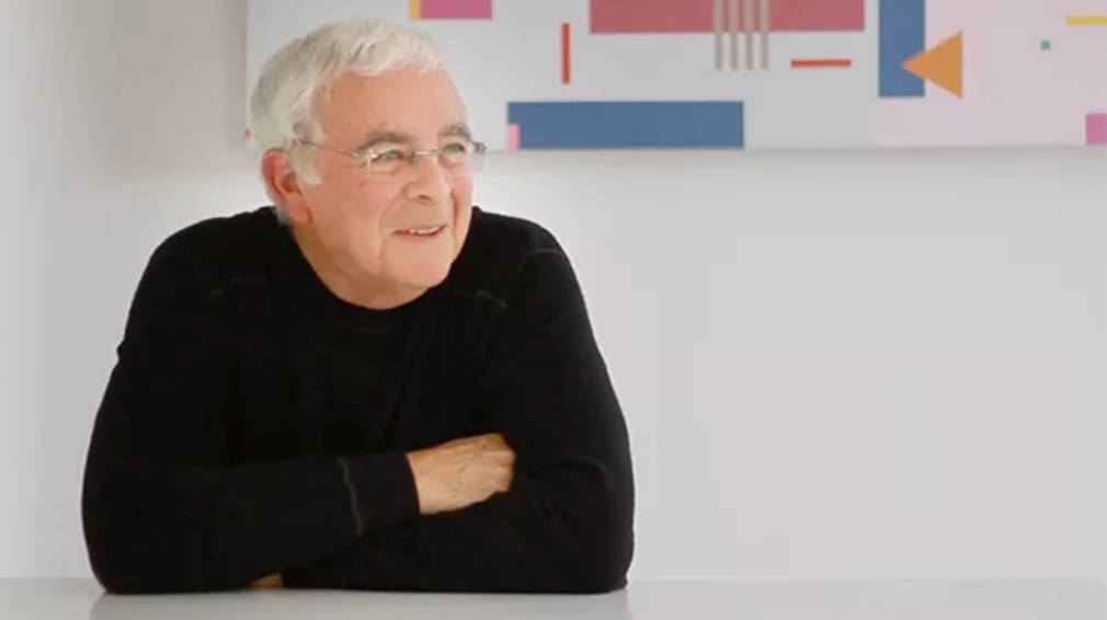
Despite being born in New York, Burton Kramer has been a prominent figure in Canadian graphic design. He began his design career in New York for a few years before working as an art director in Zurich, Switzerland. There he received awards for his work which included the Swiss Poster Award and the Swiss Packaging award as well as becoming the first foreign member invited to join the Swiss Professional Graphic Design Society.
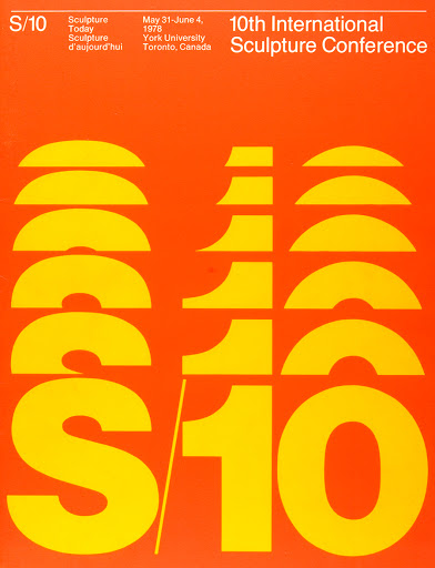
Poster created in 1978
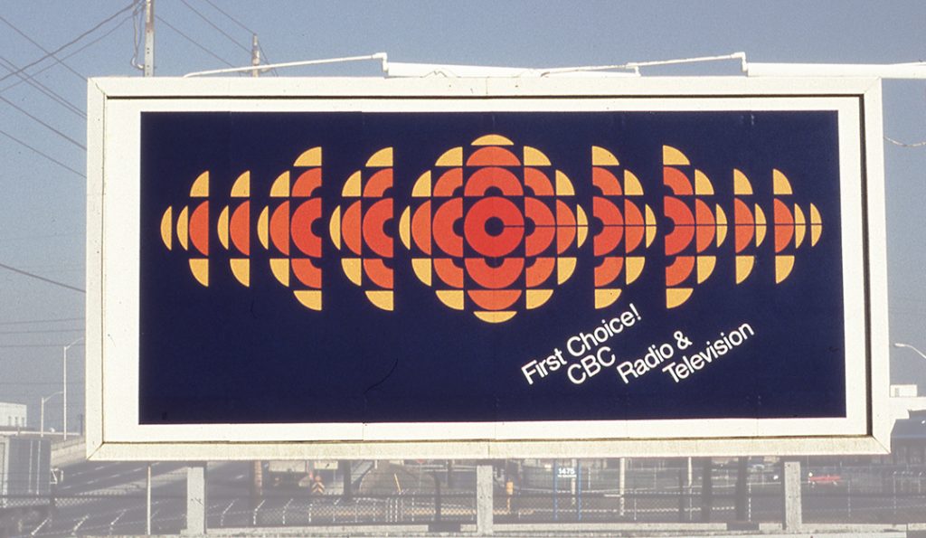
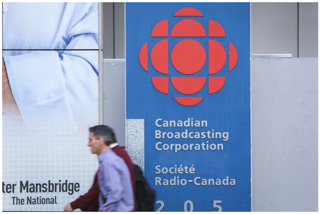
When he moved to Toronto in 1965, he brought Modernist design with him, becoming a pioneer in modernism in Canadian graphic design. He had been exposed to the style while he was studying at Chicago’s Institute of Design, which was dubbed as the ‘New Bauhaus’ as well as studying under Swiss design masters such as Paul Rand and Herbert Matter while he completed his MFA in graphic design. He is best known for designing the logo and corporate identity program for the Canadian Broadcasting Corporation (CBC) and for his work in Expo ‘67, which was considered to be the most successful World’s Fair of the 20th century.
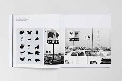
“To say it disgusts me would be a mild reaction…” was Burton’s response to the CBC logo being changed in the 90’s from having a C to a closed circle in the center. Signage icons for Expo ’67
American graphic designer Herb Lubalin was known for being a typographic GOD. He began working at S&H, a healthcare advertising agency, where he quickly became known for his work with type. He became one of the pioneers of expressive typography, or word pictures, as he called it. He left the company to pursue graphic design instead of continuing to create advertisements.
Like other postmodernists, he rejected modernism, deeming the style too plain and bare, which did not fit the American essence. In response, he created a new conceptual style called ‘graphic expressionism’, which was the use of text in a creative and expressive way instead of the conventional way it is normally used, which was to simply have them be placed on the page with no other purpose.
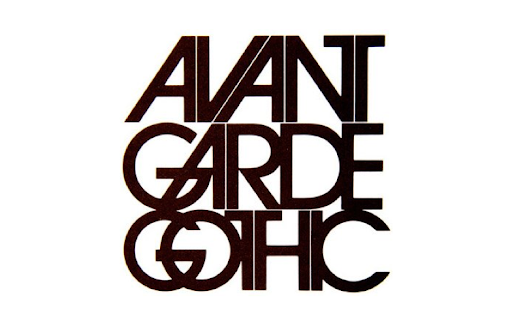
He created many typefaces, one of which was called Avant Garde. Based off the logo font of the magazine Avant Garde, this font was different and innovative. As it was so unique and interesting, the font became widely used, but it was not used correctly, and so the font became stereotypical of the 1970’s.
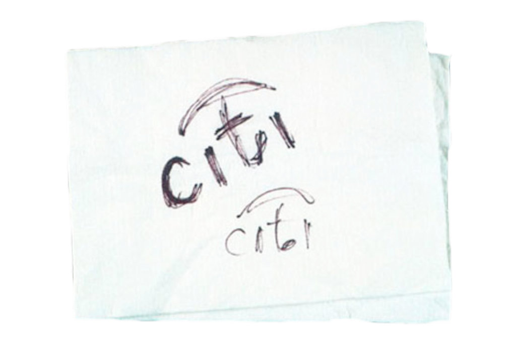
Known as one of the most influential graphic designers in the world, Paula Scher has spent her 40-year career developing brand identities, advertisements and packaging with her keen eye for all things eye-pleasing and interesting. She started off her career working at CBS records, designing album covers and magazines, then went on to become the first female principal at Pentagram, the world’s largest independent design firm. Scher has done a wide range of work, but she is most known for creating brand identities and logos for companies such as Citi.
“…Scher designed the logo during an initial client meeting, later admitting that it took only a few seconds to sketch the initial idea for the logo on a napkin. ”
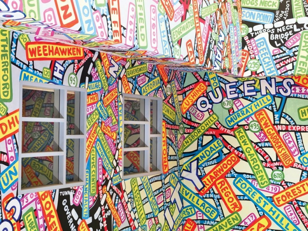
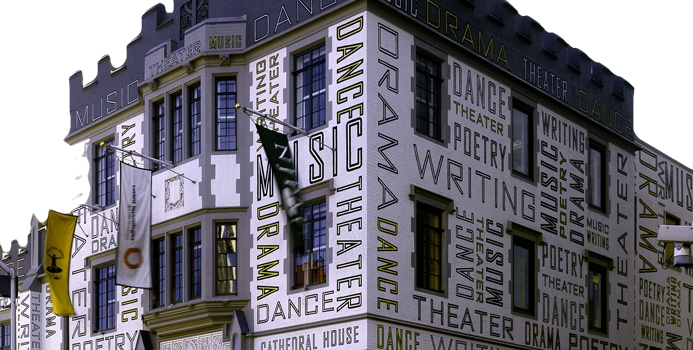
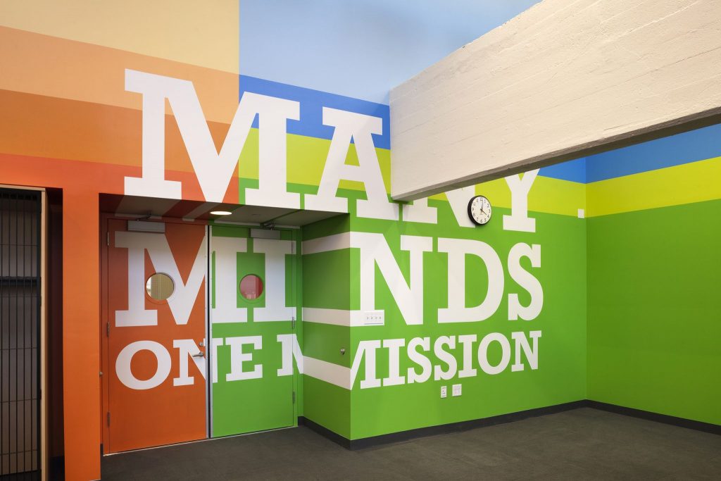
Although not as well known as her other works, her supergraphics cover the walls of rooms and building exteriors in many public structures and are just as marvellous as her other works.
Paula Scher for the Queens Metropolitan Campus.
Scher calls these ‘environmental graphics’, although they hold the same definition as supergraphics, which are used to describe graphics that are put up over large surfaces to decorate and brighten up buildings, spaces in rooms, or halls.
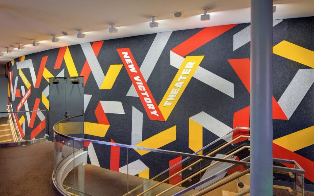
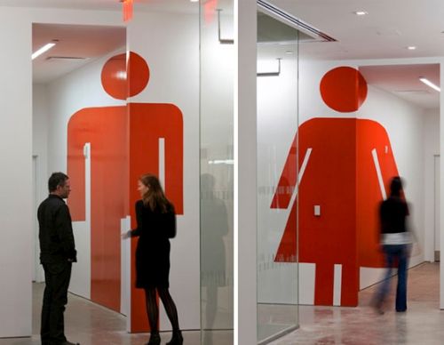
Supergraphics on the walls of The New Victory Theatre, located in New York.Environmental graphics for the agency’s headquarters in New York. Restrooms at Grey Group on the second and third floors feature superscale male and female icons that appear “correct” at their respective entrances but then graphically stretch down the halls.
Typography on the New Jersey Performing Arts Centre’s exterior.
It is amazing how she can have such a diverse portfolio of work when it comes to design, there is no distinct style in her works, which makes it hard to tell what exactly she has done- but she has done just about everything there is.
Supergraphics on put up in a Brooklyn public high school.
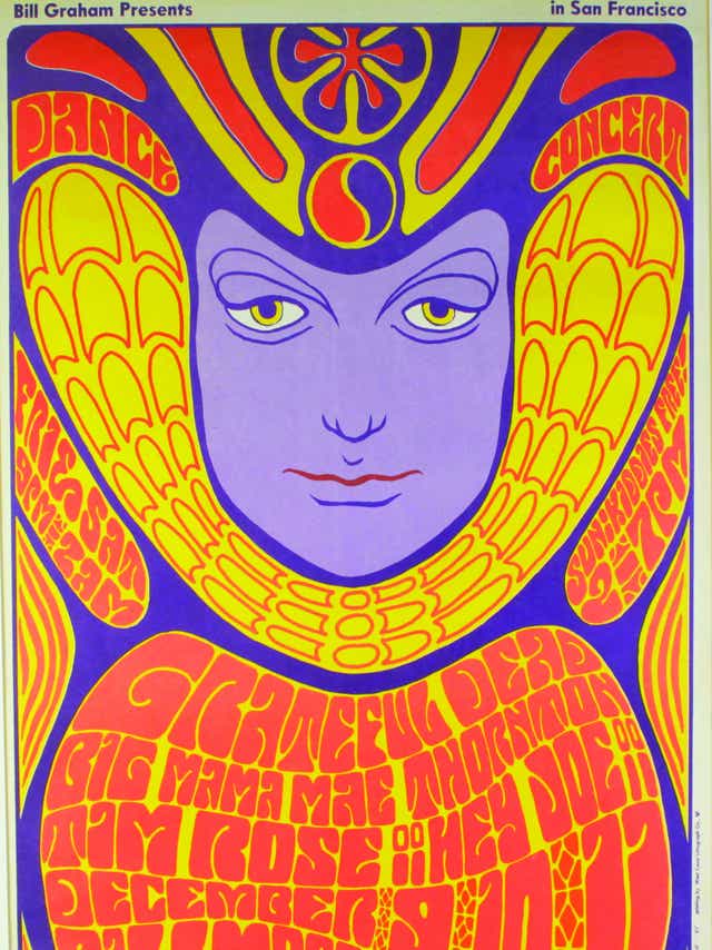
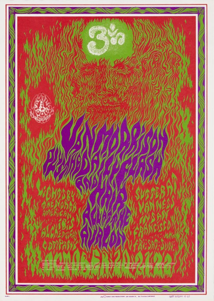
Robert Wesley Wilson, also known as Wes Wilson, was a pioneer for psychedelic posters.
Grateful Dead poster by Wes Wilson. (1966)
He is credited for launching the psychedelic art movement as well as for popularizing the psychedelic font, which emulated the trippy LSD experience with its shape which made it look like it was moving.
Van Morrison at the Avalon Ballroom, by Wes Wilson, 1967 – I like how the font on this poster looks like flames, although it is a little hard to read, haha
His work is associated with the 1960’s, a time that was defined by the peace movement and psychedelic era. Although he essentially created the style, there were many people who imitated his work and he became easily replaceable. Apparently, his posters were so coveted that they would be stolen not long after they were put up.
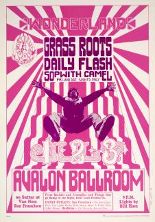
Wonderland (Grass Roots, Daily Flash…Avalon Ballroom, San Francisco, California (1966)
We can see elements of the Art Nouveau movement in his work. Wilson’s bold use of colour comes from his experience with LSD.
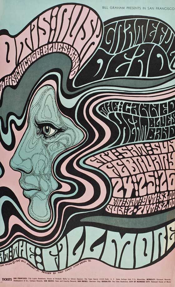
Poster for the Grateful Dead, 1967. Fillmore, San Francisco
He recently passed away in January, but his legacy will be immortalized- his works have been put up in museums like the New York’s Metropolitan Museum of Art and Museum of Modern Art.
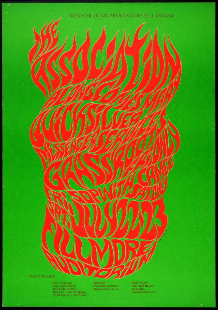
The Association at the Fillmore Auditorium, by Wes Wilson, 1966. Courtesy of Wes Wilson. This is considered to be the original psychedelic rock concert poster
Paul Rand was an American Advertising art director known for designing logos for major companies such as IBM, UPS and ABC.
Some logos designed by Paul Rand
Born in 1914, he grew up with an avid interest in art. His early job was designing product spreads and magazine covers before he moved on to designing corporate logos.
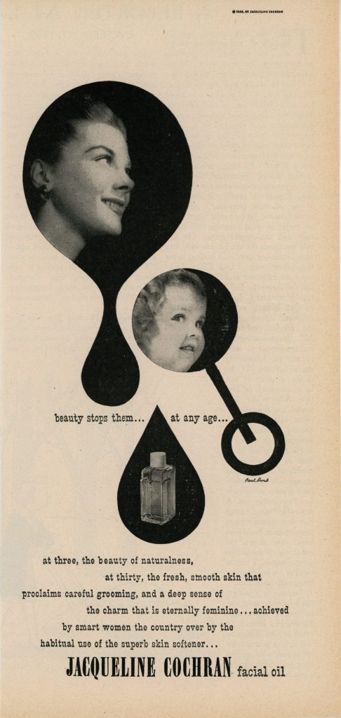
Dubonnet advertisement by Paul Rand in Time Magazine (November 10, 1947) Jacqueline Cochran facial oil advertisement by Paul Rand (1950)
He was greatly inspired by Modernist and European design, and is one of the first American designers to utilize its style in his work. He looked to Paul Klee for inspiration, and we can see his influence in his early work. I find it so amazing how elements of modern design have come back and designs made by designers who were active in the 50’s and 60’s look as if they were made today.
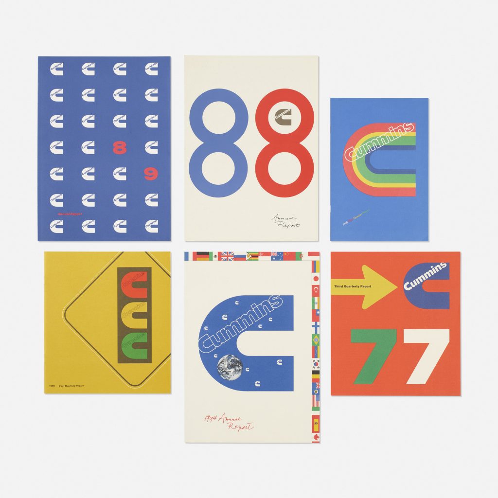
Cummins Engines annual reports and quarterly brochures by Paul Rand (USA, 1987-1994)
It’s fascinating to see companies such as Google and Apple have their logo changed over time, embracing the simple sans-serif, flat, limited colour palette that are characteristic of the Swiss style. While logo designs by Rand have changed very little as they are timeless.
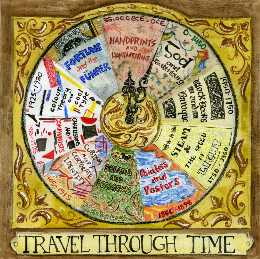
I did the index of the book! I had too many ideas and had a lot of trouble narrowing them down to good ones. Since the index was not going to include page numbers, I felt that the purpose of the index was to just show the chapters of the book and not where to find them. With this in mind, I wanted to stray from the standard linear form that most indexes follow, which is why I played with different ways of arranging the content. I liked the theme of time and travelling through time, which is why I decided to put the chapters onto a clock face. I also put a little plaque on the bottom that said “travel through time” to really drive that point home.
Initially, I was going to draw the names of the surveys and their dates in typefaces from that time, but I felt that the clock face would still look too plain. I put patterns and little elements from that time period in addition to the dates and chapter names in the background to make it eye-catching.
I would give myself 9/10 for this index. I felt that my index reflected the research I did prior to making this, and that it would give the viewer an idea of what the sections would be about. I think everything looks great, although if I were to do this again I would change the look of the survey 4 section (steam and the speed of light).
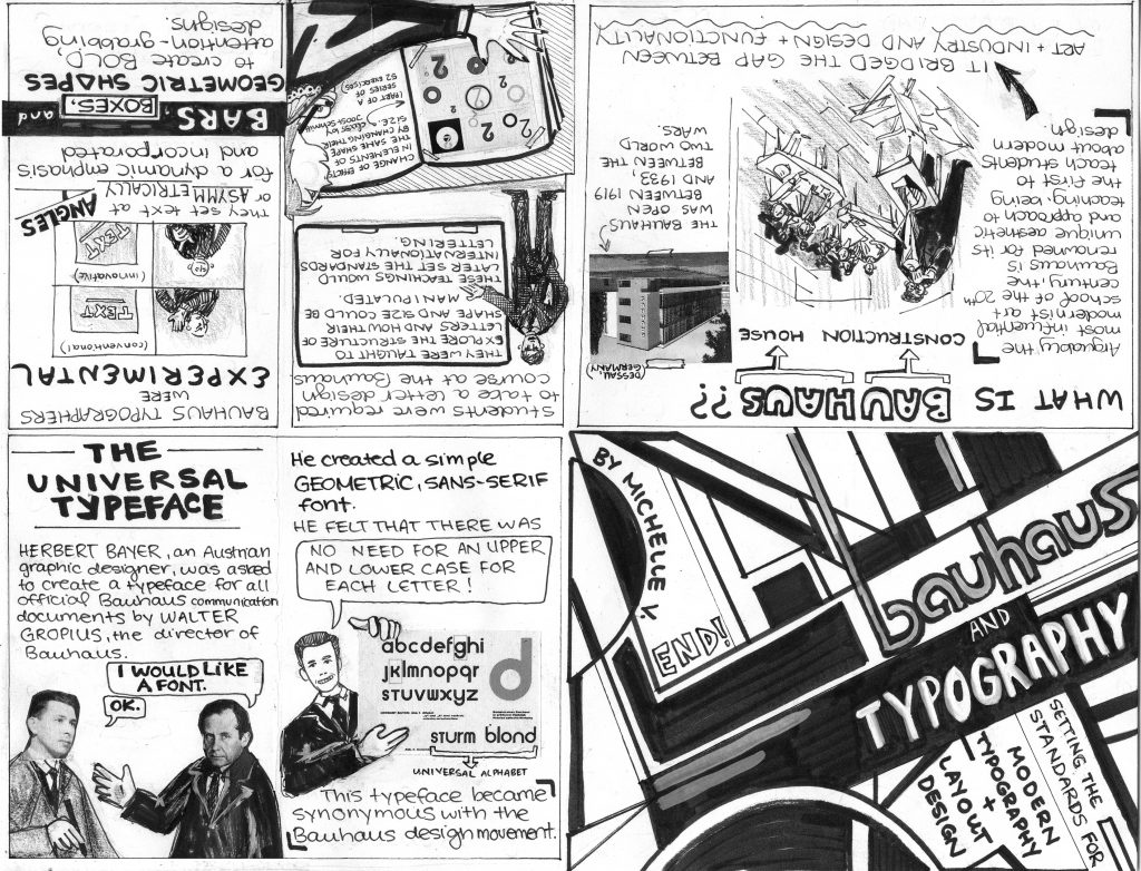
For my final history book assignment, I did a typography zine. I had trouble choosing what to make my zine about. Initially I was going to make it about key typographers of the time, then I changed it to exclusively Bauhaus typography since they were so iconic. I noticed that the zines done before me were super neat and very aesthetically pleasing, however they were rather text-heavy and I would find myself glazing over the text. I made sure to put in as many pictures as possible in addition to copy so that there could be ‘breaks’ from reading. I was inspired by how Grace printed and pasted a picture of Behrens for her zine, so I decided to incorporate printed images into my zine as well, which worked really great since I’m sure my drawings could not produce the same effect. I felt that putting straight text would be boring to look at, so I made certain words stand out by making them a different font, or put them into speech bubbles and boards.
On the 4th page I summarized the writing on that page in a meme format, which I hope was translated well. I did this because I wanted to present the information in a funny, yet understandable way. Nothing captures one’s attention more than a meme, and it adds to one’s understanding if they understand memes.
Judy pointed this out but the information on the zine did not seem to have an ‘order’ and was kind of all over the place, and I agree it seems like that. There was a lot of information to work with so I put whatever sounded the coolest, which made the zine unable to flow as smoothly as it should have.
I would give myself a 9/10 for this zine. It was my first time making a zine and I was incredibly pleased with the results. Someone suggested that I could have made some of the copy in the style of Bauhaus, which I agree with, so I’d definitely do that if I were to do it again, but otherwise I’d keep it that way it is.
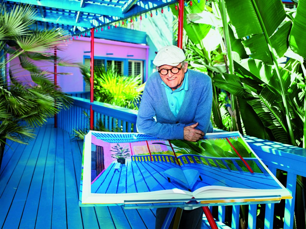
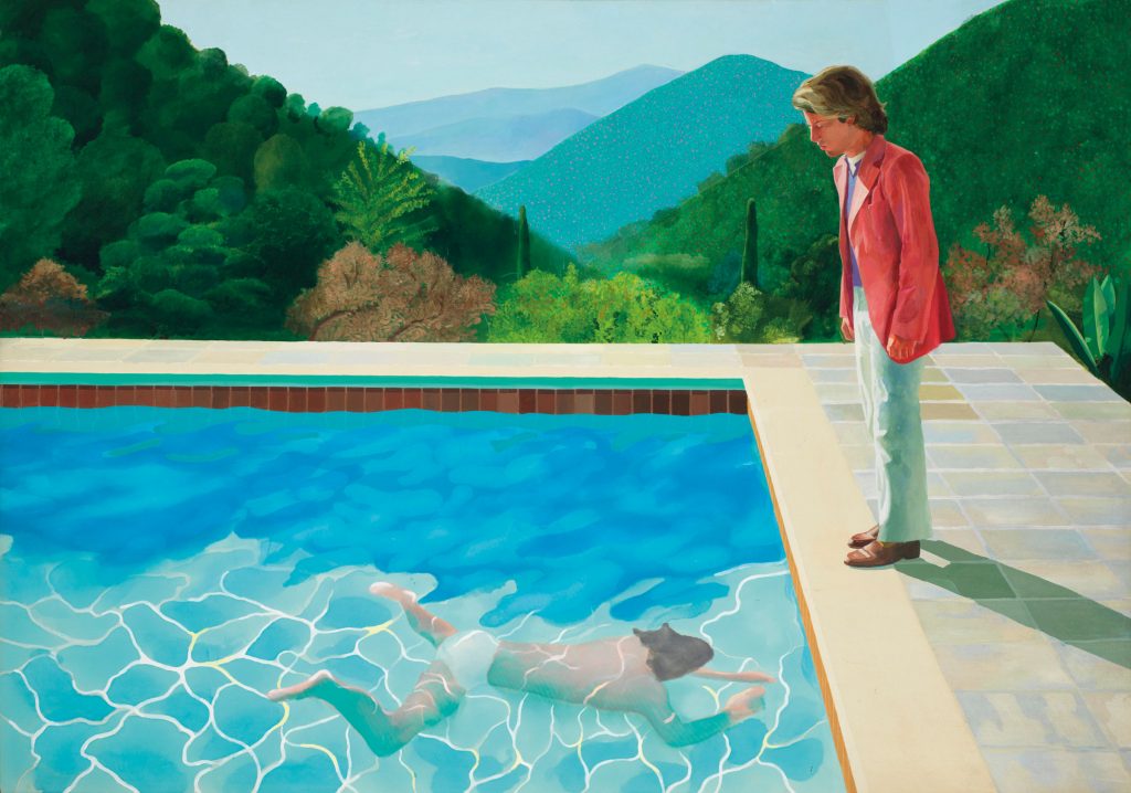
One of the most important painters of the 20th century (and one of my favourite artists of all time), David Hockney (1937-present) has made his name painting swimming pools and creating photo collages.
Born in England, he attended the Royal College of Art in London. Here, he featured in an exhibition that promoted British Pop art, where he was associated with the movement, although his earlier works had expressionist elements.
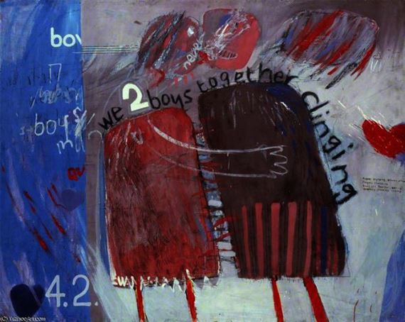
We Two Boys Together Clinging (1961) – Created in 1961, this painting acknowledged his homosexuality, despite the fact that homosexuality had not been decriminalized in England until 1967.
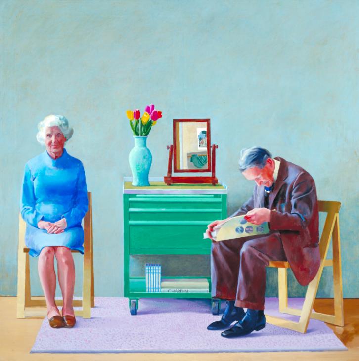
He moved to Los Angeles in 1964 where he painted swimming pools, palm trees, and sunshine using bright colours, which showed the beautiful weather in California. Hockney also painted portraits of the people he cherished in pairs.
My Parents (1977) – In these paintings, he wanted to depict the feelings of love he felt toward the subjects in these paintings.
Although he had always been fascinated with photography it was only until the 80’s where he began working in that medium.
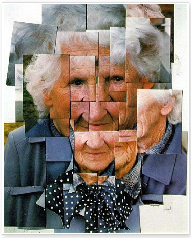
Mother (1986) – Dubbed as “joiners” by Hockney, several photographs of the same subject were taken at different angles, where he would join them together to create a single composite image.
In 2018, Hockney’s painting, Portrait of an Artist (Pool with Two Figures) had been sold for $90 million, which was the most expensive work by a living artist sold at auction until 2019.
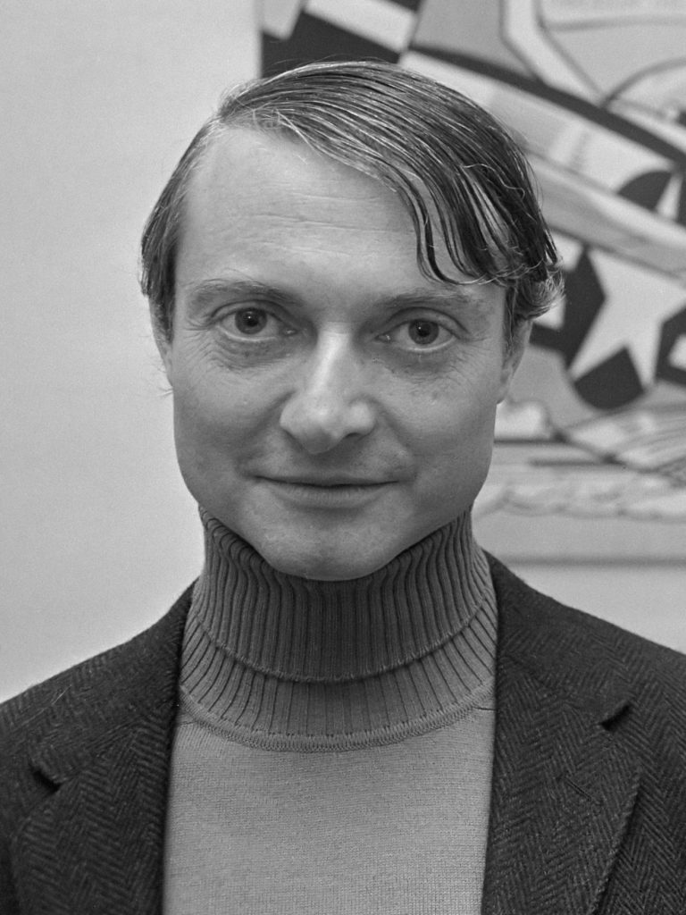
American artist Rou Lichenstein was one of the founders of American Pop Art. His most famous works, which were cartoon-style paintings, are synonymous with the movement.
Roy Lichtenstein
Lichenstein worked in several modern art styles early on in his career, including Abstract Expressionism. He began to include cartoon characters such as Mickey Mouse into his abstract paintings.
Untitled (1959)
During the ’60s, he began to move away from his abstract style and started to experiment with other techniques. He challenged the idea that commercial art and cartoons were not “true” art, going against the Abstract Expressionist movement which was popular during this time.
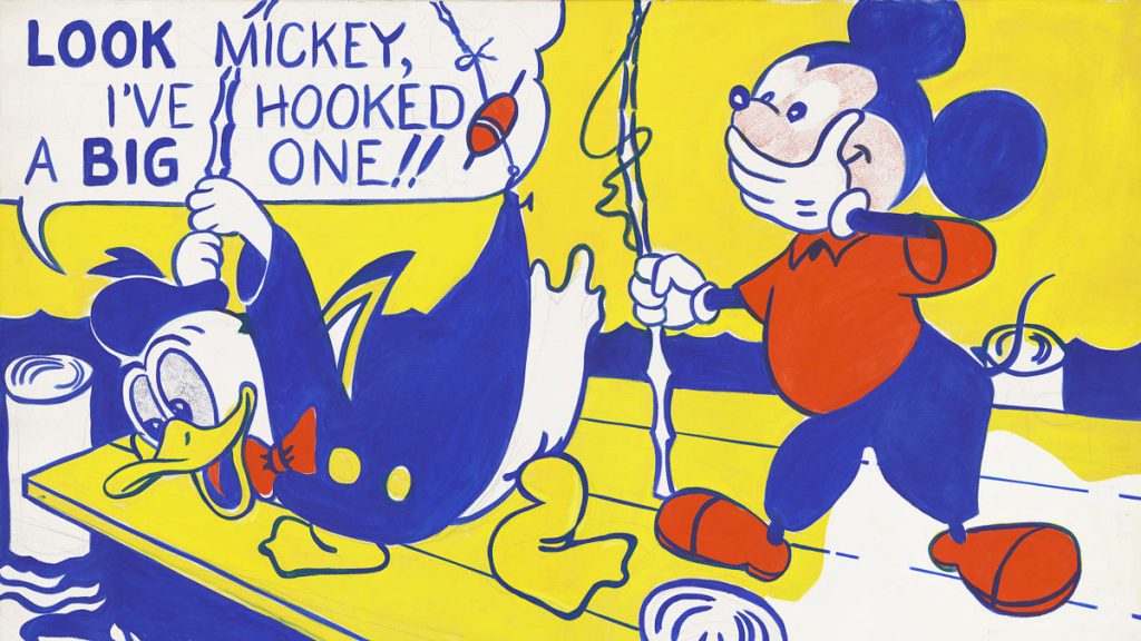
Look Mickey (1961) – This piece came from a challenge from one of his sons, who pointed to a Mickey Mouse comic book and said; “I bet you can’t paint as good as that, eh, Dad?”
The process for his cartoon works began with Lichenstein taking a single frame from a comic strip, then reproducing the frame on canvas and paint, working with bold black lines and Ben-Day dots.
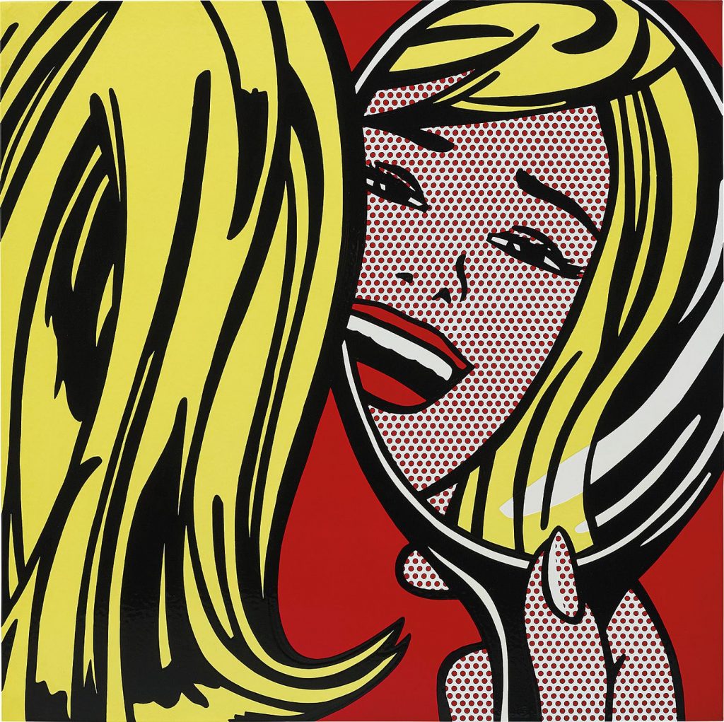
Girl in Mirror (1964) – Ben-Day dots, named after illustrator and printer Benjamin Henry Day Jr., was a cheap printing technique that involved utilizing dots to create the effect of shading and colours in print images.
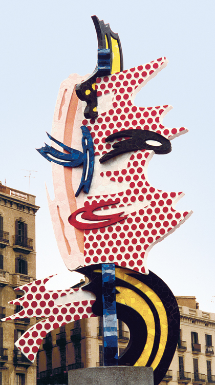
Although his paintings are famously known, he has also created thousands of murals, prints, ceramics and sculptures as well.
Barcelona Head (1992)
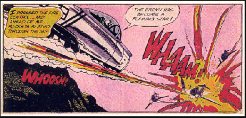
Personally, I find Lichenstein’s works enjoyable to look at. His bold use of colours and line are incredibly impactful. However, I am not sure how to feel knowing that his paintings literally came from the work of other people without credit. Lichenstein stated that his work is different because of the way he created it, as he chose the colours and painted the dots on by himself, but it does not dismiss the fact that the line drawings are not original.
Original comic book panel from DC Comics’ All-American Men of War No. 89 (Feb. 1962)
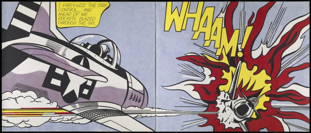
Whaam! (1963)
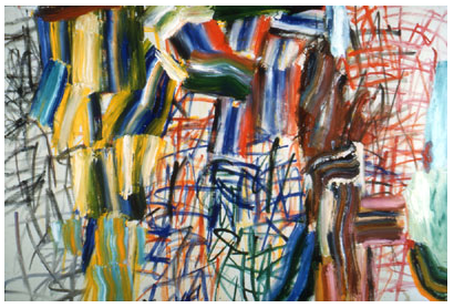
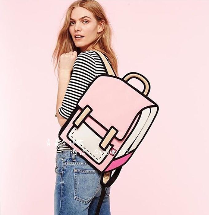
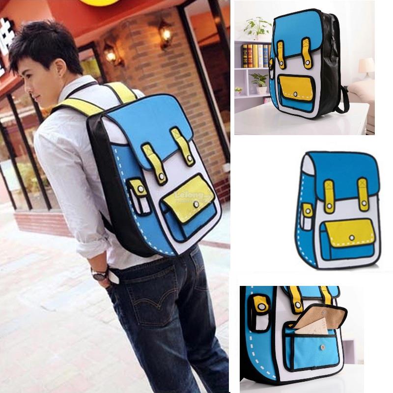
I also really like his sculptures, especially those of his brushstroke series. They give the effect of something that is flat and 2-D while in reality, they are not. They remind me of these backpacks that were really popular a few years ago because they gave the viewer the illusion that they were completely flat and not a functional backpack while in reality they were. I will never get tired of that concept- it’s so clever.
Brushstroke (1996)
Backpacks that were made to look like they were 2-D and reminded me of Lichenstein’s sculptural works. ^^