John William Waterhouse (1849-1917) was an English painter who painted in the pre-raphaelite style. Born in Rome to two English painters, he was immersed in the art world from an early age. He enrolled at the Royal Academy of Art when he was 21.
John William Waterhouse
He initially studied sculpture but went on to exclusively study painting. His paintings depicted women of British literature and Classical mythology such as Arthurian legends and Greek myths.
Ophelia (1889) by John William Waterhouse –
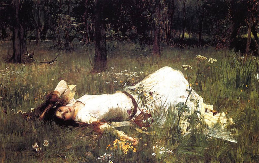
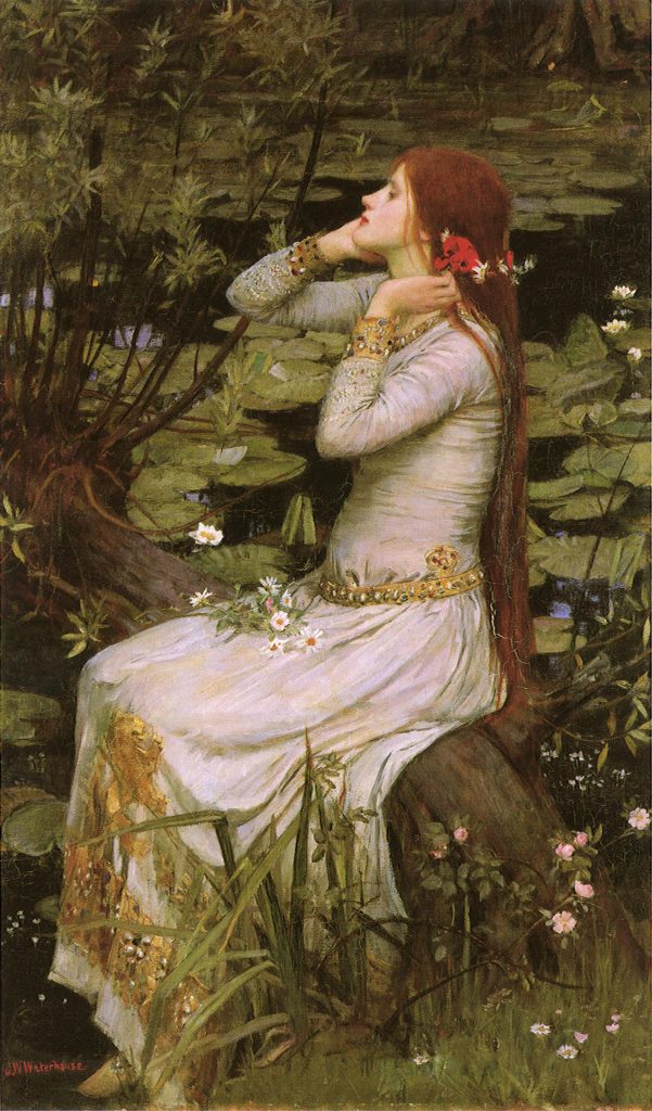
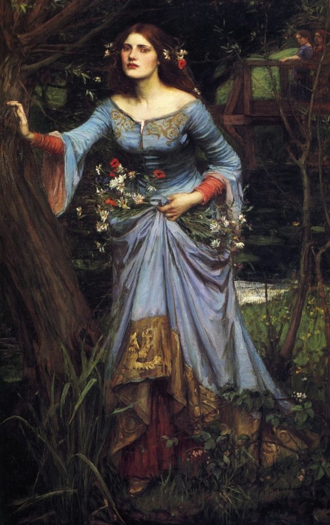
Waterhouse painted three versions of Ophelia from Shakespeare’s Hamlet. Each version is a depiction of her at different stages before her tragic death. In the first one (above), she is youthful and innocent. The second painting (1894) shows a slightly older Ophelia, sitting near the stream where she ends her life. The mature, grown woman in the last painting (1910) is Ophelia, who looks starkly different from the previous two paintings. We can see that she has fallen into madness by the look of her challenging gaze and the flushed cheeks. It is thought that she is just about to end her life in this piece as she seems to be balancing herself against the tree in preparation for stepping into the river.
Ophelia (1884) by John William Waterhouse
Ophelia (1910) by John William Waterhouse
He produced hundreds of watercolour and oil paintings. As he became more well known, his paintings grew larger in scale.
Although he was not a true member of the Pre-Raphaelite Brotherhood, his subjects and painting style reflected their tastes. He would continue to paint until his death in 1917 from cancer.
I am in love with Waterhouse’s paintings! They’re richly coloured and dramatically beautiful. All of the women in his paintings have an air of mystery and elegance in them. His paintings seem to have an Impressionistic style to them- I can see and feel the “grain” of his brushstrokes.
The Lady of Shalott by John William Waterhouse Waterhouse Hylas and the Nymphs by John William Waterhouse
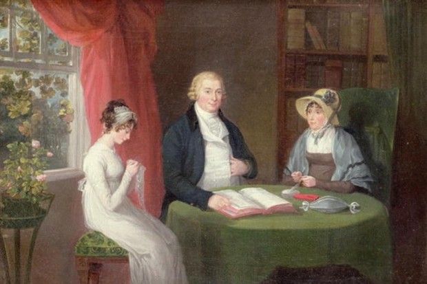
We had Harry Potter and the Hunger Games. What kind of books did the people of the 19th century like to read?
People like to criticize the younger generation of this age for using their phones to distract themselves when they could be reading or doing better things, but did you know, some people of the 19th century considered reading to be dangerous. They feared that people who read books would not be able to tell the difference between reality and fiction. These people would spend hours engrossed in a book.
A Young Girl Reading by Jean-Honoré Fragonard
What kind of books were they reading for them to not be able to put it down? Many books during this time were of the realist kind. A popular literary movement during the 19th century, realism was a literary movement that started in France during the mid 19th century and spread to the rest of Europe, Russia and the USA. This movement came about as a response to the Romantic movement, which emphasized imagination, prose, exotic themes and outstanding heroes. Books of this movement had characters of various classes, usually of middle to low classes of society.
In Europe, there were writers like Jane Austen and Charles Dickens. Jane Austen’s novels addressed the limited opportunities women of all classes had. The dialogue is natural and realistic, which was her way of critiquing the unrealistic portrayal of women in books of the 18th century. In her novels, she does not portray all couples as perfect, despite being novels about finding love. Charles Dickens’s novels are thought to have been used for social reform. His books criticized Victorian society for their treatment of the lowest class of people. His characters were often poor, working-class people tackling poverty and injustices.
In the USA, William Dean Howells and Mark Twain were two of many American realist novelists. Howells wrote novels about situations that were realistic such as a marriage falling apart and the rise and fall of businesses. What made Mark Twain’s novels so realistic was that he used colloquial speech that was unique to the United States. During this time, American writers were trying to imitate the fancy writing style of the English, so Twain’s use of American slang was revolutionary and gave American writing a distinctive voice. Twain’s novels had characters that were highly believable and put in tiny details that made his stories highly realistic.
Not only did books help pass the time by immersing readers into the lives of different people and scenarios, but they also brought awareness to social problems that would have otherwise gotten ignored. By writing to fight against the idealization and the dramatization of life in literature, realist writers allowed the voices of the impoverished or less fortunate to be heard.
How To Tell If A Building Is a Piece of Baroque Architecture If The Need To Impress People With Your *Vast Knowledge* of Art History Ever Arises
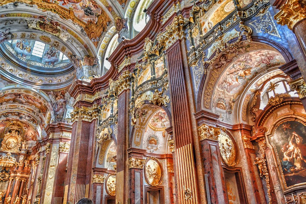
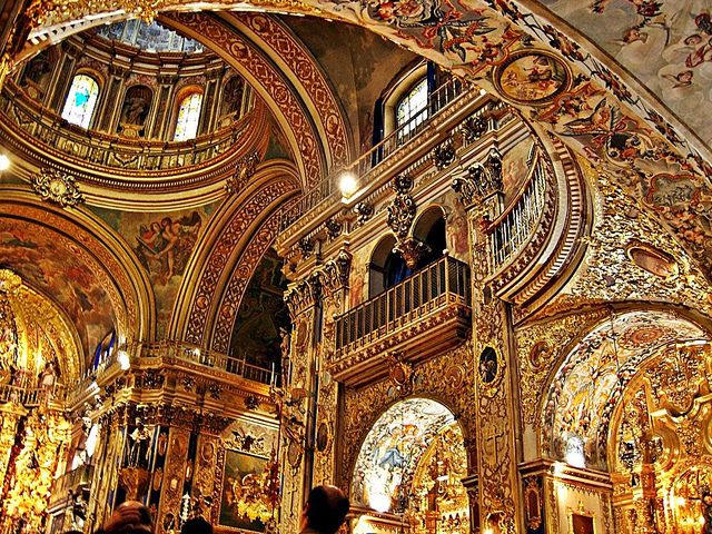
Renaissance, rococo, classical, medieval… if you are not an art student spending 7+ hours in class every day, you may have little to no clue of what these terms mean. All you know is that these fancy words describe different chapters in the history of art. To the untrained eye, the differences between these periods may be hard to tell, so I’m here to enlighten you about the fantastical majesty that is baroque architecture.
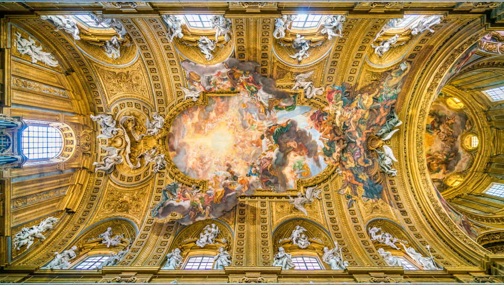
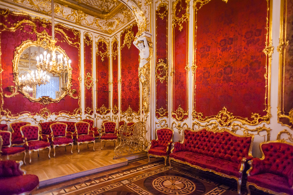
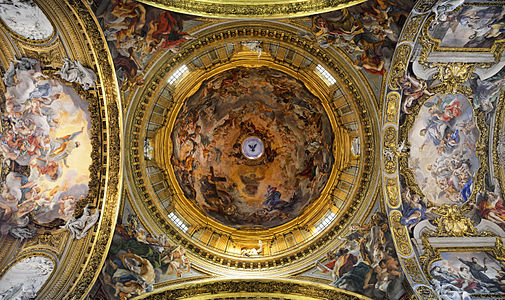
Baroque architecture emerged in Italy during the early 17th century. During this time, the Catholic church’s influence on the people was diminishing due to the Protestant Reformation movement, which challenged the power of the church. To counteract this, the church had extravagant churches and cathedrals built to evoke emotion and wonder to the people, attracting new followers. By doing this, they showed off the vast amount of wealth and power they had. Not long after the monarchy had lavish buildings built as well as a reminder to everyone that they also held a tremendous amount of wealth and power.
Renaissance architecture, which preceded baroque architecture, was a source of inspiration for the latter. The domes, colonnades and other elements of renaissance architecture were taken and made bigger and grander. The complex and highly decorated structures were what made baroque structures so unique.
Other elements of baroque architecture also included:
Broad naves
LOTS of ornamentation, often inlaid with gold
Emphasis on light and darkness- in churches, the altar is bathed in light as it is the most important part of the church
Trompe-l’oeil (forced perspective) paintings on the ceilings
Plaster or marble finishings for a fancy look
Strong curves and twists
Large frescoes
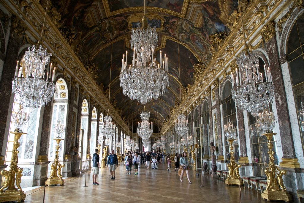
Some baroque buildings:
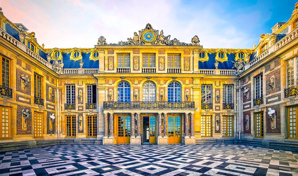
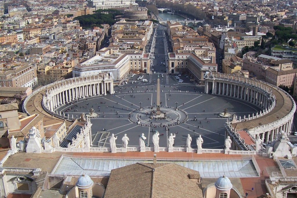
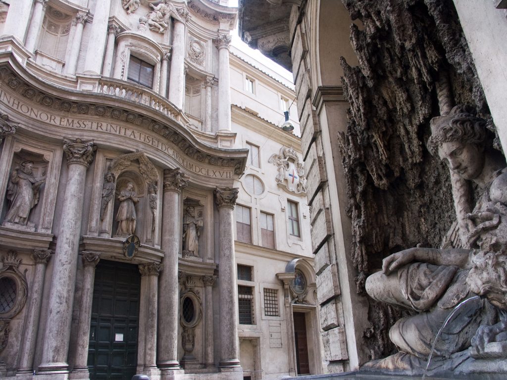
The Palace of Versailles, Versailles St. Peter’s Square, Vatican San Carlo alle Quattro Fontane, Rome
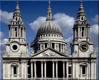
St. Paul’s Cathedral, London
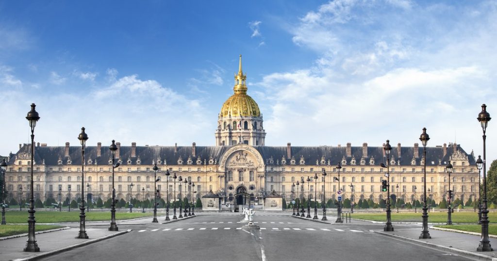
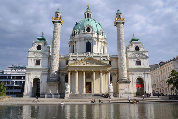
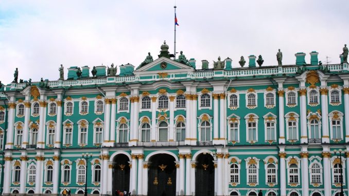
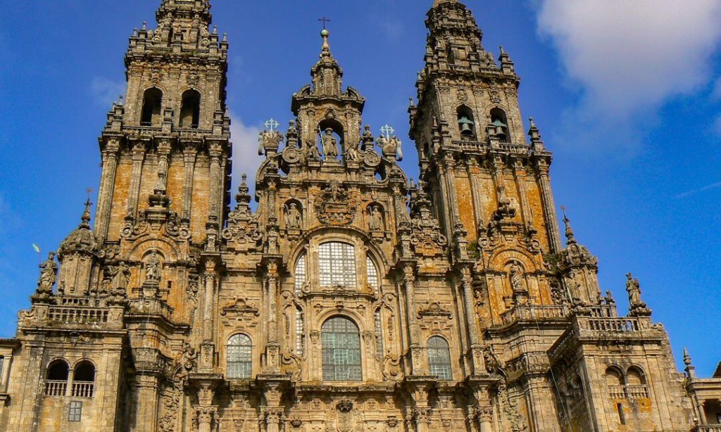
Les Invalides, Paris Karlskirche, Vienna Winter Palace, Saint Petersburg Cathedral of Santiago de Compostela, Western Facade
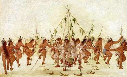
Throughout history, clothes could be worn to signify status, to enhance one’s looks, provide warmth or other practical uses. The clothing worn by Native Americans in the 15th century greatly varied across North America due to differences in weather, access to resources and differing values from tribe to tribe. Prior to the Europeans arriving and initiating trade in the 1500s, Native Americans mainly relied on hunting to provide the skins for clothing.
Native American tribes were divided into several cultural regions. The tribes in these regions shared the same language, climate and environment.
The cultural regions and the clothing worn in these areas follows:
The Arctic: Located in the North of present-day Alaska, Canada and Greenland, this region had flatlands and had no trees. Living in one of the coldest regions on the planet, groups such as the Inuit relied on wearing several layers of thick clothing to keep them warm. Their outfit consisted of a parka, pants and boots made from seal and caribou. Seal skin would keep their clothing waterproof, while caribou fur lined the inside and covered the outside of their clothing to keep them extra warm.
The Subarctic: This area featured swampy lands and boreal forests. Stretching across inland Canada and Alaska, people of this region lived a nomadic lifestyle, following herds of caribou. Women wore long dresses with removable sleeves while men wore breechcloths and leggings. Alternatively, both men and women also wore tunics with knee-length pants. Everyone wore moccasins, a type of soft leather boot.
The Northeast: This region covered the Canadian Maritimes, the Great Lakes region, the Mid-Atlantic states, and the American Midwest. The region had temperate weather and a rolling landscape, which made good land for farming. Everyone wore moccasins and clothing made from deerskins and pelts. In the summer, women would wear deerskin aprons while men would wear breechcloths. When the weather got colder, the people would don bearskin capes and gloves. For ceremonies, beads, shells or porcupine quills were used to decorate the cloths.
The Southeast: North of the gulf of Mexico, this region was full of fertile land. Men and women wore little clothing, wearing short skirts in warmer weather, while children wore nothing at all. In colder weather, they wore skin cloaks and moccasins. They also wore jewellery made from shells and bones. Feather headdresses and capes made from bark and feathers from eagles and turkeys were worn during ceremonies.
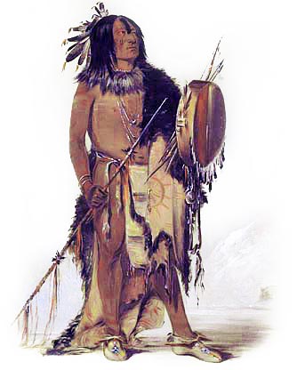
The Plains: Spanning the vast prairie region between the Mississippi River and the Rocky Mountains, the people of the Plains dressed according to the weather. During the warm summer months, women would wear loose-fitting dresses and men would wear breechcloths. In the winter, men would wear robes and high boots. Deerskins and buffalo hides were used to make their clothing. Popular American media loosely based their depiction of an “Indian” from the Plains people due to the fact that they wore feathered war bonnets.
The Southwest: This area lies between present-day Arizona and New Mexico. It was a desert ecosystem and rained very little, although there were many rivers. Everyone wore deerskin moccasins. Men wore breechcloths and cloth headbands. Women wore knee-length cotton dresses called mantas. The dress was fastened over one shoulder while the other remained bare.
There are many more cultural regions such as the Northwest Coast, the Great Basin, and the Plateau. The areas I have talked about above are meant to show how different people dress depending on the region’s climate and topography. Not long after this period in time, Native Americans were exposed to the influences of the European settlers, adopting their styles as well as the styles of neighbouring tribes due to trade.
Sir Joshua Reynolds (1723-1792) was an English painter who was famous for his work in portraiture. He was born into a well-educated family, growing up and becoming versed in the classics. He became apprenticed under Thomas Hudson, who was well known for his portraits during this time.
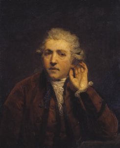
Self-Portrait as a Deaf Man by Sir Joshua Reynolds – Joshua Reynolds became partially deaf in his 30’s after a bad cold. He was often seen with an ear trumpet.
Reynolds later developed a style unlike any others of his time, using impasto (the texture of thick paint) and large brush strokes. He studied the works of the old masters, Italian painters, and ancient Greco-Roman sculptors.
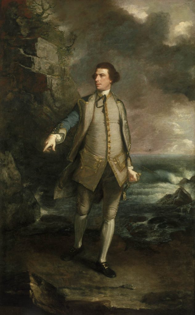
Captain the Honourable Augustus Keppel by Sir Joshua Reynolds – Inspired by Romans, Reynolds based this painting off the famous statue of Apollo Belvedere.
He founded and became the first president of the Royal Art Academy, where he delivered a series of lectures. There he greatly encouraged people to refer back to the classics and works of the old masters. He believed in idealizing the natural world, choosing not to paint things as they are in real life; this would be later called the “grand manner” of painting.
Colonel Acland and Lord Sydney: The Archers by Sir Joshua Reynolds – Grand manner was utilized in history painting, which Reynolds greatly appreciated and claimed to be the greatest form of art. He did not get the chance to do many epic history scenes as his portraits were in greater demand. Reynolds managed to incorporate this style into his portraiture.
What I enjoy about his paintings are that they all have blurred, almost rough-looking backgrounds that contract with the soft, smooth subjects, pulling the eye in. Their somber, pensive looking faces give them an air of dignity.
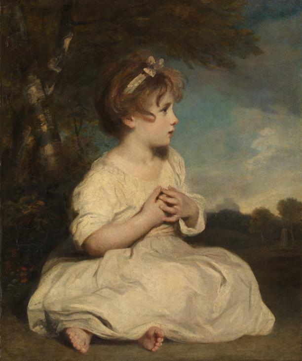
The Age of Innocence by Sir Joshua Reynolds
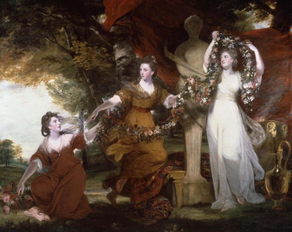
Three Ladies Adorning a Term of Hymen by Sir Joshua Reynolds
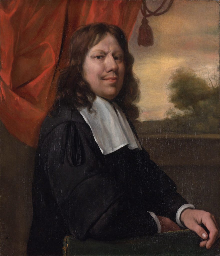
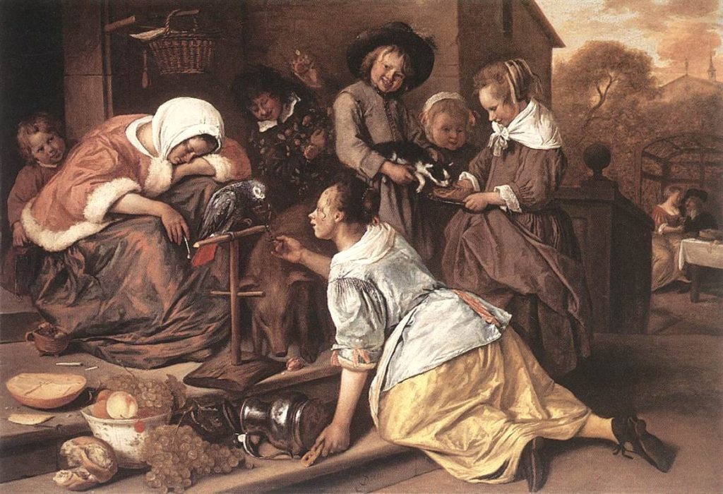
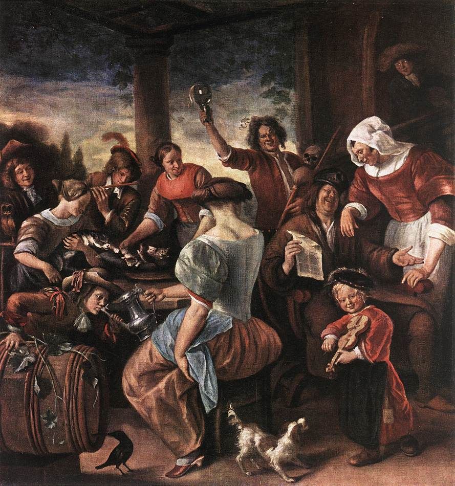
Jan Steen (c.1626 –1679) was a Dutch painter who was known for his animated and lively paintings. He was born into a well-off family, his father being a brewer. He trained with artists Nicolaes Knupfer and Adriaen van Ostade. He moved several times, living in Leiden, The Hague, Harlem and Delft.
Self Portrait by Jan Steen
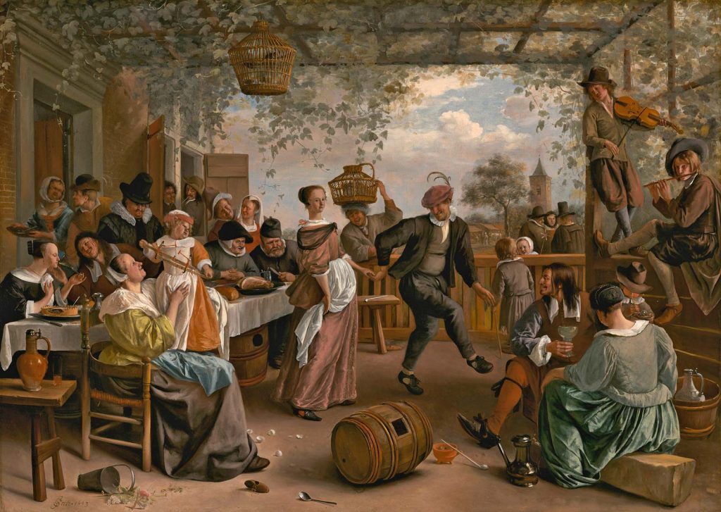
He painted over hundreds of paintings ranging from portraits to landscapes to tableaus. He could not survive on the money he was making from his paintings alone so he ran a tavern and a brewery. His popular paintings often depicted humorous family scenes that were chaotic or scenes from daily life that filled the viewer with warmth. He also painted other themes such as religion or ones based off of proverbs which served to remind those of important lessons.
The Dancing Couple by Jan Steen – Jan Steen often inserted himself into these tavern scenes.The Effects of Intemperance by Jan Steen – Proverbial pieceThe wrath of Ahasuerus by Jan Steen – Religious art
I really like the details Steen put into his paintings. It makes me look at his work for a long time to uncover the small things he adds to make it more interesting. I can feel his sense of humour in these works. What I find the most interesting is that none of the colours in his paintings are super saturated or pop out. I know that the colour of the composition affects the mood however he does not use bright colours and yet we still feel a sense of joy looking at his comical paintings.
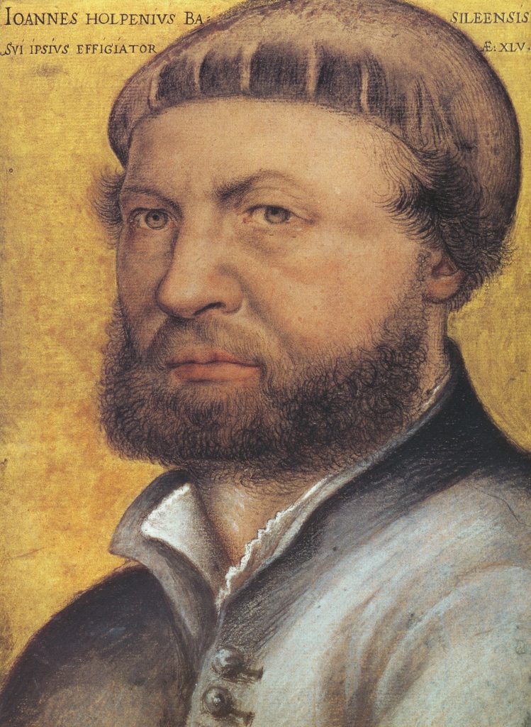
Hans Holbein (c. 1497-1543) was a German artist who was known for his portraiture and woodcut works. His father, whom he was named after, was a painter as well and taught him how to paint. He later moved to Basel, Switzerland, where he worked with a variety of mediums, from stained glass to prints to painting portraits of affluent merchants.
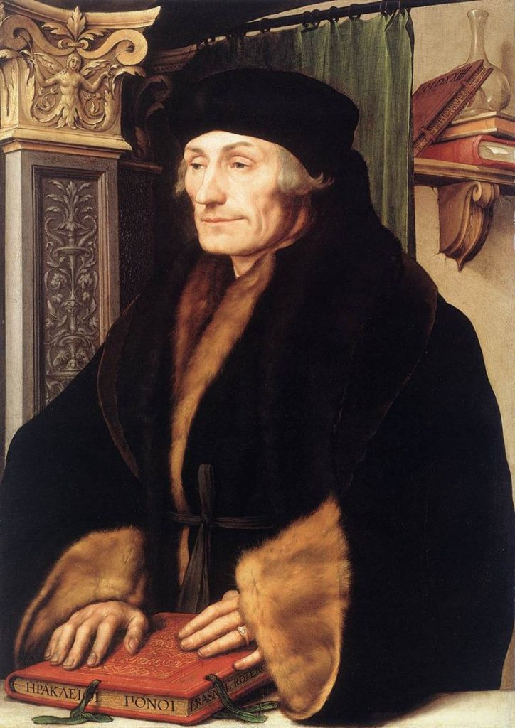
Hans Holbein the YoungerPortrait of Erasmus of Rotterdam by Hans Holbein
A few years later he came to England and during this time his work in portraiture became known. Holbein became the court painter for King Henry VIII, painting hundreds of portraits until his death in 1543 from the plague.
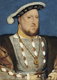
Portrait of Henry VIII of England by Hans Holbein
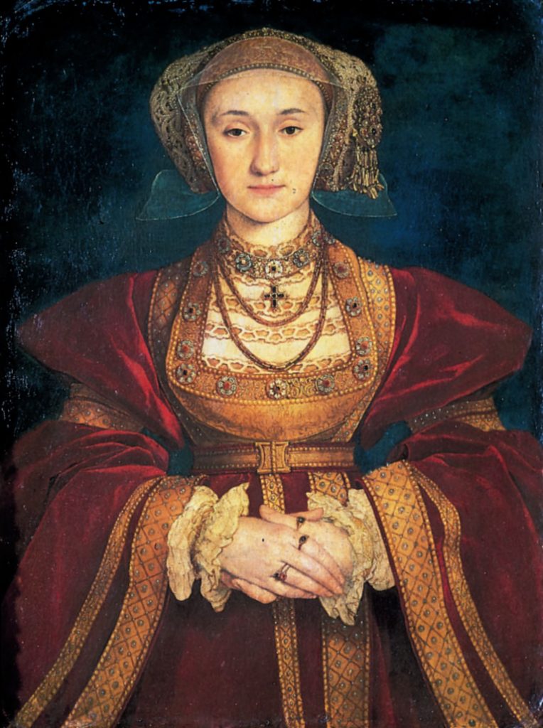
Anne de Clèves by Hans Holbein – In addition to being the court painter, Holbein was the fashion designer for the court.
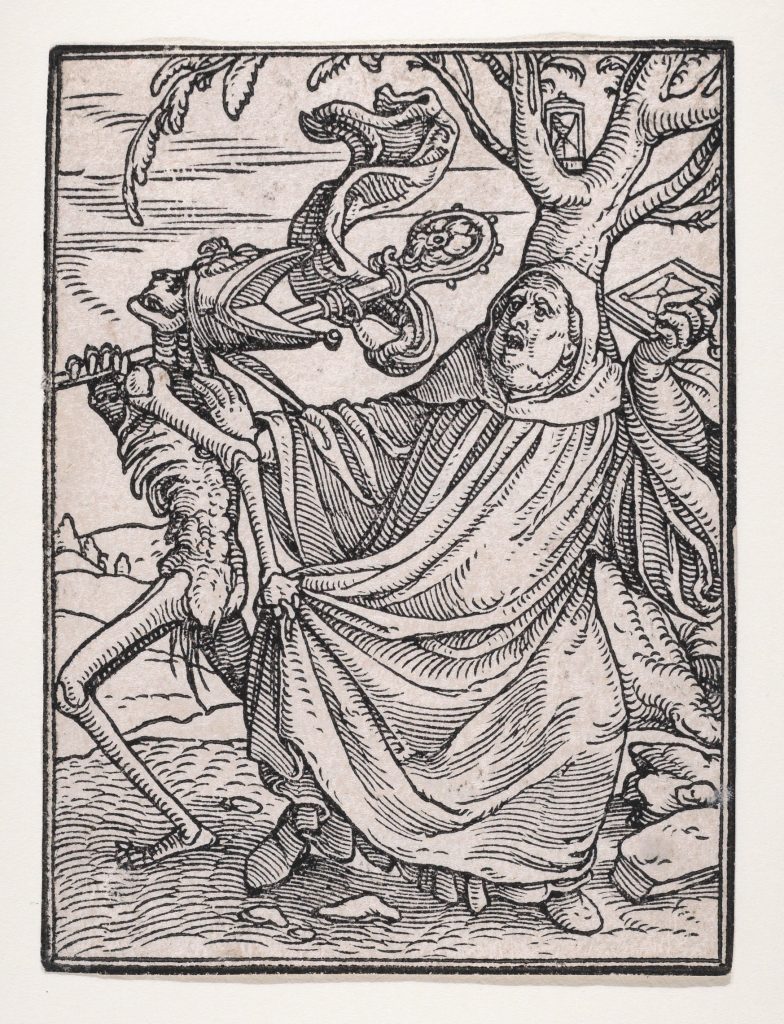
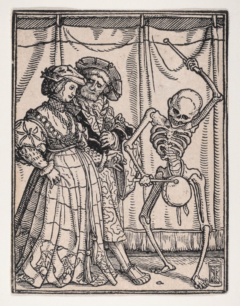
My favourite works by Holbein were his illustrations for the allegory the “Dance of Death”, which are extremely expressive and have a sense of movement within them. Despite how morbid the theme is, I particularly liked the skeleton, which represented death. In every piece, it seemed as if it was joyfully inviting their next victim to ‘dance’, much to the latter’s horror.
The Abbot, from The Dance of Death by Hans Holbein – The “Dance of Death” depicts how all people, regardless of class or age were unable to escape death. This theme was popular during the time of the Plague especially since everyone was dying. The Noblewoman, from The Dance of Death by Hans Holbein
Wait- there’s a reason why the Ancient Egyptians coloured their art in a funky way?
In Ancient Egypt, art decorated Ancient Egyptians’ houses to tombs. Colours made from minerals and semi-precious stones were used to colour them. Their use of colour was highly symbolic. Every colour used in paintings served a meaning which told a story.
They used six main colours; the ancient names listed after the colour.
Red ( “desher”), green ( “wadj”), blue ( “irtyu”), yellow ( “khenet”), white (“hedj”) and black ( “kem”).
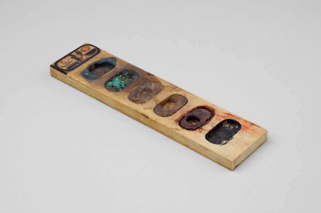
Painter’s Palette Inscribed with the Name of Amenhotep III
These colours represented people, characteristics, and things found in nature. A summary of the colours and their meanings and how they were used in art follows.
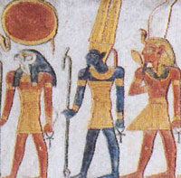
Red symbolized chaos, fire, and anger. This colour was associated with the god of storms and chaos, Set, who had red hair. He was also associated with the desert which was believed to be the entrance to the underworld- therefore making the colour red be associated with death as well. Additionally, red can represent victory as a result of Set defeating an evil being called Apep. Egyptian men were painted with red skin, which was standard protocol.
Set, the god of chaos and storms
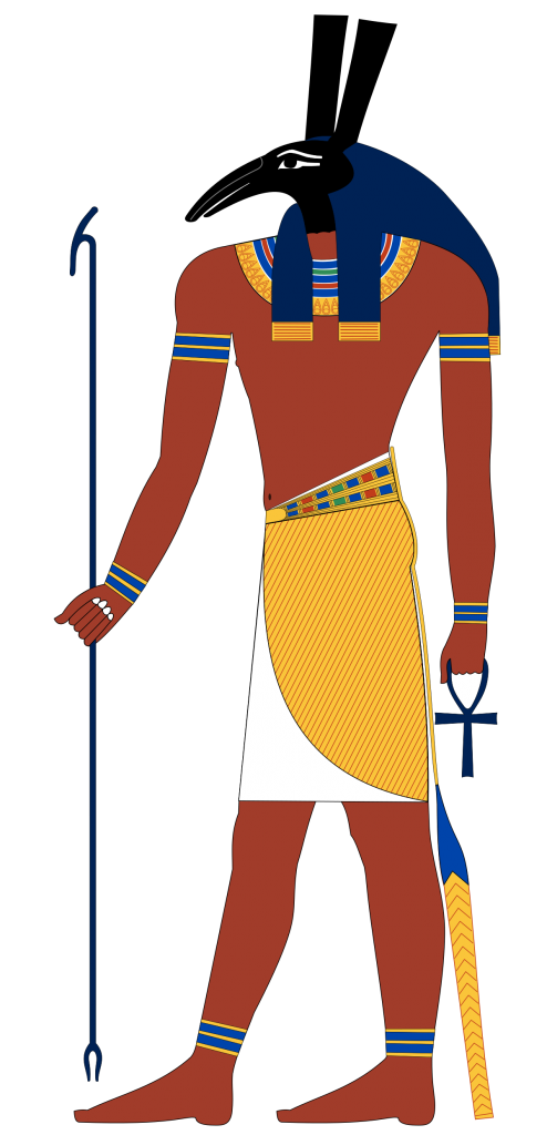
Green symbolized growth and vegetation, life and resurrection (which could also be represented by black). Osiris, the Egyptian god of fertility, the underworld and the afterlife was often depicted with green skin.
Osiris, the god of fertility and the Underworld
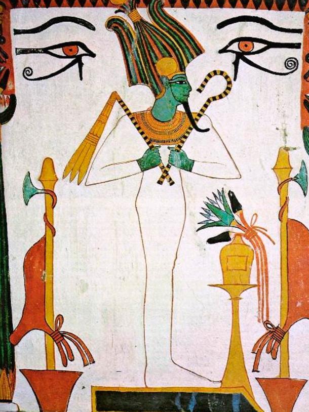
Blue, commonly known as “Egyptian Blue” was very popular.. It was the colour of the heavens and the water. Blue was, of course, the colour of the Nile River which symbolized fertility, growth and birth. Amon, the god of Egypt, was often portrayed with a blue face to show that he had a role in the creation of the world. Some Pharaohs (Supreme leaders of the land) that were associated with Amon were shown to have blue faces or hair in art.
Amon (center), the god of Egypt
Yellow, the colour of the sun and gold, symbolized eternity, perfection and being indestructible. It was also used to colour the skin of women, who spent more time indoors. Egyptian gods were believed to have skin and bones of gold and were often portrayed having gold skin in sculptures and paintings
White symbolized purity, clarity and simplicity. During holy rituals, white clothing was worn. Sacred animals such as oxen and cows were white. White was also used to depict clothing and other objects which associate the colour to everyday life. However, white was usually used to bring attention to the important aspects of a painting.
Black symbolized darkness and the underworld. It also represented both life and death. Osiris, the god of the underworld was called “The Black One” so the colour black was associated with death as well. One may not expect it, but black also symbolized fertility and life, similar to the colour green. This is because the black silt of the Nile was used for agriculture and nourished the people. Black was used as the standard hair colour in paintings, and was used to represent the Nubians and Kushites, people from the south.
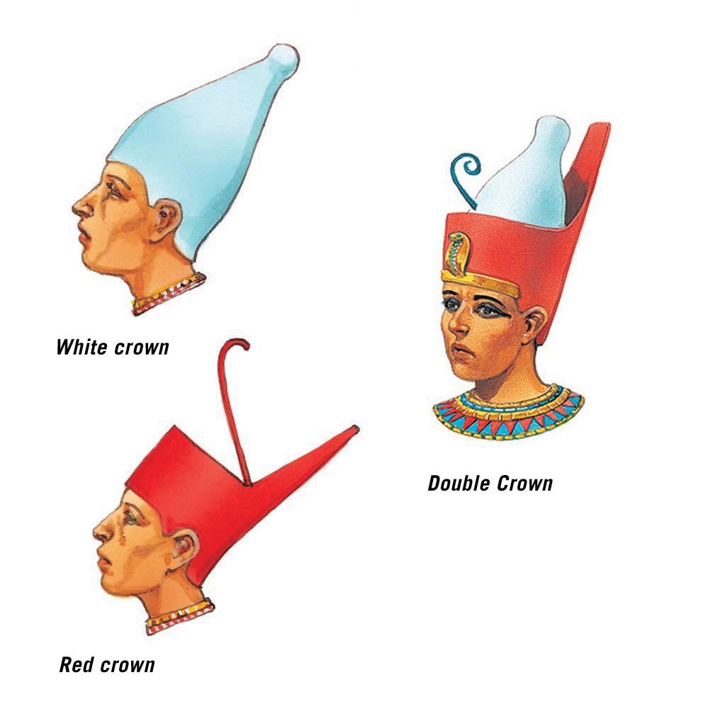
Red and white were paired as they were opposites. These colours were featured of the double crown of Egypt, which represented the two regions of Egypt coming together as one.
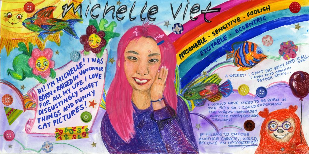
I wanted to have my yearbook spread reflect who I see myself as- strange but charming. To show this, I filled my page with every colour of the rainbow and added various things to make it feel busy and lively. The keywords I chose to put on my spread were: personable, sensitive, foolish, excitable and eccentric, which I feel describe me quite well. I used gouache and watered it down to paint the background, since I dislike colouring large areas with pencil crayons. I used pencil crayons to draw in the weird characters and fish, which I immensely enjoyed doing. These drawings gave off a kooky energy. I intentionally left some small white spaces while colouring to give the drawings a loose, messy feeling. Initially, I was going to print out a picture of myself but then I decided to challenge myself by drawing a self-portrait, using both gouache and pencil crayons. For the finishing touch, I stuck on colourful stickers to make the image feel less flat.
Overall, I would give myself a 8.5/10. I feel quite proud of this piece although there is definitely room for improvement. For one, I feel that my self-portrait does not completely look like me. Although I would like to see it look more realistic, I am still satisfied with how it turned out. I would also change the placement of the last two keywords on the rainbow as they are less visible on the green stripe compared to the yellow stripe. Lastly, I could have written the facts about me in bigger handwriting so that it would be easier to read for those who may have difficulty reading smaller text. Even though this project was not worth any marks, I had fun doing this activity!
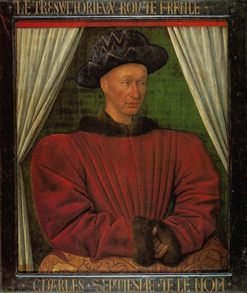
Jean Fouquet (c.1420-c.1480) was a distinguished French painter of the 15th century. He painted for the French monarchy, and was given the title of Court Painter. He was well known for his portrait, panel painting and manuscript illumination works.
Portrait of Charles VII of France.
Fouquet is also thought to have been the person who produced the earliest portrait miniature, which was a form of portraiture that was inspired by the techniques used to create illuminated manuscripts.
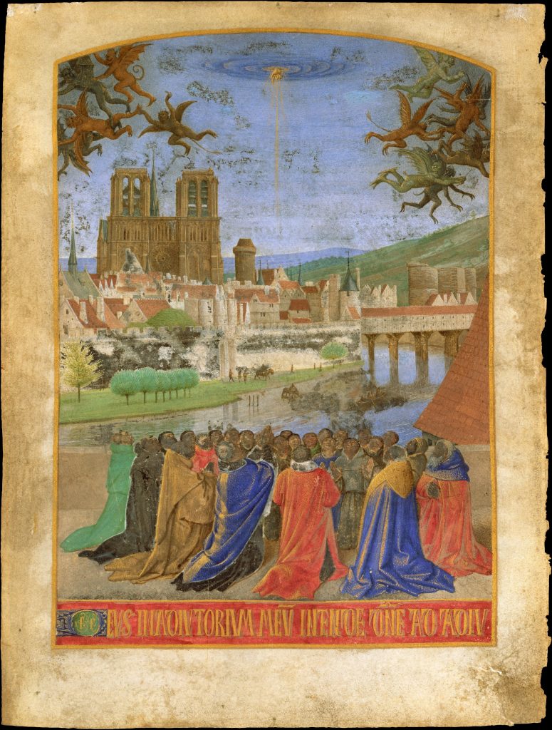
The Right Hand of God Protecting the Faithful against the Demons. A page from one of the most famous manuscripts of the fifteenth century- The “Hours of Étienne Chevalier”
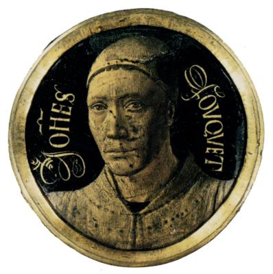
Jean Fouquet, self-portrait. In addition to being one of the earliest portrait miniature, it may have been one of the earliest formal self-portrait.
The first French artist to travel to Italy, Fouquet picked up Italian painting techniques, and brought them back with him to France. We can see in his works that there are elements of Flemish and Italian techniques in his French-style paintings.
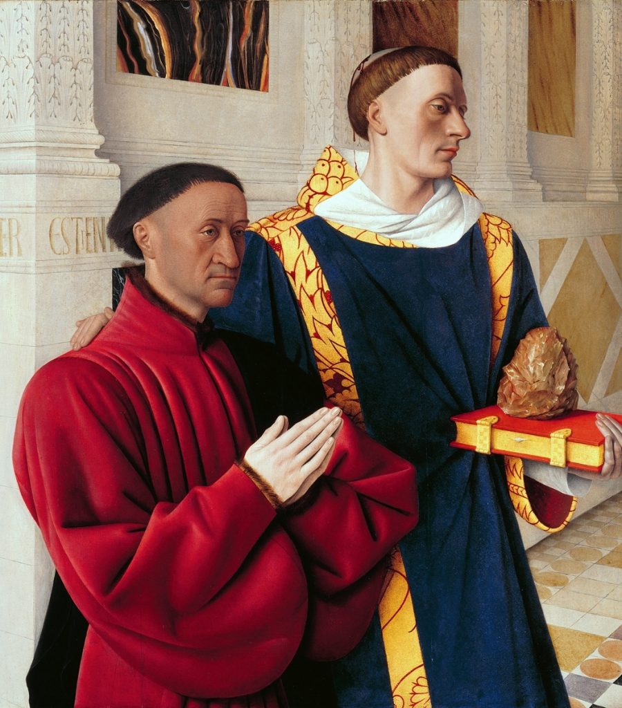
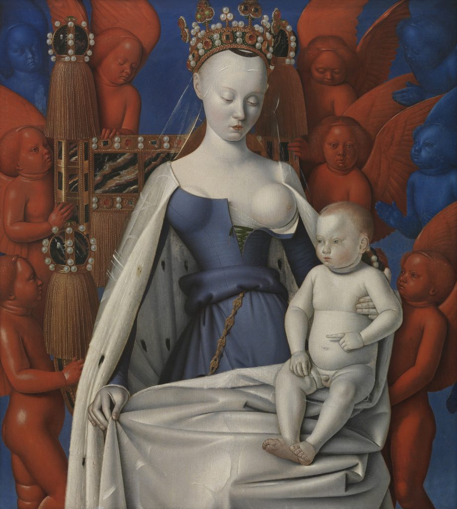
I find Fouquet’s paintings pleasing to look at. He utilizes rich colours, especially primary colours. These make his paintings pop and make them feel lively, despite the somber looking subjects in his paintings. We can see this in paintings such as “Virgin and Child Surrounded by Angels.” and “Etienne Chevalier with St. Stephen”.
Etienne Chevalier with St. StephenVirgin and Child Surrounded by Angels


#/media/File:John_William_Waterhouse_-_The_Lady_of_Shalott_-_Google_Art_Project_edit.jpg)
#/media/File:Waterhouse_Hylas_and_the_Nymphs_Manchester_Art_Gallery_1896.15.jpg)