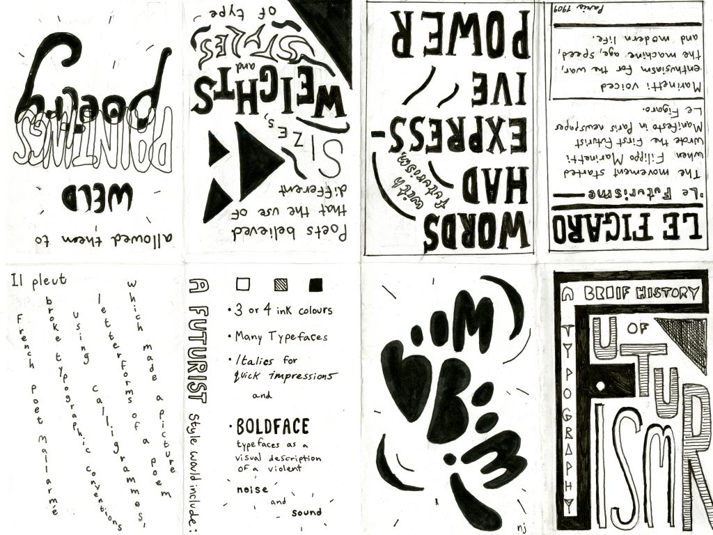
This week, I made a zine that explores the history of typography during the Futurism era. I wanted to emulate the Futurism style by using expressive typography, capturing a sense of movement and sound. I also wanted to include some historical background while keeping text fairly minimal and think I was successful at keeping information clear and concise.
There are a few things I would like to change; however, like making some of the type less rounded looking and modern to better suit the time period. Also, I think my lines could be made cleaner and the page that says paintings and poetry is interesting but a bit messy. My writing could be made a little neater and I think using a greater variety of typefaces would have benefited me. I think my title page is strong but the back page could have been worked on some more.
Overall, I think my concept is strong and I was able to demonstrate characteristics of futurist type in a simple and fun manner.
Leave a Reply