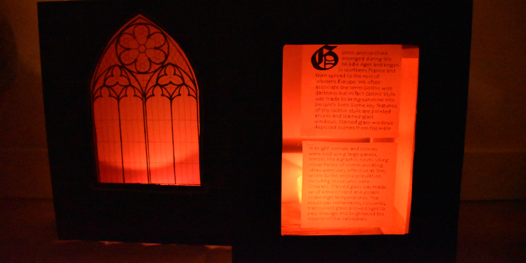
Here is the Artefact I created for my theme of Gothic Architecture.
I chose to focus on stained glass when researching the topic of Gothic Architecture. To achieve this look, I placed transparent red gift wrap over my illustration which was done on tracing paper. I used candles to illuminate the scene and give a dramatic feel. I like the red and black combination, although I do believe my project would have worked better if I used blues and yellows for the window as well. Also, I wasn’t sure how to make the letters visible using regular paper which is why I used the same technique of writing on tracing paper and using a light source. The letters could’ve been a little bolder and adding a background would have helped. I drew on the black paper with grey pastel to imitate stones, but it wouldn’t show up on camera since the photo had to be dark. Overall, I like the concept I had but I think my execution could have been a little stronger.
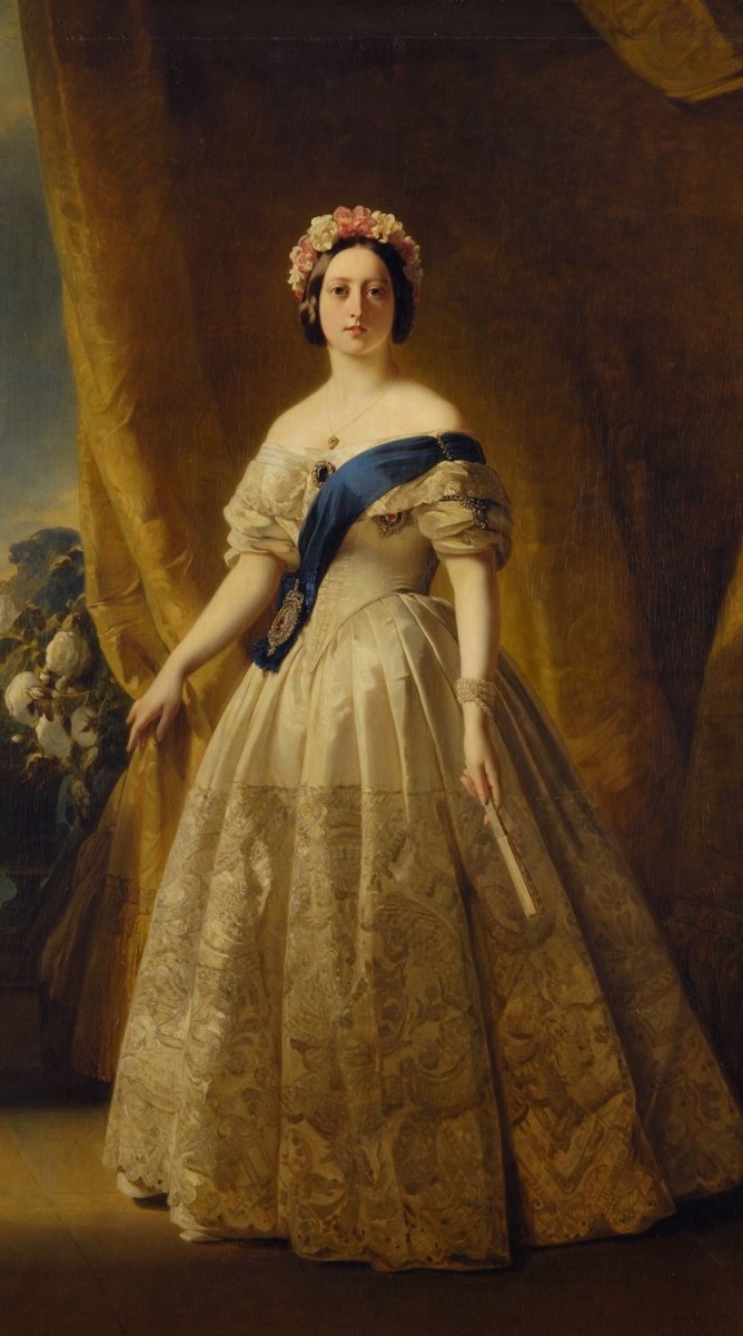
The Industrial Revolution brought about all kinds of changes to society. It created new wealth and opportunities for investors and merchants and they would proudly show it off. One way women could display their wealth was through fabric. The style at the time was very ostentatious. Women wore giant hoop-skirts, corsets and bustles which all looked quite exaggerated.
Queen Victoria
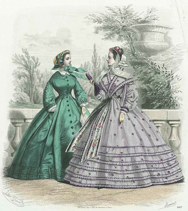
Because so much fabric was used in skirts, most women didn’t own that many outfits, but for variety they owned detachable collars and cuffs which allowed them to change their outfits slightly. Naturally, wealthier women owned had more clothes made from finer fabrics.
During the romantic period, Gigot sleeves were a major trend but in the 1830s large sleeves were replaced by slimmer, more fitting sleeves. Victorian Fashion placed a lot of emphasis on the ‘prim and proper’ feminine ideal, and one way this was achieved was through highlighting the waist. Corsets were used to create a narrow waist and cartridge pleats gave volume to the skirt without adding bulk to the waist. Another key aspect were the dropped shoulder lines which were supposed to make women look more demure. Corsets were not only uncomfortable for women but also did great harm to their health; it could cause anemia and internal damage to their organs and lead to birth defects.
A decade later, in the 1840s, skirts became larger to emphasize the hourglass shape, shoulders dropped a little more and bodices were more of a V shape. Evening wear was similar, although shoulders and neck were usually more exposed and corsets didn’t have their straps. Later on, bonnets became popular and were either plain or ornate.
Most women during the time had long ringlets or had their hair up in a bun. Some women crimped their hair as well. Make up was minimal except for those in theatre and skin was pale with the exception of blush on the cheeks.
Skirts grew bigger and more exaggerated with time, and were made out of crinoline which derived from horse hair which was both expensive and hard to clean. Instead of adding layers of petticoats, the crinoline cage was invented to give the look that was most popular at the time. It soon became more economical so women in the lower class were able to wear it as well.
Soon after, sewing machines have revolutionized the world of fashion. Now clothing was more accessible and could be produced at a faster rate and more economical for everyone.
Victorian fashion certainly was very unique and was a reflection of the period during that time.
Citations:
Monet, Dolores. “Women’s Fashions of the Victorian Era: From Hoop Skirts to Bustles – 1837 – 1901.” Bellatory, 27 Nov. 2018, https://bellatory.com/fashion-industry/Fashion-History-Victorian-Costume-and-Design-Trends-1837-1900-With-Pictures.
Church of the Gesu by Giacomo Barozzi da Vignola, and Giacomo della Porta
Baroque style can be described as extravagant, irregular, abnormal and highly ornate. These characteristics were definitely exemplified in art as well as in architecture.
Similarly to the Renaissance, the most common commissions for architects were for churches and palaces. However, baroque architecture differed from Renaissance in many ways. While Renaissance focused largely on classical style and simple perspective, Baroque style was much more complex and dynamic. Architects rejected the geometric and rational forms of the Renaissance. The floor plans of buildings were not limited to simple rectangular shapes, but also consisted of ovals and ellipses. Grandeur, curves, contrast and drama were key features of the Baroque. Interiors included elements which were highly detailed such as grandiose corridors and staircases as well as painted ceilings full of colour.
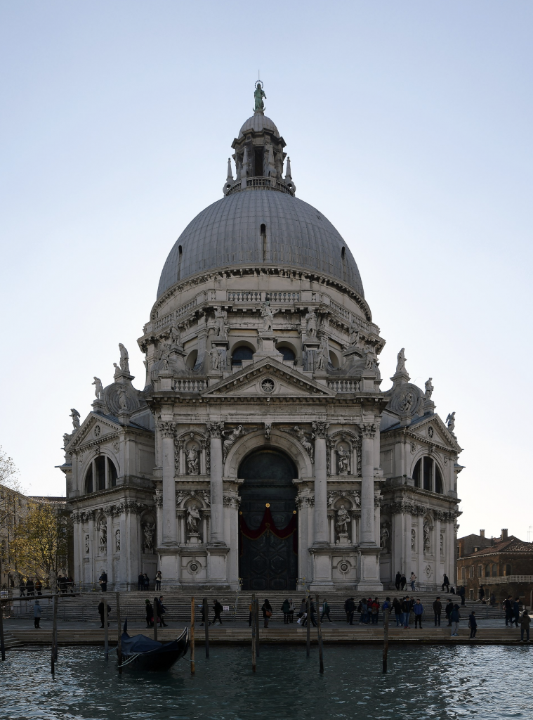
Santa Maria della Salute by Baldassare Longhena in Venice
Apart from the individual buildings, a key feature of Baroque architecture was that it accounted for the environment around the building as well. This was the beginning of urban planning. Now buildings were planned more practically and architects ensured that these buildings lay close to gardens and fountains when constructing them.
Throughout history, religion played a significance influence on architecture. The Baroque period came about in the late 16th century which was a period of reformation for the Roman Catholic church. This was after the Protestant Reformation, when the Protestants split from the Catholics. In return, the Catholics responded with the Counter-Reformation, which basically was a way of making a statement by displaying power and wealth. This is apparent when looking at architecture, as the Baroque style was very extravagant and was reserved for churches rather than everyday buildings and households.
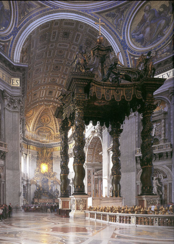
Baroque architecture originated and was most predominant in Italy. The most important architects during the time were Carlo Maderno, and Gian Lorenzo Bernini. Maderno worked on the St. Peter’s Basilica in Rome while Bernini designed structures over St. Peter’s tomb including a baldachin which was a canopy like structure, distorted in shape and standing four stories high.
Bernini’s Baldaquin
The Baroque movement spread through Europe and varied by country. Soon after, the Baroque style was replaced by the Rococo.
Johannes (Jan) Vermeer was a Dutch painter who lived during the Baroque period. He was most famously known for his paintings of interiors and capturing scenes from middle class life. Vermeer paid strong attention to light and detail in his work and used expressive colours which came from expensive pigments.
One of Vermeer’s most famous paintings is Girl with a Pearl Earring.
I love this piece because of the way the girl looks at the viewer as she’s turned to her side as oppose to facing full frontally; I think it makes the painting more interesting this way. I like the way the light shines on her earring, eyes, and lips, and her earrings look as though they are made of metal. Furthermore, I like the way Vermeer left the background black as it makes the portrait pop and it gives an almost modern feel.
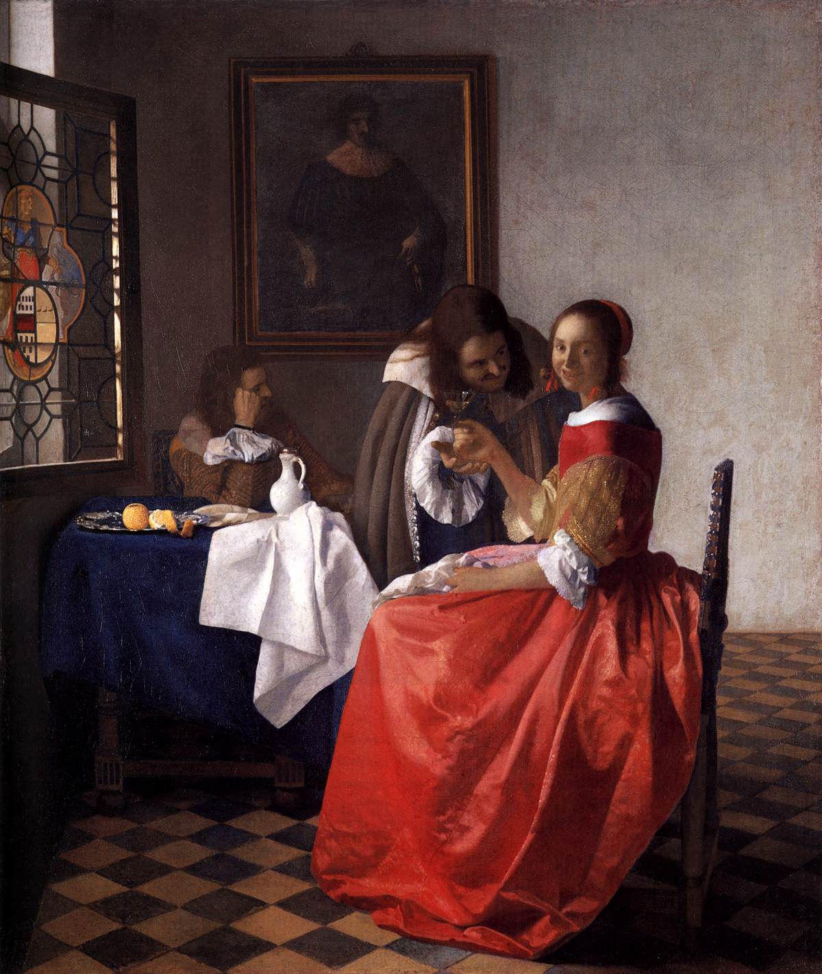
The Girl With the Wine Glass
I also like this painting above for the juxtaposition between the vivid red dress against the darker, more dull colours of the background. I also like how this piece is set in an interior which is a common theme of Vermeer’s. I like the detailing in the stained-glass window and orange sitting on the table. However, I do not like the facial expression of the girl in the dress compared to that of the girl in the Girl with a Pearl Earring. I prefer the simple yet expressive way Vermeer painted the man thinking in the background.
“During the height of his career, in paintings depicting women reading or writing letters, playing musical instruments, or adorning themselves with jewelry, Vermeer sought ways to express a sense of inner harmony within everyday life, primarily in the confines of a private chamber (Wheelock).”
I find Vermeer’s work inspiring for the way he captures a moment in time and for choosing to portray more ordinary moments such as daily household life rather than strictly choosing religious scenes. Although there are more allegorical aspects to some of his works, it isn’t the prime focus and his paintings aren’t as excessive or overly ornate as some Baroque paintings.
Citations:
Wheelock, Arthur K. “Johannes Vermeer.” Encyclopædia Britannica, Encyclopædia Britannica, Inc., 12 Aug. 2019, https://www.britannica.com/biography/Johannes-Vermeer.
Gothic architecture emerged during the Middle Ages and began in Northern France and then spread to the rest of Western Europe. We often associate the term Gothic with darkness but in fact Gothic style was made to bring sunshine into people’s lives.
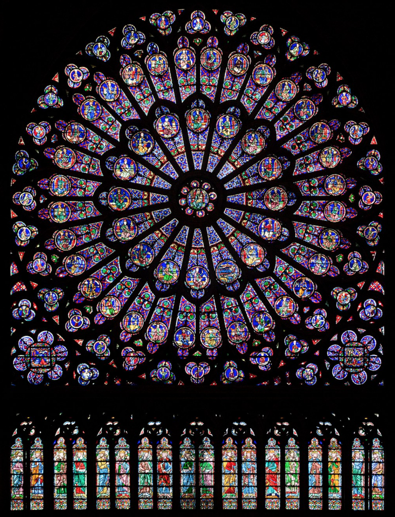
Above is the Notre Dame in Paris and an example of stained glass which show beautiful, ornate patters and religious stories.
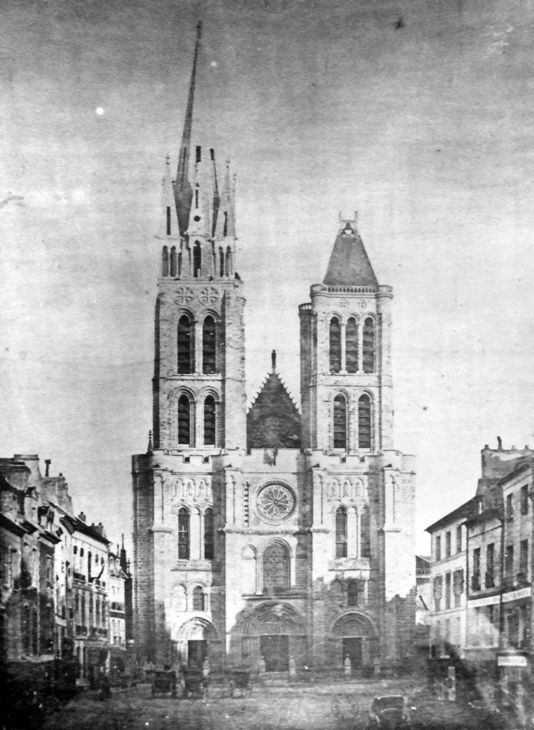
There were three phases of Gothic architecture, Early, High and Late Gothic. High Gothic was more elaborate and Late Gothic was even more so and sometimes referred to as ‘flamboyant architecture’. Previously, architecture has been much simpler in nature. The first phase, early Gothic, began near Paris and lasted from 1120-1200. The abbey of Saint Denis was the first surviving gothic structure and was built in 1140. Soon after the Notre Dame was built in 1163 and the gothic style spread throughout the rest of Western Europe. High Gothic was more elaborate and Late Gothic was even more so and sometimes referred to as ‘flamboyant architecture’.
Some key features of the Gothic style are pointed arches and stained glass windows. These arches are also a characteristic of Romanesque architecture, which the Gothic evolved from. Because cathedrals were built using heavy stone, traditional arched barrel vaults would collapse under pressure. The solution was to build thick vertical supporting walls to contain the barrel vault. Masons also chose pointed arches as oppose to domes and invented ribbed vaults which would add additional support to the ceiling. The weight of the roof was now channelled through the ribs of the ceiling and across the walls to a flying buttress which which was basically a semi arch and then down the the piers to the ground. The roof didn’t depend on the walls for support. This is why walls could be built very high and they would be thinner to give more room for the interior. Furthermore tracery, (the series of structural support between sections of glass) supported the weight of the wall while still leaving plenty of room for windows which were made of stained glass.
Stained glass windows depicted scenes from the bible in bright colours and stories were told using large panels, almost like a graphic novel. Using visual forms of communicating ideas were very effective as they spoke to the entire population and could be understood by those who were illiterate.
Sainte Chapelle Interior Stained Glass
Stained glass was made up of a mix of sand and potash under high temperatures. The result was remarkable; colourful, translucent glass allowed light to pass through and brightened the interior of the cathedrals.
The abbey of Saint Denis is considered an architectural landmark for being the first example of Gothic style. Before the term Gothic emerged, it was known as the ‘French Style’. This structure served as a prototype for future cathedrals in France and later the rest of Europe.
I’m a designer this week and was inspired by Gothic style particularly stained glass windows. I really like the contrast between glowing light and bright colours against darkness and want to convey this in my panel. I think it would be cool to tell a story similarly to what masons did when constructing cathedrals.
Boundless. “Boundless Art History.” Lumen, https://courses.lumenlearning.com/boundless-arthistory/chapter/gothic-architecture/.
“Stained Glass Windows in Gothic Architecture.” Study.com, Study.com, https://study.com/academy/lesson/stained-glass-windows-in-gothic-architecture.html.
“Gothic Architecture: an Introduction.” Khan Academy, Khan Academy, https://www.khanacademy.org/humanities/medieval-world/gothic1/a/gothic-architecture-an-introduction.
Raphael was a master painter of the High Renaissance. Raphael is most famously known for his paintings of madonna, balanced compositions and clarity of form. He is also well known for his many self-portraits which he etched and painted throughout his lifetime. Raphael proved to be a very skilled artist from an early age. We can see the influence of Leonardo Da Vinci in his work as we commonly see the use of sfumato and chiaroscuro.
One painting I particularly love by Raphael is the Madonna Del Prato. I love the calm, peaceful disposition of the scene, the softness of the skin and the pale blue sky that fades over the horizon. I think the composition is very pleasing and I also like the little details such as the flowers scattered over the field in the foreground. I like the contrast in colour between the Madonna’s clothes and the colours of the background and we can see the use of sfumato. I also like the way the angels appear to be more human like. Overall, I think this is a stunning piece painting.
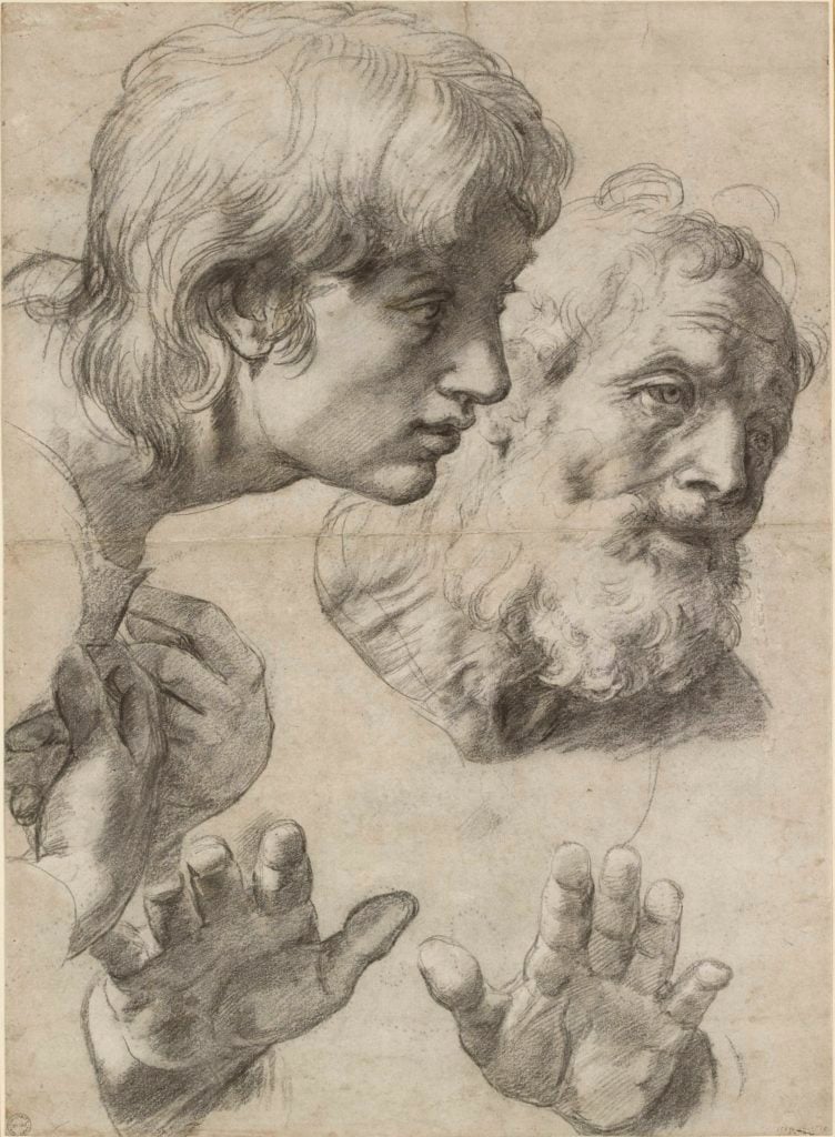
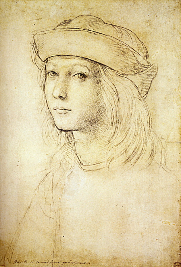
Above is one of Raphael’s sketches, The Heads and Hands of Two Apostles. I wanted to include a drawing as well because I find his sketches very inspiring. Down below is just one of the many self portraits Raphael drew.
Today in class we learned and discussed the origin of typography.
One thing I took from this slideshow that relates to the topic I’m researching was that language and typography changed significantly over the course of thousands of years, much like architecture has. My group explored architecture in Ancient Greece and we decided to specialize on The Parthenon.
The Parthenon is a symbol of Athens and a famous example of classical Greek architecture. It was built in honour of the goddess Athena between the years of 447-432 BCE. The Parthenon has undergone many changes after its construction. A century later it was converted into a Christian church and in the 15th century The Parthenon was turned into a mosque when the Ottomans ruled. The Parthenon was left in ruins after a battle between the Venetians and Ottomans in 1687 but since then has been modified and reconstructed several times. Today it still stands and attracts tourists from all over the world.
When doing research on The Parthenon, one thing that stood out to me was that it was built in honour of the gods. Looking back on our lecture in class, I compared Greece with other ancient civilizations and thought about all the things other civilizations would create in order to communicate to a higher power.
For example, in ancient Egypt, death books were created in order to show what would happen in their afterlife and architecturally speaking pyramids were created in honour of the gods.
The construction of The Parthenon was a slow process but its impact is long lasting and both language and architecture has come a very long way.
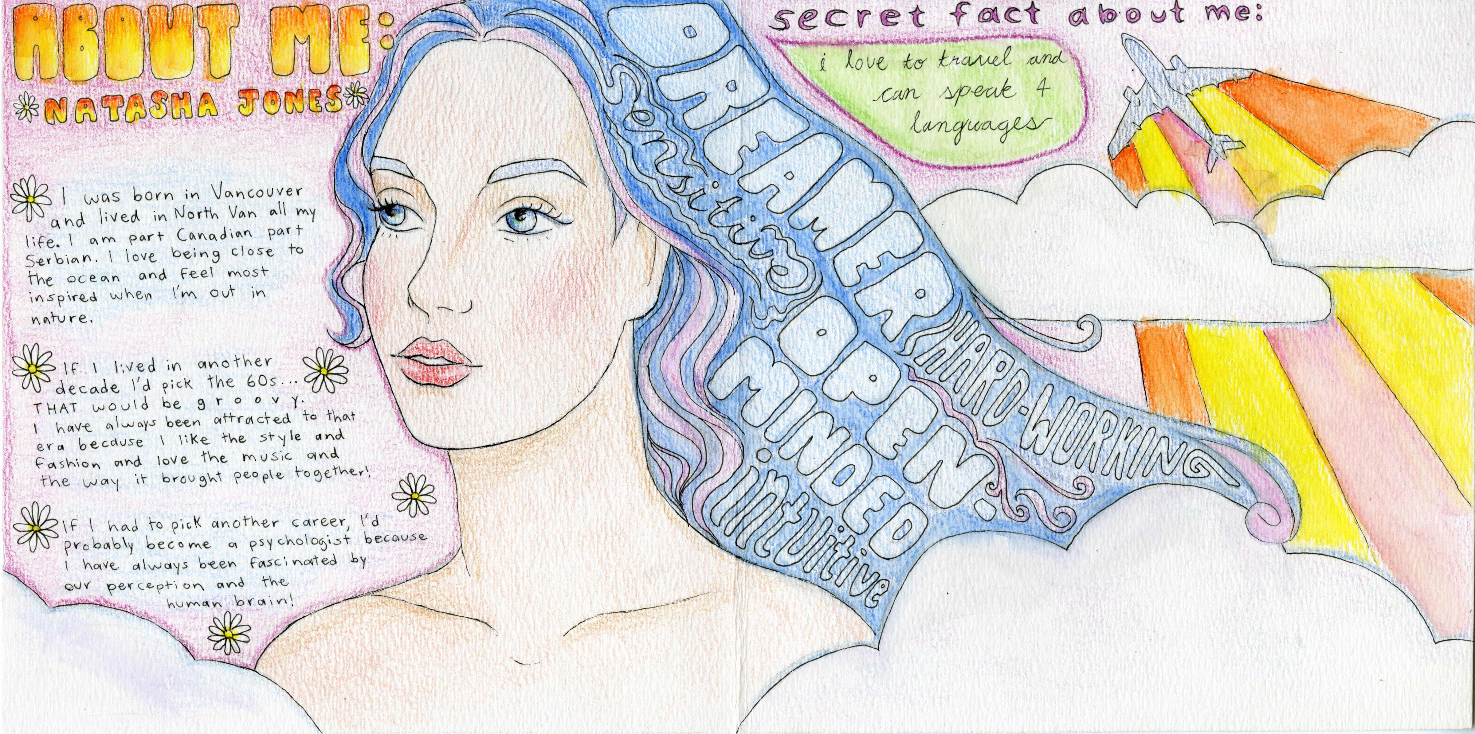
Here is my yearbook spread! It was done in pencil crayon and is inspired by the hippie movement of the late 60s. I was going for something a little more abstract for the self portrait: it might not resemble me exactly but I think it represents me pretty well. I chose to draw my hair blue because it reminds me of the ocean and wanted to show my connection to nature.
I like the way I incorporated the 5 words to describe myself into my hair. Those words are: dreamer, sensitive, hard-working, open-minded and intuitive. I do think I could have made the colours a little more vibrant but I also kind of like the softer look.
For the background, I kept things pretty simple and chose to do it in light pink since that is my current favourite colour. I also added an airplane in the top right corner because it symbolizes my love for travel. The clouds and flowers were put there to create a more dreamy look.
On the left, I wrote a bit about myself. I grew up in North Van and am part Canadian part Serbian. I love to learn languages, and if I weren’t pursuing design I’d probably study Psychology. There are a few more things I wanted to add, but I wanted to keep text fairly minimal to put more emphasis on the drawings. Overall, I think this yearbook spread shows a pretty good summary of who I am.
Fra Filipo Lippi (1406-1469) was a Florentine painter who lived during the 15th century Renaissance period. His paintings were largely inspired by the works of Masaccio and Fra Angelico and depicted religious themes as most commonly found during the Late Gothic and Early Renaissance.
Lippi grew up in “the convent of Carmelite monks at Santa Maria del Carmine” (Valerio) with his brother and was exposed to art at an early age. Frescoes painted by Masaccio decorated the walls of the Brancacci chapel Lippi visited and proved to be a source of inspiration as he later started to do the same.
Filipo Lippi left the monastery in 1432 but returned to Florence in 1437 and was commissioned by the Medici family to paint for the church. Lippi ended up marrying a nun and had a son who also ended up becoming an artist.
If I could time travel to another period in history I would probably pick ancient Greece because of my interest in philosophy and appreciation for classical art. I’ve always been fascinated with Greek architecture and the way it relates to architecture today.
Many elements of design can be reflected in Greek architecture.
One of the key features of Greek architecture is its famous columns. The function of these columns is to “support a section of an entablature, which constitutes the upper horizontal part of a classical building” (Encyclopaedia Britannica). Each column consists of a base, shaft and capital, and can be characterized by three different types: Doric, Ionic and Corinthian.
The Doric is the plainest of the three while the Ionic and Corinthian are more complex. The Ionic is notable for its scrolls while the Corinthian consists of both scrolls and elaborate shapes and patterns.
The Romans adopted a combination of these styles in the 1st century BC and such columns have been used ever since in Western architecture.
Today, we can still see examples of order of architecture and find these columns in modern day buildings, most commonly found in office buildings and supreme courts. Greek architecture has impacted and inspired works in the future and its legacy can still be seen today.
References:
column. (2018). In P. Lagasse, & Columbia University, The Columbia encyclopedia (8th ed.). New York, NY: Columbia University Press. Retrieved from https://ezproxy.capilanou.ca/login?url=https://search.credoreference.com/content/entry/columency/column/0?institutionId=6884
“Five Beautiful American Buildings Based on Classical Greek Architecture.” USA.GreekReporter.com, 4 July 2018, https://usa.greekreporter.com/2018/07/04/five-beautiful-american-buildings-based-on-classical-greek-architecture/.
Britannica, The Editors of Encyclopaedia. “Order.” Encyclopædia Britannica, Encyclopædia Britannica, Inc., https://www.britannica.com/technology/order-architecture.