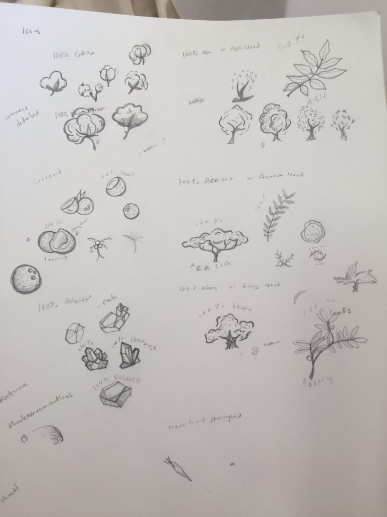
This week I worked on icons for packaging. The icons are about the materials and processes used in the products, some of them are pretty obvious, for cotton I’m going to show a cotton plant but things like Silicone and Stainless steel are more abstract and difficult to convey. Creating icons is really like creating a bunch of logos. Trying to find the simplest form to explain the process. I broke the work into batches and left the hardest ones for last. I gave options for each of them but more for the tricky ones. They all went over well though and Christie chose which options to go with. The icons are meant to have more of a vintage hand-drawn feel so I have been drawing them by hand, scanning them in and image tracing them to get the desired effect. Most often I find I’m asked to modernize and simplify icons so it was interesting to have the opposite brief of making it look more vintage. I referenced a lot of stamps and scanned the illustrations in as graphite sketches and as ink drawings to get the desired texture.

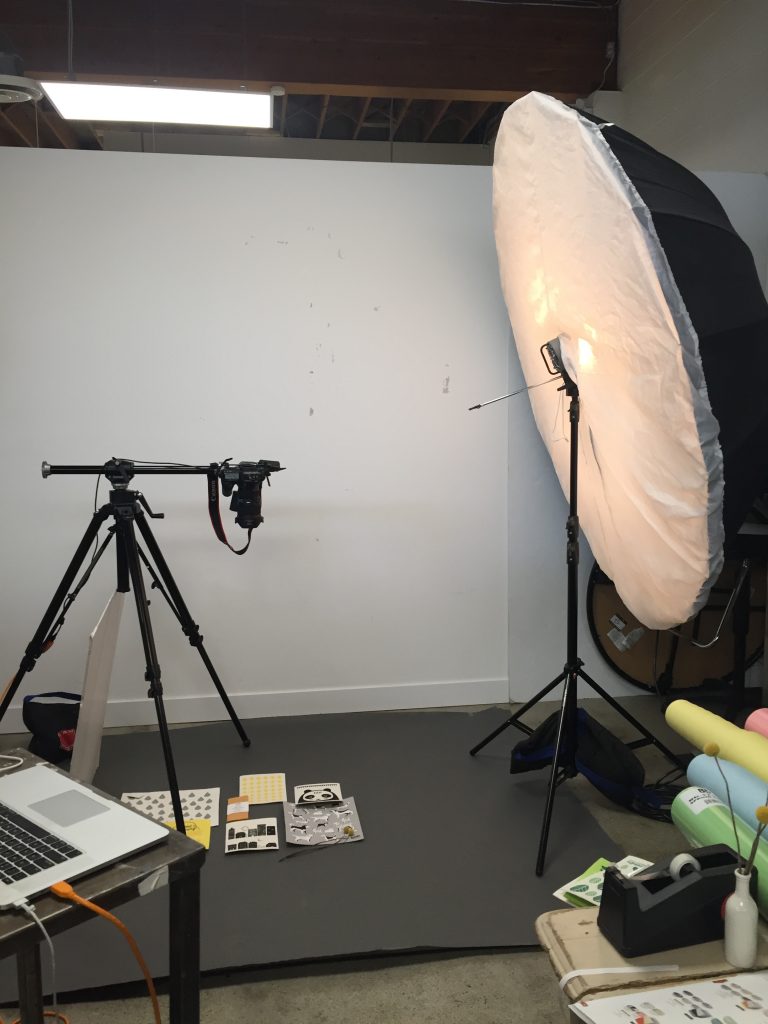
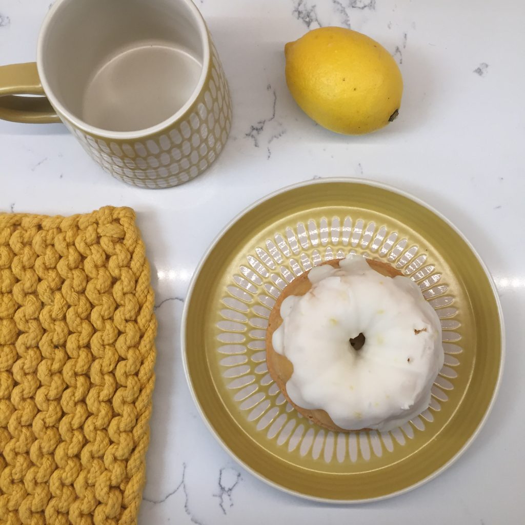
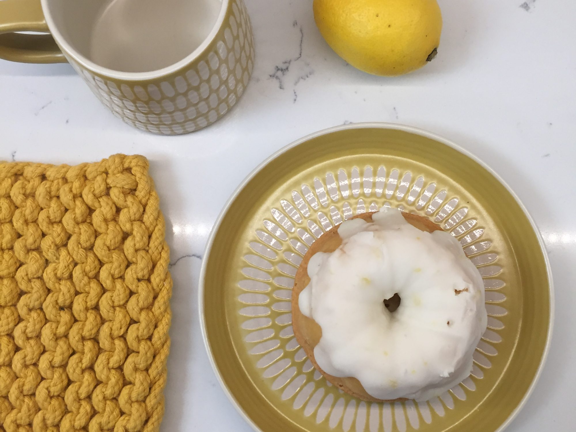
I also worked on a newsletter for the Ecologie brand to promote sponge cloths as an alternative for paper towels during this time as well as a print ad for a gift magazine. I helped style the image for the ad a couple of weeks before. Danica has 2 contract photographers that come in. Tanya does the styled shoots, it was really nice to meet her she’s pretty badass she shot tons of photos for Danica while very pregnant and came in to shoot these after only having her baby a month ago. She also had a photography student shadowing her and we all ended up talking about her program and the idea program as well. I really enjoyed being a part of the shoot and then editing the photos and creating the ad.


