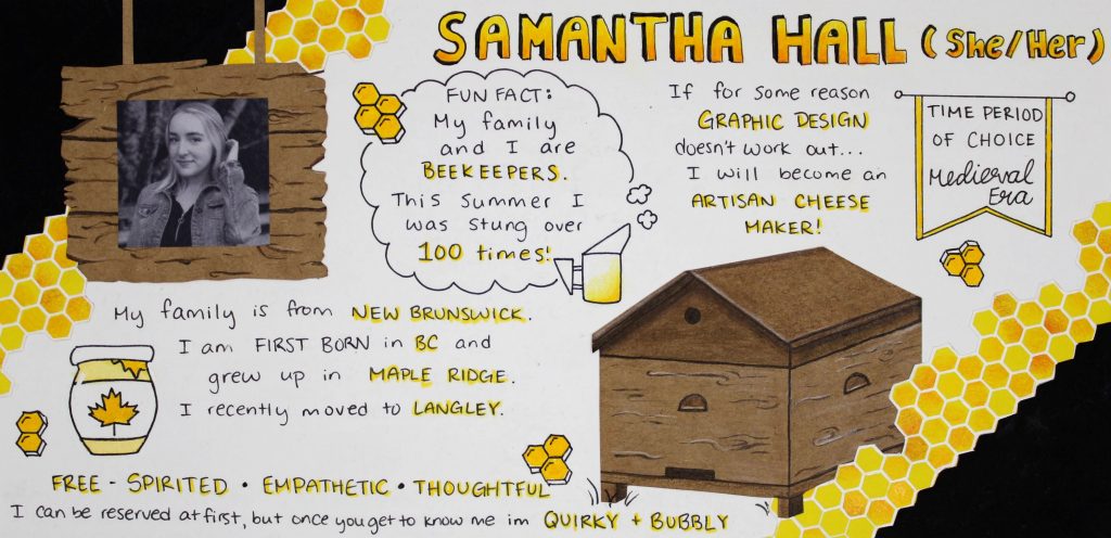
One of the most unusual and surprising things people learn about me, is that I am a beekeeper. I knew right away that this was the theme I was going to use for my yearbook spread assignment. The part of the design that I was most excited about was the honeycomb. I wanted to make sure it looked bright and bold, to match how I see my own personality. There was a time where I would typically portray the theme of beekeeping with soft pastel colours, flowers, and illustrations of spring/summer. But this time I felt strongly towards a bolder and more vivid tone towards my artwork. To me this was because more recently I have felt more confident in my artwork, since I began my journey into the IDEA School of Design. It was important to for me to portray this feeling in my assignment. To create this spread I layered different drawings and construction papers on top of each other to create depth and an eye catching design. I incorporated kraft paper to make the beehive and wooden farm sign to represent the farm I grew up on in Maple Ridge. The colours I chose are to follow the typical colours used when you think of bees, but I also think is worked great to tie into my quirky, bubbly, and free- spirited personality. For this assignment I put a lot of effort and thought to how I wanted it to turn out and exactly what message I wanted to depict. In total it took me about 5 hours to complete. I am very happy with how it turned out and feel it tells an accurate story of who I am. For these reasons I would give myself a 10/10.

Leave a Reply