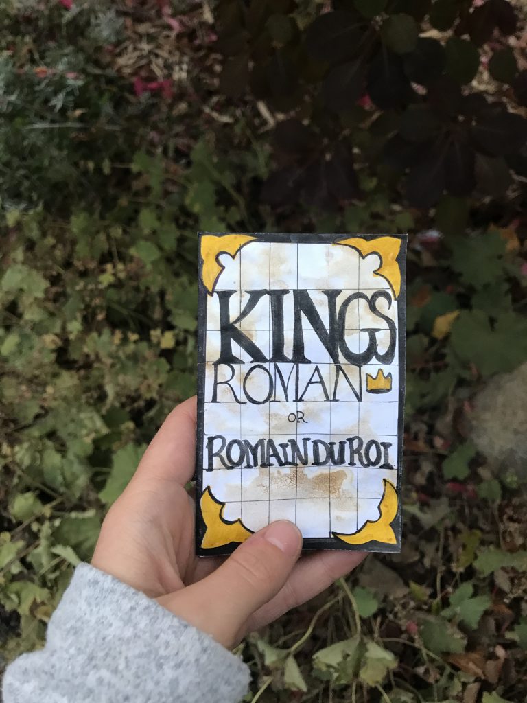
Kings Roman
Romain Du Roi


ZINE RATIONAL:
For the composition of the Zine I am overall happy with it, but the staining technique seemed to blur the pen text more than I anticipated. The gold pen is also not showing correctly on the scanned document so I ended up adding a photo of the cover of the Zine for reference.
I stained and antiqued the zine because I wanted it to resemble a small old book which I thought was suiting due to the era when Romain Du Roi was invented (1692). Most books in those days had to detail of gold, red and of course, the ink was black. They all were printed on discoloured paper as well.
Looking back now, I do wish that I printed out my text and glued it into the zine for a more professional look. But overall I followed the process and am happy with the outcome of my Zine. I also include 7 facts about Kings Roman, and I find that it is easy to flow through the zine. I think that having the Louis XIV character tell us about the text is clever and engaging. The 3rd to the last page is the only page that could have had a better flow to it, I had made an error but covered it up effectively.
I would give my self a 8/10. I really enjoyed this project and think that based on the theme, font and style I achieved what I was aiming to. We learned early on about Kings Roman and since the start, I’ve had this idea of portraying the king as a little bossy character ordering around the scientist to make this amazing new font. As I said above, I could have had a better flow on one page and I am dealing with a lack of true colour from the scanner and a bit of a dulling of pen due to the antiquing. It’s unfortunate that you cannot see the real Zine because taking pictures or scanning always alters the documents colour.