Typography Infographic Timeline

So You Want To Learn About The History Of Type?

(1440-1939)

Sketches and Ideas:

Rationale:

ZINE RATIONAL:

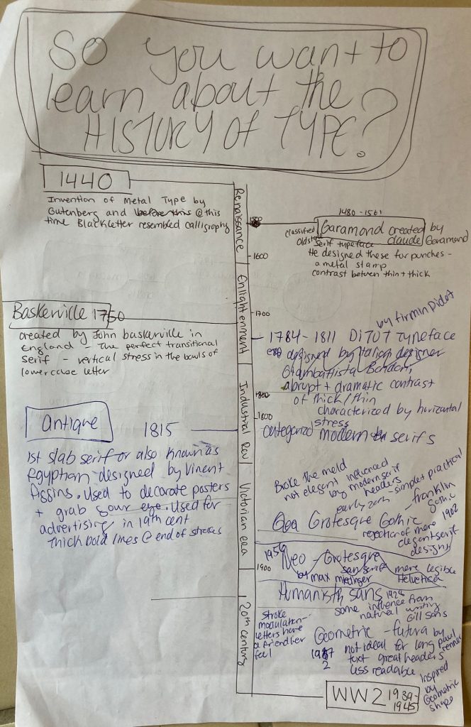
I wanted to give this project a fun name that explained what the infographic/timeline was about. I decided on my fonts for the type categories and drew a simple and effective timeline to show when the type was made. I also added information about each typeface.

I do not know the name of these designs, but you start with a question and then you move through the design following the arrows and with every move, you make either with a “yes or a no” you move around the design. I was inspired by that to draw lines connecting the type to the different information boxes. I also wanted to showcase the ways that the different typefaces looked so I printed them out for a more exact look.

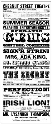
I would give myself a 7.5 /10. I made most of the graphics connect to the very history of type and included key movements throughout art history. Starting with Gutenberg and the printing press, to a poster promoting a product with a Slab Serif Font used in advertising, and then I showcased the more Modern look of the Bauhaus and the change in type and the design rules they were breaking. I think that the Art nouveau girl could have been tied in better if I had connected her or the drawing its self into a more type-specific art nouveau event or design rather than just as a design/advertising element.

References:

Didot family. (2017). In Encyclopaedia Britannica, Britannica concise encyclopedia. Britannica Digital Learning. Credo Reference: https://ezproxy.capilanou.ca/login?url=https://search.credoreference.com/content/entry/ebconcise/didot_family/0?institutionId=6884

typography. (2018). In P. Lagasse, & Columbia University, The Columbia encyclopedia (8th ed.). Columbia University Press. Credo Reference: https://ezproxy.capilanou.ca/login?url=https://search.credoreference.com/content/entry/columency/typography/0?institutionId=6884

Cook, J. W. (2014). printing in the Renaissance. In J. W. Cook, Encyclopedia of Renaissance literature (2nd ed.). Facts On File. Credo Reference: https://ezproxy.capilanou.ca/login?url=https://search.credoreference.com/content/entry/fofrl/printing_in_the_renaissance/0?institutionId=6884

Garamond, Claude. (2018). In P. Lagasse, & Columbia University, The Columbia encyclopedia (8th ed.). Columbia University Press. Credo Reference: https://ezproxy.capilanou.ca/login?url=https://search.credoreference.com/content/entry/columency/garamond_claude/0?institutionId=6884

serif. (2006). In P. H. Collin (Ed.), Dictionary of publishing and printing (3rd ed.). A&C Black. Credo Reference: https://ezproxy.capilanou.ca/login?url=https://search.credoreference.com/content/entry/acbpublishing/serif/0?institutionId=6884

Sandberg, B. (2013). Printing press. In C. Clark Northrup (Ed.), Encyclopedia of world trade: from ancient times to the present. Routledge. Credo Reference: https://ezproxy.capilanou.ca/login?url=https://search.credoreference.com/content/entry/sharpewt/printing_press/0?institutionId=6884

Survey 9

Colour Theory And Cool Type

(1925-1930)

Dessau_Bauhausgebaeude_T.Franzen_7380.jpg

Bauhaus Baby

The Bauhaus School of art and crafts was founded in Weimar, Germany in 1919. Walter Gropius was the first director of the school. He was a famous modern architect.

He was inspired by art nouveau in the early 1900s and he had the budding idea that crafts and industry must be intertwined. The school was designed to focus on that relationship. He wanted every student to reimagine the industrial world through the eyes of an artist. He felt that design must be used for mass production. The school focused on subjects such a: fine arts, wood work, weaving, printing, to theatre and the crafts, which were all taught by the Masters through a hands on experience. The Bauhaus school had an international impact on art and design. Its teaching style made its way through to America when the Nazis took over in 1930.

Bauhaus Art Bauhaus Design Bauhaus Architecture What is Bauhaus What is the Bauhaus Movement

Bauhaus translates to “construction House” – soon this school of arts and crafts was transformed into a real arts movement. It’s very important part of art history. This modern arts movement was characterized by its unique approach to design and architecture. It’s renowned for its unique aesthetic that combines fine arts with arts and crafts as well as its influence on modern and contemporary art. Its main goal was for a functional, balanced design with a modern edge. The design was avant-garde, and translated to modernist posters that featured bold typography and block colour.

Today it is safe to say that Bauhaus is credited as the catalyst for modern architecture, furniture and influenced mid 20th century painting and sculpting.

Bauhaus Art Bauhaus Design Bauhaus Architecture What is Bauhaus What is the Bauhaus Movement
Examples of Bauhaus Design & Architecture

Science Baby…

In this time period in the 1920’s two astronomers, Edwin Hubble and Georges Lemaitre realized that the universe is expanding. Lemaitres discovered the Big Bang Theory in 1927 that explains the origin of the universe, this was huge!

Georges Lemaître
Georges Lemaître

 Georges Lemaître, was a Belgian cosmologist and Catholic priest came up with the big bang theory which states that “the expansion of the observable universe began with the explosion of a single particle at a definite point in time.” At this time a lot of astronomers were uncomfortable with the idea that the universe was expanding and that this idea seemed preposterous. The Theory was a radical idea even in science in the 1930s.

He was fascinated by physics and studied Einstein’s laws of gravitation which was published in 1915. He concluded that if Einstein’s theory was true, which there was a great deal of evidence supporting it in 1919, it meant that the universe was was expanding.

When he got his PHD he proposed this theory ” in which states that the expanding universe was the same in all directions the same laws applied and its compositions was the same but it was not static. Georges had no data to prove his discovery so others ignored him, but then slowly more and more scientists came out with their own research independently and it made the entire astronomers and physicians work together to come up with supportive data.

Georges Lemaitre: Father of the Big Bang | AMNH
Georges Lemaître, (1894-1966), Belgian cosmologist, Catholic priest, and father of the Big Bang theory. Photo courtesy of AIP Emilio Segré Visual Archives, Dorothy Davis Locanthi Collection. 

References:

Gombrich, E. H. (1966). The story of art. New York: Phaidon Publishers; distributed by Oxford University Press.

Bauhaus. (1993). In K. McLeish (Ed.), Bloomsbury guide to human thought. Bloomsbury. Credo Reference: https://ezproxy.capilanou.ca/login?url=https://search.credoreference.com/content/entry/bght/bauhaus/0?institutionId=6884

Bauhaus. (1996). In S. West (Ed.), The Bloomsbury Guide to Art. Bloomsbury. Credo Reference: https://ezproxy.capilanou.ca/login?url=https://search.credoreference.com/content/entry/bga/bauhaus/0?institutionId=6884

https://www.pbs.org/wgbh/aso/databank/entries/dp27bi.html

The Editors of Encyclopaedia BritannicaTITLEGeorges LemaîtrePUBLISHEREncyclopædia BritannicaDATE PUBLISHEDJuly 13, 2020URLhtACCESS DATENovember 28, 2020

Georges Lemaître. Encyclopaedia Britannica. The Editors of Encyclopaedia Britannica reference :ps://www.britannica.com/biography/Georges-Lemaitre

Photo Source:

https://www.smithsonianmag.com/smart-news/five-events-watch-germany-celebrates-100-years-bauhaus-180971261/

https://www.britannica.com/biography/Georges-Lemaitre

https://www.amnh.org/learn-teach/curriculum-collections/cosmic-horizons-book/georges-lemaitre-big-bang

Exhibit Artifact

Art Nouveau Earrings

(1890-1910)

The Art Nouveau period was characterized by its use of long organic lines and natural colours. This was used often in architecture, interior design, jewelry, and glass design. It was an attempt to create something new. Art Nouveau used flower stalks, vines, insect wings, and other delicate and natural elements. The Art nouveau period was an important part of visual design history because it aimed at modernizing design. Moving away from all the historical styles before it. It broke down the traditional distinction between fine arts and applied arts and married the two.

Art Nouveau earrings and jewelry brought on the same feel as all the other trending design elements of this time. It used organic natural creatures such as insects or butterflies, with natural colours of greens, yellows, and other earth tones, and it was all about showing the light through the translucent jewelry. So most pieces were made from Plaque-a-jour enamel which means “letting in daylight”. This really makes the jewelry from this time stand apart from other periods.

Rationale:

I chose to make a pair of earrings that essentially show the artistic, design and architectural elements that were used at this time. The earthy tones, the stained glass, and the use of bronze /iron (gold in my artifact). It encompasses the vibe of the art nouveau period. 

I would give myself an 8.5/10. The artifact its self is a true representation of this period. I believe that the photos capture the artifact really well. I wanted to show off the stained glass and bronze (gold) that is used often in interiors, architecture, design, and jewelry in this period. The catalogue its self is sufficient and describes the essence of how this artifact relates to this period and is important.

One thing that was difficult to do was to capture the light coming through the stained glass earrings, and I thought it was an important part of the artifact so I included two product shots in the catalogue. Alongside the product shot showing off the stained glass element of the earrings, I included a photo of a recreation inspired by the art nouveau posters that were a stable piece of design from this time.

Survey 6: Dreams and Designers (1895-1905)

Alphonse Mucha – Cigarette Advertisements

It’s Not Art Nouveu-o its Art Nouveau

The design really picked up in this period of time. In the 1890s the Arts and Crafts Movement evolved into the Art Nouveau Movement. This was a pretty amazing time for anyone who could hold a pencil or write their name. No, but seriously, the art nouveau period was awesome. People were inspired and trying new things. Art, graphic design, architecture, and interiors were all encompassed by this movement.

Art Nouveau moved and grew with commercial influence and moved away from the expensive handcrafted elites which is what the arts and crafts movement really was. It kept the prices of art and craftsmanship higher than the common folk could afford, when it came to art nouveau it made products more affordable. There was a big embrace of commercial mass-production as well as this kind of art greatly influenced advertisements.

Women were the main focus of this kind of art. Although it was happening a bit in the past, you can really see how central and more sexual women become in these posters. Alongside the art being very feminine and more sexual, the overall composition of the designs started to become more delicate. The use of organic shapes, and what is called whiplash curves (which is essentially the spirals and whimsical notes in the art), decorative borders, earthy colour choices, florals, and the text was actually fully thought out before it was added to the artwork. It had more design elements to it rather than just art with an afterthought of text. The text was incorporated into the designs and made very readable.

Gustav Klimt – The Kiss

When Your Building Starts Looking Like A Dragon With Scales, Keep Designing

What were they thinking when they designed such crazy incredible buildings. Like the example below, lots were incredibly fairytale-like and slightly on the ugly side. They resembled creatures with scales on them, but others were a complete work of art.

Casa Battlo - Antoni Gaudi architecture
Luciano Mortula – LGM / Shutterstock – architecture

Art Nouveau was a movement that encompassed architecture, design, art, and interiors. The architecture was incredible. It had an ornamental style of art influence to the inside and the outside of the building. You can also always tell when something is art nouveau inspired because you can characterize it by its long, sinuous, organic lines in architecture.

The long curving lines and shapes inspired by nature, and the use of the glass, the touch of iron details are all elements that were used often in architecture at this time. Not only focused on the outside of the building, but this movement also encompasses all of the building down to the forks and spoons design. The furnishing, interiors, silverware to wallpaper were dedicated to creating a completely immersive experience. Thank you, France!

Citations:

hArt Nouveau. (2018). In P. Lagasse, & Columbia University, The Columbia encyclopedia (8th ed.). Columbia University Press. Credo Reference: https://ezproxy.capilanou.ca/login?url=https://search.credoreference.com/content/entry/columency/art_nouveau/0?institutionId=6884

Arts and Crafts & Art Nouveau. (2003). In J. Miller (Ed.), Miller’s antiques encyclopedia (2nd ed.). Mitchell Beazley. Credo Reference: https://ezproxy.capilanou.ca/login?url=https://search.credoreference.com/content/entry/mae/arts_and_crafts_and_art_nouveau/0?institutionId=6884

Mackintosh, Charles Rennie. (2017). In Encyclopaedia Britannica, Britannica concise encyclopedia. Britannica Digital Learning. Credo Reference: https://ezproxy.capilanou.ca/login?url=https://search.credoreference.com/content/entry/ebconcise/mackintosh_charles_rennie/0?institutionId=6884

Gombrich, E. H. (1966). The story of art. New York: Phaidon Publishers; distributed by Oxford University Press.

Photo Reference:

https://www.overstockart.com/painting/the-kiss-(full-view-luxury-line)&option_id=5598&bc=791_1210

http://www.alphonsemucha.org/

Zine Project

Kings Roman

Romain Du Roi

Kings Roman Zine Cover
Zine Spread

ZINE RATIONAL:

For the composition of the Zine I am overall happy with it, but the staining technique seemed to blur the pen text more than I anticipated. The gold pen is also not showing correctly on the scanned document so I ended up adding a photo of the cover of the Zine for reference.

I stained and antiqued the zine because I wanted it to resemble a small old book which I thought was suiting due to the era when Romain Du Roi was invented (1692). Most books in those days had to detail of gold, red and of course, the ink was black. They all were printed on discoloured paper as well.

Looking back now, I do wish that I printed out my text and glued it into the zine for a more professional look. But overall I followed the process and am happy with the outcome of my Zine. I also include 7 facts about Kings Roman, and I find that it is easy to flow through the zine. I think that having the Louis XIV character tell us about the text is clever and engaging. The 3rd to the last page is the only page that could have had a better flow to it, I had made an error but covered it up effectively.

I would give my self a 8/10. I really enjoyed this project and think that based on the theme, font and style I achieved what I was aiming to.  We learned early on about Kings Roman and since the start, I’ve had this idea of portraying the king as a little bossy character ordering around the scientist to make this amazing new font. As I said above, I could have had a better flow on one page and I am dealing with a lack of true colour from the scanner and a bit of a dulling of pen due to the antiquing. It’s unfortunate that you cannot see the real Zine because taking pictures or scanning always alters the documents colour.

Survey 4: Steam and the Speed of Light (1750-1850)

The Steamy Engine

The industrial revolution hit Europe hard, and a heavy hitter known as James Watt put the ‘industrial’ in the revolution. He patented the steam engine in 1769. He also designed a new engine in 1776 “that exhausted the steam from cooling into a separate condenser where the vacuum now formed”(De La Pedraja, et al). Not having to cool or heat the cylinder saved fuel although it did call for a heavier machine. He pretty much pioneered the manufacturing of iron and steel and steam. And with the steam engine, anything was possible.

Smokestacks in Pittsburgh, Pennsylvania, 1890s © Bettmann/CORBIS https://www.khanacademy.org/humanities/big-history-project/acceleration/bhp-acceleration/a/the-industrial-revolution

Ultimately, the Industrial Revolution and in particular the steam engine lead to the means of producing goods more quickly and efficiently and offered alternatives to human and animal power. Some people call it the age of mass consumption, but where would we be without the technological advancements of the engine. The industrial revolution raised the standard of living in almost every part of society. Though some people did become worse off due to the technological advancements because the machinery put a lot of people out of work. The machinery required fewer people to operate it and created more than ever could be done by humans, throwing lots of people into different fields and killing some craft.

Library of Congress, Washington, D.C. (LC-DIG-nclc-01581)https://www.britannica.com/story/the-rise-of-the-machines-pros-and-cons-of-the-industrial-revolution

Designers Gone Get That Design

An example of the efficiency of the new machinery that the steam engine kicked off was in printing technology. The steam press was invented in 1814 and it made 1,100 impressions in an hour and the cost was half.

Rotary printing press invented by Richard Hoe.https://en.wikibooks.org/wiki/High_School_Engineering/The_Industrial_Revolution#/media/File:Hoe’s_one_cylinder_printing_press.png

Up until this revolution the only printing that was done was incredibly time-consuming and could only print 100 copies if that, and most of the time it still took human power to fill in the blanks. People were using etchings and engravings for illustrations in books, but there was nothing as sophisticated as the steam press.

Poster for the Chestnut Street Theatre in Philadelphia, 1854.
Collection of Philip B. Meggshttps://www.britannica.com/art/graphic-design/Neoclassical-graphic-design

This invention quickly escalated design. Artists used to be the designers of the world. Creating these beautiful works of art, and now the common folk could. Regular people were hired on to create posters and prints to advertise the mass-produced goods that were being made. They had no artistic flare and actually thought that since it was so cheap to print that they may as well get as much writing done on the one poster as possible. This lead to really busy designs that people would read over, or not read at all. And thus the spiral effect of design continued- and different texts in different widths were used as headers or to grasp someone’s attention. Designers (common folk at that time) had to figure out what was the most important part of the poster.

Resources:

Bush, G., & BUSH, G. (2000). Advertising. In P. Finkelman (Ed.), Encyclopedia of the United States in the nineteenth century. Gale. Credo Reference: https://ezproxy.capilanou.ca/login?url=https://search.credoreference.com/content/entry/galeus/advertising/0?institutionId=6884

https://search-credoreference-com.ezproxy.capilanou.ca/content/entry/ngeongaw/europe_s_industrial_revolution_1769_1900/0

Science and technology. (2001). In P. N. Stearns, & W. L. Langer (Eds.), The encyclopedia of world history (6th ed.). Houghton Mifflin. Credo Reference: https://ezproxy.capilanou.ca/login?url=https://search.credoreference.com/content/entry/hmencyclwh/science_and_technology/0?institutionId=6884

Hills, R. L. (2000). Engines: steam. In A. Hessenbruch (Ed.), Reader’s guide to the history of science. Routledge. Credo Reference: https://ezproxy.capilanou.ca/login?url=https://search.credoreference.com/content/entry/routhistscience/engines_steam/0?institutionId=6884

https://search-credoreference-com.ezproxy.capilanou.ca/content/entry/fofworld/major_themes_in_world_history_1750_1900/0

De La Pedraja, R., & PEDRAJA, R. D. (2000). Steam power. In P. Finkelman (Ed.), Encyclopedia of the United States in the nineteenth century. Gale. Credo Reference: https://ezproxy.capilanou.ca/login?url=https://search.credoreference.com/content/entry/galeus/steam_power/0?institutionId=6884

Mood Board Assignment

Rational:

It was an interesting time to learn about as a lot of revolutionary things happened during this time period. I thought that it was fun to learn more about how different the times were and the connection to what was going on in that time period. One thing led to the next, or that you can always make a connection/ see the influence of the times. I did find that the brief was a bit confusing only because there was a lot more talked about in class, but not in the brief.

I would give myself a 7/10 because I linked up the events as best as I could to the different categories, but there is the possibility that they are not all perfectly linked together. I would say that my use of tone or voice is for the most part consistent. I followed what was in the brief and just tried to focus on what I felt the brief was saying even though there were a lot of extra elements talked about in class, but due to them not being put in the brief I just followed the guidelines there. I think that I showed how the groups intertwined together or influenced people of the time.

Survey 3: Block Books and Baroque (1450-1750)

The 9 Year War

The Not So Sunny King

The Baroque period was an exciting and new time to be alive, especially for those who were of noble blood and enjoyed wearing uncomfortable extravagant clothing, but also for those who felt the desire to move away from the power of the churches. For in this era which is known as the “enlightenment” period people from all walks of life began to have more freedom. An example of this is for artists, they were able to start creating for their own pleasure and not just for the churches. There was more wealth distributed throughout the country and therefore more artists could survive off of commission from wealthy patrons. One of those patrons being the one and only, SunKing.

Louis XIV was a ruthless leader and he believed that his word was law. Although he did do some great things for France. One thing that he did was commission scientists to invent a new type known as the Kings Roman. It took them 10 years to create this completely geometrically calculated type. This type is still used today…which is pretty amazing.

Kings Roman Typography

Okay, so what. He did a couple of good things for France as a country and actually all in all he was a fair ruler. But did he have to be so war hungry?

Louis XIV: The SunKing

He brought France to the height of its power and dominated the rest of Europe. He created many laws, and advanced politics and due to the brilliance of his court became known as the Sun King. But its no doubt that he was still a pompous arrogant leader.

WAR HUNGRY

Louis XIV went to three major wars in his life. One the War of Devolution in (1667-1668). A triple alliance made France back out of Spain and give back the land, this is known as the Treat of Aix-la-Chapelle. This did put the Dutch Republic in France’s black book. Which lead to isolation in France’s Foreign affairs.

This lead to what’s known as the Franco-Dutch War (1672-78). France and a couple of other countries went against the Dutch Republic. Not to go into too much detail, but everyone wanted power back then and they always had a reason to go on fighting. After a while, though everyone gets sick of it and comes to a new treaty. France took over Franche-Comte and the Spanish Netherlands, making France Europes strongest power.

A decade later, the Nine Year War happened. This included many players who all came against France. France was the most powerful monarch in Europe but due to the wars and his short temper and bad behaviour, this all lead to the deterioration of his military and political dominance. He crossed too many people and had to pay for it. Due to all the wars, France was coming to an economic crisis. So the countries at war negotiated and Louis accepted William 3 of England. Soon after another conflict arose and this lead to the final war, the War of the Spanish Succession.

XIR473636 Louis XIV at the Siege of Besançon in May 1674 (oil on canvas) by Martin, Pierre-Denis (1663-1742); 72 x 116.7 cm

Citations:

Louis XIV. (2017). In Encyclopaedia Britannica, Britannica concise encyclopedia. Britannica Digital Learning. Credo Reference: https://ezproxy.capilanou.ca/login?url=https://search.credoreference.com/content/entry/ebconcise/louis_xiv/0?institutionId=6884

The monarchy made Majestic (1598-1789). (2010). In P. F. State, A brief history of France. Facts On File. Credo Reference: https://ezproxy.capilanou.ca/login?url=https://search.credoreference.com/content/entry/fofbf/the_monarchy_made_majestic_1598_1789/0?institutionId=6884

Encyclopedia of the age of revolution and empire (1750 to 1900). (2016). In Facts on File (Ed.), World history: a comprehensive reference set. Facts On File. Credo Reference: https://ezproxy.capilanou.ca/login?url=https://search.credoreference.com/content/entry/fofworld/encyclopedia_of_the_age_of_revolution_and_empire_1750_to_1900/0?institutionId=6884

Gombrich, E. H. (1966). The story of art. New York: Phaidon Publishers; distributed by Oxford University Press.

Louis XIV, King of France. (2018). In P. Lagasse, & Columbia University, The Columbia encyclopedia (8th ed.). Columbia University Press. Credo Reference: https://ezproxy.capilanou.ca/login?url=https://search.credoreference.com/content/entry/columency/louis_xiv_king_of_france/0?institutionId=6884

Photography Reference:

https://www.wargamer.com/articles/louis-xiv-14-reading-list/ sunking

https://www.wargamer.com/articles/louis-xiv-14-reading-list/

History of typography: Transitional

Louis XIV at the Siege of Besançon in May 1674 (oil on canvas). (2014). In Bridgeman Images (Ed.), Bridgeman images: The Bridgeman Art Library. Bridgeman. Credo Reference: https://ezproxy.capilanou.ca/login?url=https://search.credoreference.com/content/entry/bridgeart/louis_xiv_at_the_siege_of_besancon_in_may_1674_oil_on_canvas/0?institutionId=6884

SURVEY 1

Chen-shu Script: On Calligraphy by Mi FuSong Dynasty
https://en.wikipedia.org/wiki/Calligraphy#/media/File:Mi_Fu-On_Calligraphy.jpg

Ancient China 500-100 BCE

Science & Tools

The Bamboo Miracle

Western and Middle Eastern civilizations started slowly writing on surfaces such as wood, bamboo, stone, bone, pottery, and cloth. Around 3000 BCE the Egyptians began making papyrus “paper” by pulping the flesh of the papyrus reeds. While In the East, China had invented paper made from the pulp of bamboo in 105 BCE.

Bones with inscriptions written on them: Lowell Georgia / Getty Images,
https://www.thoughtco.com/oracle-bones-shang-dynasty-china-172015

According to Chinese tradition, Cai Lun invented paper by improving upon previous techniques and developed a process in which a variety of materials could be used. It was discovered that fibers could be formed into a thin sheet on a screen. He worked with numerous fibers mixed with water in a large bin, washed, soaked, and beaten to a pulp. He then submerged a four-sided bamboo-framed cloth screen in the bin and lifted it, catching all the fibers on its surface. When dried and pressed with a covering mold, the thin layer of fiber became paper.

Bamboo Pulp Paper Process: https://www.dkfindout.com/us/history/ancient-china/chinese-paper-making/

Bamboo paper was soft, smooth, white, and durable and was favoured by Chinese artists and calligraphers in the Tang Dynasty Era. Chinas well-kept secret of paper-making technology was introduced to Vietnam and Tibet in the third century, to Korea in the fourth, and to Japan in the sixth. Paper was incredibly important for China because the government needed to keep records of religion, trade, and inventory; and the more complex those systems became the more there was a need for paper.

Typography

The Evolution of Type In The East

In 1800 BCE writing appears in Asia. The origin of writing comes from China. It was called the Chiku-wen (bone and shell) script because of the engravings on shells and bones. As the legend goes, the writing system in China was created by Cangjie, a servant of the Yellow Emperor, the system was made up of logograms which represent words and phrases, but this way of writing was not adopted all over China. There were many branches of writing that were all different creating a lot of confusion throughout China.

Fast forward to 200 BCE, Chinas Emperor Qin Shi Huang ordered a new writing style to be created, that would spread through all of China and be adopted by all. This writing style is called Chen-Shu which means “regular”. It is crazy when you think about it, but that was created a very long time ago and it is still the writing style that is used in modern-day China.

The Yellow Emperor who ordered the creation of the first writing style: https://www.east-style.com/celebrity/detail-page/Yellow-Emperor/

Some details about Chen-Shu, it has 40-50,000 characters but most people in China only know a fraction of those characters and they just learn enough to get by. Chen-Shu was also the foundation for other countries to create their own script form it, like the Korean alphabet.

Citations:

Oyler, D. W., Arisa, M., Hall, K., Julie-Ann, V., & Aslan, R. (2008). Writing. In P. J. Crabtree, Facts on File library of world history: Encyclopedia of society and culture in the medieval world. Facts On File. Credo Reference: https://ezproxy.capilanou.ca/login?url=https://search.credoreference.com/content/entry/fofsociety/writing/0?institutionId=6884

Schmandt-Besserat, D., & Erard, M. (2008). Writing systems. In D. M. Pearsall (Ed.), Encyclopedia of archaeology. Elsevier Science & Technology. Credo Reference: https://ezproxy.capilanou.ca/login?url=https://search.credoreference.com/content/entry/estarch/writing_systems/0?institutionId=6884

Yearbook Spread

I planned the layout of the spread to have the characteristics of an old map. I wanted it to be a map about myself and where I come from. The tone of my spread reflects my personality of being playful and the rustic colours to portray myself as an “old soul”. It is antiqued but playful. I achieved the rustic brown colours by dabbing old tea bags all over the spread and then baking it in the oven. I planned for the title of the map to be my name and the legend to explain a little bit more about myself.

It feels obvious to me, but it probably isn’t to others, but the theme of the map is based on old miner maps from my area. My family has collected tons of them. Mining in this area was an important part of New Denver’s history and how it came to be, it was predicted to be the next Denver, Colorado (that obviously didn’t happen) and to date, the tiny little town tucked away in the mountains is slowly becoming more of a ghost town day by day. I think it is an important piece of its history to share.

The map its self is an important part of the spread due to the visual representation of where my home is and where the old mining town is. I also added myself in a drawing pointing down at New Denver trying to showcase where I literally was on the map.

7.5/10

I think that I could have taken more time on the title. I made a couple of spelling mistakes that do come off as messy. I think that writing was my biggest challenge with this assignment.