Line:
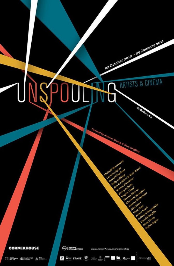
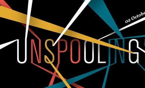
This poster was created for an art and cinema gallery by the agency Design By Day. It uses multiple lines that start from the edge of the page and join the text ‘Unspooling’ at the top.
The lines act as leading lines, guiding the eye to focus on the text ‘Unspooling,’ which helps emphasize those letters.
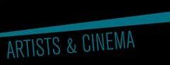
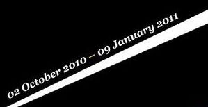
The designer also used lines to organize the information. That is, the lines separate the different texts with the help of colour as seen below. This makes the information appear clean and structured, as well as easy to read.

Lastly, the agency has used lines to perhaps highlight the concept of how this exhibition will unravel art and cinema in the same way thread can be unspooled. In fact, the lines resemble pieces of thread unspooling the word ‘Unspooling.’
Space:
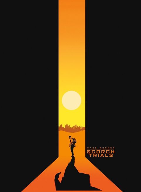
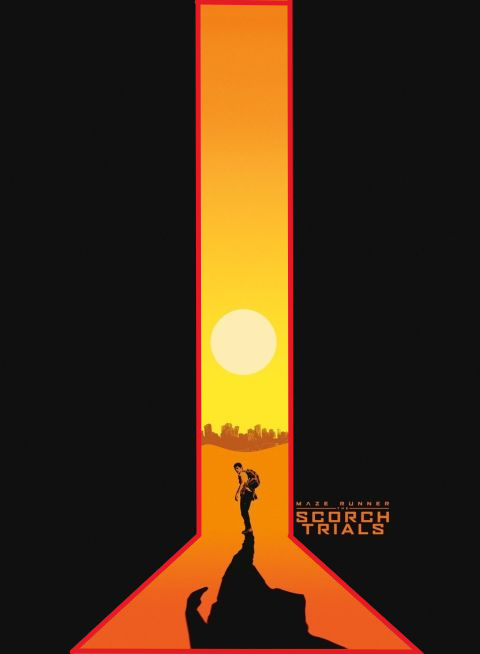
This is a poster for the movie Maze Runner: The Scorch Trials by an unknown designer. The poster uses negative space to highlight the character in the middle and the scorching sun. In fact, the black space helps the orange stand out more and helps show the intensity of the heat.
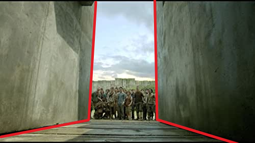
If looked at closely, the space is also used to form the shape of the entrance of the maze as shown below.
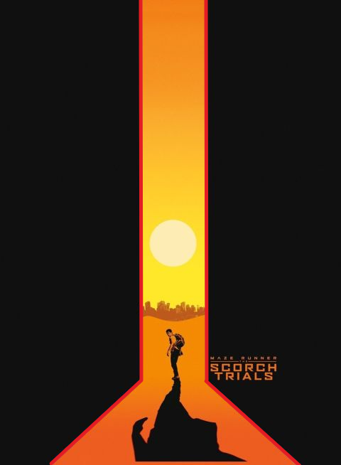
The space is also used to form an image of a flask (outlined in red below) which is a reference to the movie’s storyline.
Shape:
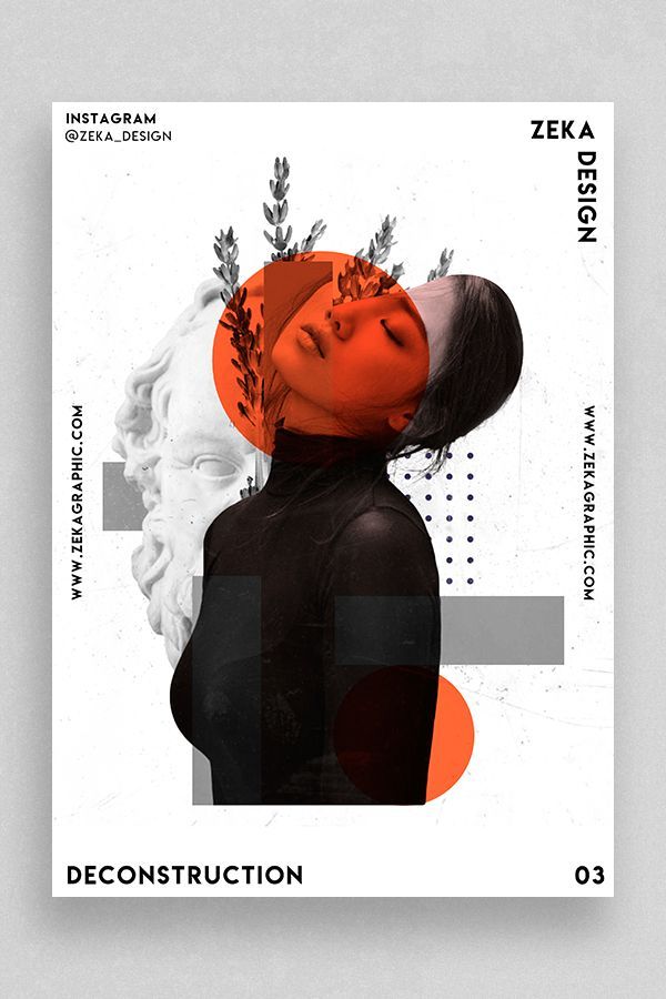
This poster was created by Zeka Design as part of her ‘Deconstruction’ series.
The use of the orange circle highlights the image of the girl’s face, making it the main point of attraction. The shapes are also used as a form of decoration that adds liveliness to the otherwise black and white image. Moreover, the three rectangles create a sense of uniformity and structure to the design because they are aligned with the girl’s body parts. For example, the square shown below is aligned with her head.

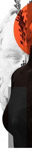
The square here is aligned with her body.
Moreover, the shapes are used to enhance the feeling of deconstruction that the girl is experiencing. The shapes are also geometric which produce a feeling of structure and order.
Leave a Reply