Repetition (Design Principle):
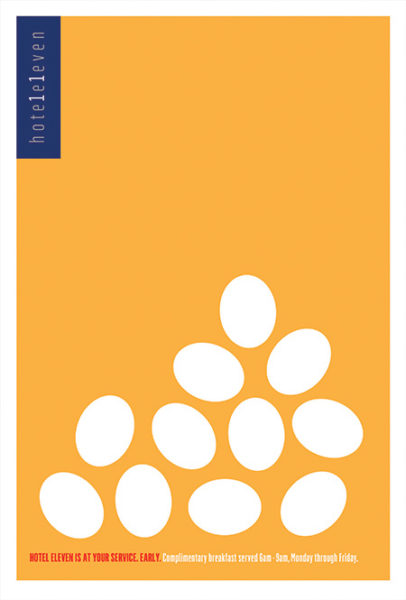
This poster was created by Hotel Eleven to advertise their breakfast service.
They have used repetition by showing multiple white eggs. This immediately catches the viewer’s attention and makes them realize that the eggs stand for breakfast. The repetition of the eggs emphasizes the hotel’s breakfast service. The eggs were also used because they are easily recognizable and one’s mind can quickly make the connection to breakfast. Moreover, the white eggs contrast with the orange background which immediately attracts attention and creates interest.
Image Source: https://www.printmag.com/post/rda-60-poster-design-ideas/
Balance (Design Principle):
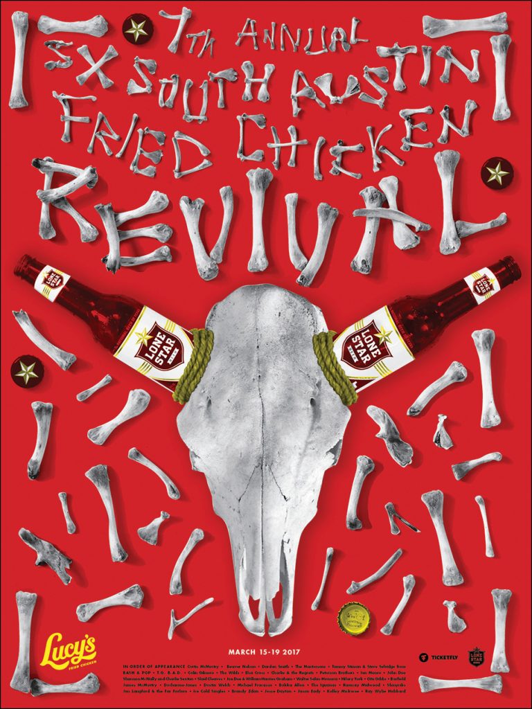
This poster was created by designer Barrett Fry at Pentagram for Lucy’s Fried Chicken 7th Annual Revival.
The poster uses symmetrical balance to achieve a unified look. Even though the dispersion of the bones may appear chaotic, there is an orderly look overall due to the use of symmetry. There is a structure to the design and this can help Lucy’s seem more trustable. It is also much more pleasing to the eye as everything is well balanced. This balance is important as all parts of the poster attract equal attention instead of only one side/area overpowering everything else.
Image Source: https://www.printmag.com/post/rda-60-poster-design-ideas/
Closure (Gestalt Principle):
This is a rebrand of the logo for the toy company named GUND. It was created by Cynda Media Lab.
The logo uses closure because even though parts of the stuffed bear are missing, we can still make out the shape of it’s head and ears. Our brains understand that it forms the arc of a circle. The use of closure makes the logo simple and the image of the bear easy to comprehend. The logo is not excessively detailed. It is also a more playful piece to look at.
Image Source: https://competition.adesignaward.com/design.php?ID=49389
Figure/Ground (Gestalt Principle):
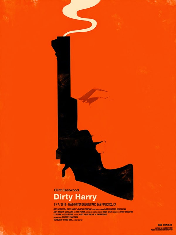
This is a movie poster for the movie ‘Dirty Harry’ that makes use of the figure/ground relationship. If we view the black part as the figure and the orange as the ground, then we see a gun. However, if we view the orange part as the figure, then we can see a face. This illusion creates a lot of visual interest and makes the poster more engaging. The figure/ground relationship also makes us focus on two different aspects of the movie (the gun and the face) which may be important to the storyline.
Image Source: https://www.tallengestore.com/products/cult-movie-poster-art-clint-eastwood-hirty-harry-tallenge-hollywood-poster-collection-1-canvas-prints
Leave a Reply