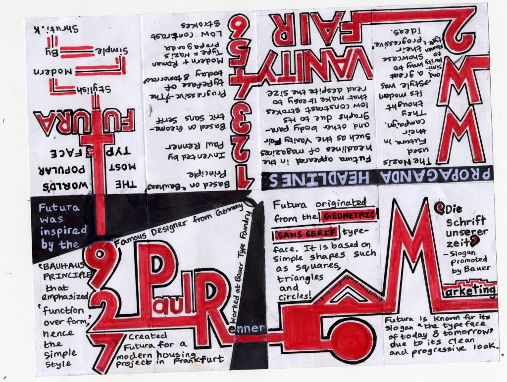
I decided to do my topic on the Futura font for the typography zine project. What I really liked about this font is that even though it’s old (created in 1927), it still appears new and is used even today. It has a modern and simple style so I thought I would depict that with the colours red, black and white. To make the flow of reading easier, I made all the pages linked to each other with a red line that runs through all of them. I also used big red letters to keep the viewer’s attention from page to page.
I would give myself an 8.5/10 for the amount of time and thought I put into it. I also really planned it out and did a lot of initial sketches so that the layout is all set up. I wish I did read the instructions better because I restarted the zine two times as my information was not before 1945. I spent approximately 10 to 11 hours on this. If you include the time I spent doing my previous zine (on Helvetica), then I would have spent 14 hours on this project.
Overall, what I took away from this project is that a typeface is more than just pretty letters. It has a purpose and sometimes ideas attached to it. For example, Futura has a clean and modern design which makes it suitable for a variety of texts. It also has the idea of ‘progressiveness’ attached to it.
Leave a Reply