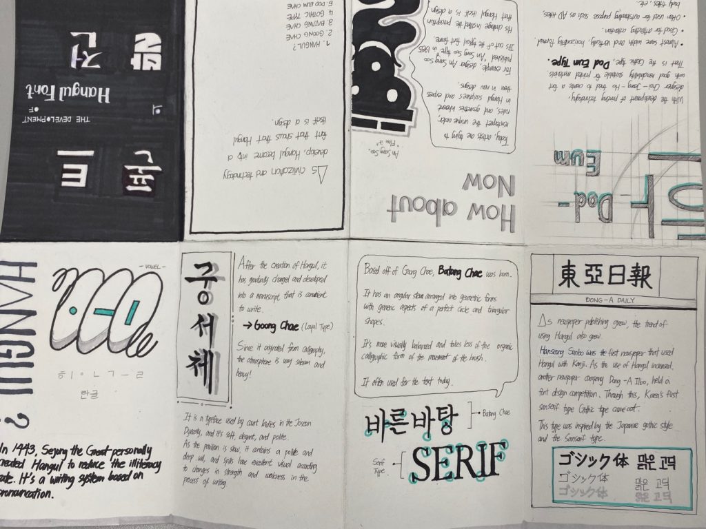
I was trying to do “Origin of Hangul,” but I already did that in my blog post, so I decided to develop Hangul font.
I want to give my zine 10 out of 7. First, I spent a lot of time researching unfamiliar topics. Listing and organizing them in chronological order was also part of the layout configuration, so I want to give many points here. I also like the application of a layout that reveals the characteristics of each topic well, and the use of Turkish color as a highlight color also stands out in my zine. But these points made it hard to read my zine.
Because my design and words don’t engage us and are hard to read, I think they are complicated layouts. I was able to organize a more unified layout, but I focused on the characteristics of each topic and organized a different layout for each page, which makes it difficult for viewers to see.
I should pay attention to the unified design and the composition that shows the content well.
Sources :
http://abcdefridays.blogspot.com/2013/09/a-brief-history-of-korean-typography.html
https://issuu.com/jiyooncha/docs/history_and_development_of_hangul
http://typesquare.com/app/webroot/userfiles/Morisawa%20Choi%20Jeong-ho%20Fonts%EF%BC%BF160929.pdf
https://en.wikipedia.org/wiki/Ahn_Sang-soo_(typographic_designer)
https://typographica.org/typeface-reviews/ag-choijeongho/