Skip to content

Newest posts

Jan Tschichold and Modernism

Born and raised in Germany in the 1900’s, Jan Tschichold is a typographer, calligrapher, and book designer that fled to Switzerland during the rise of the Nazi party. His emphasis on new typography and sans-serif typefaces was deemed a threat to the cultural heritage of Germany, which traditionally used Blackletter Typography. His work was considered unconventional, ground-breaking, and an obvious enemy of the Nazi regime who denounced him along with the designer of the modernist Futura, Paul Renner, as “cultural Bolshevists.”

Theatre posters (1927)
More theatre posters (1926-1927)

Before he was able to flee the country, the Nazis seized much of his work. In an article by Typeroom about Jan Tschichold, it states that Richard Hollis ( author of Graphic Design: A Concise History) in his Guardian Review of Graphic Design in Germany 1890-1945 by Jeremy Aynsley wrote: “After Hitler became chancellor, designers had to register with the culture ministry. Indexes of art books can be found with the note: ‘Jews are identified by an asterisk’ Permission to work was refused on political or racial grounds. All radicals were at risk. At best, their livelihoods were taken away. ‘Protective custody’ was arranged for any who had links with progressive movements”

He continues by saying, “The typographer Jan Tschichold had a visit from the stormtroopers while he was away lecturing. They asked his wife to ‘open’ a Mondrian painting on the wall, mistaking it for the front of a safe. More dangerously, they found incriminating collages by Russian constructivists. Rather than wait for the party thugs, Tschichold surrendered himself to the police. After six weeks a policeman helped him get a passport so that he could leave for Switzerland. In a letter to Tschichold’s publisher, the Gestapo wrote that ‘for the protection of the German people’ all copies of one of his books were to be confiscated. ‘In its general design and in its exclusive use of lower-case letters and the type of illustration, Photo-Eye exhibits a subversive tendency incompatible with the aspirations of the nationalist-socialist state.’”

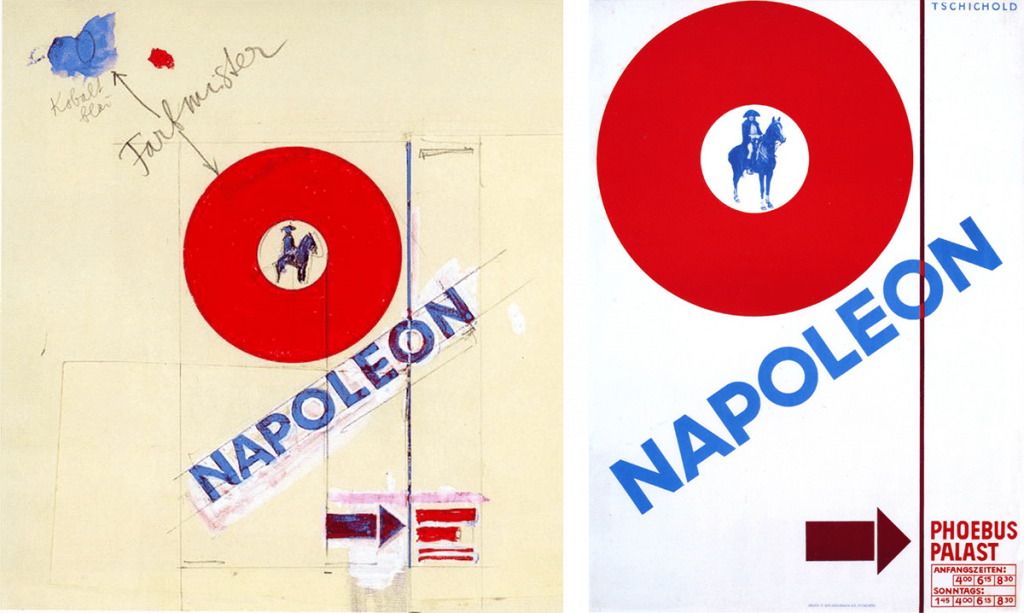
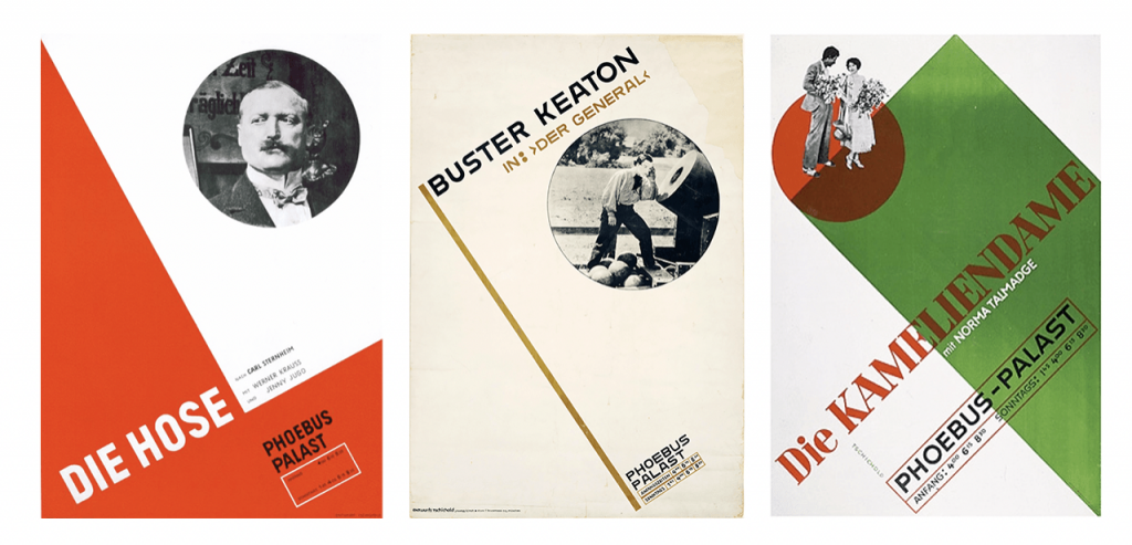
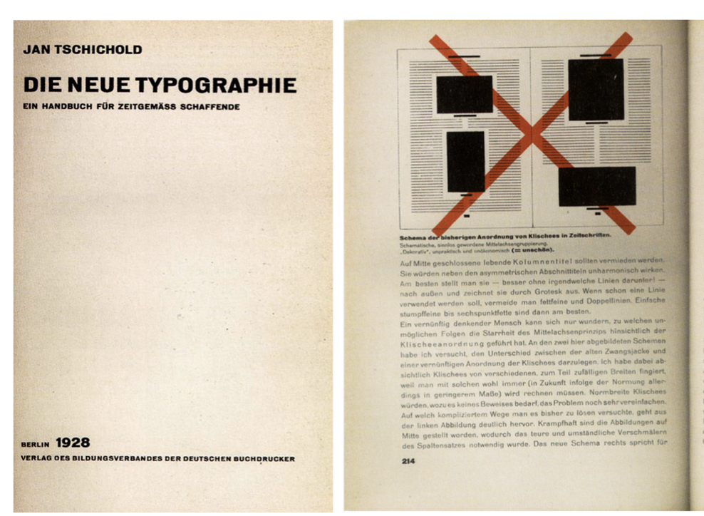
Tschichold is consider controversial due to his claims that he was one of the most powerful influences on 20th century typography. Though many try to deny his statement, his book about typography that he wrote named “Die Neue Typographie” (which translates to “The New Typography” in English) where he set forth rules for standardization of practices relating to modern type usage. This essay of his became a manifesto of modern design. He condemned all typefaces except for sans-serif (called Grotesk in Germany) types. He also advocated standardized sizes of paper and set forth guidelines for establishing a typographic hierarchy when using type in design. He also favoured non-centered design, and arranged many other Modernist design rules. 

A look inside Die Neue Typography (1928)

Tschichold eventually slowly abandoned his beliefs that he wrote about in “Die Neue Typographie” around 1932 onwards as he moved back towards Classicism in print design. Later 0n in his career, he condemned Modernist design as being authoritarian and inherently fascistic, and condemned his own book as too extreme. However, many still find his rules in his essay to be relevant to this day.

Between 1947 and 1949 Tschichold lived in England, where he spent part of his career with Penguin Books. He developed a standardized practice for creating the covers for all of the books produced by Penguin while he was there called “The Penguin Composition Rules”. He personally oversaw the development of more than 500 books.

Though it is controversial whether he really is such an influential figure when it comes to 20th century typography, his boldness and pride towards his work is unmatched, and his passion for his art that was deemed controversial at a dangerous time period. Although you can have your own opinion about his self-proclaims, one thing is for sure: he is not afraid to fight for his work and what he believes in, and that in itself should be admired.

CITATIONS

Jan Tschichold – German typographer & calligrapher. Shillington Design Blog. (2022, September 11). Retrieved November 24, 2022, from https://blog.shillingtoneducation.com/jan-tschichold-tbt/ 

TypeRoom. (n.d.). Jan Tschichold: The father of modern typography in his own words. TypeRoom. Retrieved November 24, 2022, from https://www.typeroom.eu/jan-tschichold-the-father-of-modern-typography-in-his-own-words 

Wikimedia Foundation. (2022, October 12). Jan Tschichold. Wikipedia. Retrieved November 24, 2022, from https://en.wikipedia.org/wiki/Jan_Tschichold 

William Morris and The Arts and Crafts Movement

Born in 1834 to a wealthy middle class family in Walthamstow, William Morris was a British textile designer, poet, artist,  novelist, architectural conservationist, printer, translator and socialist activist who was an outstanding figure in the Arts and Craft movement. He developed his own particular style of art from a young age, and he began to realize the only way he could have the beautiful home he wanted was if he designed every part of it himself. He famously once said, “Have nothing in your houses that you do not know to be useful or believe to be beautiful.” 

The aesthetic and social vision of the movement grew out of ideas that he developed in the 1850s with a group of students at the University of Oxford– the Birmingham Set– who combined a love of Romantic literature with a commitment to social reform. The Birmingham Set consisted of 8 outstanding individuals including Charles Joseph Faulkner, Edward Burne-Jones, William Morris, Cormell Price, Richard Watson Dixon, Edwin Hatch, William Fulford, and Harry MacDonald. 

In 1861, Morris founded the Morris, Marshall, Faulkner & Co. decorative arts firm with Burne-Jones (one of the members of The Birmingham Set), Rossetti, Webb, and others. The firm influenced interior decoration throughout the Victorian period. Morris was responsible for designing wallpapers, fabrics, furniture, and stained glass windows, which became highly fashionable and high in demand. In 1875, he took over total control of the company, and was renamed Morris & Co instead.

It was around 1880 where the Arts and Crafts movement officially came to be, which was born from the concerns of people who were worried about the effects of industrialization on design and traditional craft. In response to these concerns, architects, designers, craftsmen, and artists turned to new ways of living and working, pioneering new approaches to create decorative arts. William Morris was one of the leading figures in this movement with his belief that people should be surrounded by beautiful, well made things and wanted to promote the job of craftsmanship. He was mostly well known for his wallpaper designs and has created over 50 designs in his career. 

“Strawberry Thief” by William Morris ​​

“Bird & Pomegranate” by William Morris

Citations

Archive II wallpapers. morrisandco. (n.d.). Retrieved November 11, 2022, from https://morrisandco.sandersondesigngroup.com/collections/archive-ii-wallpapers/ 

Arts and Crafts Movement. Arts and Crafts Movement | William Morris. (n.d.). Retrieved November 11, 2022, from https://exhibitions.lib.umd.edu/williammorris/morris-influence/arts-and-crafts-movement 

Taggart, E. (2022, August 25). Meet William Morris: The most celebrated designer of the Arts & Crafts Movement. My Modern Met. Retrieved November 11, 2022, from https://mymodernmet.com/arts-and-crafts-movement-william-morris/ 

The Beauty of The Baroque Era Artwork

The Baroque is a style that used contrast, movement, intricate detail, and deep colours to achieve a sense of awe. The Origin of the word “Baroque” is actually derived from a Portuguese term for “a flawed pearl” or an irregularly shaped pearl. Though it was originally used derogatorily, it has transformed into a word to describe a variety of characteristics, from dramatic to bizarre to overdecorated.

Using Renaissance ideals of beauty, infused with the era’s artwork, music, and architecture, it created The Baroque Era. This new highly enriched style is marked by its innovative techniques and details, which delivered fresh new visuals into what had been a relatively toned down period for art at the time. 

What I absolutely adore about the Baroque Era is the beautiful art and sculptures that were created during this time. Learning about it in class sparked my interest, and I was surprised to learn that many of my favourite paintings were actually created at this time. I wanted to conduct m0re research into the beautiful detailed paintings of this amazing time period, and learn more information about them.

Las Meninas by Diego Velázquez (1656)

This is one of the most notable and famous paintings of this time period, and I believe rightfully so. This painting has been regarded as one of the most widely analyzed works, due to its complex and mysterious composition. Many believe that this painting suggests that art, and life, are an illusion. Las Meninas has long been recognized as one of the most important paintings in the history of Western art, and its enigmatic nature draws you in, making you unable to fully look away. It is interesting to think about what story this painting is trying to tell, and what each person is doing in this painting. We can see how some people in the painting are looking away, and how some are staring at us directly in the eyes. It is fascinating to me how he was able to fit in 11 people (not including the dog) in a painting in a way that makes it not too overwhelming to look at and without overcrowding the canvas. It also fascinates me how Diego Velázquez decided to paint himself into the painting, but also the choice of making him look at the viewer directly into the eyes. For me, this gives the painting such an eerie feel to it. The most beautiful part of this drawing for me, is the wide range of interpretations and how not a single theory has found universally agreed upon. Perhaps, not even the painter himself knows, or maybe he does. We may never know the truth behind his reasonings, and I can’t help but feel moved.

Susanna and the Elders by Artemisia Gentileschi (1610)

Artemisia Gentileschi is an absolute legend and definitely now one of my favourite artists of all time. When learning about her story and looking at her paintings in class, I felt like I had been splashed with cold water. In an era when women had few opportunities to pursue artistic training or work as professional artists, she managed to become one of the most successful women of her time despite the pain she had to endure as a young woman. The way she is able to paint expressions is absolutely beautiful. I love seeing the raw emotions in painting, and she is an excellent expressive painter, and all her paintings feel like they’re telling a story. The painting is a representation of a biblical narrative featured in chapter 13 of the Book of Daniel, which talks about two elderly men are shown spying on a young married woman named Susanna. The elders spied on Susanna and then demanded sexual favours from her, which she refused. The men threatened to ruin her reputation, but Susanna did not give up and stood her ground. Compared to Annibale Carracci’s interpretation of the same story, Artemisia Gentileschi’s puts an emphasis on Susanne’s uncomfortableness, while Carracci’s is more “erotic” and “feminine” in a way, not displaying the same amount of uncomfortableness that Gentileschi’s displays.

Susanna and the Elders by Annibale Carracci (1590)

One very important fact I’d like to note about Gentileschi’s painting of Susanna and the Elders is that she was only 17 at the time! She is without a doubt a strong and talented woman, and I think her art should be talked about more. Her achievements as an artist are overshadowed by the story of Agostino Tassi raping her when she was a young woman and her participation in the trial of her rapist, and although I think it is important to note the suffering she had to go through to, I also find it important for people to talk about her art, especially during a period where men dominated the art scene and in a time period where women had so little opportunities not only as artists but as people. Against all odds she still managed to continue painting, and she is a huge inspiration to me.

Citations

“Artemisia Gentileschi.” Wikipedia, Wikimedia Foundation, 19 Oct. 2022, https://en.wikipedia.org/wiki/Artemisia_Gentileschi. 

“Baroque Art and Architecture Movement Overview.” The Art Story, https://www.theartstory.org/movement/baroque-art-and-architecture/. 

“Baroque Period Summary.” Encyclopædia Britannica, Encyclopædia Britannica, Inc., https://www.britannica.com/summary/Baroque-art-and-architecture. 

“Las Meninas.” Wikipedia, Wikimedia Foundation, 22 July 2022, https://en.wikipedia.org/wiki/Las_Meninas. 

“Susanna and the Elders (Artemisia Gentileschi, Pommersfelden).” Wikipedia, Wikimedia Foundation, 14 Sept. 2022, https://en.wikipedia.org/wiki/Susanna_and_the_Elders_(Artemisia_Gentileschi,_Pommersfelden). 

Historical Artifact Exhibit – Victorian era Dresses

For my exhibit, I chose Victorian era dresses because I always had an interest in Victoria era fashion, but never really did too much research on it. I was astonished to find that fashion had much of a deeper meaning in the 1800’s than I though, especially to women at the time.

When doing my research, I mostly used wikipedia to find my information. For picture references, I used various references pictures that showed timelines of how the Victorian fashion era evolved over the years.

I chose to display the dresses as if they were being wore by mannequins, hence the lack of face and expressions. However, I wanted to make it look like they were “interacting” with each other, because in a lot Victorian era drawings and paintings it shows them gathering together, so I thought it would be neat to incorporate that into the museum exhibit.

I chose to display a range of different dresses from the different years to display the progression of the dresses every 20-30 years, and I put labels on top of their heads and displayed it from oldest to most recent to show the growth, and to mimic the picture timeline references I used.

The first part that I did in this project was the research, which took about 30 minutes. In my research, I gathered and chose the dresses that I wanted to display not only based on how they look but also on their culture significance at the time. Fashion says a lot about a time period, and I felt as if it was important to accurately display the progression of the Victorian era fashion and show the differences between one and other. The second part was sketching, which took a lot longer. The sketch itself took about 2 hours since I was trying to figure out how I should make them interact with one another. Should they be gather around sitting at a dinner? Should they be on the streets away from another whilst displaying the scenery at the time? Should it look like a painting? In the end, I chose to go with using mannequins, since this is supposed to be a museum exhibit, not just a painting. The painting, standing, and background took about 1 hour or so, due to the amount of details in the dresses. I wanted the colours to stand out from each other so I chose different (but accurate to its time) colours. The signs and writing took only 15 minutes, since I already prepared a google document with the information I was going to write in. The tricky part was just trying to figure out how to display it. In total, I spent about maybe 4-5 hours on this project.

Although I am very proud of the shading and the way the dresses ended up looking, I feel as if the anatomy could’ve been better, but that has to do more with my art skill level than the project itself. However, I am still learning to improve with digital art and I like to believe that this project was a good opportunity to improve more. For the writing on the right, I felt like the perspective was off. Since the background was tilted, the words should’ve been too but I ultimately wasn’t sure how to change that, so in the future it’ll be a good idea to get more familiar with my programs and learn how to plan out where the words will go before doing the drawing. Overall, I think this project challenged me creatively in a new way, and I had fun drawing and researching about the Victorian era!

The Mystery of the Nazca Lines

Since the beginning of time, humans have been using images and texts to convey stories and messages. The earliest developments of this are glyphs, which means a mark that is meant to communicate something. Growing up in Peru, I was made aware from an early age about one of the most famous geoglyphs in the world, which are the Nazca Lines. 

According to Wikipedia, a geoglyph refers to a large design or motif (generally longer than 4 meters)  produced on the ground by durable elements of the landscape, such as stones, stone fragments, gravel, or earth. There are two types of geoglyphs: A positive geoglyph, which is formed by the arrangement of materials on the ground (similarly to petroforms), and a negative geoglyph which is formed using carving (similar to petroglyphs).
The history and significance of the Nazca Lines are for the most part a mystery, which makes them all the more fascinating to admire and look at. It is believed that the Nazca Lines were made by removing the top layer of reddish-brown iron oxide-coated pebbles to create a yellow-gray subsoil and were created between 500 BCE and 500 C. They can be found in the southern part of Peru in the soil of the Nazca Desert and are best seen from air. The lines depict various animals and plants, and the designs measure between 400 and 1,100 meters across. The combined length of all the lines is over 1,300 km, and the lines are typically 10 to 15 cm (4–6 in) deep.

Example of a famous Nazca Line – “The Spider” (History.com)

Example of another famous Nazca Line – “The Hummingbird” (Getty Images)


What interests me the most about the Nazca lines are the many theories surrounding heir existence. Some theorize that they were created by the Nazca people to be seen by deities in the sky, while others say that they are part of rituals to summon water. It has also been theorized that the lines could act as an astronomical calendar. However, the most intriguing theory is the belief that there were alien influences. Many have similar theories regarding other historic sites such as the Egyptian Pyramids, Stonehenge, and Easter Island so it is not surprising that the man that came up with the alien theories for the other historic sites, Swiss writer Erich von Däniken, came to a similar conclusion about the Nazca Lines.

Von Daniken published a book titled “Chariots of the Gods’’  in 1968 in which he describes his theory that these mysterious lines were actually used as landing sites for UFOs, and that the Nazca lines site reflected visits by astronauts from other worlds, who became the creators of ancient civilizations. In his theory, he talks about an “ancient astronaut” (the aliens) who came and created the landing tracks, and he uses one of the Nazca Lines who looks like an astronaut to back up his theory. However, it is highly speculated that the “astronaut” he is referring to is simply just a drawing of a person or a fisherman. Many scientists and archeologists declared his theory as absurd, but his book drew in many believers and visitors to the site, making the Nazca Lines one of the most highly visited places in Peru.

The “Astronaut” Nazca Line that Von Daniken refers to (Machu Travel Peru)

CITATIONS:

(n.d.). Nazca Lines. Retrieved from https://www.google.com/url?sa=i&url=https%3A%2F%2Fwww.britannica.com%2Fplace%2FNazca-Lines&psig=AOvVaw3RHI4EBj3rpSCtb_qQIjpt&ust=1664679796617000&source=images&cd=vfe&ved=0CAwQjRxqFwoTCMDzxdGFvvoCFQAAAAAdAAAAABAW. 

Admin. (2021, October 25). All about the Nazca Lines Images: Blog Machu Travel Peru. Peru Travel Blog | Machu Travel Peru. Retrieved September 30, 2022, from https://www.machutravelperu.com/blog/nazca-lines-images 

History.com Editors. (2017, December 4). Nazca Lines. History.com. Retrieved September 30, 2022, from https://www.history.com/topics/south-america/nazca-lines 

Wikimedia Foundation. (2022, September 25). Nazca Lines. Wikipedia. Retrieved September 30, 2022, from https://en.wikipedia.org/wiki/Nazca_Lines 

Yearbook Spread

For my yearbook spread, I went for a simpler approach as I felt like that was the most synthetic version of “me”. I consider myself a pretty messy, but yet at the same time organized person and I think my yearbook really conveys that through an organized mess. Next to the pose of me sitting, I decided to draw a picture of me standing wearing a different outfit, kind of displaying that I’m a very outfit/fashion oriented person and care about what I wear. The whole spread overall gives off a very doodle-vibe to it, which is exactly what I was going for since I feel like the “clean” and “too polished” look doesn’t suit my personality nor my style. I used some different shapes as bubbles to put text because to me, they kind of looked like stickers/sticky notes. I also kept my intros and texts straightforward, as I believe that I am someone who is pretty blunt in some retrospects, especially when it comes to introductions. I like to get to the point when it comes to introducing myself because I think a nice, short and simple introductions is the best way to get to know someone.

In all complete honesty, I think I deserve a B- for this project because although I did plan it out and even sketched it out a few times, I felt a little unsatisfied with the end result mostly due to my art skills which I will plan on improving, and this gave me good motivation to start. Overall I’d say I spent a good 20 hours on this project, which sounds a little ridiculous but I spent a lot of time sketching and drawing, plus I made an entire finished draft that was completely different in style and format.