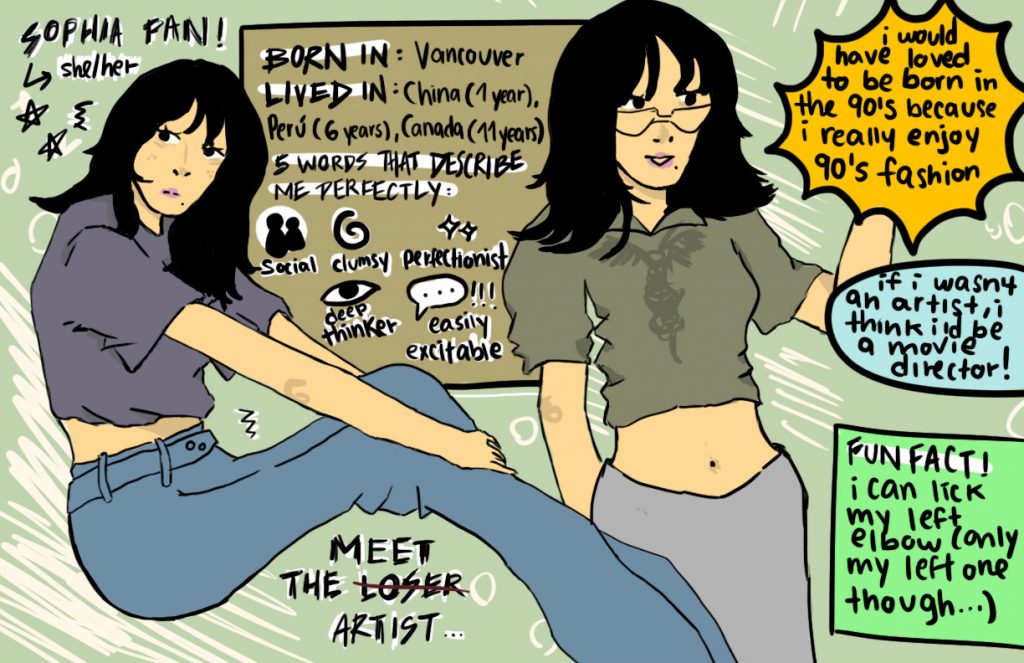
For my yearbook spread, I went for a simpler approach as I felt like that was the most synthetic version of “me”. I consider myself a pretty messy, but yet at the same time organized person and I think my yearbook really conveys that through an organized mess. Next to the pose of me sitting, I decided to draw a picture of me standing wearing a different outfit, kind of displaying that I’m a very outfit/fashion oriented person and care about what I wear. The whole spread overall gives off a very doodle-vibe to it, which is exactly what I was going for since I feel like the “clean” and “too polished” look doesn’t suit my personality nor my style. I used some different shapes as bubbles to put text because to me, they kind of looked like stickers/sticky notes. I also kept my intros and texts straightforward, as I believe that I am someone who is pretty blunt in some retrospects, especially when it comes to introductions. I like to get to the point when it comes to introducing myself because I think a nice, short and simple introductions is the best way to get to know someone.
In all complete honesty, I think I deserve a B- for this project because although I did plan it out and even sketched it out a few times, I felt a little unsatisfied with the end result mostly due to my art skills which I will plan on improving, and this gave me good motivation to start. Overall I’d say I spent a good 20 hours on this project, which sounds a little ridiculous but I spent a lot of time sketching and drawing, plus I made an entire finished draft that was completely different in style and format.