Repetition

A Principle of design
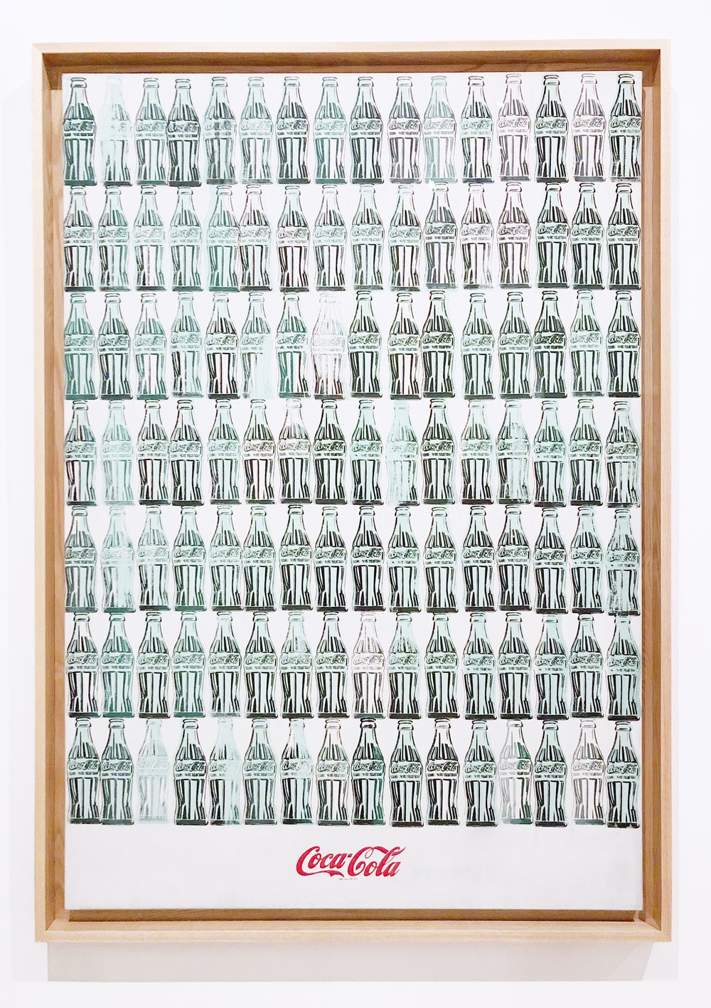
A piece created by Andy Warhol, an American pop artist, is an exact definition of repetition. He uses 7 rows and 16 columns to create an instantly recognizable composition of Coca-Cola bottles. He has played around with the boldness of bottles to create a more interesting design.

Contrast

A Principle of Design

This poster for Staedtler Highlighter Pen was created by an artist that goes by “bdpqbd”. They have made an eye catching advert using the Principle of Contrast. By making
the background monotone, the bright yellow highlighter is able to catch the audience’s attention which supports the reference to the product’s tagline,”never get lost”

Figure/ground

Gestalt’s Principle

I absolutely love this illustration. It is such a clever and unique way of integrating the principle figure/ground in Gestalt’s Theory of Design. The silhouette of Steve Jobs acts as the instantly recognizable apple bite. If we isolate the two components, we are able to see the individual shapes they represent.

Closure

Gestalt’s Principle

This illustration of James Dean demonstrates the use of closure. Closure in the terms of Gestalt’s Principle is the ability of our brains to see/fill in broken lines or shapes. We can picture the invisible lines that help us recognize certain shapes or familiar objects.