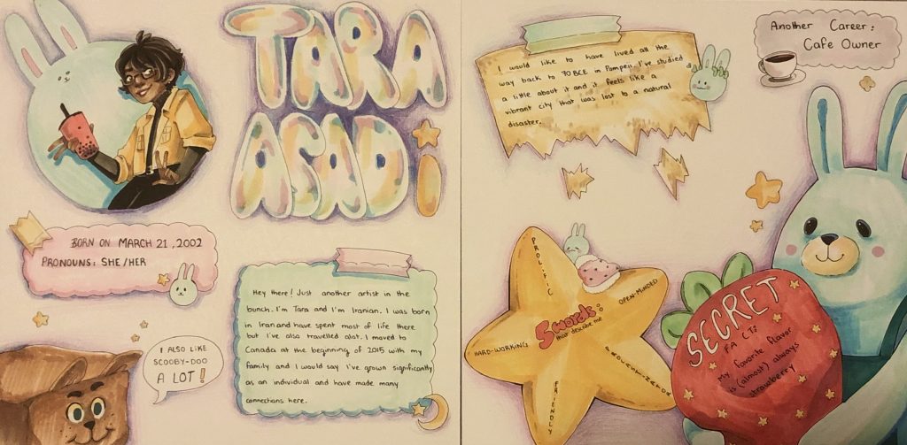
For my yearbook spread, I wanted to convey aspects of my personality and my ideal aesthetic into the spread while still remaining authentic to myself. I tried to make the spread chaotically organized since that is what best describes my habits which is where the tape and pieces of paper on the page come up. Furthermore, I tend to be a cheerful person yet pretty soft-spoken most of the time; which is why I incorporated bright pastel colors and bubbly shapes. I have a significant amount of plushies shaped like rabbits and decided to sprinkle them throughout so they keep me company on the page. The repetition of stars is mainly because that is one meaning behind my name, it’s also part of the reason why I associate myself with it so deeply.
I feel as though while I have the required criteria, there’s so much more I could’ve done with my composition and my choice of colors to make the piece flow better. Overall, I would probably give myself a 8/10.
Leave a Reply