Leo Lionni
Despite shifts in career, style or workflow, one’s inner creativity will continue to grow and evolve. That is what I noticed when looking at Lionni’s work and wanted to focus on the evolution of his work during and after his career.
Art direction pieces:

Design #1 for Printed Page 
Design #2 for Printed Page
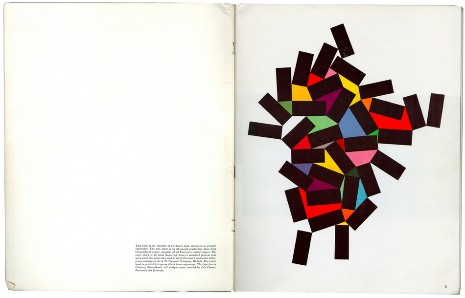
I personally admire and enjoy his art direction and composition for many of his projects. The design he made for Printed Page above stand out in a charming way. I admire the way the ‘tear drop’ shapes connect with one another yet still individually stand out. The colors compliment each other in an exciting way instead of clashing together, I didn’t think it was possible to make such a color scheme look visually appealing. He uses similar color schemes in his other designs for Printed Page.
The essence of his design
Even though vibrant color schemes were predominant in this era of design, specifically the use of the primaries, the way Lionni uses it in his work creates a more serene undertone to the excitement that the saturation can ignite. His use of saturated colors establishes a friendly and dynamic mood in his pieces, one that I think he kept in his later work.
Illustration work:

This is the cover of one of Lionni’s children books after he retired from art direction. The same energetic atmosphere that was present in his design intensive pieces is still present in his more illustrative work. The round shapes with sharp edges is complimented by the flurry of colors that goes on in the page. Although some of his illustrations have a more earthy tone, they never lost that touch of serenity paired with excitement.
Feeling inspired:
I genuinely enjoyed looking at his work and learning more about him. It inspired me to be bolder with my color choice and sharper with my edges.
Leave a Reply