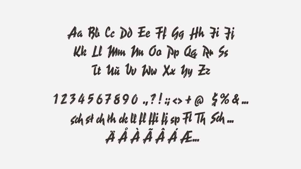
Captivated by “Reporter”
While paging through the various typography books in the library, I was captivated by a font drawn by brushstrokes. I discovered more about the typographer and found instances of Reporter used as a bold accent font or an eye-catching headline.
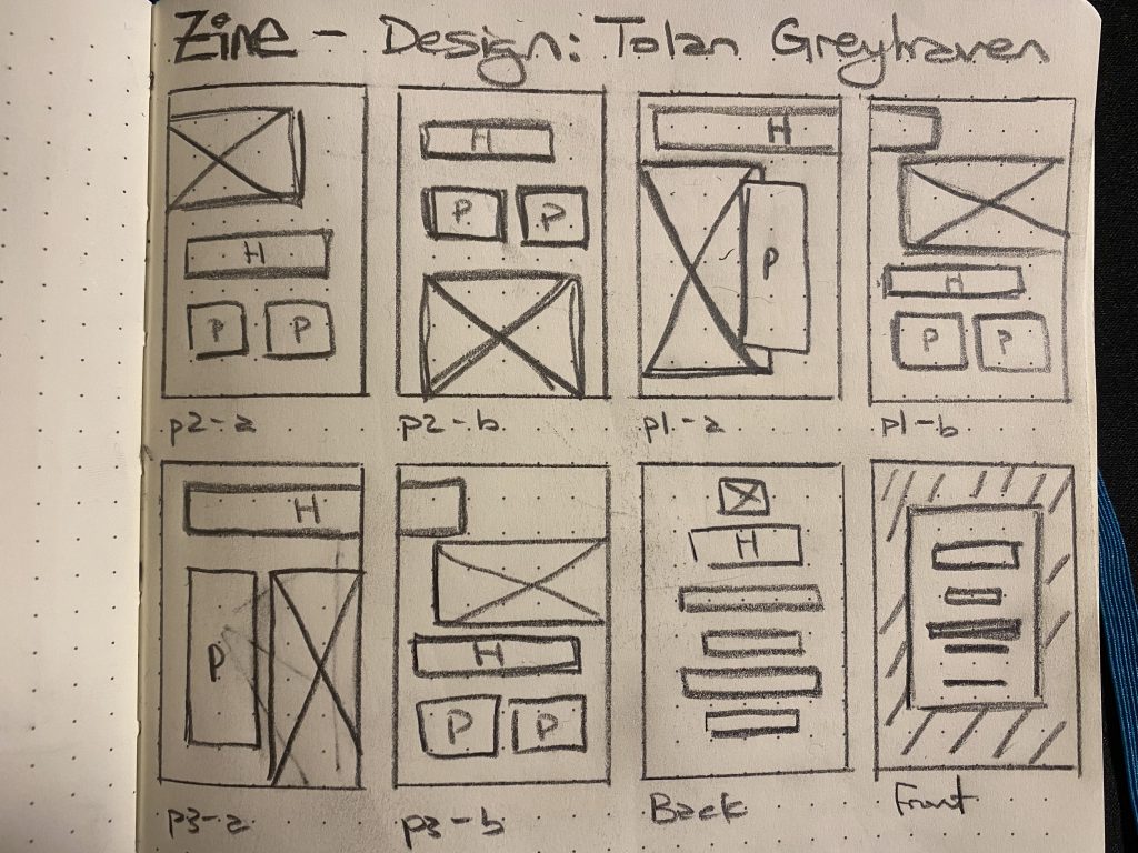
Then turning to transform this information into a tiny little book, I knew that I would be hard-pressed to make something by hand to showcase this dynamic font in a minuscule format. So I chose to maintain the Tabloid sized proportions and keep the dimensions at only half an entire piece of paper. This size would allow me to move my hands with enough space to keep my words legible.
Sketches and Writing
After writing out my notes and narrowing them down to the essential facts, I repeatedly rewrote the information concisely.
Over a few sketches, I decided that the small format would not work well for a multiple-column layout and could balance some of the larger images I wanted to incorporate with some narrow single columns on some pages.
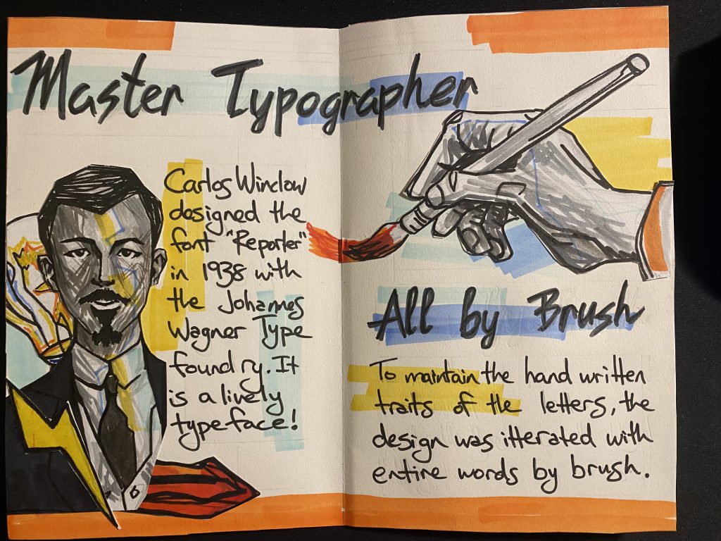
I also sketched out some images that I would use as illustrations for the spread. I felt they were successful illustrations, so I inked them and cut them out as collage elements.
Developing the Layout
Once I had a framework established, I moved pieces and my pencil outlines over my pages until I was happy with the skeleton. Next came text via pencil and then over again in ink. I hoped to keep enough whitespace amongst the headlines that spread across the middle of the spread. My goal was to create a composition with movement and a dynamic impression that matched the font I was highlighting. All of the text I wrote by hand using a photo reference of the Reporter Font.
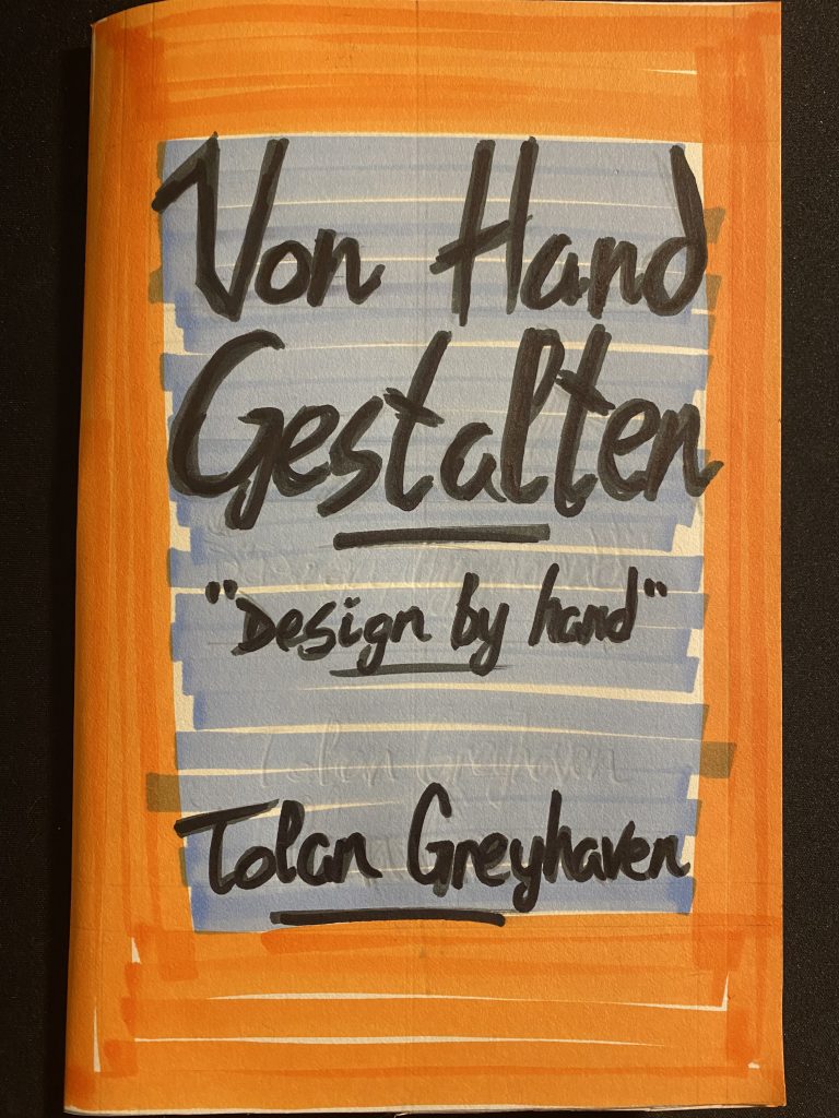
After I had everything securely placed and inked, I added contrasting orange and blues for colour elements and repeated areas across the spread for a sense of rhythm.
Reflections
I appreciated the challenge of working through this process without digital tools. Iterating and developing a complex set of information by hand was a challenge. In the future, I feel like my use of white space will become more practiced as this Zine may be a little bit busy. In conclusion, I am happy with the result. I feel the project is deserving of a 7.5 out of 10 for my 8-hour effort on the project.