
Neville Brody
This iconic designer has made an indelible mark on the design world with an edgy approach to design that channels the London Punk-rock approach to aesthetics, combined with a slick post modern package.

Trained at the London College of printing, Neville was often criticized by his teachers for work that was “uncommercial”. So he went out and carved a path through the design world with exactly that. His body of work grew from album art and magazines into designing typefaces, starting his own design firm, and consulting on projects from print, web, branding and digital visuals.
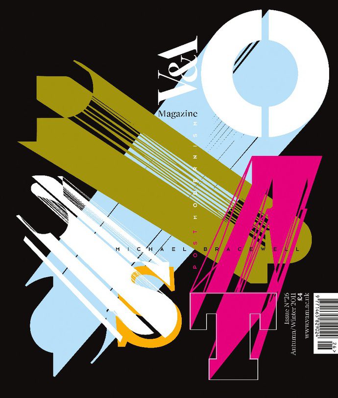
This lettering genius pushed hard against the structures of modern design and moved letters and shapes all over the place. And did it while maintaining a distinct quality that didn’t completely fall into the realm of chaotic design such as David Carson.
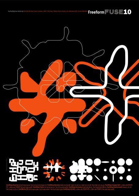
There is a level of structure and thoughtful manipulation in Brody’s work that can organize the chaos that arises from playing with scale so often within a design.
I found myself gravitating towards his pieces that were more simplistic than some of his other works and was also very happy to discover that he did the post for Ocean’s 12, which is a heist movie that I quite enjoy!
