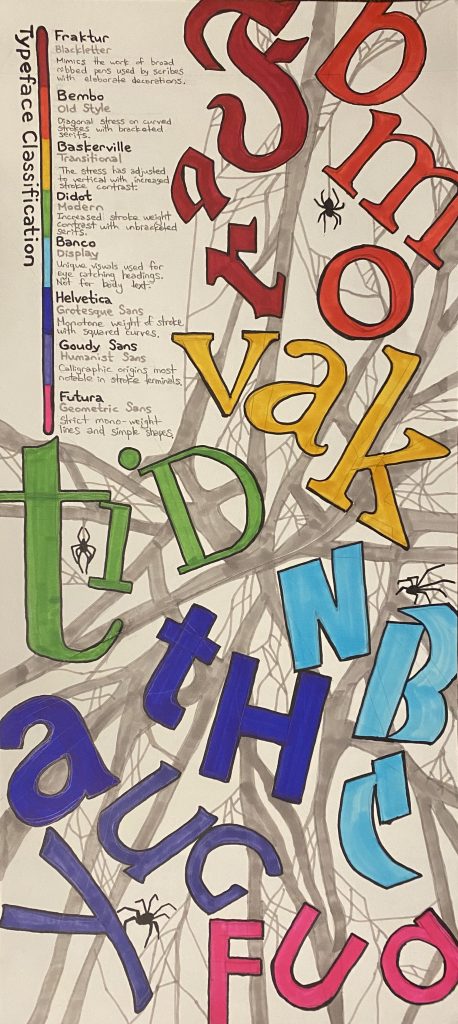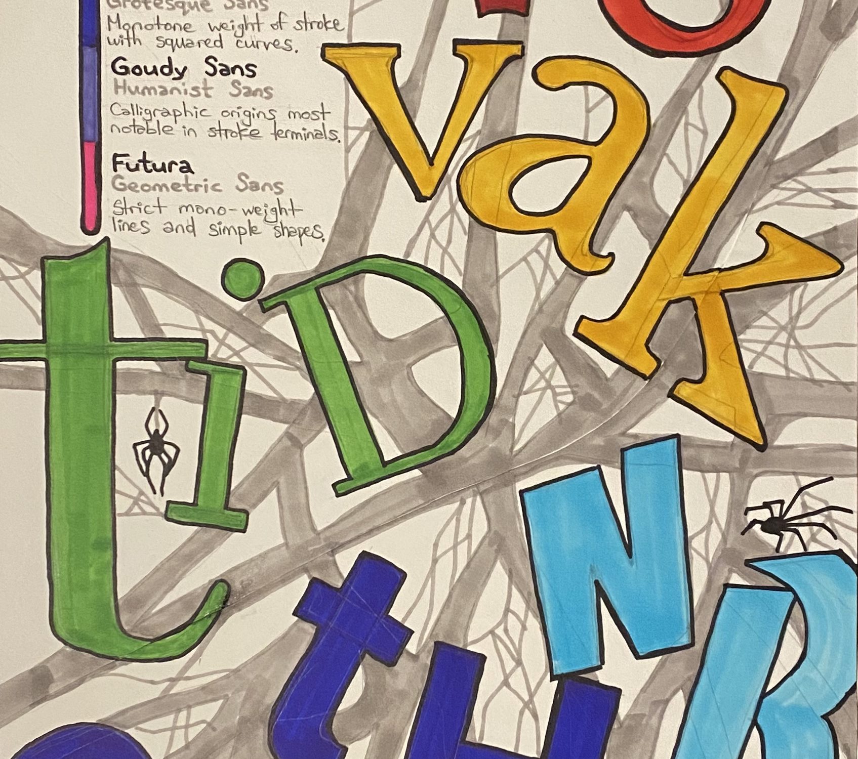
Tangling up the letters
This project was a helpful reminder that graphic design is more often than not, an attempt to compile a large amount of information and concepts onto a page or into a solution. As much fun as it would be to always make graphics and projects that simply look good for the sake of it.
So I wanted to experiment. This felt like a lot of new data about typography to integrate over the past few weeks and put into something eye-catching yet informative.
So I experimented with collating pieces of typography and arranging them in dynamic ways. As I did so I felt as if I was untangling all the pieces of paper. So the idea dawned on me to tangle them up in what would appear to be spider webs.
I used a rainbow colour scheme to try and connect the different typefaces to the specific styles and details along the side. Like a small menu bar that informs about the details on the page. To simplify the entire titles of the letters I chose to take 3 letters from each typeface name.
Not my best design solution, and I’ll admit that I was stumped on putting all the information onto the page in an effective way. And that only means it can only go up from here.
I would award myself a C on this grade and I spent about 9 hours designing ideas, sketching and rendering.