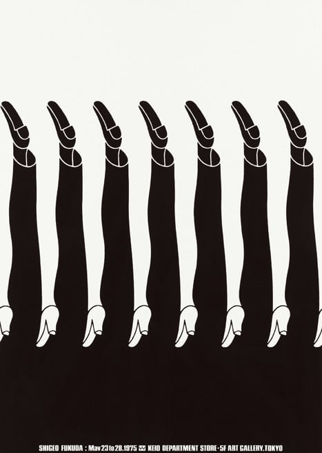
Blog Post 3: Supergraphics Innovator

Shigeo Fukuda

“I believe that in design, 30 percent dignity, 20 percent beauty and 50 percent absurdity are necessary,”

Heavily drawn by illusionism, graphic designer Shigeo Fukuda created extremely creative and compelling works using simple imagery.

L: Victory 1945 M: Untitled 02 in 1982 R: Happy Earth Day in 1982
Shigeo Fukuda

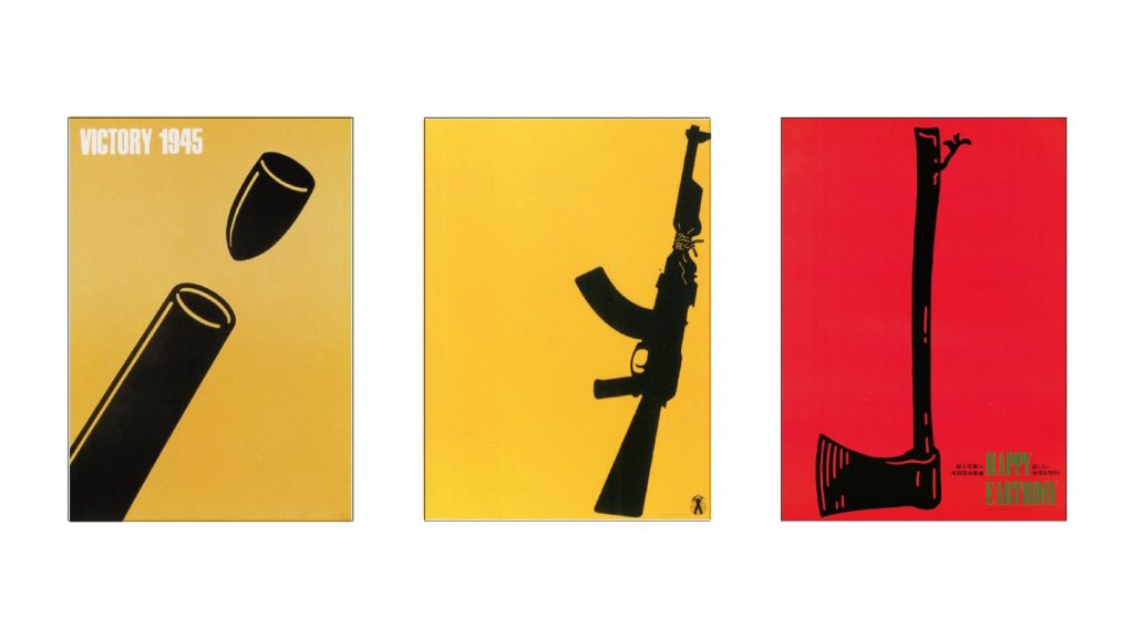
Shigeo Fukuda was known to be an antiwar advocate, and he is truly a master of creating unique visuals with deep meanings and impactful messages. I consider him to be someone I look up to when it comes to visual communication.

Interdesign 81′

He believed in peace, and many of his most famous posters’ messages involved satirizing the senselessness of war. By cleverly utilizing simple shapes and negative space, he is able to construct imagery that draws you in with its layering of illusion. The symbols immediately catch the eye as the dots are connected to understand his intention.

Falling bombs form an image of a skull in this antiwar poster from 1968
From the “Victory” series

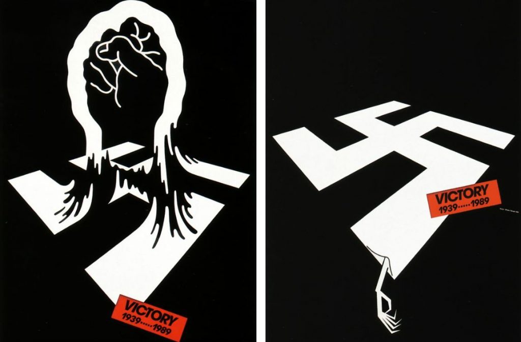
Shigeo Fukuda’s way of thinking when he approaches design is fascinating, the way he interprets different subjects and utilizes visual elements is something we can all learn from. I personally feel like he is one of those designers whose works speak for itself upon a first glance. These works all scream “we want peace” to me.

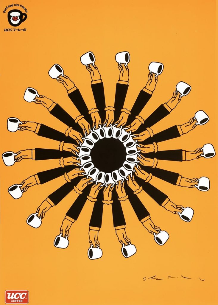
I love how these are confusing to look at in a good way. I think that’s one of the hardest things to achieve in design, The New York Times referred to them as “[distilling] complex concepts into compelling images of logo-simplicity.” This is a perfect description of how masterfully Shigeo Fukuda can interpret a concept.

Blog Post 5: Canadian Design Today

Douglas Coupland and his Canadian identity

Douglas Coupland is an extremely talented artist, writer, and designer from Vancouver. I am fascinated by how contemporary and modern his works are, especially his sculptures. He has made many works contributing to the exploration of the Canadian identity.

Douglas Coupland
sourced from Vancouver Art Gallery – Douglas Coupland: everywhere is anywhere is anything is everything.
Canada Picture No.3 (wolf)

According to Douglas Coupland, ” [he] did 10 of them in 2 days and shortened [his] life by about a year by doing all that so quickly.” How relatable as a creator. However, the idea behind this still-life photography still amazes me. He purposely took time to find these objects that represented a modern-day Canadian era and placed them in a format that resembled a still life painting. Instead of the traditional objects like fruits, plates, and tablecloths, he wanted to express that the time we are experiencing now is the same as any other time in history. What a thought-provoking concept.

installation view of Douglas Coupland: everywhere is anywhere is anything is everything, exhibit at the Vancouver Art Gallery, May 31 to September 1, 2014
Towers, 2014

Postmodern sculptures of architecture are a common theme seen in Coupland’s works. This concept that seemed like a dystopian interpretation of society’s progression emerged from his post-war upbringing. It is a reflection and reaction to the over-optimized progress that he was exposed to in his childhood.

Digital Orca

Located near Vancouver Convention Centre, this iconic pixelated orca has become a famous symbol of Vancouver over the recent years. It blends beautifully with the harbour scenery around it, connecting Vancouver’s past and present of the ever-changing pace of this harbour.

Blog Post 1: Advertising Art Director

Bea Feitler (1938-1982)

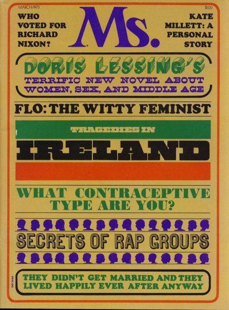
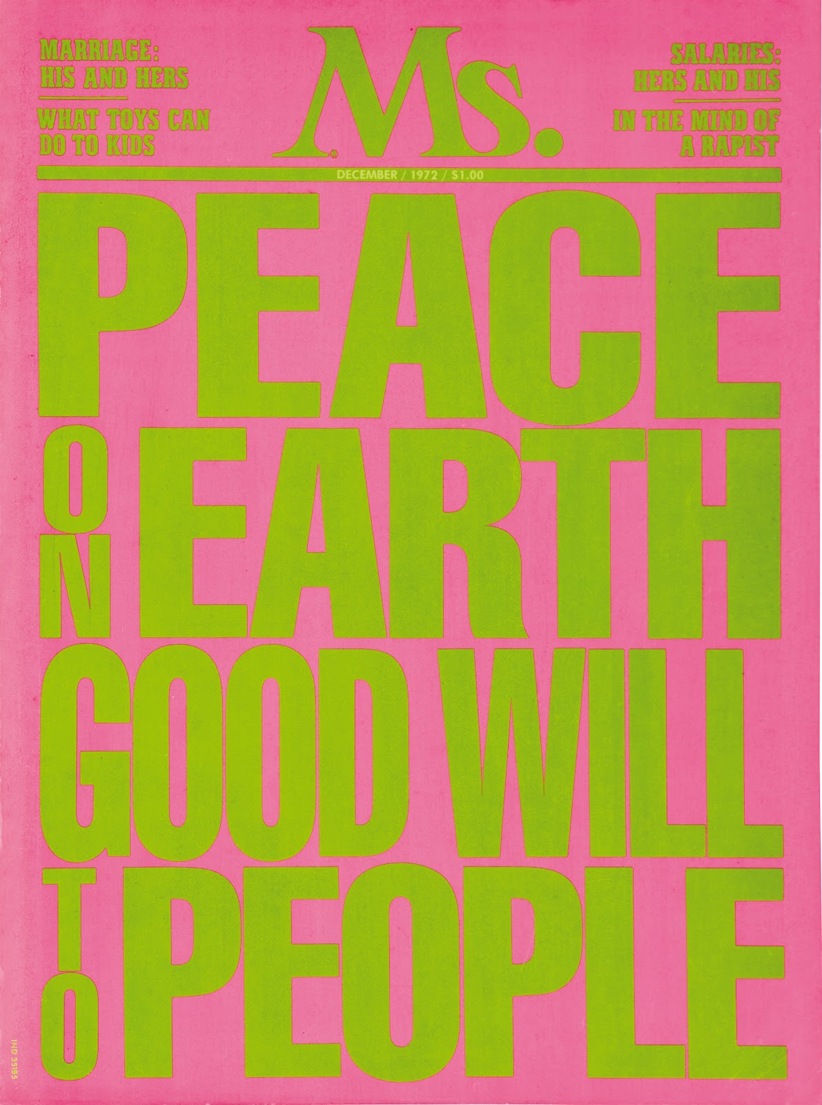
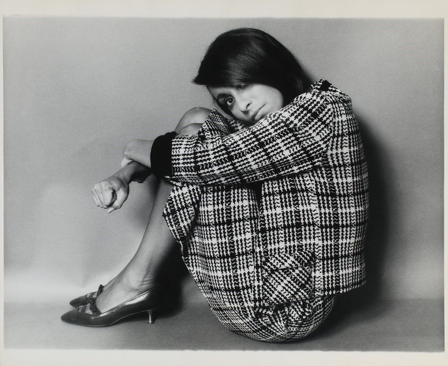
Portrait of Bea Feitler

Famous works during her career

Beatriz(Bea) Feitler’s career as a female art director during her time was undoubtedly short but very successful. Her bold, colourful style is all about making good design with impactful messages.

Spread from Harper’s Bazaar, 1966

In her words, “A magazine should flow. … you have to visualize what comes before and after. Good editorial design is all about creating a harmonic flow.” I personally think that these spreads from the Harper’s Bazaar magazine perfectly explains her style and approach when it comes to design. Funky, bold, niche, yet flows beautifully.

Cover design for Ms. Magazine

 In 1972, Bea feitler moved on from Harper’s Bazaar and became the art director at Ms. , which was a women’s’ magazine that focused on feminist themes, and this was the perfect chance for her to take on an opportunity that gave her more freedom to express her creativity and thoughts.

Cover design for Ms. Magazine

As her coworker Carl Barile once said, “In one sense, Feitler was always the original feminist,” and you can see how these themes play out in her works while she directed for Ms., the content Bea Feitler created were witty, funny, slightly controversial, and were a voice for women.

Blog post 4: Postmodernism in Europe

Zuzana Licko

Zuzana Licko

After learning about Zuzana Licko through my Pecha Kucha research, I think it’s only natural to write about this wonderful designer. At the beginning of the digital revolution, Licko and her husband, Rudy Vanderlans were some of the first designers to utilize the Macintosh for digital type design work.

Emigre Magazine issues 1-6

They published the typography in the Magazine issue, Emigre which was established by the couple in 1984. Since then, Zuzana went on to create a revolutionary impact during early digital type design.

Designed in 1985, the LO-RES font family remains to be one of the first yet most iconic fonts of early digital typefaces. As you might be able to tell, this pixelated font would often be used in video games and computer interface design.

Emigre website

Emigre office, 1985

in 1985, Zuzana and Rudy established Emigre type foundry, which now includes hundreds of fonts created by great type designers.

Mrs. Eaves

Filosofia

These two fonts, Mrs. Eaves and Filosofia, are arguably Zuzana’s most famous fonts. They evolved from Baskerville and Bodoni.

Slowly, Emigre evolved into a larger design company. Now, not only does their website include fonts, but they also sell textile patterns, ceramics, and even original emigre magazine issues.

Blog Post 2: Psychedelic Design Hero

The Acid Aesthetic and its Origins

Grateful Dead 1966 Concert poster
Grateful Dead

Swirling, vibrating, moving, tripping. Whatever you call it, we can all agree that the psychedelic aesthetic was trippy, to say the least! These were all defining characteristics of posters for bands in the 1960s.

Posters by Wes Wilson

As the LSD drug (lysergic acid diethylamide) was popularized amongst young people in the 60s, it brought out a completely new look in the world of visual design. Not only do these posters reflect what an acid trip would look like, but they also reflect the energy of pop culture during that time. For example, The Grateful Dead’s rise in the 60s also echoes the elements in these posters. People at that time loved the elements of rock, more specifically, “psychedelic rock”, which is an original style from the band. Freeing, hardcore, elliptical—— these are all expressed in the posters and the music.

Taking inspiration from Art Nouveau

Art Nouveau poster

So where did these elements take inspiration from? Well, it may be clear now that the swirly, flowing movement and flat, graphic look of figures definitely takes inspiration from the Art Nouveau movement. You could say it’s all a part of “hippie poetry”.

The original illustration of the Grateful Dead’s concert poster