The Acid Aesthetic and its Origins
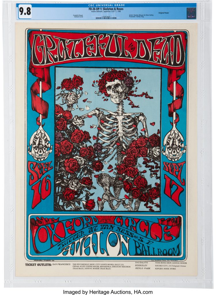
Swirling, vibrating, moving, tripping. Whatever you call it, we can all agree that the psychedelic aesthetic was trippy, to say the least! These were all defining characteristics of posters for bands in the 1960s.
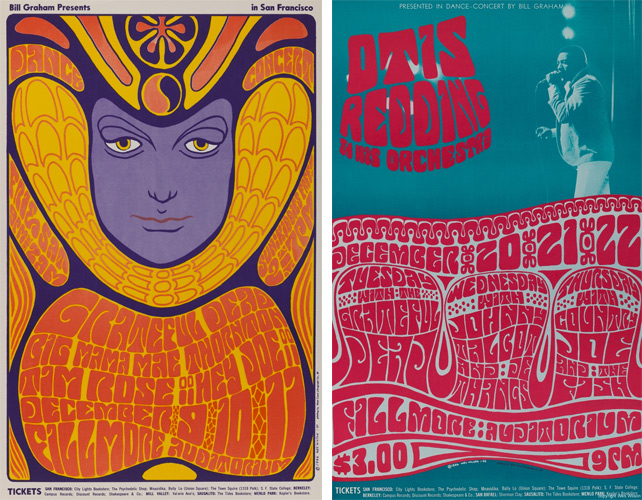
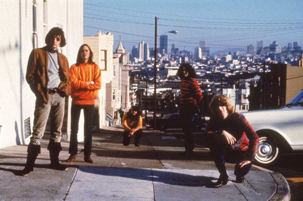
As the LSD drug (lysergic acid diethylamide) was popularized amongst young people in the 60s, it brought out a completely new look in the world of visual design. Not only do these posters reflect what an acid trip would look like, but they also reflect the energy of pop culture during that time. For example, The Grateful Dead’s rise in the 60s also echoes the elements in these posters. People at that time loved the elements of rock, more specifically, “psychedelic rock”, which is an original style from the band. Freeing, hardcore, elliptical—— these are all expressed in the posters and the music.
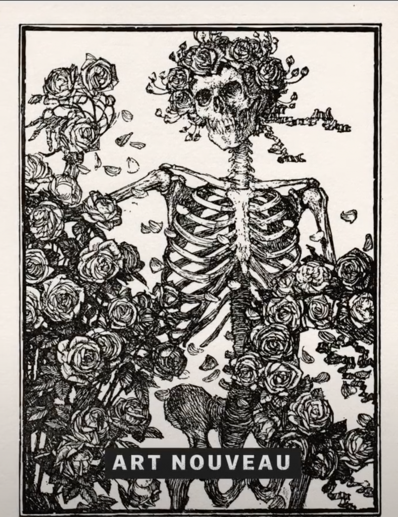
Taking inspiration from Art Nouveau
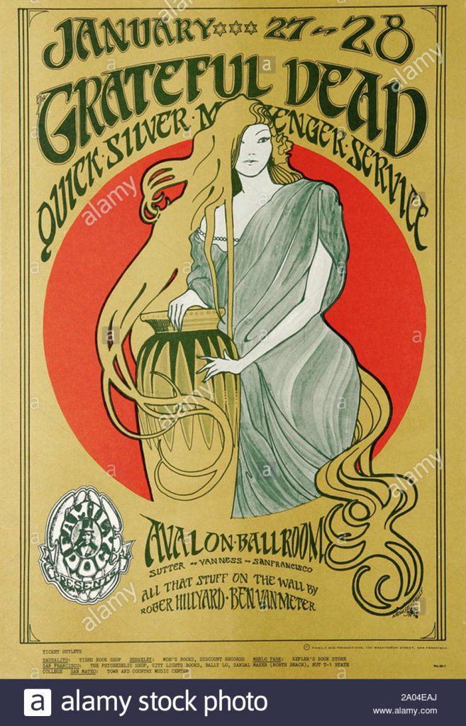
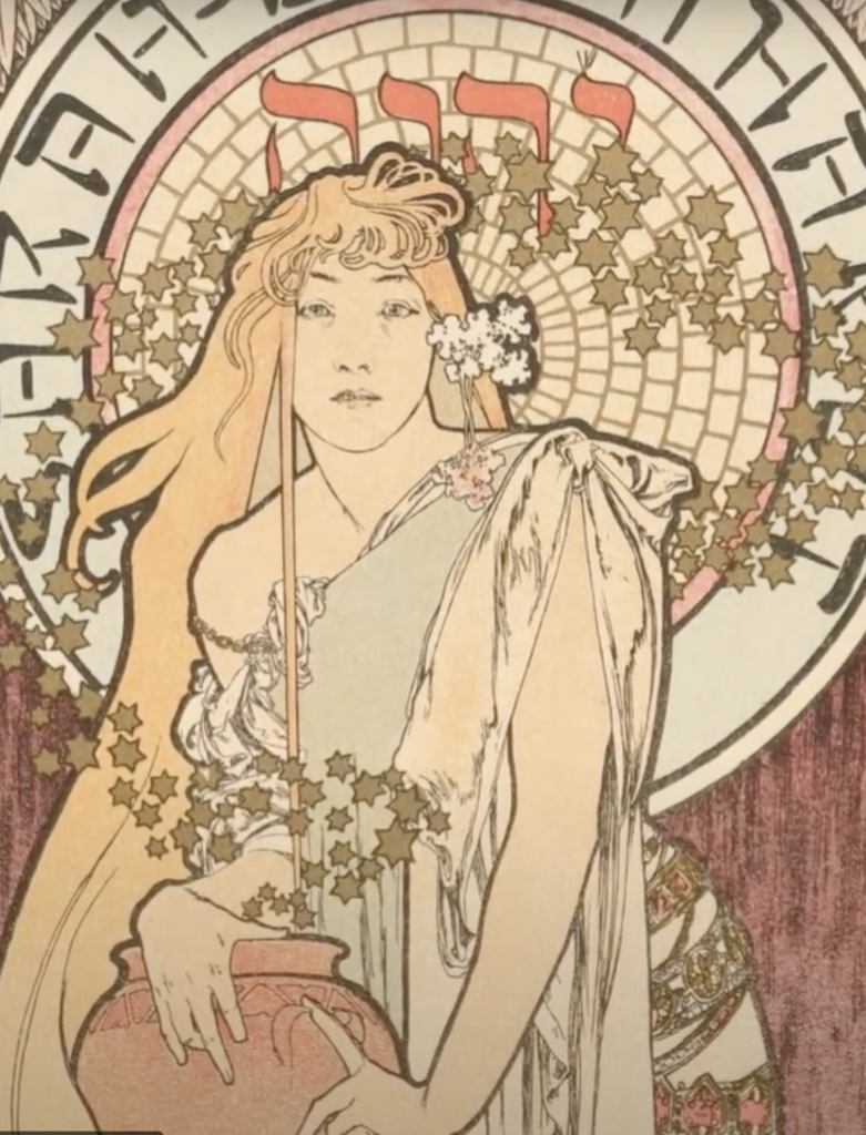
So where did these elements take inspiration from? Well, it may be clear now that the swirly, flowing movement and flat, graphic look of figures definitely takes inspiration from the Art Nouveau movement. You could say it’s all a part of “hippie poetry”.
