“I believe that in design, 30 percent dignity, 20 percent beauty and 50 percent absurdity are necessary,”
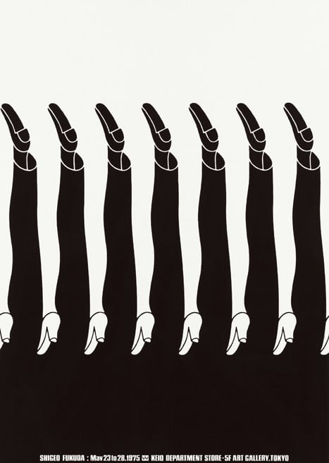
Heavily drawn by illusionism, graphic designer Shigeo Fukuda created extremely creative and compelling works using simple imagery.
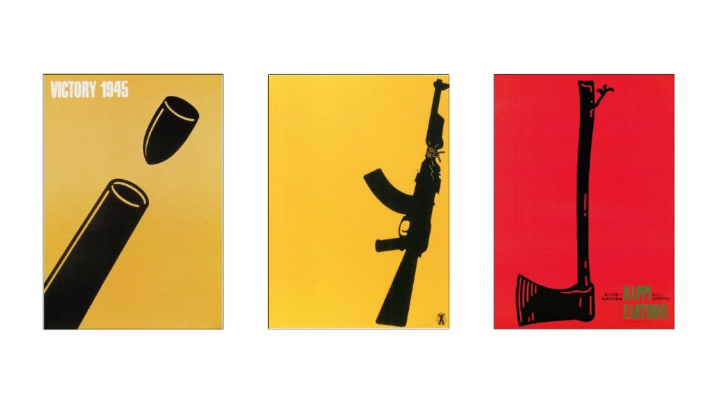
L: Victory 1945 M: Untitled 02 in 1982 R: Happy Earth Day in 1982Shigeo Fukuda
Shigeo Fukuda was known to be an antiwar advocate, and he is truly a master of creating unique visuals with deep meanings and impactful messages. I consider him to be someone I look up to when it comes to visual communication.
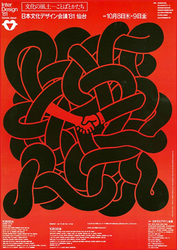
Interdesign 81′
He believed in peace, and many of his most famous posters’ messages involved satirizing the senselessness of war. By cleverly utilizing simple shapes and negative space, he is able to construct imagery that draws you in with its layering of illusion. The symbols immediately catch the eye as the dots are connected to understand his intention.
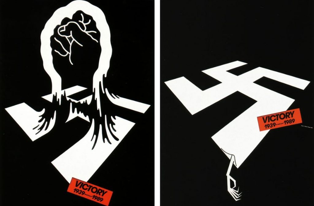
Falling bombs form an image of a skull in this antiwar poster from 1968From the “Victory” series
Shigeo Fukuda’s way of thinking when he approaches design is fascinating, the way he interprets different subjects and utilizes visual elements is something we can all learn from. I personally feel like he is one of those designers whose works speak for itself upon a first glance. These works all scream “we want peace” to me.
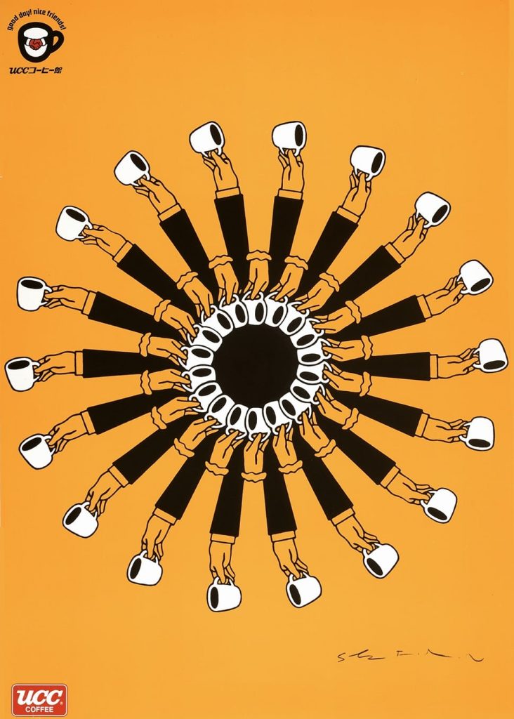
I love how these are confusing to look at in a good way. I think that’s one of the hardest things to achieve in design, The New York Times referred to them as “[distilling] complex concepts into compelling images of logo-simplicity.” This is a perfect description of how masterfully Shigeo Fukuda can interpret a concept.
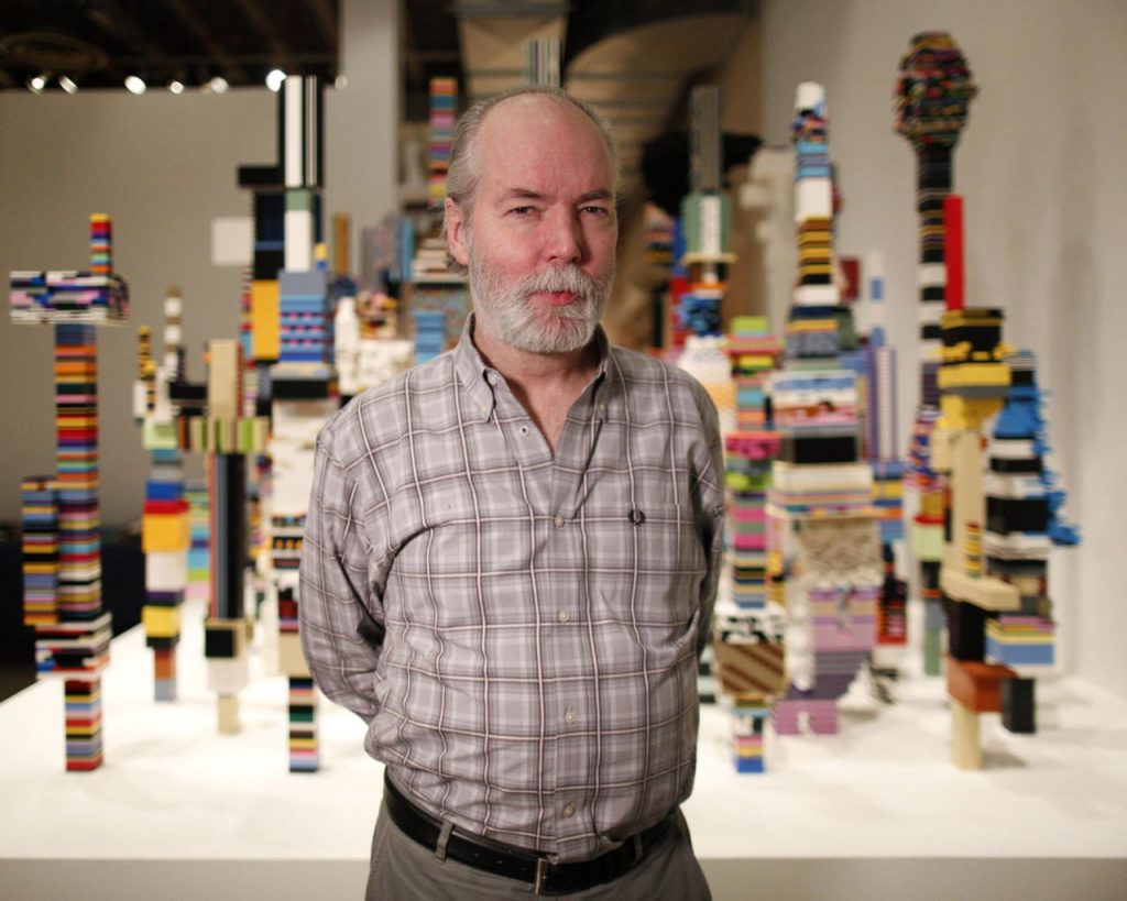
Douglas Coupland is an extremely talented artist, writer, and designer from Vancouver. I am fascinated by how contemporary and modern his works are, especially his sculptures. He has made many works contributing to the exploration of the Canadian identity.
According to Douglas Coupland, ” [he] did 10 of them in 2 days and shortened [his] life by about a year by doing all that so quickly.” How relatable as a creator. However, the idea behind this still-life photography still amazes me. He purposely took time to find these objects that represented a modern-day Canadian era and placed them in a format that resembled a still life painting. Instead of the traditional objects like fruits, plates, and tablecloths, he wanted to express that the time we are experiencing now is the same as any other time in history. What a thought-provoking concept.
installation view of Douglas Coupland: everywhere is anywhere is anything is everything, exhibit at the Vancouver Art Gallery, May 31 to September 1, 2014Towers, 2014
Postmodern sculptures of architecture are a common theme seen in Coupland’s works. This concept that seemed like a dystopian interpretation of society’s progression emerged from his post-war upbringing. It is a reflection and reaction to the over-optimized progress that he was exposed to in his childhood.
Digital Orca
Located near Vancouver Convention Centre, this iconic pixelated orca has become a famous symbol of Vancouver over the recent years. It blends beautifully with the harbour scenery around it, connecting Vancouver’s past and present of the ever-changing pace of this harbour.
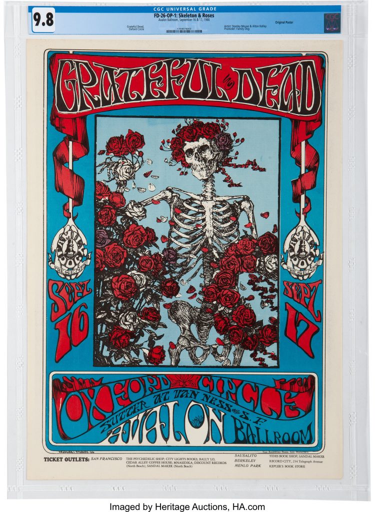
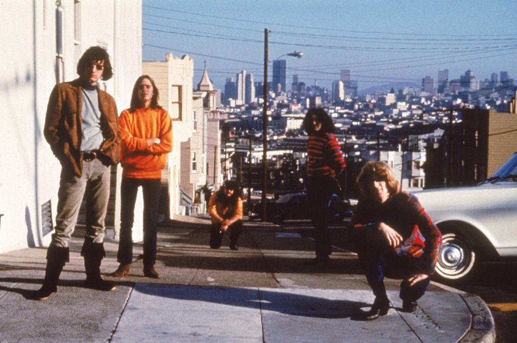
Swirling, vibrating, moving, tripping. Whatever you call it, we can all agree that the psychedelic aesthetic was trippy, to say the least! These were all defining characteristics of posters for bands in the 1960s.
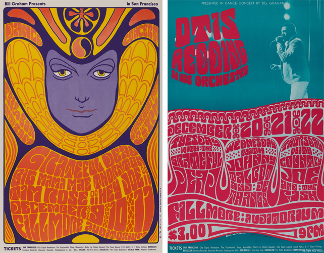
Posters by Wes Wilson
As the LSD drug (lysergic acid diethylamide) was popularized amongst young people in the 60s, it brought out a completely new look in the world of visual design. Not only do these posters reflect what an acid trip would look like, but they also reflect the energy of pop culture during that time. For example, The Grateful Dead’s rise in the 60s also echoes the elements in these posters. People at that time loved the elements of rock, more specifically, “psychedelic rock”, which is an original style from the band. Freeing, hardcore, elliptical—— these are all expressed in the posters and the music.
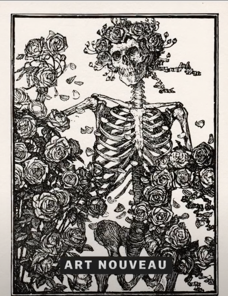
Taking inspiration from Art Nouveau
Art Nouveau poster
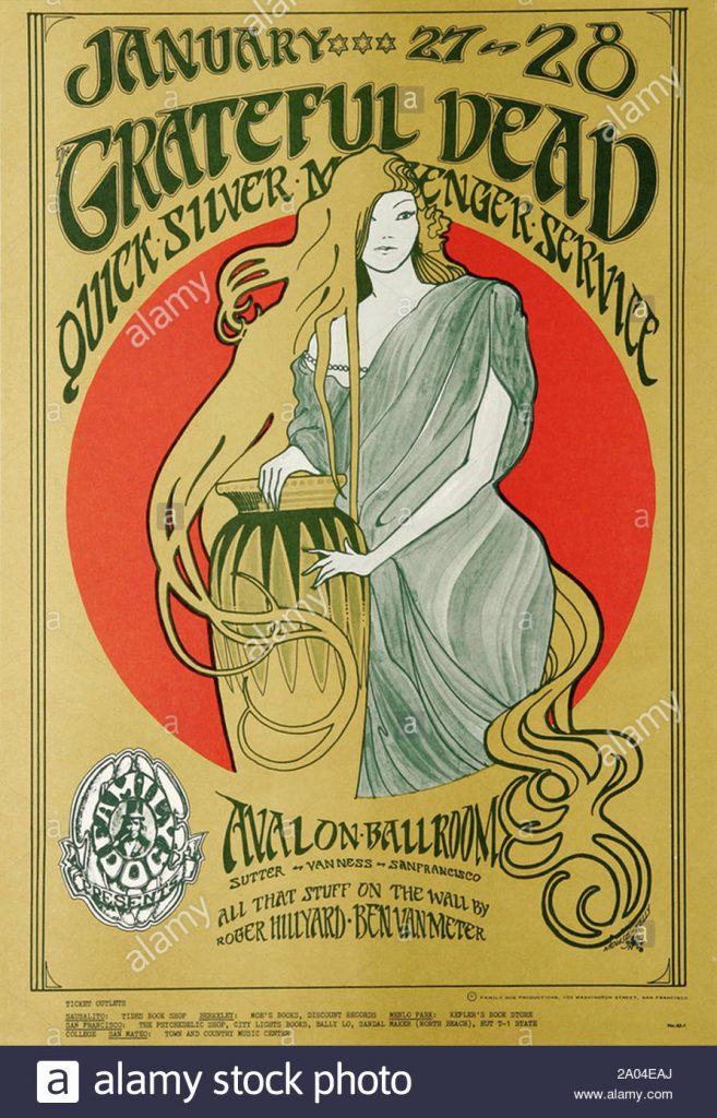
So where did these elements take inspiration from? Well, it may be clear now that the swirly, flowing movement and flat, graphic look of figures definitely takes inspiration from the Art Nouveau movement. You could say it’s all a part of “hippie poetry”.
The original illustration of the Grateful Dead’s concert poster
After learning about Zuzana Licko through my Pecha Kucha research, I think it’s only natural to write about this wonderful designer. At the beginning of the digital revolution, Licko and her husband, Rudy Vanderlans were some of the first designers to utilize the Macintosh for digital type design work.
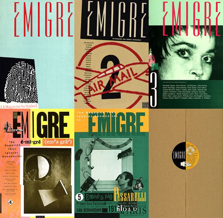
Emigre Magazine issues 1-6
They published the typography in the Magazine issue, Emigre which was established by the couple in 1984. Since then, Zuzana went on to create a revolutionary impact during early digital type design.
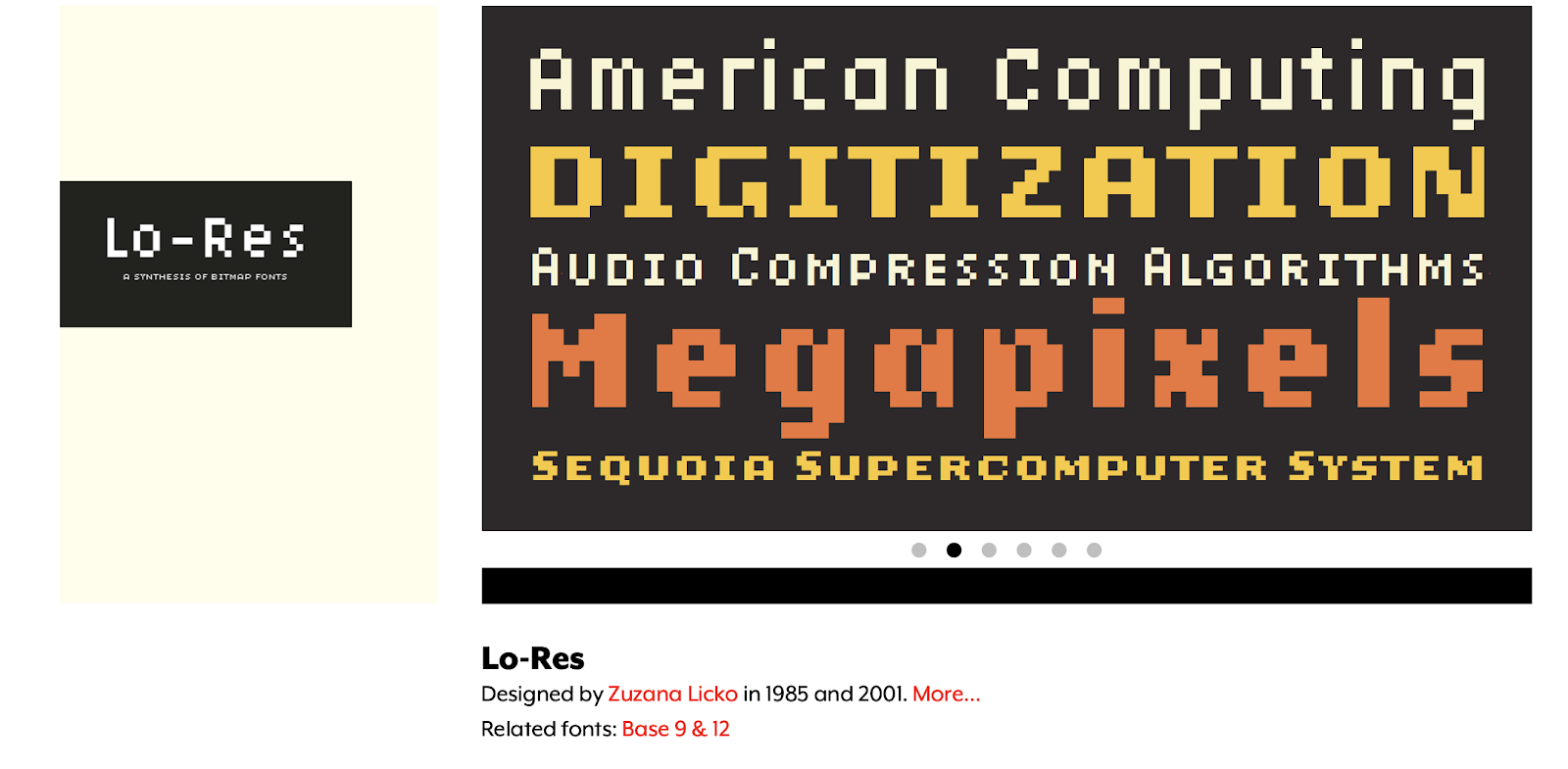
Designed in 1985, the LO-RES font family remains to be one of the first yet most iconic fonts of early digital typefaces. As you might be able to tell, this pixelated font would often be used in video games and computer interface design.
Emigre website
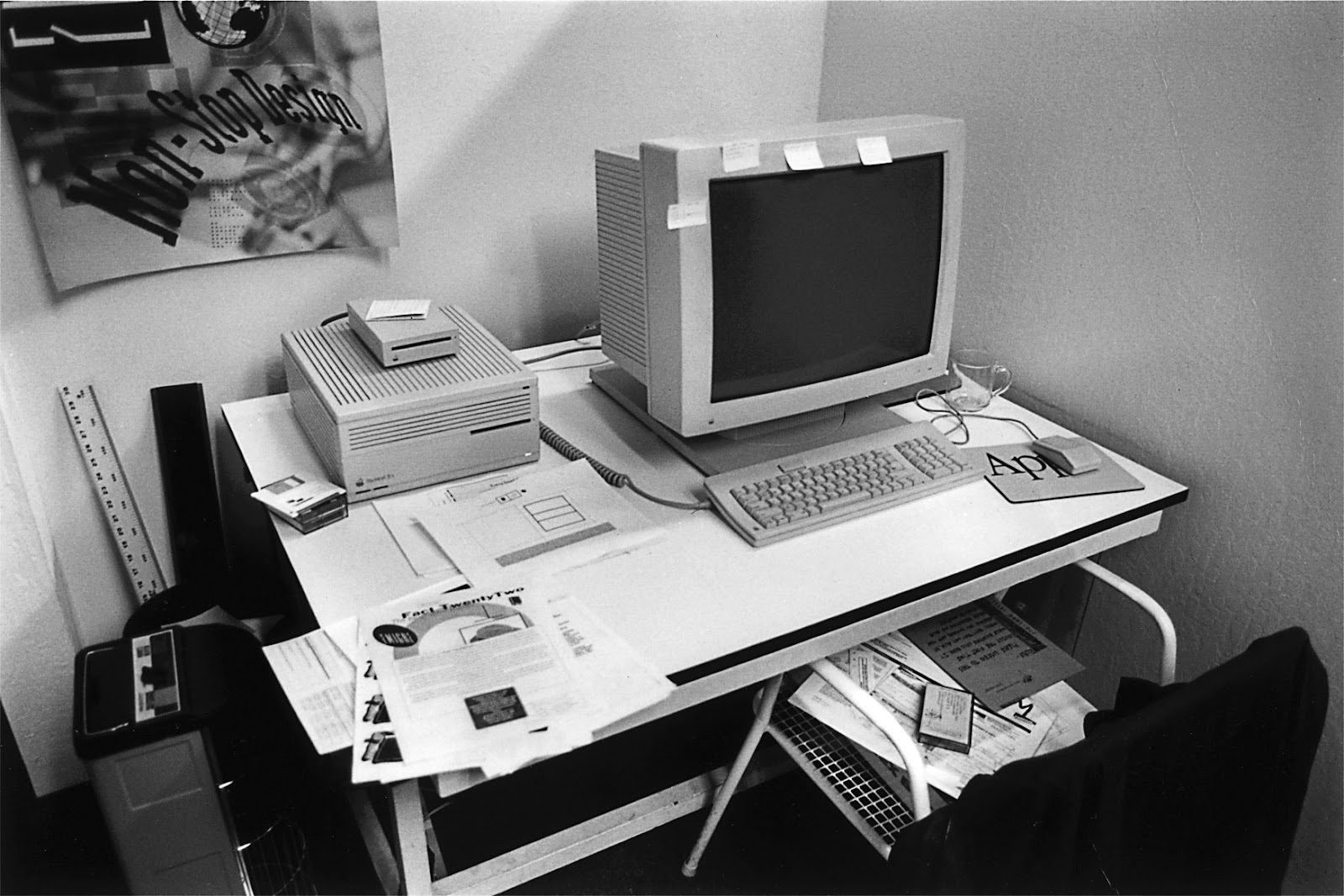
Emigre office, 1985
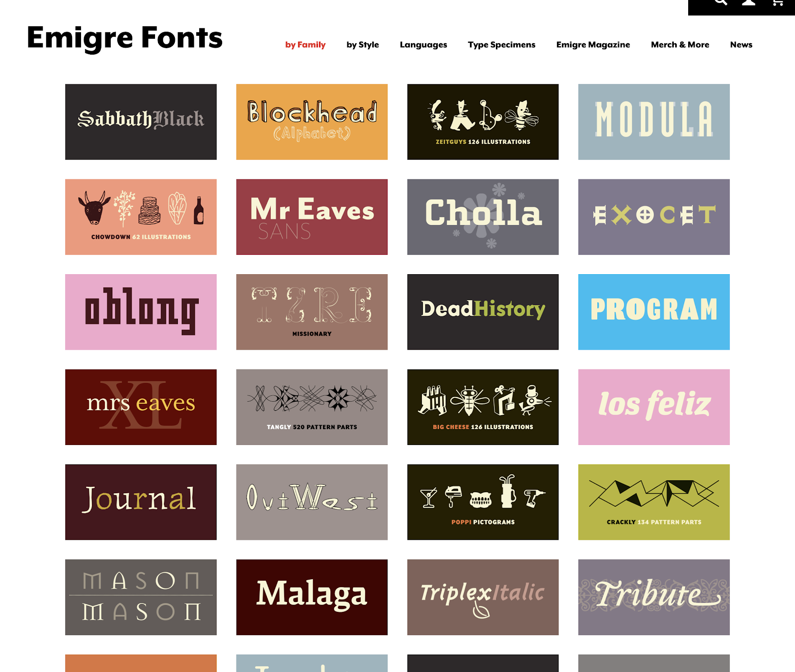
in 1985, Zuzana and Rudy established Emigre type foundry, which now includes hundreds of fonts created by great type designers.
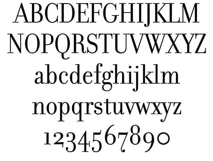
Mrs. Eaves
Filosofia
These two fonts, Mrs. Eaves and Filosofia, are arguably Zuzana’s most famous fonts. They evolved from Baskerville and Bodoni.
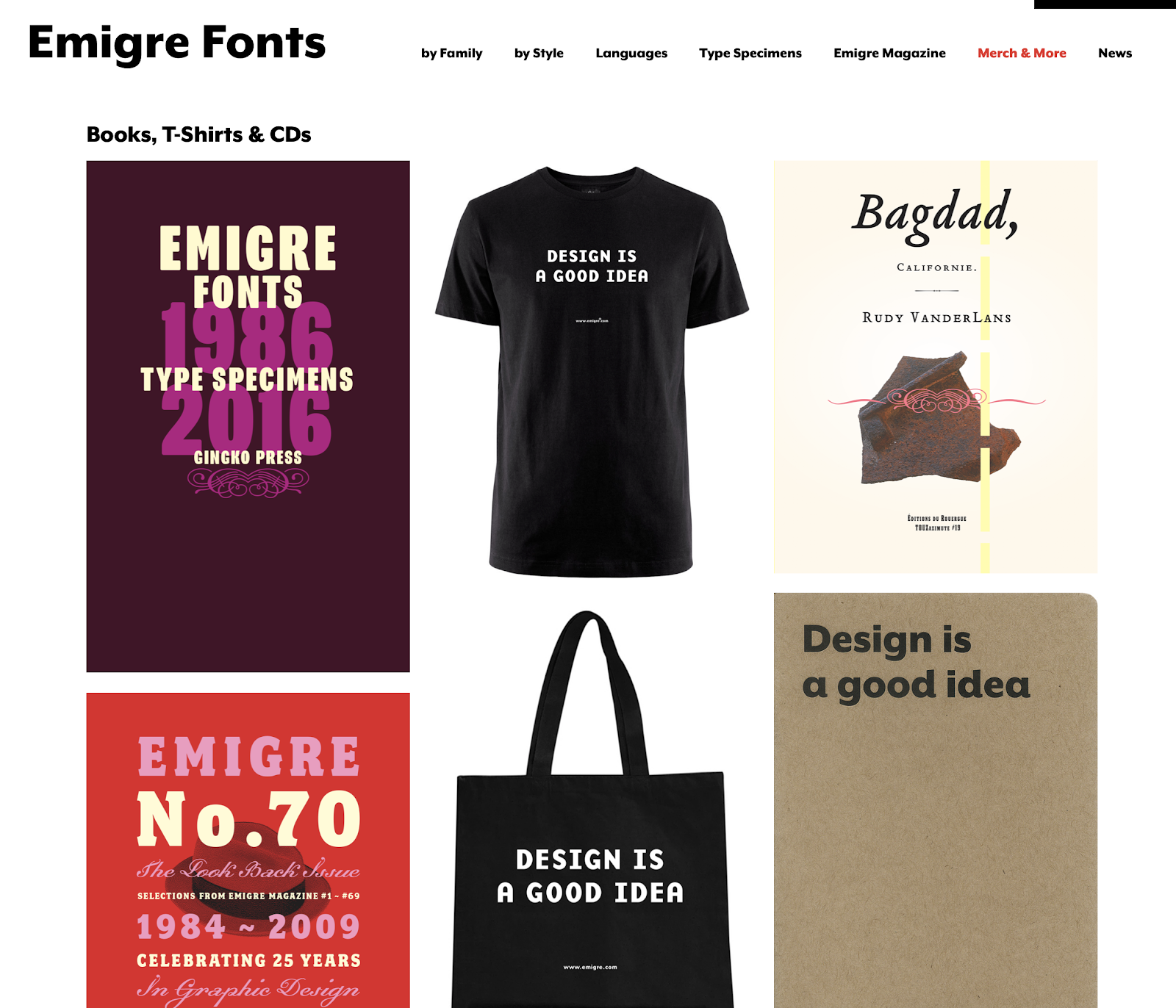
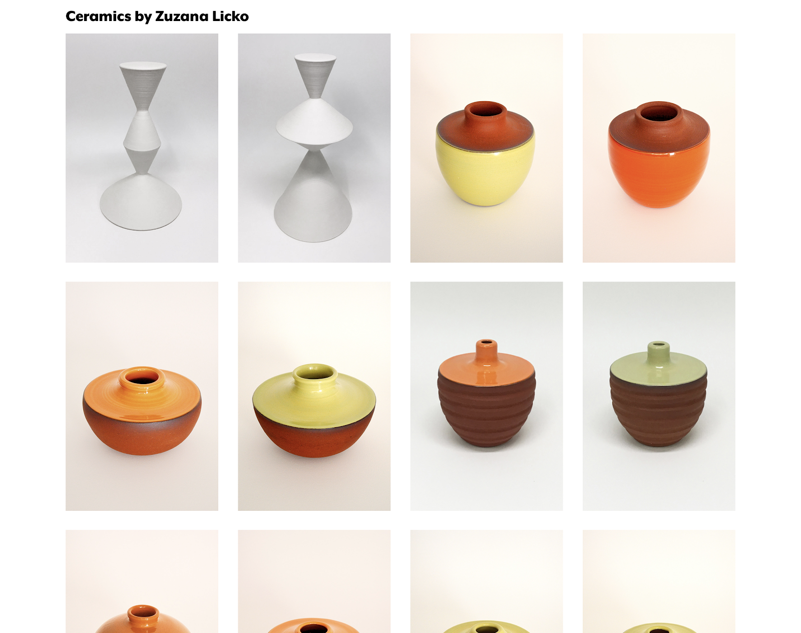
Slowly, Emigre evolved into a larger design company. Now, not only does their website include fonts, but they also sell textile patterns, ceramics, and even original emigre magazine issues.
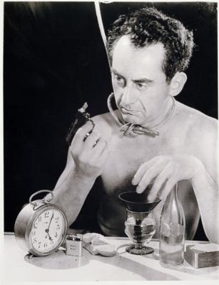
“I do not photograph nature, I photograph my visions.”
“Self Portrait with a Gun” (1932)
Biography
Man Ray (born as Emmanuel Radnitzky) was a successful American artist who transitioned from dadaism to surrealism. He is not a man living in the past, as he doesn’t even want to let people know of his original name. Man Ray is best known for his surrealist photography, which he calls “rayographs”, a pun on his name and the word “photograph”. In his teenage years, he often visited art museums and galleries with old masters’ paintings, which became sources of inspiration in his earlier years. His works exhibit many different styles, from cubism, dadaism, to surrealism. After he graduated from art school, He became close friends with Marcel Duchamp, and they influenced each other’s works on the journey of modern art.
Earlier works-paintings/sculptures
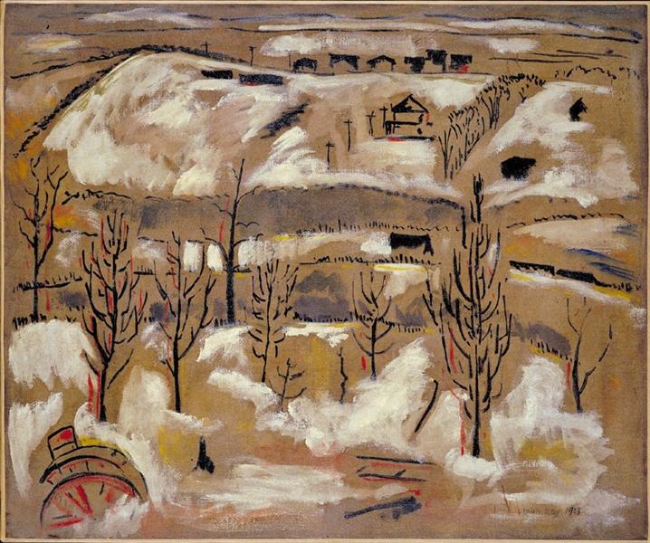
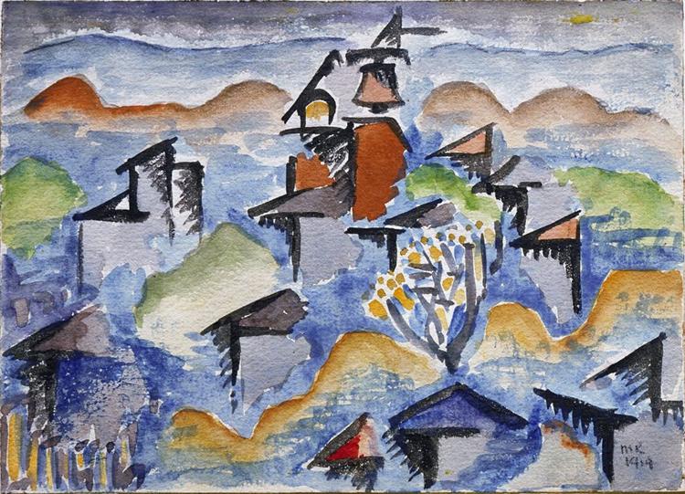
“the Hill” (1913)
In his earlier works, he often works with oil paintings and we can see how he transitions by starting off with a more dadaist style and approach. He did many landscapes and still lives in his earlier paintings.
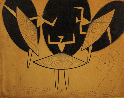
“Still Life with Red Tea Kettle” (1913)“Landscape” (1914)“Silhouette” (1916)
As we approach closer to the 1920s, we can see that Man Ray has adopted a more cubist style as a reaction to WWI, like many other artists of this period. The last piece titled “Silhouette” holds many iconic characteristics that would begin to appear later on in his photographs. The use of overlapping shapes, the composition, and the negative space would all become a consistent style seen in his works.
Rayographs/photography
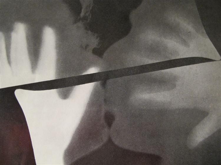
“The Kiss” (1922)
Finally, in 1922, his first “Rayograph” was born. In this photo, no cameras were used. Instead, he used a piece of paper that was exposed to light multiple times, using the kissing heads of his lover and himself as a stencil on the paper to create the shapes in this image. I wonder if he was inspired by Gustav Klimt’s version of “The Kiss” for this piece.
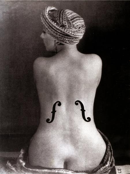
“Ingres’s violin” (1924)
This is a piece referencing ean Auguste Dominique Ingres’s painting of a nude woman, titled “La grande baigneuse”. However, in Ray’s version, he combines the shape of a woman with characteristics of a violin, which becomes another classic theme seen in his works: objects and women’s figures. This photo is One of his most iconic pieces in the era of surrealism.
From the series, “Électricité“, 1931
Possibly the best example of his surrealist style in photography. During that time, electricity was not very commonly used for household energy consumption. This series was commissioned by the French electric company (La Campagnie Parisiene de Distribution d’Électricité) as an advertisement/promotion of electricity during the interwar period. Ray’s visual representation of electricity in our lives is indeed surreal and captiviating, as he combines the theme of electricity with nude figures of women, and roasted chicken.
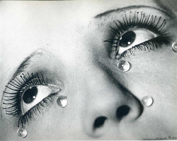
“Glass Tears” (1932)
This piece shows a more cinematic/film-like approach. Using a mannequin with glass beads on its cheek, Ray wanted to convey the theme of “revenge”, which originated from his heartbreaking break-up with his lover, Lee Miller. The cropping of the image amplifies emotion seen through the eyes, and many believe he challenges the definition of reality and still life photography in this piece.
Reflection
Honestly speaking, although I am personally not a big fan of the movements during this era, I loved seeing Man Ray’s works. It was simply fascinating to witness his evolution through many movements of this era, as his works was an amalgamation and embodiment of some of the most iconic artistic themes during this time. I think that he’s a successful artist for being able to capture the essence of this time period through his works.
A Polish artist who helped bring modern art to Poland.
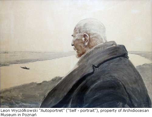
“self portrait” (1913)
About the artist
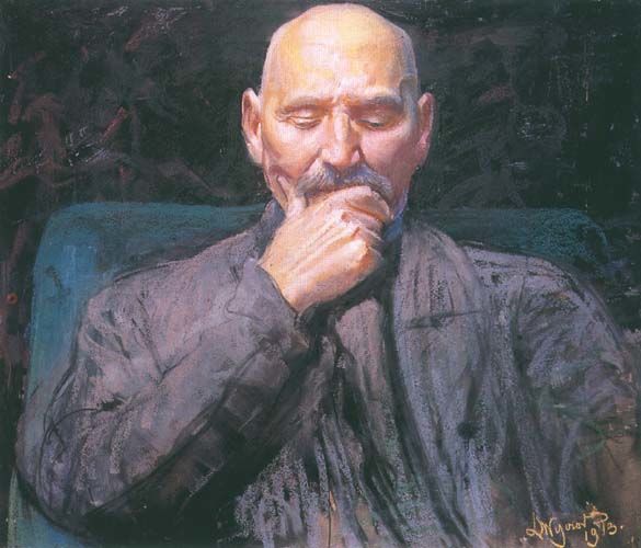
Leon Wyczółkowski was a realist painter who helped bring the Young Poland Movement to its success. The young Poland movement was a revolutionary change for art, literature, and music in Poland since modernism and symbolism in art began to find its way into the country. He was a realist/impressionist painter who studied at several different fine arts academies in Poland and produced over 700 works in his lifetime. Later in his career, he began exploring graphic art and sculpture and also became the president of the Academy of Fine Arts in Kraków. His works often convey a strong feeling of a certain mood in daily life, through his style of color usage and tones.
I really resonate with his style of painting. I love the way he depicts the feeling of solitude with the simple composition, and a very muddy, grey background (not a bad thing at all!). I just love the foggy landscape that have a strong sense of depth, and the gaze of himself in the foreground feels absolutely melancholic although I cannot even see his eyes! This painting almost makes me feel sad and nostalgic, and allows me to ponder a lot. But I love that he is able to convey these emotions.
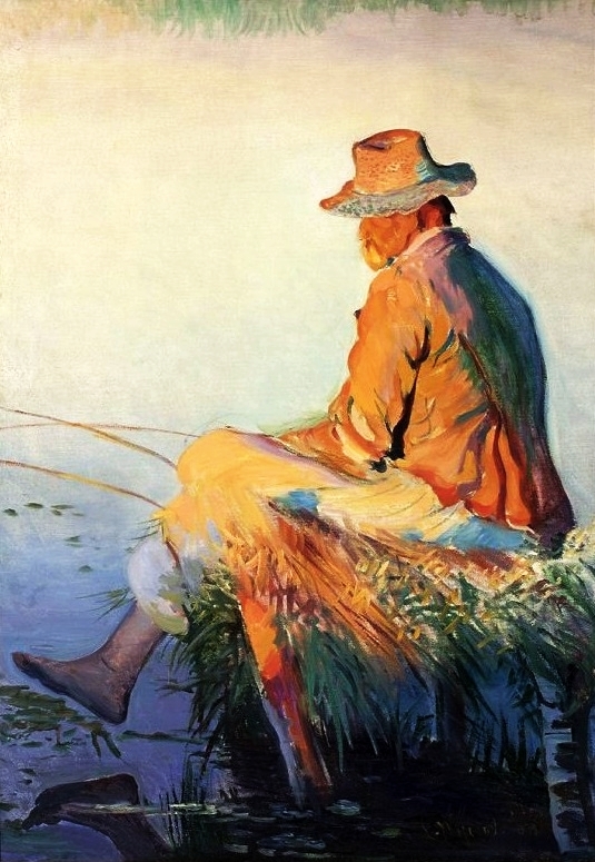
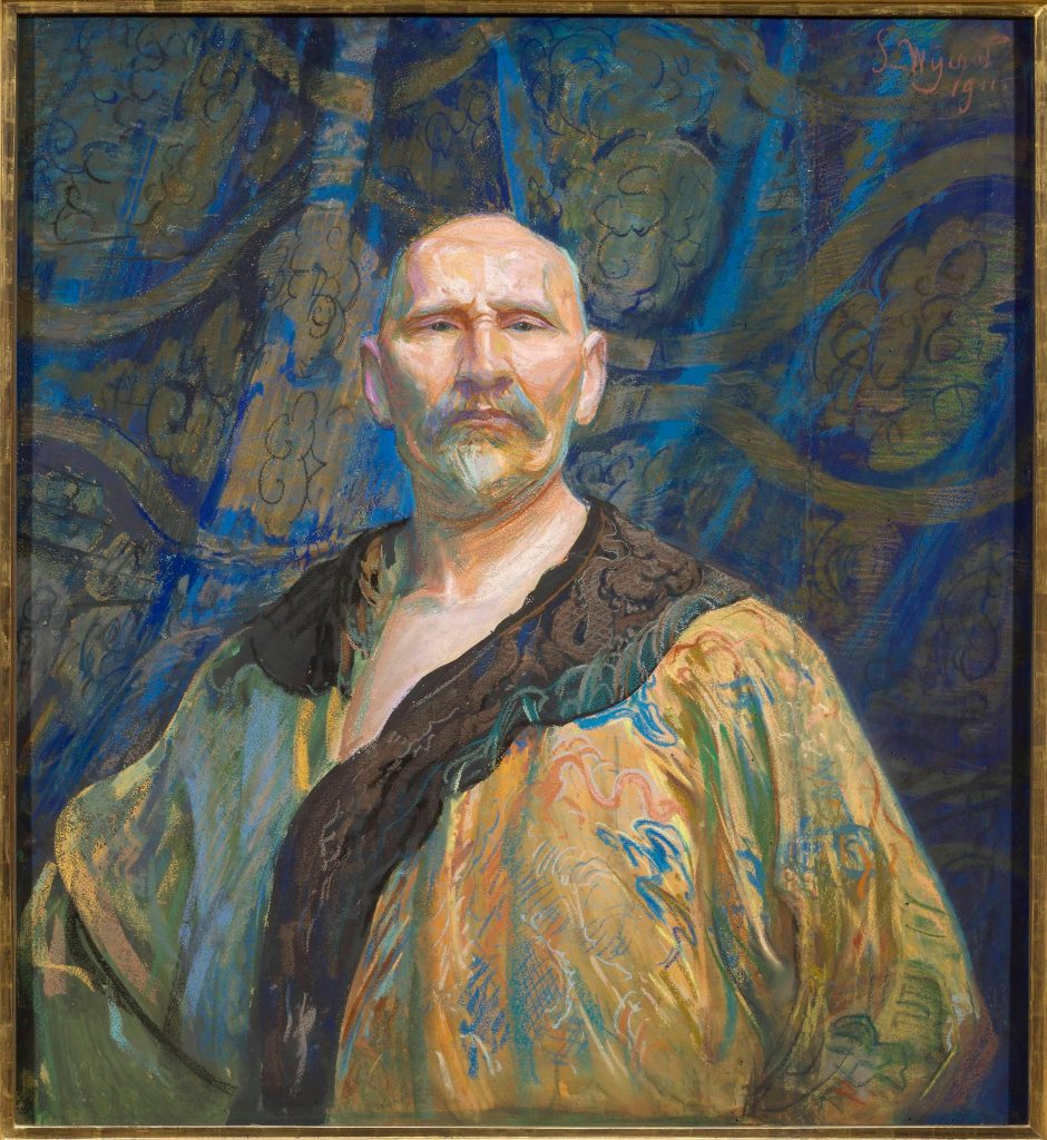
“Untitled” (1911)
This is a classic representation of his style. The usage of saturated blues in the atmospheric light in his paintings, and the back of a human figure facing towards somewhere the audience cannot see. I think this is why many of his paintings feel melancholic. However, I personally feel that the mood of this painting feels more comforting and peaceful rather than sad. The slight extension of the leg towards the water, and the warm sunlight shining on the figure captures the small feeling of assured peacefulness in this very short moment of this fisherman’s day (personal feeling).
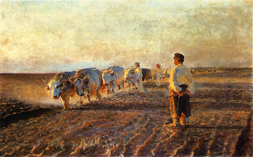
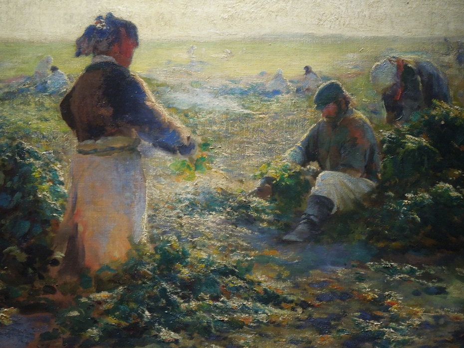
“Ploughing in Ukraine” (1892)“Untitled” (1893)
He loved painting the working class. I feel like the way he paints in the last photo especially shows how he blurs the lines between realism and impressionism. He uses both techniques, as he captures a brief moment of the day with seemingly loose brushwork, but also captures the mood and certain details of his subjects very well. Again, the people in his paintings are not looking directly at the viewer, instead, they are working away at the task at hand. I think he intends to show this feeling of the workers’ diligence and mood in their daily life by painting the way they focus on their work.
“Self portrait in Chinese tailoring”
Like many artists during his time, Wyczółkowski was also greatly influenced by Chinese, Japanese, and asian art. This is often seen through the pattern and subjects in his paintings. Another aspect that often stands out, again, is the usage of blue. He loves to use saturated azure blue for his shadows, instead of making them very dark. It almost gives his paintings a velvety look.
Reflection
I thoroughly enjoyed viewing and learning about Wyczółkowski through his artworks. I think the reason I resonate with his style so much is simply becasue he is able to capture what I want to achieve——the mood of nostalgia. Not as in I personally experienced the scenes in his paintings myself, but the way he delivers the feeling as if you were there, as if you can recall a memory where you experienced the same thing. I think artists who are able to convey these emotions through a frame of a moment are amazing.
You’ve definitely heard of a few artists of this period, but have you noticed the iconic style of color usage in their paintings?
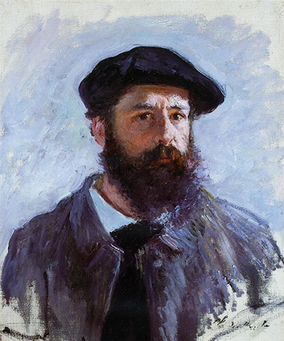
Claude Monet: The Father of Impressionism
Claude Monet (1840-1926)
I think we’ve all heard of him, haven’t we? Let’s talk about the characteristics of the way he changed color usage in paintings.
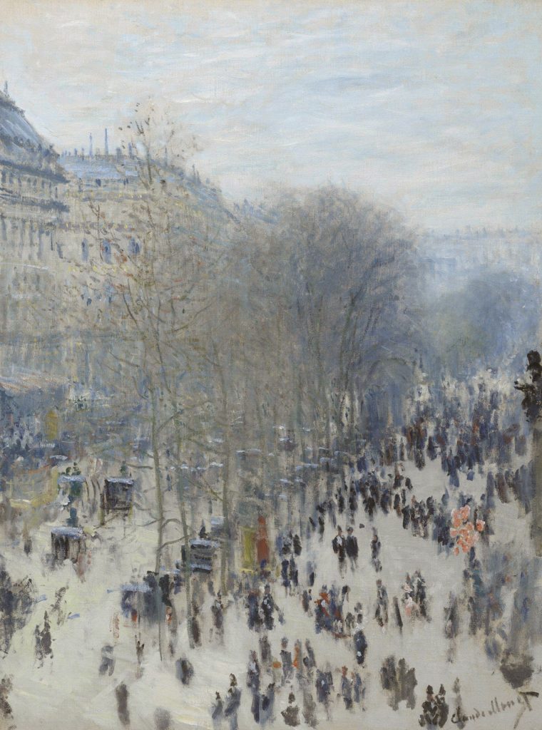
“Boulevard de Capucine” (1873)
Claude Monet is known to be the one who caused impressionism to rise. He paints the motif or the “impression” of a scene by being in the environment and quickly capturing a moment. Though these paintings may look “sketchy” and loose, he is a master of controlling the balance of colors, by balancing foggy, muted colors with saturated atmospheric colors. This is the iconic character of color usage in impressionist paintings.
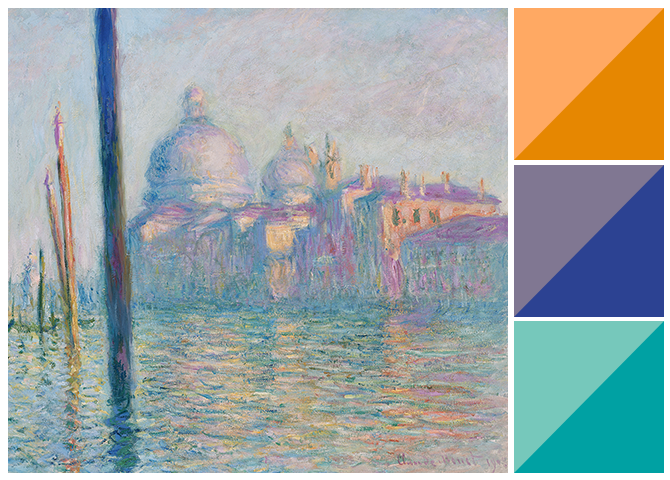
“The Grand Canal” (1908)
As seen in this painting, Monet’s colours are often low in contrast of values, but high in contrast of saturation. This would become a classic style of impressionist colors.
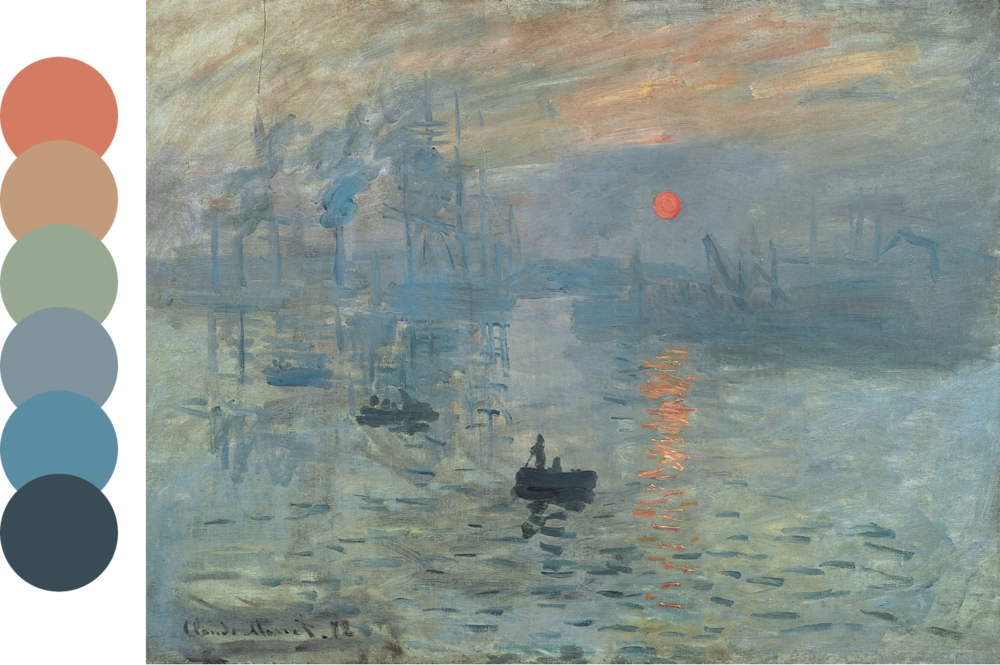
“Impression, sunrise” (1874)
Another great example of the foggy, soft, and low contrast impressionistic colours.
Many great impressionist artists who were influenced by Monet use this same style of color combinations in their artworks.
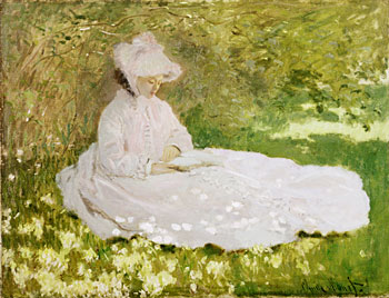
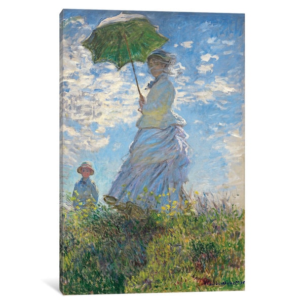
“The Reader” (1872)“Woman with a Parasol” (1875)
This is where we begin to see a common theme emerge from the paintings in this era: the Victorian Gibson girls. From here we move on to fashion.
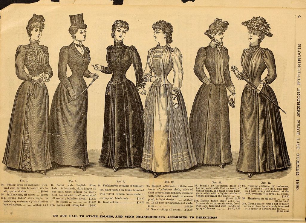
Women’s Fashion: Victorian style
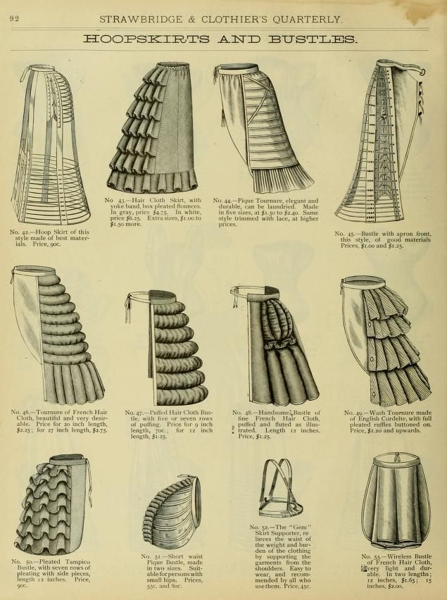
Noble women in the late 19th century usually had the standard Victorian combo: Bustles, high updos, corsets, and draped, frilly dresses.
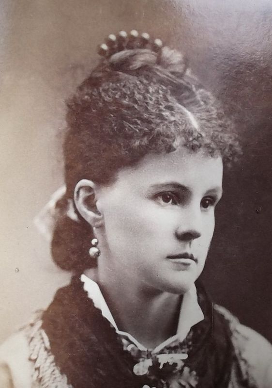
Example of the trendy hairstyle in the late 19th century
As seen in Monet’s paintings, women often wore high, curly updos with lots of buns and braids. The hair got even taller once bustles became the “hot new thing”!
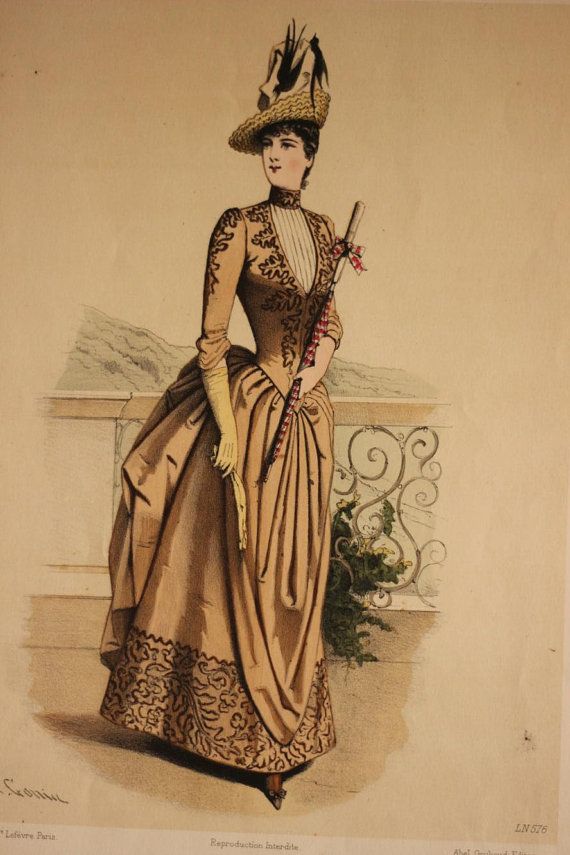
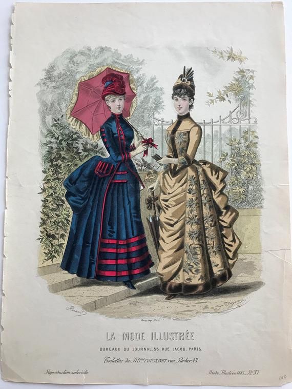
French women fashion in the late 19th centuryBustles and hoop skirts were used to accentuate the bottom half of a woman’s figureClassic Victorian fashion trends at its peak
The large, exaggerated bustles in contrast to a tiny waist was very common. The dresses reached their max fullness in volume, and it was beginning to get a little too fancy.
However, bustles began to back out of the fashion trend near the beginning of the 20th century.
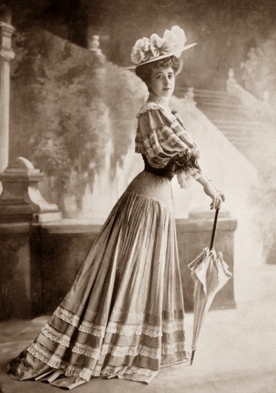
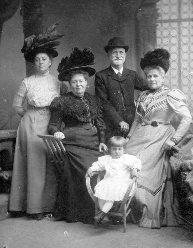
Early Edwardian era fashion
Here, we see the fashion trend moving towards a new era: the Edwardian era. The Edwardian era represented a more serious, well-conducted, and strict fashion trend. The skirts began to diminish in size, as well as the height of women’s hair. Instead, a straighter, slimmer silhouette of simpler dresses was much more preferred, and the big hats became very trendy.
The Edwardian era fashion standards
As we can see here, women’s dresses were much more toned-down in terms of puffs, frills, and fancy folds. They were almost suit-like.
A family in the Edwardian era, with classic big hats and formal, mature attire
Technology: the Watt engine-new and improved steam engine!
Watt said it’s time for the steam engine 1.1 update.
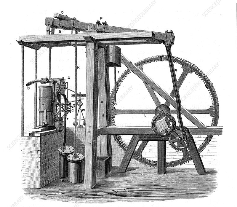
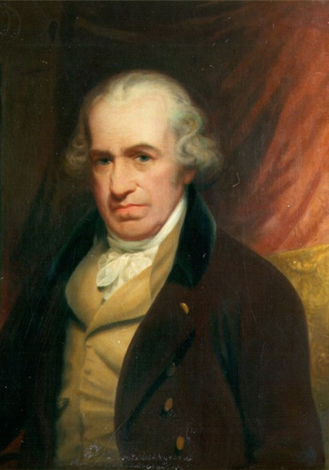
The invention of the steam engine was no doubt a revolutionary leap towards a thriving industrialized society. James Watt, a mathematical-instrument maker, was the one who made the Watt engine, a revised version of the original prototype——the Newcomen atmospheric steam engine. While Watt attempted to fix a Newcomen engine, He was not impressed with the waste of resources that Newcomen atmospheric steam engine causes and realized that all the luscious energy and heat being lost in the process needed compensation. Watt added another compressor, reducing the steam consumption and upgrading efficiency. He partnered up with a British inventor, John Roebuck, and successfully launched the Watt engine in 1777-1778. Pumping water from mines has never been easier for them!
Watt’s version of the steam engine greatly improved efficiency and reduced energy consumption.James Watt (1736-1819)
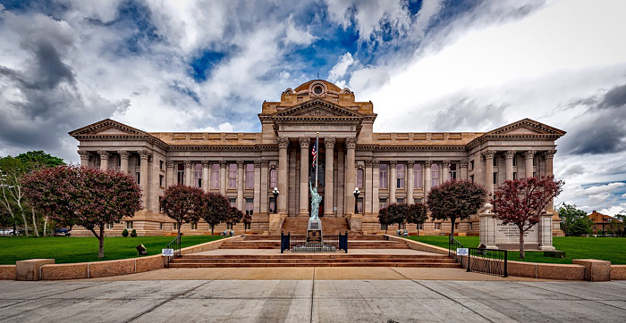
Architecture: Neoclassical Architecture-going back to Ancient Greece and Rome
Have you ever wondered why the White House and many other important buildings look like this?
Greatly inspired by Ancient Greek and Roman architecture, the neoclassical style emerges in the mid-18th century. The consistent designs of these buildings have many common themes: grand simplicity, geometrical harmony, usage of columns, and classical nobleness. This style is believed to be a reaction to the Rococo and Baroque period, which focused more on ornamental elements and sophisticated designs. Learning from the old masters of architecture was definitely a trend back in the days. Neoclassical architecture spread through Europe quickly, and today we can see these elements being used commonly in governmental buildings, theatres, museums, and other buildings that require a visually grand scale. This is why the Neoclassical form is often associated with power, seriousness, and grandness.
Pueblo County Courthouse, Pueblo, Colorado USAU.S. Capitol building in Washington DCThe White House in Washington DC
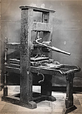
Johannes Gutenberg can be considered the father of western printing technology. He replaced wood-based printing with metal text blocks in 1450, which is the first metal movable type. This was a revolutionary step to printing in Germany, as it allowed books to be printed in large quantities of copies.
Gutenberg’s printing press
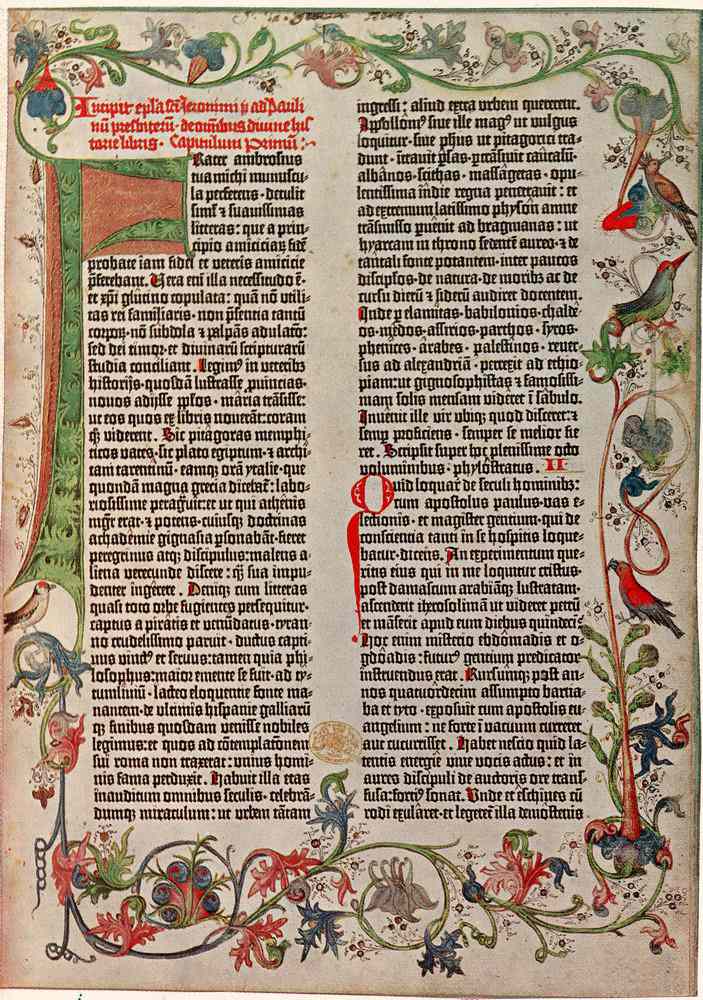
It is believed that Gutenberg had borrowed money from a business partner who believed in Gutenberg’s innovative idea—-Johann Fust. Fust lent 800 guilders to Gutenberg which kickstarted the printing career (Gutenberg was kinda broke). Gutenberg continued to improve the press while updating new versions of it, slowly but surely perfecting what he had to work with. In 1455, Gutenberg published the 42-line Bible which contained easy-to-read text in gothic font, and even colored illustrations, which was very popular amongst the churches. Great job at finding your first target audience, Gutenberg :).
The Gutenberg 42-line Bible
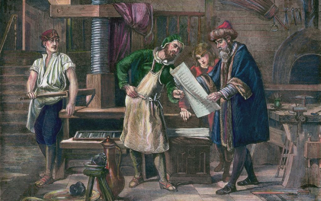
However, in 1456, Fust grew impatient and demanded the loan to be returned. This issue quickly escalated to court, and Gutenberg lost the trial. In the end, Gutenberg was unable to pay 2,026 guilders (gasp) —- much more than the original amount because of added interests. This resulted in his invention being taken away from him, and the press was handed to Fust (come on Gutenberg, you can do better than that). Fust carried on with this technology and explored new printing strategies and fonts, and it is believed that he credited Gutenberg as he did so. Some also believe that while Gutenberg became bankrupt, he had the freedom to open his own small printing shop, and continued from there. Although Gutenberg isn’t the first person to use printing technology, he definitely made revolutionary advances and brought it success in the western world. I personally think if he dealt with the money before wanting to perfect the technology, he and Fust possibly could have been great partners for a longer period of time and made even better improvements to the printing press.
Gutenberg working on the printing technology in his workshop
Art – the Renaissance and the Baroque painters
There’s this Artist who was definitely wild and you’ll quickly see why.
The 14th century is considered to be a rebirth and revolution in the art world by many since some of the most influential artists in art history originated from this era. The infamous father of Baroque painting, Caravaggio, is one of them. When the Italian painter first settled in Rome, he was greatly influenced by previous artists such as Masaccio and Giotto, masters of the Renaissance era. However, Caravaggio’s art shook the art world by using his own naturalistic interpretations.
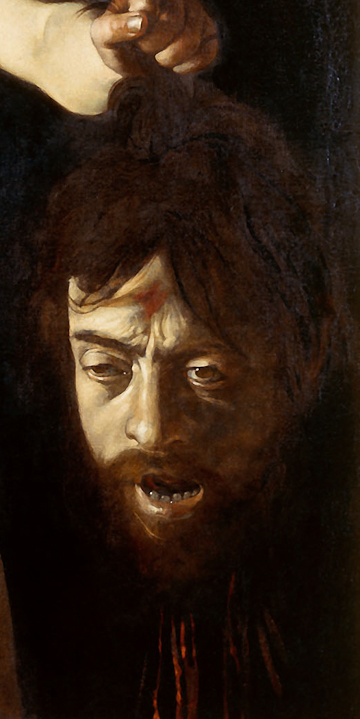
Hidden self-portrait of Caravaggio in “David with the head of Goliath” (1610)
Caravaggio took Chiaroscuro to the next level by pushing the contrast of light and dark in his works, which is an iconic characteristic of his paintings. Using this technique, he often depicted the biblical events as dark, gruesome, gory, but still natural and realistic to the point where the audience immediately puts themselves inside the image. This was the magic of his paintings. As you can imagine, controversies emerged because Biblical stories were not always pretty in his paintings, and not everyone was a big fan of that.
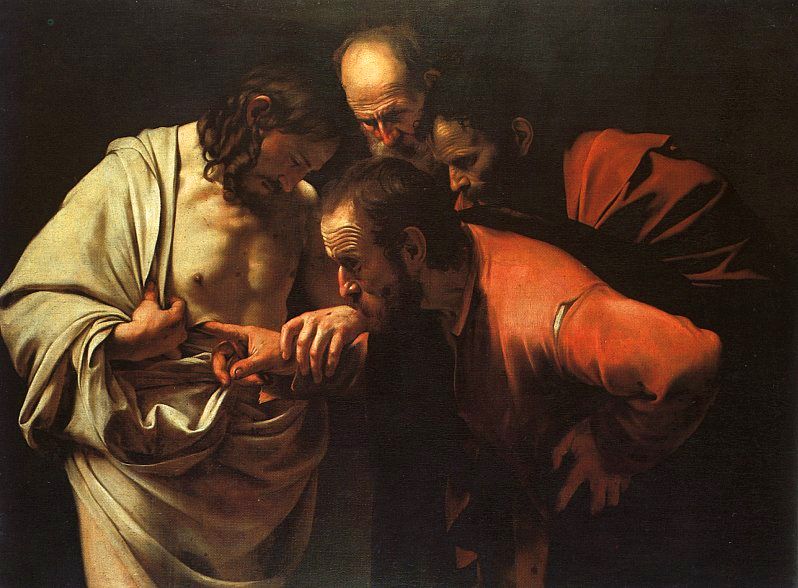
“The incredulity of Saint Thomas” (1601-1603) (Yes, his finger is inside the wound)
He went on to influence many great artists after him who also made great impacts on the art world, such as Rubens, Velazquez, and Rembrandt. Without Caravaggio’s works, art would not be what it is today.
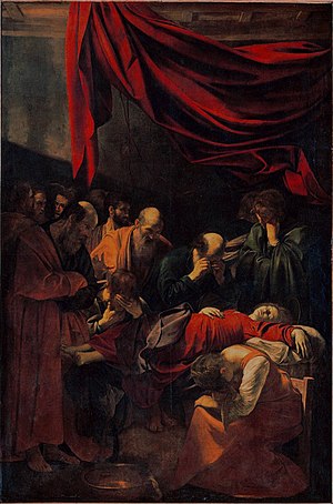
“Death of the Virgin” (1601-1606)
As you can probably tell, these people didn’t always look like the prettiest Gods and Goddesses. That’s because Caravaggio wanted the paintings to look natural and believable, so he picked models from people on the street. This is also why his naturalistic style is so different from previous famous artists, as they were mostly about “photoshopping” and idealizing the figures to look perfect.
If I were to give myself a mark, I would give myself a 7.5/10. I think I tried to get all the points down, but I could’ve written some parts with better language, and it was a bit difficult to find the fitting images especially for the camera (very difficult to find non-repetitive images and I couldn’t find a sample of a photo taken with the original Leica). I also think I could have made the connections a bit clearer though that was also hard because seemingly, these three events have no relation to each other. But I think I have the right idea. In all, It was a project heavily research-based, and less visually-creative based in my opinion. I think sometimes I lack skills in the presentation of my research, even though I’m not bad at learning on my own about these topics and simply attaining the information to myself. The main thing I learn through these projects is how to write and present to show that I know this knowledge. So I think this was mainly a writing exercise for me personally. I learned a lot about these events on my own though.


_(14597302399).jpg)