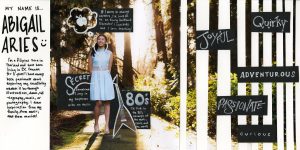
I like to consider my design style to be refreshing, tidy and organic. Along with these traits, the keywords I included in my project were: Adventurous, curious, passionate, joyful and quirky. I incorporated a handful of visuals to support these keywords.The way that I laid out the main image on the spread was to establish the movement across the page, from the main subject (me), to the edge of the right page. With the image gradually disappearing, it is to represent the parts of my life that I have yet to discover and explore.
I lettered each of the keywords in a way that I thought would represent them visually. The main visual of the environment in the photograph suggests the idea of my desires to adventure and explore. I chose to use black accents and the idea of these black pieces peeking out of the striped pattern on the right page of the spread to visually represent the idea of curiosity. The color black depicts the idea of the “unknown” which I have yet to uncover as they “peek” into my life. To represent the keywords Joyful and Quirky, I contrasted the sharp and clean layout with the organic strokes of my very own handwriting. Overall, the outcome of my layout showcases my photography and digital background, while still using traditional materials.