The Perfect Specimen
1450-1750
Summary
This week we dove into the 14th–17th century, continuing onto advancements of books and typography. This time period consisted of many designers aiming to create type easier to read, and book illustrations easier to produce. More specifically, typographers such as Nicolas Jenson had created a new style of type referred to as Roman style. This style had helped to stem away from the idea of imitating hand-lettered type on books, it was also far more legible. Many of type designs created in this time period are described as timeless and are still used to this day. I was enlightened in learning more about the foundation of typography and the evolution from hand-lettered books to solely type set books.
Research: Typographers and Illustration Techniques
Nicolas Jenson 1420-1480
After this week’s lecture, I chose to delve into researching typography and design of this era. Nicolas Jenson was one of the greats of this time, developing and establishing the evolution away from Blackletter. He was well known to be publisher, printer, a type designer, engraver and a very successful business man.
Before he was recognized as a typographer, Jenson was previously known as Master of the French Royal Mint at Tours. He had worked as the cutter of coinage until 1458, when the King of France sent him to Germany to study under Johannes Gutenberg to further promote and enrich printing techniques in France.
In 1470, Jenson had opened up his own printing shop where he had showcased his brand new style of type: Roman-Style, also known as Antiqua. This style had been described as “[the] transition from imitation of handwriting to sole print type” (Wikivisually, Nicolas Jenson ). In other words, he created this type style to act completely as a typeface rather than as a mimicry of hand-produced letterings.
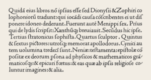
A specimen of Nicolas Jenson’s archetypal roman typeface, from the “Laertis”, published in Venice ca 1475.
To this day, Jenson’s work is still being used, like the famous roman-style typeface, “Jenson.” His typeface is well described as highly legible and evenly weighted. He was concerned of the overall look of a large block of text, rather than of each individual letter. This is why the Roman style is considered one of the more easiest type styles to read, especially on large blocks of printed text.
William Caslon 1692-1766
William Caslon was born on 1692, in Cradely Halesown, United Kingdom. He was a respected engraver, type founder, and type designer of this time period. Caslon began his career as an engraver, opening up his own engraving shop in London in 1716. This background helped to shape him into the renowned type founder he had certainly become.
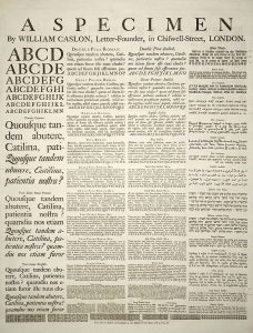
A specimen sheet of typefaces and languages, by William Caslon I, letter founder; from the 1728 Cyclopaedia
His typeface, Caslon, and a lot of his other creations still hold a highly respected place in the design world of today. One of these creations is known as the Specimen Sheet. In 1734 Caslon issued his first specimen sheet which showcased his type in various fonts and sizes. This creation served typographers by presenting how certain typefaces were to behave on paper. Creating the specimen sheet had given him the chance to truly showcase his type designs across the land. With the help of type specimen sheets, “his types eventually spread all over European and American Colonies” (The Editors of Encyclopaedia Britannica, William Caslon).
Book illustrations
I was also tasked with researching about Illustrations during this time period. I focused this research specifically on the different techniques of creating illustrations which appeared on books and broadsides.
Woodcutting
Woodcutting was a technique first used by woodcarvers and cloth printers to imprint and display their designs. It was then continuously used to copy illustrations and designs onto books. This technique called woodcutting, is also known as Xylography, which had been used in Europe during the late 14th centuries–early 15th centuries.
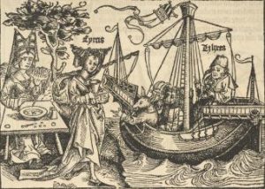
Ulysses and Circe, Michael Wolgemut and Wilhelm Pleydenwurff
What this consisted of, was the cooperation of the artist, the carver, and the printer. The artist would design the illustration, aware of the conditions and complexities of the carving processes, then the carver would then carefully carve the relief of the design into large wood blocks. What this meant was that the negative spaces of the drawing were carved deeper into the woodblock. After this, it was then given to the printer, where the wooden block is smeared with ink, and a paper would be placed and rubbed onto the block until the design had been carefully transferred. This technique was created in Germany by Hans Burgkmair around 1509.
Copperplate Engraving
Was used during the 15th century, and was a technique adapted from goldsmithing. What it generally was, were generous amounts of engraved lines and strokes carved into metal plates to create an image. Once the engraving was finished, ink was wiped unto the plate, filling the carved areas. Paper was then rolled with this plate under the high pressures of the printing press.
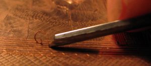
Wedge-shaped metal tool known as a burin is used to gouge clear, sharp furrows in a metal plate
This technique required great skill and precision. It was considered a very intricate and time consuming task because mistakes were close to impossible to correct. This technique showed a vast improvement in the accuracy of illustrations in books. Illustrations were more precise and true compared the the pictures transferred from woodblocks.
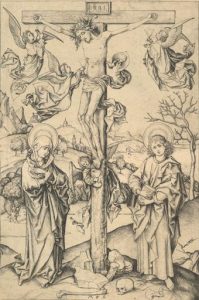
The Great Crucifixion with Four Angels Circa 1474 – 1475, Martin Schongauer
Sources
https://www.britannica.com/biography/Nicolas-Jensonhttps://trydesignlab.com/blog/7-inspiring-facts-nicolas-jenson/http://www.historyofinformation.com/expanded.php?id=3383
https://www.linotype.com/348/william-caslon.html
https://www.britannica.com/biography/William-Caslon
http://www.historygraphicdesign.com/index.php/the-age-of-information/corporate-identity-and-visual-symbols/62-james-k-fogleman
https://en.wikipedia.org/wiki/Nuremberg_Chronicle
http://www.historygraphicdesign.com/a-graphic-renaissance/printing-comes-to-europe/2-xylography
http://www.hellenicaworld.com/LX/Literature/JosephCundall/en/WoodEngravingHistory.html
http://germanprints.ru/articles/german_prints_15c/index.php?lang=en
https://eportfolios.capilanou.ca/judysnaydon/wp-content/uploads/sites/7204/2018/10/141_17-Survey-3-Block-Books-and-Baroque-1450-1750.pdfa