Category Archives: DSGN 121

Posts for Design Fundamentals

Continuation

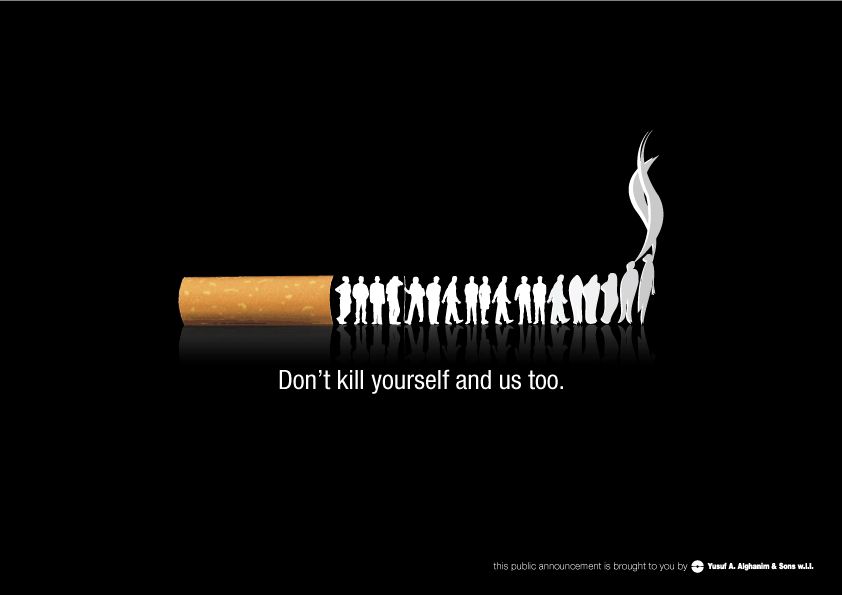
I found two examples of continuation. I thought both of these images were good examples of continuation. In the first one the Tiktaks are laid down in a line for our eyes to follow and it reminds our brain of a video game from the time period that Tiktaks were invented in. in the second one the feet are much farther apart from each other than the Tiktaks were but we are still able to follow the line they create up the page.

Closure

I found this anti smoking poster to represent Closure. It is a good representation of closure because our brain fills in that the people form the rest of the cigarette. it could have also been used for proximity because of the way the people were grouped together.

Size

For Size, I chose this alternative poster for Bambi. It was designed by Rowan Stocks-Moore. This poster is visually striking both because of the use of colour and by the size difference between the big deer in the foreground and the little deer on its head.

Space

I chose to use a poster for Black swan as my representation of space. I felt I could have used this example for a few of the fundamentals, such as direction, line, or colour but I chose space. I think it is a wonderful use of negative space creating the swan in black and the ballerina inside of the swan. I couldn’t find the original artist for this piece.

Line

For line, I chose this concert poster for Umphreys Mcgee. It has a lot of directional lines that both separate sections and bring your eye around the poster. it is also an excellent use of colour. The layout looks somewhat inspired by Art Nouveau. The artwork is by James Flames.