I played with many different ideas for this project. Once i had decided on my topic I tried playing with a brick wall motif but it wasn’t really working out design wise, i then tried a typewriter idea but I was told Alex already was using that idea, so eventually I came to the idea of a tree. The tree represents gradual growth through time and I chose to do it in a sort of simple style that hints at Art Nouveau. I think if I did this project again I wouldn’t use pencil crayons I would instead use watercolour or some other more flat medium, I didn’t quite get the effect I had hoped for with the pencil crayons. My information is well researched and laid out in an understandable way. I got my partner to look it over (who knows nothing about type) and he claims he learned a thing or two. Overall I think I probably should get a 7.5/10 because the end result could have been cleaner if I had chosen the right medium in the first place.
Category Archives: IDES 141
Historical Artifact
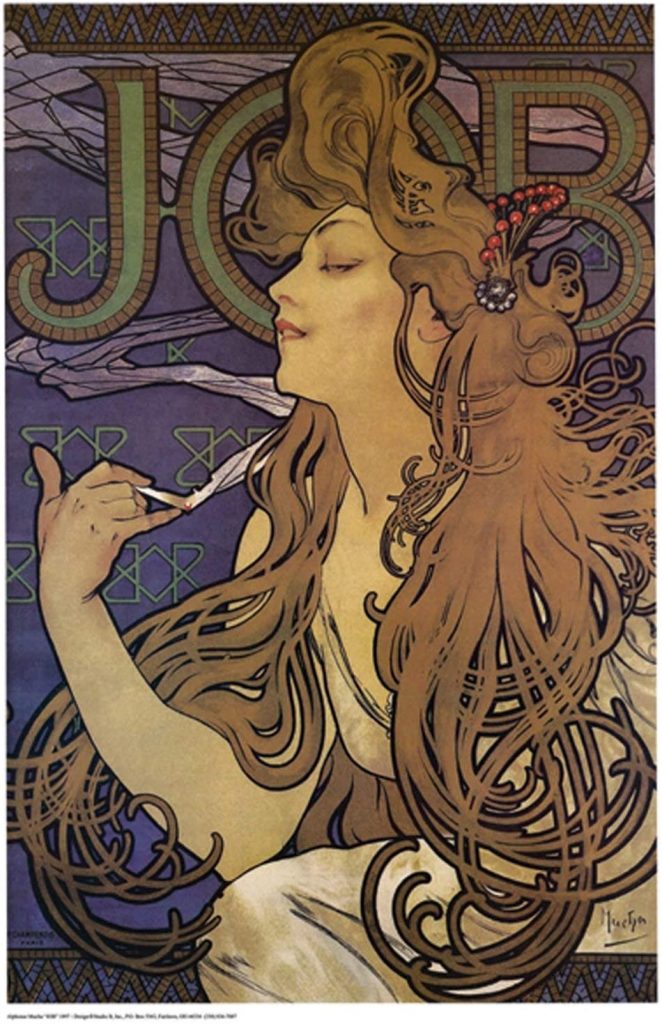
I love art nouveau and I find the moulin rouge exciting and fascinating so I chose my art piece because it is a middle ground between those two things. I chose to do a poster design, which I originally thought was unambitious but very quickly came to a different conclusion. I did tons of sketches and had to sort through so many artworks before finding the one I eventually chose. To get it right it took a lot of planning and precision and those are not typically a strong suite of mine. It was also a challenge trying to colour match, I hope the colours came though well in the photograph. I think I could’ve spent more time on the written components but overall, I think I should get a high B or A-.
Survey 6
Art Nouveau
As much as we are supposed to choose an event from the survey timeline, I broke the rules a little bit on this post. I love art nouveau and I really wanted to write about it. Art nouveau is a fascinating movement that I have frequently found myself inspired by when doing my own work. It has beautiful organic shapes, neutral colours, and amazing depth despite its flat colours. It also inspired much of the art in the 60’s and 70’s and served as a foundation for psychedelic art.
Design
Design was a big part of Art Nouveau, a key element to many of its iconic imagery and posters was incorporating text into illustrations or thoughtfully framing illustrations with text and embellishments. A lot of the most recognized pieces of art from the movement were advertisements and poster designs. I would say the foundation of current day poster design began with art nouveau. The artists took care with visual hierarchy and made meticulously detailed illustrations with plenty of embellishments. Alphonse Mucha is an iconic artist from this time period and probably who most people think of when they think of art nouveau. He is said to have had a skill with printing that was unrivaled.
Features of Art Nouveau design is organic shapes, whiplash curves, detailed illustration and flat and neutral colours.
Architecture
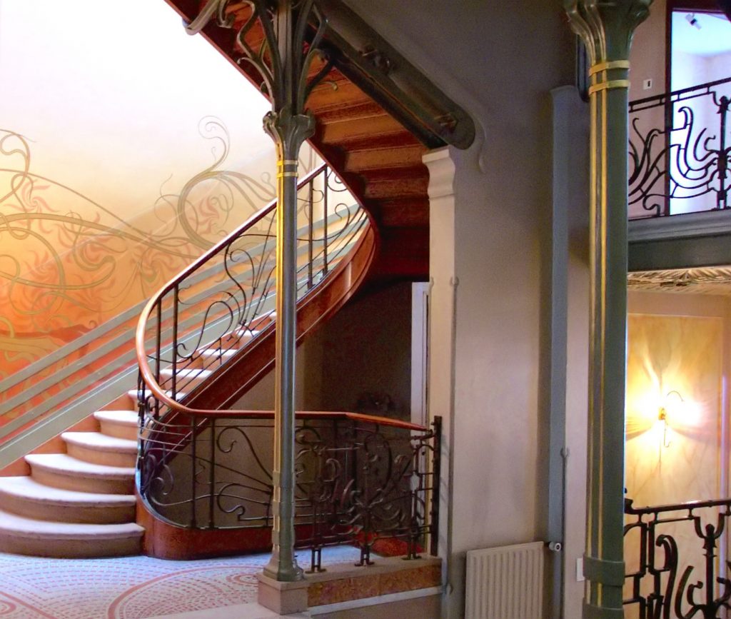
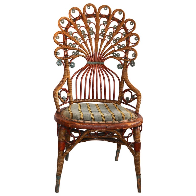
Art Nouveau architecture is facinating and beautiful, using those same organic shapes and natural curves but this time in staircases and buildings. Architects like Hector Guimard ran with this style and designed beautiful pieces of ironwork for subway stations and buildings. The craftsmanship of ironwork and furniture is where the core of art nouveau really comes into play. The movement came from the arts and crafts movement. The ideology of that movement came from a rejection of industrialism and a value for well-made products with thoughtful design. These products being well made and beautiful is a big reason we still see these antiques around today. They didn’t break down as easily as many of the mass produced products of that era.
survey 4
The Invention of Braille
The last class focused heavily on typography, we learned about the invention of the printing press, display typefaces, and typography in art. But we didn’t learn that much about how type and even just literacy have developed in visually impaired people so I chose to do my blog post on Braille and the invention of Braille its cultural impact was incredibly significant and I would argue that it still counts as a type of typography.
Culture
Braille was invented by Louis Braille in 1824 when he was only 15 years old. It was a modified version of something the military was already using to allow people to read communications with no light. This invention allowed visually impaired people to read which was something nearly unimaginable to the community up to this point. Louis Braille invented himself was blind. Even though this was a world-changing invention it would not be adopted universally until 1932. Braille has since been adapted for many languages besides English around the world.
Typography
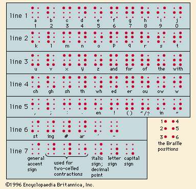
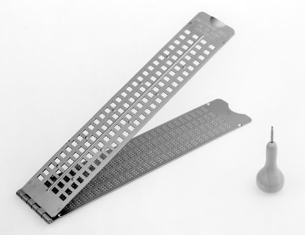
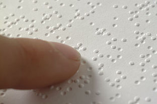
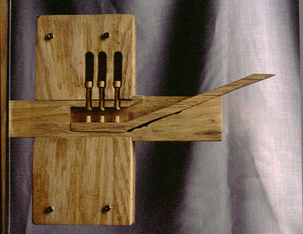
Braille as a type is fascinating. It is written from right to left using a slate and read from left to right. The slate uses 2 metal plates with cell-sized holes that you punch with a poking tool to create each letter and then the paper is flipped so the raised parts are on the top. A cell is one letter, which is made using a maximum of six raised dots.
Each letter of the alphabet plus punctuation is represented with these dots. When red, all one does is run your fingers along these cells distinguishing each letter. Even though it is usually representing English it is truly a unique language in and of itself.
Before doing this research I didn’t really have any idea how braille worked or how it was read. It was fascinating to be able to grasp a better understanding of Braille since it was such an important invention.
The Gutenburg Press
The part of the lesson I found most fascinating was the invention of the printing press and Johannes Gutenburg.
Books laid the foundation of our society, they allowed us to spread knowledge, track historical events, and teach lessons through stories. We wouldn’t be where we are today without them. Gutenburg, with the invention of the printing press made knowledge accessible. People were able to read the bible themselves and decide on their faith without the watered-down interpretations of the church in their way for instance. Previously books were hundreds of dollars each and had to be made one by one, sometimes taking years to create, now you could make hundreds, or even thousands of copies of the same book, and you could even hire illuminators to make the books just as beautiful as something hand written.
In 1445 the demand for books was high, people wanted something affordable and uniform. This demand went hand in hand with the first ever universities. More and more people were literate and wanted to use this to their advantage. Gutenburg saw an opportunity and had a world changing idea.
He found financial backers and began prototyping. By 1450 he had invented the Gutenburg press. It worked by carving out individual letters, punctuation, and ligatures, pressing those into a soft copper block, then, using a hand casting tool also invented by Gutenburg, casting the letters into lead. These lead pieces were then organized into a mirror image of the desired page, covered in ink and pressed onto the pages. Once a page was organized it could be used repeatedly to produce copies of the same page.
The first things printed by Gutenburg were small official documents and decrees, but it didn’t take him long to take on much more ambitious projects. He spent months creating copies of the Lain bible, having them illustrated and selling them. It is one of the most important books in history to this day because of the innovation of Gutenburg.
Finally, books were available for ordinary people and reading and education were no longer exclusively for the super-wealthy.
Mood Board
I liked this assignment in theory. the topics I was researching grabbed my interest, I had an opportunity to find images and make connections I wouldn’t have otherwise made, I liked the content quite a bit. I managed to pick three topics that all had to do with new beginnings and breaking free from the status quo. I had a lot of problems with Invision. I felt like I was never taught how to use the took and it seemed to work against me rather than for me, especially within the context of making a nice layout and having everything look cohesive and nice. It was very hard to find any resources to help me understand the tool better as well. it seemed like it could work well if you were only working with images, but text kind of broke it.
Survey 1
Fashion and tools in Ancient Egypt
For my Survey one blog post I chose ancient Egypt as my time period. The two topics I chose to focus on are tools and sciences, as well as fashion. Ancient Egypt was a fascinating portion of history that we are lucky to have well-kept records of. Let’s get into it.
I found it easier to find information on tools rather than sciences for this period as Egyptians were geniuses when it came to engineering. The Egyptians made incredible jumps in innovation and productivity with their inventions, many of which are still in use today to some extent.
Let us begin with time. The sundial was one of the two main kinds of clocks used by the Egyptians. It was presumably invented in the 8th century BCE and was a device that used shadows cast by the sun to tell time. Time was crucial to ancient Egypt as they had advanced systems for farming and yearly flooding of the Nial River. They invented their own calendar to keep track of the years, and irrigation systems to redistribute floodwaters and allow for control over more land.
Egypt also has some of the first evidence of door locks. Pin locks, much like the ones used today in our own homes, were found in buildings. They were much larger and presumably much easier to lockpick but nevertheless, it was a system of locking that has never gone out of style.
Fashion was also important to the Egyptian people. Both men and women wore wigs and makeup. They wore kohl on their eyes and ochre on their cheeks. Many fashion items were worn to signify and display wealth and sexuality.
Nudity was commonplace in Ancient Egypt and not taboo. Women would wear Kalas which were thin sheer dresses to protect their skin but also allow themselves to stay cool. Men were almost always seen wearing Shenti’s which were white skirts to protect their genitals from the work they were doing. People with money and importance would wear their shenti starched and stiff with lots of space in the front to represent their massive… amounts of fertility.

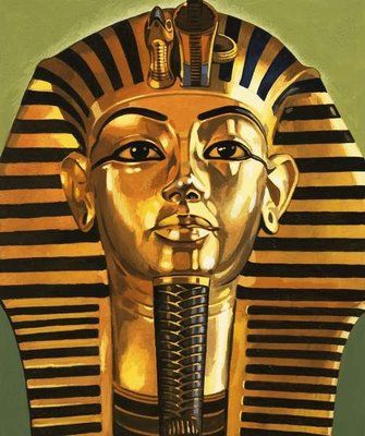
We also can’t forget about the headdresses. The one we are all most familiar with is the Nemes, which was made of stripped starched linen and is commonly seen represented on the tombs and sarcophaguses of pharaohs.
There is a lot we have taken and kept from Ancient Egypt, from their eyeliner to their irrigation systems and we would not be where we are today without the engineers of that time period.
Sources
https://www.youtube.com/watch?v=1VY7C_Wa6DI
https://www.youtube.com/watch?v=d9kvd5wgRYA
https://en.wikipedia.org/wiki/List_of_Egyptian_inventions_and_discoveries
Yearbook Spread
Hi! As you can see, this is me. I chose the imagery in the spread because I practice witchcraft and elements like skulls and snakes are seen very regularly in witchcraft and the aesthetics that stem from it. I chose a font for my titles that resembles a Celtic stylization because of my Scottish Celtic heritage. The keywords that I chose for myself that can be seen surrounding the circle in the center of the spread are Compassionate, Ambitious, Creative, Intuitive, and Scatter-brained. Ambitious was one that was very important to me, I have always been told I am independent and when I set my mind to something I make it happen, in my teenage year’s people referred to that trait as selfish but now as an adult people tend to use ambitious instead, I prefer it. I went out and did a photoshoot to get the two portraits in the spread, but they printed very light, so I stylized them with pen to bring back some of the sharpness. I think I did very well on this project, my design is simple, but it is balanced and does a good job displaying my style. The image is cohesive, and I think I did a good job of following the brief. There are a few small mistakes with how I spaced the writing in one of the boxes and I messed up a word in the bio portion which left an out of place black box. 8/10.
