Learning about how Display type was used in the 1800s was intriguing to me because of the techniques these early typographers used to make these titles attention-grabbing and eye-catching. Before display type printing was used only to print out body text. The titles on these pages before display type were just body text styles blown up in size but it didn’t attract any needed attention. A display typeface was considered anything over the size of 14 points. Some fonts that are used for display titles such as slab serif, reverse-contrast, and script font. When the first posters came around, the titles on posters were custom created by hand and took up lots of time considering these signs were used for advertising material. In the 1900s new letter designs began to appear. Many of these new display typefaces were over the top, aggressive, extremely bold to catch the attention of the viewer.
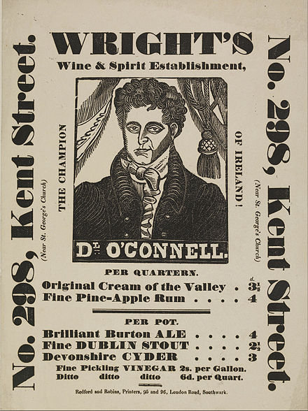
I think this was smart because anyone using a display type in their titles had an advantage in advertising. After all, people would be drawn to bold type. My favourite type created at this time is the “fat face” type which is essentially a bold version of a serif typeface. The first time “fat face” was used was in the year 1810 in London. It became popular and it was described as the first “real typeface” at this time.

The most inspiring part of this survey for me was J.J Grandville. I am inspired by surrealist art and this is the first time we have been introduced to it in art history. Grandville is known for making some of the first absurd yet beautifully executed surrealist illustrations and his interest in this came from a young age where he began over accentuating and exaggerating the features of his father’s drawings.

He was a well-rounded artist, his first job was to illustrate a game titled “Old Maid”, he also illustrated newspaper strips. A famous project he worked on was called “metamorphoses” which consisted of 70 scenes showing middle-class characters, animals and humans, dressed in clothes in casual settings. This series was successful and was copied in the years to come.

This makes me wonder if Grandville was the first person to illustrate animals in human form. Grandville was enabling political provocation in his artwork which made him favourable. Some other artists who were a part of the surrealist movement were Andre Breton, Georges Bataille, who both were greatly inspired by J.J Grandville.

https://www.antiquetrader.com/art/the-wonderfully-odd-world-of-french-artist-j-j-grandville
https://fontsinuse.com/uses/5578/the-story-of-our-friend-the-fat-face
https://en.wikipedia.org/wiki/Display_typeface
https://design.tutsplus.com/articles/a-brief-history-of-display-fonts–cms-33518