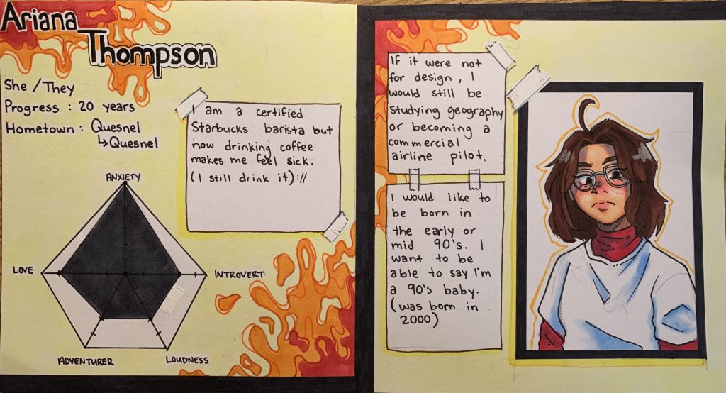
The media I am using are inks and alcohol markers. I made my yearbook spreadsheet to resemble the look of a character reference or a stats sheet. The overall layout is not overly serious and a little bit messy or disorganised as I often tend to lack that seriousness in my own personality. My idea was to reflect some of my energy by using warm but vibrant colours in the background, I like to try to welcome the warmer side of my personality and then convey it with the bright and bubbly side of it to coexist as one. My self-portrait isn’t 110% accurate but it is how I see myself and, in a way, hope it’s how other view me as an individual. I want people reading it to feel like it isn’t something overly serous and is a little bit more fun or interesting to look at.
If I were to give myself a mark on a 10-point scale, I would grade myself a 7 perhaps. Although I spend a total of around 4 hours, I do feel like my use of colour could’ve been thought out a little bit more.