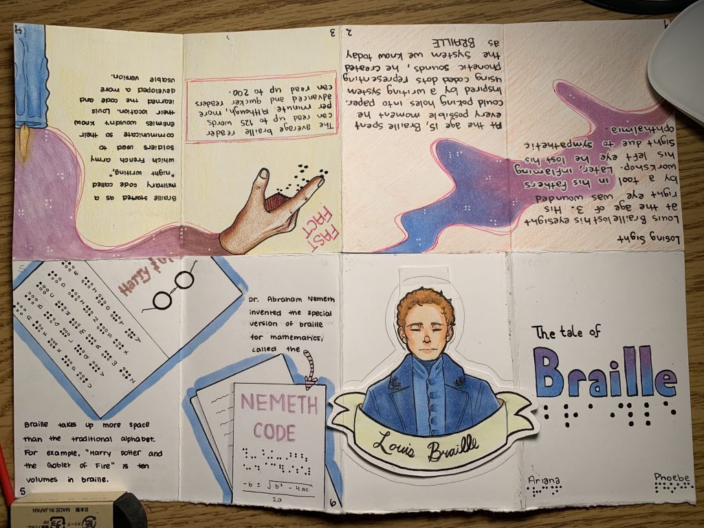
For the typography zine, Phoebe and I chose to do it on Louis Braille. We selected the colour pallet consisting of pale pink, blues, and violets to represent the blindness those may feel. Although, despite the blindness, we selected these colours to reflect on the “light” that the creating of the braille typeface may have brought. Braille opened up a world for those who cannot see, to have an opportunity to read. Our main concept was figuring out how we can apply the simplicity of braille into design, utilizing the white space to our advantage.
This project was an excellent opportunity to learn about the braille typeface. I’ve known about it my whole life, though never was aware of the origin and the amount of function it served. Phoebe and I have taken approximately 10 total hours, planning included. If I were to grade our own assignment I would perhaps grade us a 9 out of 10. I believe we laid out our facts well and summarized them perfectly. Also, I appreciate the colour pallet we selected and am pleased with the overall layout of our design, though our designs on the first spread could have been thought out more, I will admit.
https://www.britannica.com/biography/Louis-Braille
https://www.nbp.org/ic/nbp/about/aboutbraille/whoislouis.html