Pierre Bonnard

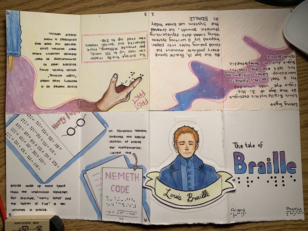
Pierre Bonnard was a French painter, illustrator and printmaker during the Post-Impressionist period. He was born in  October 3, 1867, in the town of Fontenay-aux-Roses, France. Bonnard was one of the founders of the Post Impressionist group of avant-garde painters, Les Nabis. He was commonly well known for his use of bright colours and his works with, landscapes and even urban scenes. With this style, he worked outside of the “mainstream” and was interested in creating his own works, outside of these confines. The use of the colour and avoiding the stress of perspective in his images give an impression as if this was printed on a tapestry.

https://www.gallery.ca/magazine/your-collection/pierre-bonnards-rediscovered-radiance
Porte du jardin de la villa Le Bosquet, Le Cannet, 1944

Bonnard’s use of colour in his works was used to give his paintings life, he said his objective “is not to paint life, but to make painting come alive.” As an artist, I personally believe this is such a strong view to have, it is almost vital to getting people to engage and be intrigued by your images. Bonnard has the benefit of his artwork looking like posters, they are engaging, bright, and full of life for the viewer.

http://www.artnet.com/artists/pierre-bonnard/marine-dans-un-port-du-midi-a-yiCA_CrIBeLGtc_MMzAKPw2
Marine dans un port du Midi, 1867-1947
https://frenchculture.org/performing-arts/3843-pierre-bonnard-dining-room-country
Dining Room in the Country, 1913


https://eclecticlight.co/2018/08/15/pierre-bonnard-at-home-with-marthe-1937-1943/
At home with Marthe, 1937-1943
https://eclecticlight.co/2018/08/15/pierre-bonnard-at-home-with-marthe-1937-1943/ 
The Open Door, 1937

Sources

https://www.gallery.ca/magazine/your-collection/pierre-bonnards-rediscovered-radiance

https://en.wikipedia.org/wiki/Pierre_Bonnard

E. H. Gombrich, The Story of Art

Pierre Bonnard

Typography Zine

For the typography zine, Phoebe and I chose to do it on Louis Braille. We selected the colour pallet consisting of pale pink, blues, and violets to represent the blindness those may feel. Although, despite the blindness, we selected these colours to reflect on the “light” that the creating of the braille typeface may have brought. Braille opened up a world for those who cannot see, to have an opportunity to read. Our main concept was figuring out how we can apply the simplicity of braille into design, utilizing the white space to our advantage.

This project was an excellent opportunity to learn about the braille typeface. I’ve known about it my whole life, though never was aware of the origin and the amount of function it served. Phoebe and I have taken approximately 10 total hours, planning included. If I were to grade our own assignment I would perhaps grade us a 9 out of 10. I believe we laid out our facts well and summarized them perfectly. Also, I appreciate the colour pallet we selected and am pleased with the overall layout of our design, though our designs on the first spread could have been thought out more, I will admit.

https://www.britannica.com/biography/Louis-Braille

https://www.nbp.org/ic/nbp/about/aboutbraille/whoislouis.html

https://brailleworks.com/braille-resources/history-of-braille/
https://www.youtube.com/watch?v=8hzPIKmCHUA
Typography Zine

Apocalypse (Albrecht Dürer)

Albrecht Dürer Depicted the Book of Revelations in his 15 paged woodcut, “Apocalypse.” This book would bring fame to Dürer all across Europe. The “Book of Revelations” is a title heard by many, known for its incredibly dramatic and frightening tone. Written by John, it is the final book in the new testament in the Christian holy bible. This book is widely known for its depiction and description of the “Four Horsemen of the Apocalypse.” The Four Horsemen may be the most recognisable and iconic piece from Dürer’s booklet, as shown below.

https://www.metmuseum.org/art/collection/search/336215
The Four Horsemen of the Apocalypse

Originally, Apocalypse was cut onto pearwood, amongst 15 woodcuts and of course, printed beautifully in black and white. The booklet was 15 pages in length, respectfully, although, Dürer initially planned to include every scene from the book. The earlier woodcuts by Dürer were depicted unrealistically, later on, they were to be recreated following his travels to Italy. Travelling to Italy enabled Dürer to combine the iconography of the bible and early ideology with his art skills. This aided him throughout the final products to appear more realistic, practical, and expressive. Dürer depicted the images beautifully, the black and white almost complementing the imagery.

https://images.metmuseum.org/CRDImages/dp/original/DP816928.jpg
The Whore of Babylon

There have been speculations as to the depictions of Dürer’s images. I’ve shared the pieces “Opening of the Seventh Seal” and “The Whore of Babylon.” It’s been speculated the turbaned figures in “The Whore of Babylon” are being seduced by the woman. This results in subjecting them to the Apocalypse. She appears to be represented as a dangerous figure, with the monsters by her side, as if implying that falling for her could be catastrophic.
Through my own observation, “Opening of the Seventh Seal” is a lot to unpack. The angels and the screaming eagle display a strong sense of triumph and a warning, conveying their message to the vast world below. It definetly delivers the energy of an approaching apocalypse or an approaching end.

https://www.metmuseum.org/art/collection/search/397139
Opening the Seventh Seal

Sources:

http://www.albrechtdurer.org/opening-of-the-seventh-seal/

https://www.britannica.com/topic/Revelation-to-John

https://en.wikipedia.org/wiki/Apocalypse_(Dürer)

Apocalypse (Albrecht Dürer)

Anthony Van Dyck

Self-Portrait c. 1620–21

Anthony van Dyck grew up in Antwerp, developing his painting skills from a very young age. Dyck was a notable Flemish Baroque painter in the 17th century and was commonly known for his work in portraiture. Kicking off his career, van Dyck set out for Genoa, Italy in 1602, the city soon became his headquarters. Here he was immediately patronized by aristocratic families. Van Dyck enjoyed studying pieces created by Italian painters, he utilized their works to recreate them into sketches, throwing in notes and often compliments.

Jan Karel de Cordes, c. 1617/18

Van Dyck created his portraits utilizing mellow colours and tones, applying the paint very lightly. As his works deleoped, the textures on the images began to appear more and more artificial.

Study Head of a Young Woman, c. 1618–20
Lucas van Uffel, c. 1622

His painting habits were quite different, he applies paint very lightly and thinly, creating softer images. I personally admire the softness of these colours and how smoothly the portraits appear. The skin tones were always very light and almost appear soft to the touch.

Cupid and Psyche, c. 1638-40

Sources:

https://www.britannica.com/biography/Anthony-Van-Dyck

https://www.nationalgallery.org.uk/artists/anthony-van-dyck

Anthony Van Dyck

IDES141 Mood Board Assessment

I decided to create my mood board to revolve around the development of aviation and their major events. Aviation is a concept that is incredibly intriguing to me, I was raised with the passion my dad had for aviation. I was pleased to learn where gas powered engines began, to the disappearance of Amelia Earhart, to the establishment of a major airline that I never knew existed. I was pleased with my overall layout on Amelia, keeping the greyscale tones from the print and photos of the time period.

my screencap

Despite spending a good 4 to 5 hours on the assignment I would most likely give myself a 7. I am pleased with the overall composition although, my captions within the images could be more creative or perhaps, longer. This was a very interesting assignment to tackle, I enjoyed playing around with the mood board.

IDES141 Mood Board Assessment

Egyptian Hieroglyphs and Deities, Guiding the Souls into the Afterlife

Ancient Egypt was one of the earliest and first known civilizations to come about, and it is still kicking around to this very day. Their earliest form of writing was known as hieroglyphs, or Egyptian hieroglyphics, its development following shortly after cuneiform was developed. Hieroglyphs were widely used to communicate and develop their religious beliefs, creating the Egyptian Gods and Goddesses. 

Hieroglyphs from the tomb of Seti I.
http://www.egyptarchive.co.uk/html/british_museum_29.html

Very often, especially after the discovery of papyrus scrolls, hieroglyphs were used to assist the dead in the afterlife. These writings would be buried with the dead and placed either within their body, inscribed on the walls of the tombs, pyramids, or painted onto the wooden coffins. When writing out these scrolls, as Britannica states, “certain signs were avoided or were used in garbled form in grave inscriptions for fear that the living beings represented by these signs could harm the deceased who lay helpless in the grave.” 

A private tomb located in Egypt.
https://www.bbc.com/news/world-middle-east-46580264

It was believed there would be a god to guide these beings into the afterlife. This being was said to lead the souls of the individual through the threshold that is the living world and the afterlife. Anubis (Anpu), the god of death, mummification, and afterlife, is the protector over these humans. Anubis was depicted to have the head of a black jackal, throughout Egyptian history jackals were often portrayed with cemeteries and were known to dig up human bodies to consume their flesh. Due to the nature of digging bodies up after burial, it was believed a jackal would be suited to portray the role of protecting these bodies

Anubis weighing the soul, from the Egyptian Book of the Dead, c. 1275 BCE.
https://www.britannica.com/topic/Anubis

Within Egyptian mythology, it is believed there are hundreds upon hundreds of deities, whether their role be large or amount of deities and concepts is very intriguing and appealing. I found myself often studying the idea of Egyptian gods during my free time in middle and high school. The artistic portrayal and the study of hieroglyphs is incredibly intriguing, I cannot help but wish we still incorporated this writing and these beings to learn during the present times.

The sun god, Ra, a creator of ancient Egypt.
https://www.britannica.com/list/11-egyptian-gods-and-goddesses

References:

Dorman, Peter F. “Hieroglyphic Writing.” Encyclopædia Britannica, Encyclopædia Britannica, Inc., https://www.britannica.com/topic/hieroglyphic-writing/Hieratic-script. 

“Anubis.” Wikipedia, Wikimedia Foundation, 31 Aug. 2021, https://en.wikipedia.org/wiki/Anubis. 

Survey 1 Powerpoint.

Egyptian Hieroglyphs and Deities, Guiding the Souls into the Afterlife

Heironymus Bosch

 The Haywain by Hieronymus Bosch

Over in the Netherlands, in the town of Hertogenbosch, the painter Heironymus Bosch resided. Our historical knowledge on the man is incredibly limited, we are aware he passed away in the year 1516, but there lies no record of his age. It is shown that he must’ve been active for an extended period of time, as he became an independent master in the year 1488. Bosch appeared to be well known for his use of hells and demons. His painting style turned the table on the idea of traditional paintings, creating works full of fantasy and creatures no person has seen. 

The Garden of Earthly Delights by Hieronymus Bosch.


The idea of going against tradition has always been intriguing. Bosch can perfectly convey dark and evil themes solely through his imagination. The use of vibrant colours later transitioning to darker tones helped me to view the intimidating themes of hell.

Hieronymus Bosch, 'Crucifixion with Saints and Donor,' ca. 1490, oil on panel.
Crucifixion and Saints and Donor
Hieronymus Bosch, 'St. John the Baptist in Meditation,' ca. 1490, oil on panel.
St. John the Baptist in Meditation
Hieronymus Bosch, 'The Garden of Earthly Delights' (detail), 1490-1500, oil on oak panel.
The Garden of Earthly Delights

Sources

https://www.theguardian.com/artanddesign/2016/feb/11/hieronymus-bosch-review-a-heavenly-host-of-delights-on-the-road-to-hell

https://www.artnews.com/feature/hieronymus-bosch-life-early-works-best-paintings-1202685134/
Heironymus Bosch

Gestalt Principle – Similarity

I’ve selected the Qatar Airways logo as an example of similarity from Gestalts Principles of Design. This example is a little more subtle, I paid extra close attention to what’s within the maroon part of the image. The white lines coming in from the right off the image resemble similarities to the grey in the background portion. Both the lines in each section of the image present a strong sense of movement, presented with the white background as if the animal is running. It helps to distinguish that this is an airline logo. 

Gestalt Principle – Similarity

Gestalt Principle – Closure

The logo for the band “The 1975” presents an obvious example of closure from Gestalts Principle of Design. At first the lettering looks incredibly flat and a little bit confusing, I found it hard to make out the words at first. The spaces between the letters and the missing areas apply the principle of closure, they still help us to make out what the title is saying. Upon taking a longer look at the image, I began to realize the letters are indeed 3D, unlike the foreground only the shadows are displayed. It is a deceiving logo, making one believe the foreground is displayed, when it is not. I found even moving my head and looking at it from the left helped to realize.

Gestalt Principle – Closure

Size

This poster I find very intriguing, although I am uncertain if I am grasping the entire idea behind it. I believe the use the large pencil implies the power voting holds over a nations government or a nations leaders. It applies the idea of “every vote counts,” which it truly does, and the sheer power the stroke of our pencils have over the next president or prime minister. It emphasizes the fact that our voices can and must be heard during any political elections.

Size