This project was the most stressful one I’ve done by far. It was mostly due to our own error, but it was stressful nonetheless.
I partnered with Rachel for the zine because we both figured that it’d be easier if we tackled it together. Things are naturally getting busier, so I thought “Great! Maybe doing it this way will make it go by faster. I’ll be done before I know it!”
Wrong!

We met up and spent a good 6-7 hours in the IDEA classroom just working (with breaks, of course). I guess in our struggle to produce a finished piece, we neglected the brief. I also realized that, after we finished it, we made the interesting choice of working through individual pages on their own, instead of working on spreads. This made it so the pages would alternate between Rachel and me, creating a huge stylistic gap.
The summarization of our six facts was completely forgotten, and we put our names on the back rather than the front. Two big mistakes!
We ended up completely reworking it (under Judy’s critiques) because neither of us really wanted to bomb this assignment. It took about 4 hours to make concrete changes.
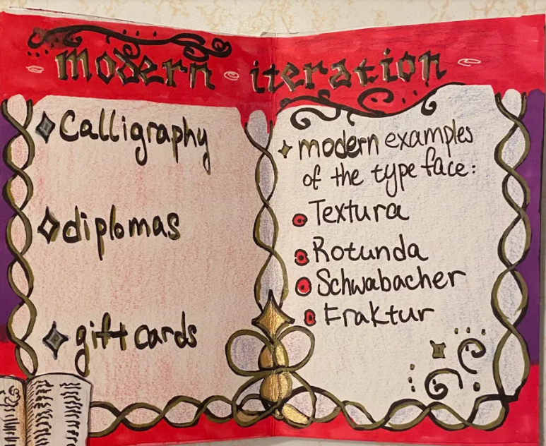
In the updated version, there were way fewer words and a lot more space for shapes and colours. There are now actual spreads, with little elements connecting the two pages.
I used a lot more black this time and turned up the opacity on the coloured sections. White is very quick to get marked-up, so I wanted to avoid that as much as possible. Also, in my opinion, coloured pencils can look extremely ugly. That texture, especially when applied with little pressure, makes things look busier and less polished. We used them because it was what we had, but this time, I practically ripped through the paper while I was colouring. If there were more time, alcohol markers would’ve been my medium of choice.
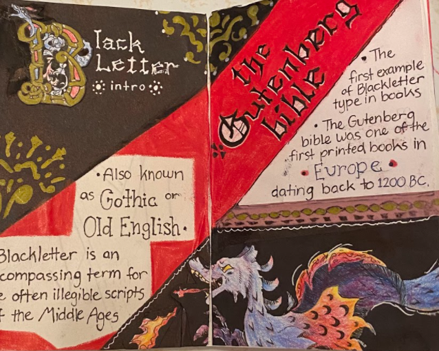
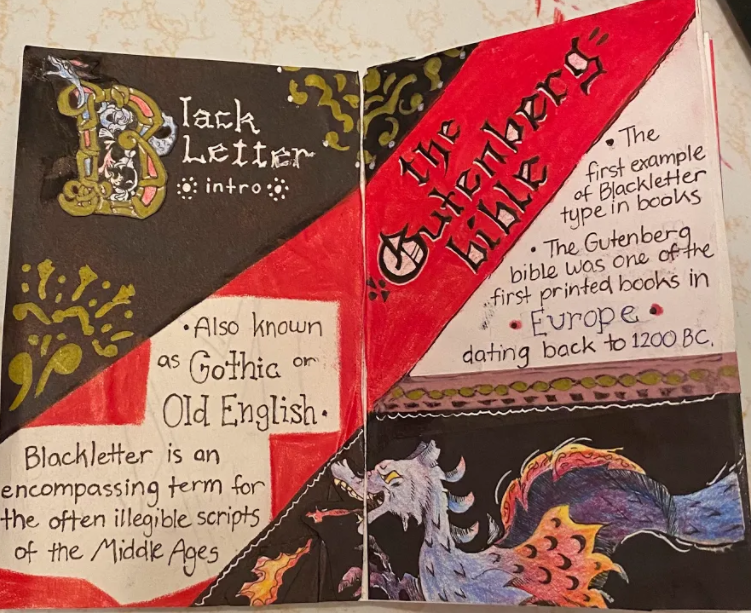
We incorporated illuminated letters and a blackletter-esque font for all of our headings, as kind of a nod to the Gutenberg bible. There are little accents scattered around to sort of imitate illumination as a whole but in a less labour-intensive way.
I can’t say for certain that I like where our zine is at now, but I do think it’s improved. I think I’d give it a 7, because of the amount of effort it took to undo our poor foundation. Obviously, it’s our fault that the foundation was bad, but we still worked to improve it. The reason I wouldn’t put it higher is that some pages aren’t super-refined, and our facts are very brief.
Still, I can’t think of any mistakes that would put it lower than a 6.
From now on, the brief and I are going to be best friends.
Works Cited:
Blackletter: The Gothic Hands 12-15th C.. Designhistory.org. (2011). Retrieved 27 October 2021, from http://www.designhistory.org/Handwriting_pages/Blackletter.html.
Farley, J. (2009). The Blackletter Typeface: A Long And Colored History – SitePoint. Sitepoint.com. Retrieved 27 October 2021, from https://www.sitepoint.com/the-blackletter-typeface-a-long-and-colored-history/.
Rainis, J. The History of Blackletter Calligraphy. Jakerainis.com. Retrieved 27 October 2021, from https://jakerainis.com/blog/the-history-of-blackletter-calligraphy/.
Williams, R. (2008, August 20). black letter. Encyclopedia Britannica. https://www.britannica.com/topic/black-letter