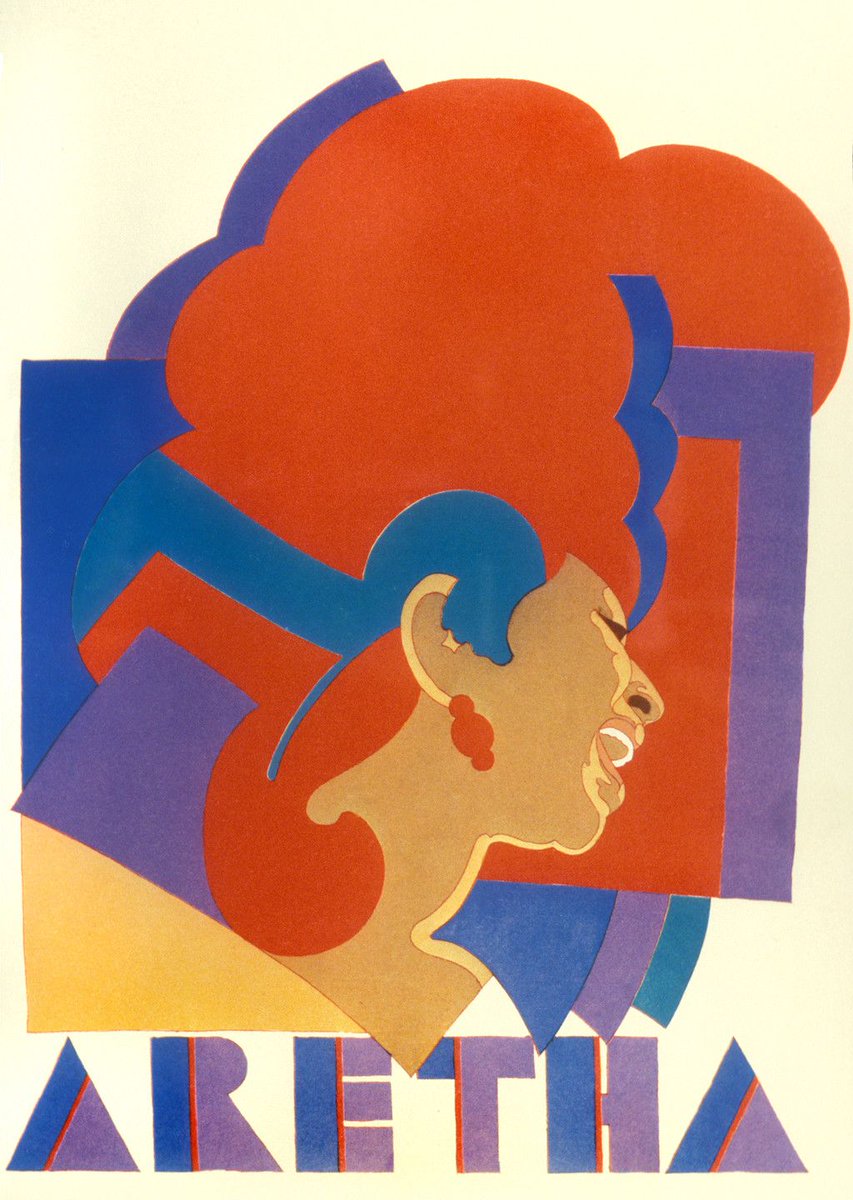
“ARETHA Franklin” by Milton Glaser
With Milton Glaser’s Aretha poster, colour is the primary component present in the piece. Using several different hues of red, purple and blues, Glaser achieves dimension in his poster, creating what almost looks like a music note hidden in Aretha’s hair. This level of detail to colour helps keep the audience engaged on the subject as the details are intricate and can only be picked up on after several times of viewing. The bright hues also add dynamic and expression to the piece as it contrasts with the simple shapes present in its composition and makes the subject stand out. Similarly, the bold choice of colours could also represent the singer’s rich and loud personality. Red is primarily dominant in this piece and with it often signifying passion and energy, it can suggest to the audience that this was the person Aretha was, daring and not afraid to be authentically herself, both as a person and a performer.
Leave a Reply