While planning the execution of my yearbook spread, the format that interested me the most was to create a spread in the structure of a scrapbook. I often get nostalgic for the past and enjoy revisiting memories in my life by looking at old photos or journals. With yearbooks, the sole purpose of their existence is to encapsulate moments in time, almost like a time capsule, preserving present memories for times in the future. Because of this, I thought it would be fitting to create a scrapbook-like theme to match the purpose of yearbooks and to capture the present moments in my life right now for me to view years later in the future.
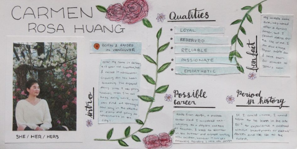
For the light blue wash of colour behind the text, I used watercolour to create a soft undertone in the design. Calm and gentle are what I am often referred to by my peers, and because the colour blue is usually associated with these adjectives, I wanted to incorporate this element into my spread. Along with this, blue is one of my favourite colours, and I tend to identify myself with this colour as my personality is similar to it.
The decision to add plants into my piece was inspired by my admiration for nature and the outdoors. I grew up surrounded by plants grown by my grandma for as long as I could remember, and though I never gave much thought to it until recently, I’ve realized how much work it takes to care for these living greens. I find the process of growing plants so fascinating, and though I don’t think I’ll ever be able to care for a plant, I enjoy looking at them and the pretty colours they bring out into the world.
Overall, I spent 6 hours on my piece and would give myself an 8/10 on the project. I believe that the colours used on the plants were not coherent with the washed-out blue present on my spread. I think if I could go back, I would use watercolour instead to keep the mediums consistent. I think the composition could’ve also been more planned out as I found myself having trouble finding places to fit everything during the process.
Leave a Reply