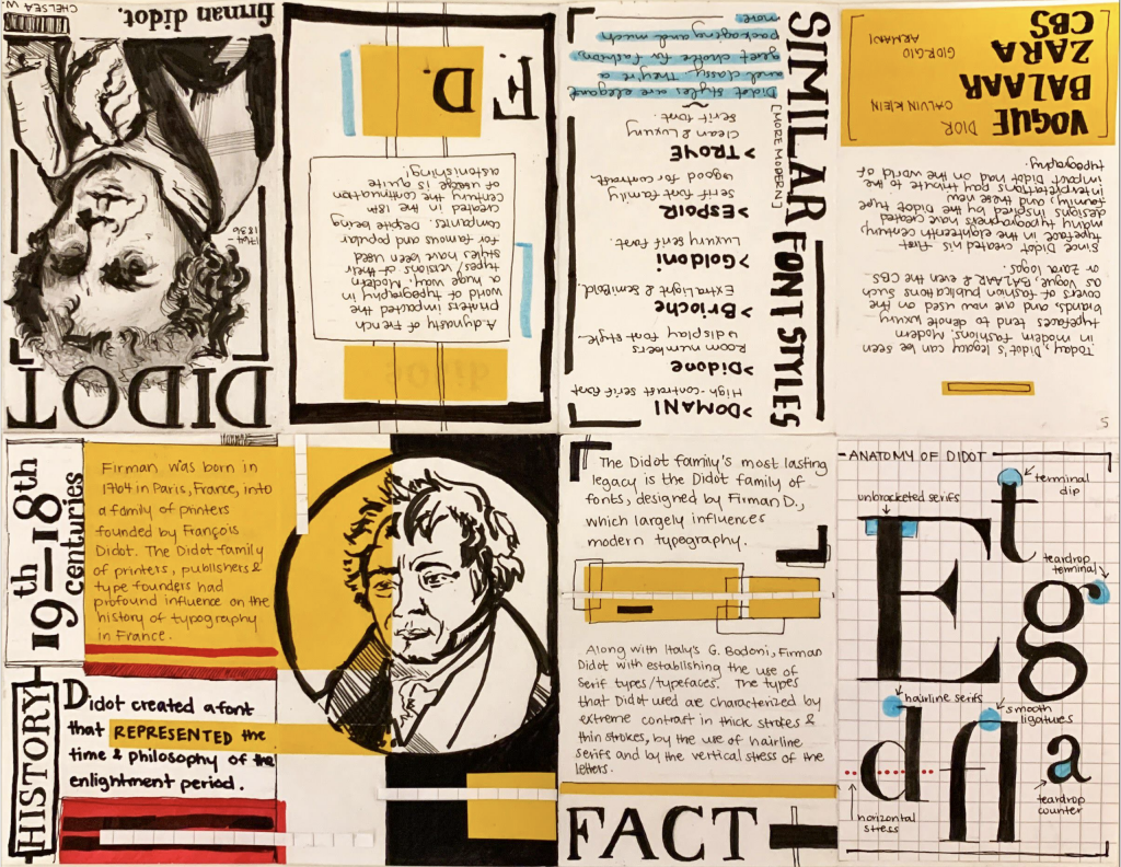
This project I had fun making. After learning a bit about Didot in one of Judy’s lectures, I thought it would be engaging and fun for me to dive a little deeper into the uses of Didot and the history behind it. Now knowing how big brand names and companies use variations of this font style, I knew this was the material I wanted to explore for my zine.
Because of the simple, sleek, and clean style, as well as how it’s used for magazines, I wanted to create a design incorporating those elements. I wanted to keep the colour palette simple but bold and eyecatching. I also wanted to keep the colours and visual elements consistent. I ended up putting more time into researching than I originally planned for, however, I was genuinely invested in learning about the topic. I spent maybe around 5-6 hours in total, researching and assembling the zine.
In giving myself a mark out of 10, I’d give myself an 8.75. I thoroughly enjoyed putting together everything for this project. I wish I had put more effort into managing my time as I felt I could have started sooner. I wanted to be able to have put more effort into designing the last few pages but other than that I am happy with my end result!

