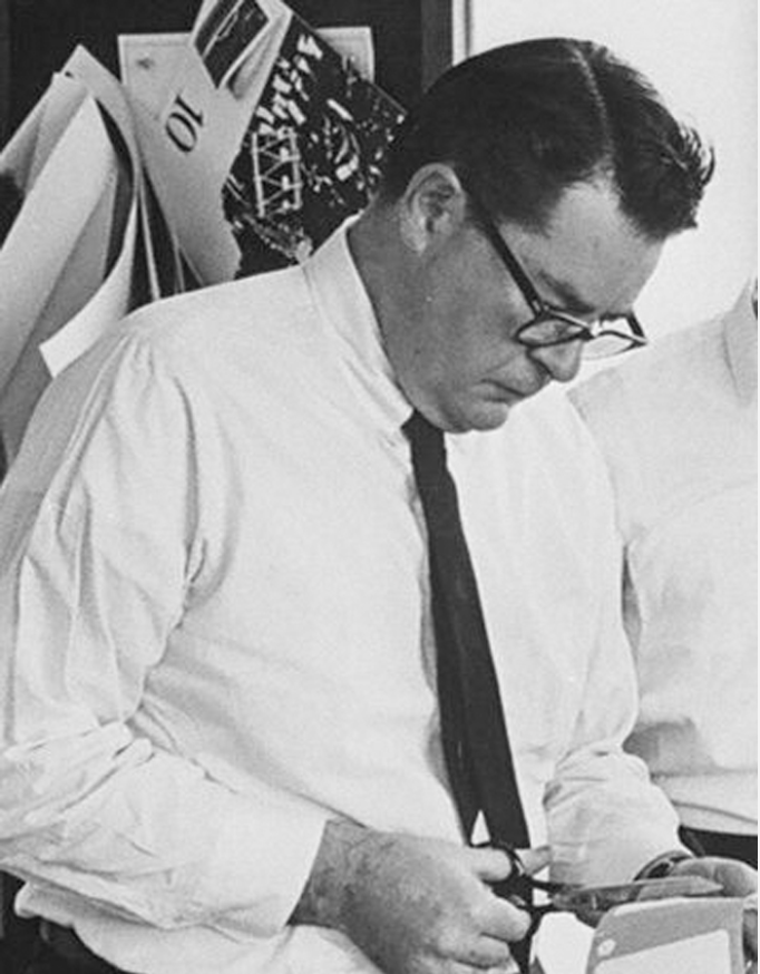
Theo Dimson, a known graphic designer, was born in London, Ontario, on April 8th, 1930. Growing up with comic books and magazines, he became interested in design at an early age. With a scholarship, Dimson attended the Ontario College of Art and Design and graduated in 1950.
After Graduation, began a three-year apprenticeship with Art Associates Limited in Toronto. He freelanced for seven years before rejoining the firm in 1960 as vice-president of creative design. In 1960, Dimson became president and director of a new partnership Reeson Dimson & Smith Ltd. The company then later became Dimson & Smith & Smith Ltd. And maintained this name until Dimson created Theo Dimson Designs Inc. in 1985. He was the president creative director of this company.
He is the author of Great Canadian Posters and has been commissioned by Canada Post to create stamps. He has had solo shows in Toronto in 1978, and at the Royal Ontario Museum from 1992-to 94. Dimson is a me
mber of the Royal Canadian Academy of the Arts, Associate of the Ontario College of Art and Design, and more.
Dimson was internationally recognized and received awards and accolades in books and magazines articles in countries around the world.
Sadly, Mr. Dimson passed away on 18 January 2012.
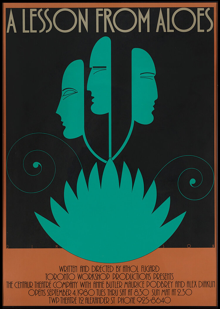
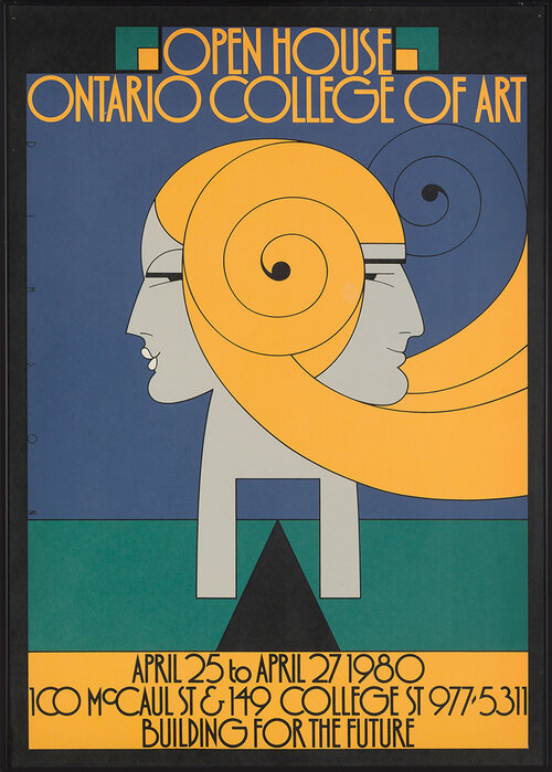
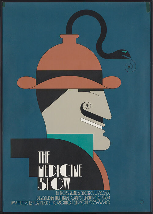
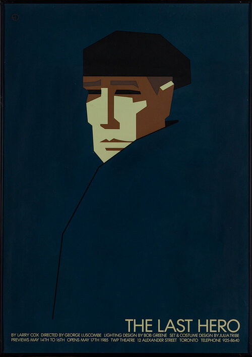
Some of His Works


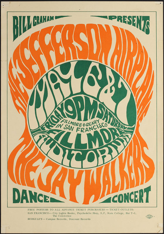
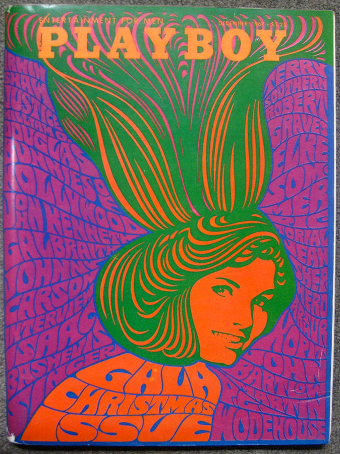
![WES WILSON (1937 ) [PSYCHEDELIC ROCK CONCERTS] Group of 15](https://catalogue.swanngalleries.com/full//227/773227_view_02.jpg)