Giovanni Bellini (1430-1516)

Madonna and Child – 1508
The Agony in the Garden – 1459-65
San Giobbe Altarpiece – 1487
Transfiguration of Christ – 1480
Naked Young Woman in Front of the Mirror – 1515

Giovanni Bellini, born in Venice, Italy in 1430 and died in 1516.  Bellini, being one of the most influential artists of Venetian lived and worked in Venice all his life. He had the honour of being born into the Bellini family of Venetian painters. He created his paintings using the old tempera method during the early period.

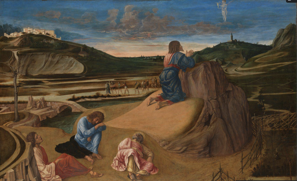
Inspired by the late gothic style of his father and other painters within the family, he went on to paint his early Madonnas and landscapes. Giovanni creates much expression in using elaborate line structure while painting landscapes, however, an even grander part is expressed by the colours of dawn, in their pure brilliance and in the reflected light within the shadows he creates. Giovanni is recognized for involving new ideas and methods portraying natural light. An example of his utilization of natural light is seen in his piece ‘The Agony in the Garden”.

He created many of the first series of Venetian landscape scenes that kept progressing for around a century or more. Giovanni Bellini contributed to the renaissance in a way that he established a distinct fashion of High Renaissance painting, based on a more lavish, colouristic style.

The National Gallery, London. “Giovanni Bellini.” The National Gallery, https://www.nationalgallery.org.uk/artists/giovanni-bellini.

“Giovanni Bellini.” Wikipedia, Wikimedia Foundation, 31 July 2021, https://en.wikipedia.org/wiki/Giovanni_Bellini.

“Giovanni Bellini (1430-1516).” Giovanni Bellini: Italian Renaissance Painter, Founder of Venetian School, 2020, http://www.visual-arts-cork.com/old-masters/giovanni-bellini.htm.

Gestalt – Law of Closure

artist unknown

This design is really creative in using utensils to outline the cola bottle, creating what Gestalt calls the closure effect. The use of the classic red and partial outline of the bottle suggests or implies that the beverage is Coca-Cola. With this piece, the fork and knife are the elements that shape the bottle. Most of the time our brains often ignore contradictory information and fill in the gaps. Viewers see the beverage because our brains fill in the missing gaps in order to create a meaningful image.

Again to reiterate, the use of utensils implies that you’ll want to be consuming a refreshing drink with your daily meals, and advertisers for Coca-Cola want to make sure that their cola will be the satisfaction their customers are looking for. Making our brains work to fill in the gaps is a great marketing tool.

Gestalt – Law of Proximity

Josh Mirman, the artist of this piece, demonstrates Gestalt’s law of proximity perfectly. Mirman exemplifies the principle well by using colour to help viewers group objects within the piece. For example, the use of the colour red, to amplify the hat on Mario as well as the red shirt that he wears. Josh also uses black to represent Mario’s shoes, moustache, and hair. The artist effectively makes the use of words – which are in relation to the game – to create the figure in a way that viewers will still recognize.

Because the artist has used a variety of different colours and has shaped the words to design the character we all know and love, the piece represents a great use of Gestalt’s principle or proximity.

Shape 3D

Artwork by Malika Favre

Malika Favre is a Barcelona-based artist. She has a style that is almost instantly recognizable due to the shapes that she uses. Due to her incredible skill at the art of understanding how to simplify an image down to its bare essentials, making what’s on the page really pop.

The colours she uses are 2 dimensional, but by using the blues for example, for creating shadows and depth really pulls you in. By concentrating on light, Malika is almost drawing with shadows, considering most of her work is super bright. Although her artwork maintains the element of colour, I really wanted to focus on how she creates dimension and depth using them in really clever ways.

Shape 2D

Poster by Han Valentine

As I browse through the artist’s pieces, I’m drawn into the fun shapes and usage of lines to create clean symmetry in this particular poster. The way she uses simple shapes such as the semi-circle for the ‘bowl’ in which one would imagine the noodles to be. The noodles being simple and fun squiggles. I think it was smart to have the word “NOODLES” in the same style at the top to really grasp the viewer’s understanding of what the poster is showing. The way she also uses direction helps pull viewers through the piece, giving it a sense of direction, rather than having the shapes placed randomly.

Something I really like about the style is the use of solely 2D shapes, even though the ‘egg’ in the top right corner doesn’t contain depth (shadows or value) we can still tell what is it. The overall composition works really well and is a fun poster I would buy for my room.

Colour

Artist – Pascal Blanché

The “Blade Runner” is about an officer in search of a former blade runner who has been missing for over three decades. The main colours that are consistently found are warm oranges reds and yellows, contrasted against the bold blues. The use of the cool indigo contrasting against the oranges and red, really make the poster pop. The glow is extremely vibrant, the complementary blue tones are a natural fit for the orange. Without colour, this poster would be very flat, boring, and not as enticing. The theme and use of colour in the movie is portrayed in the poster well.

My Yearbook Spead

Yearbook Spread by Chelsea W.

The yearbook spread I created, was made with watercolour, sharpie, and a small use of markers, on mixed media paper. I love working with multimedia, using what I have available to me in whichever workspace I have. Even when there are dried out markers I would still use them for the difference in texture. In the centre of my spread is the self-portrait of myself, done with watercolour, the pose is fun, bubbly, and has an openness to it, trying to portray myself being ready to take on the toughest things life throws at me in the most positive way. The intermediate blues, reds, and yellows I use are my favourite main colours to work with. They each contrast and balance each other out so well, it’s pleasing to the eye. I mentioned that I would love to be born in the ’80s, for the style, colours, and fun poping designs. I attempted to pull those characteristics through my piece as the theme. Despite the current (organized) mess on my desk, I had a lot of fun creating this work.