

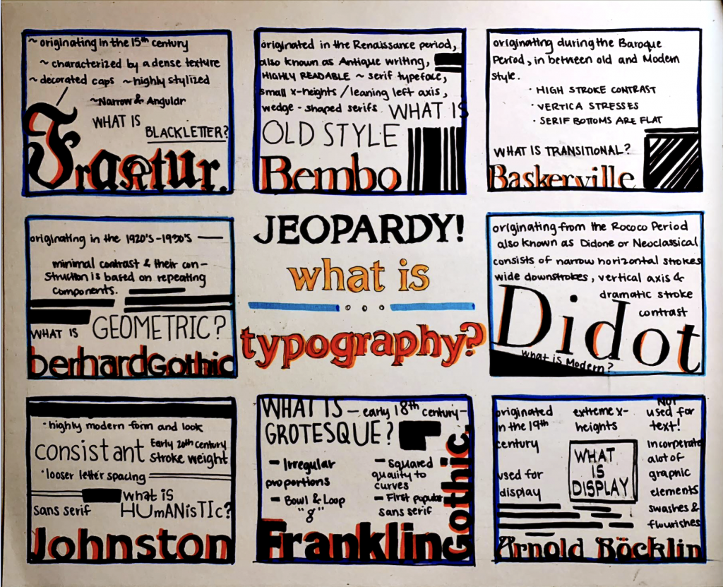
For this poster, since I knew that there would be a lot of information to additional add to the design I wanted to keep it clean and concise. Initially, I wanted to create a concept that would provide a more playful role, allowing myself to go big and design outside of the grids and limitations. However I came up with the idea of the TV show Jeopardy. I thought it would be a fun interactive way to incorperate information and characteristics of typeface with which fonts have them. In the game show Jeopardy, the way the Q&A works is by aksing reversed questions, which i thought could be a fun idea on a poster. I tried to recreate the “cue” cards and the layou, similar to how they have it on the game show. I used markers for colours and Ink pens for the outlinings and information. The research and planning took around 4 hours, moving on to the completion of the poster it took around 10 hours. Overall I would give myself an 8.5 out of 10 for the reason that the words and information feel too crammed into the grid outlines. I definitely know the execution of the final project has room for improvment, but I am happy with how it turned out in the end.