Gestalt – Law of Closure

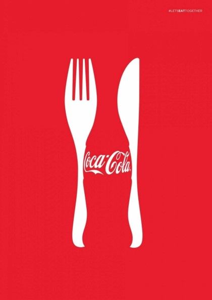
artist unknown

This design is really creative in using utensils to outline the cola bottle, creating what Gestalt calls the closure effect. The use of the classic red and partial outline of the bottle suggests or implies that the beverage is Coca-Cola. With this piece, the fork and knife are the elements that shape the bottle. Most of the time our brains often ignore contradictory information and fill in the gaps. Viewers see the beverage because our brains fill in the missing gaps in order to create a meaningful image.

Again to reiterate, the use of utensils implies that you’ll want to be consuming a refreshing drink with your daily meals, and advertisers for Coca-Cola want to make sure that their cola will be the satisfaction their customers are looking for. Making our brains work to fill in the gaps is a great marketing tool.

Gestalt – Law of Proximity

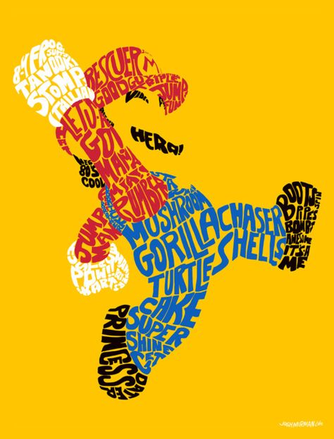
Josh Mirman, the artist of this piece, demonstrates Gestalt’s law of proximity perfectly. Mirman exemplifies the principle well by using colour to help viewers group objects within the piece. For example, the use of the colour red, to amplify the hat on Mario as well as the red shirt that he wears. Josh also uses black to represent Mario’s shoes, moustache, and hair. The artist effectively makes the use of words – which are in relation to the game – to create the figure in a way that viewers will still recognize.

Because the artist has used a variety of different colours and has shaped the words to design the character we all know and love, the piece represents a great use of Gestalt’s principle or proximity.

Shape 3D

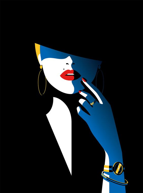
Artwork by Malika Favre

Malika Favre is a Barcelona-based artist. She has a style that is almost instantly recognizable due to the shapes that she uses. Due to her incredible skill at the art of understanding how to simplify an image down to its bare essentials, making what’s on the page really pop.

The colours she uses are 2 dimensional, but by using the blues for example, for creating shadows and depth really pulls you in. By concentrating on light, Malika is almost drawing with shadows, considering most of her work is super bright. Although her artwork maintains the element of colour, I really wanted to focus on how she creates dimension and depth using them in really clever ways.

Shape 2D

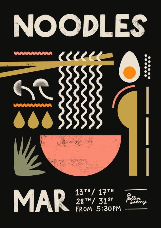
Poster by Han Valentine

As I browse through the artist’s pieces, I’m drawn into the fun shapes and usage of lines to create clean symmetry in this particular poster. The way she uses simple shapes such as the semi-circle for the ‘bowl’ in which one would imagine the noodles to be. The noodles being simple and fun squiggles. I think it was smart to have the word “NOODLES” in the same style at the top to really grasp the viewer’s understanding of what the poster is showing. The way she also uses direction helps pull viewers through the piece, giving it a sense of direction, rather than having the shapes placed randomly.

Something I really like about the style is the use of solely 2D shapes, even though the ‘egg’ in the top right corner doesn’t contain depth (shadows or value) we can still tell what is it. The overall composition works really well and is a fun poster I would buy for my room.