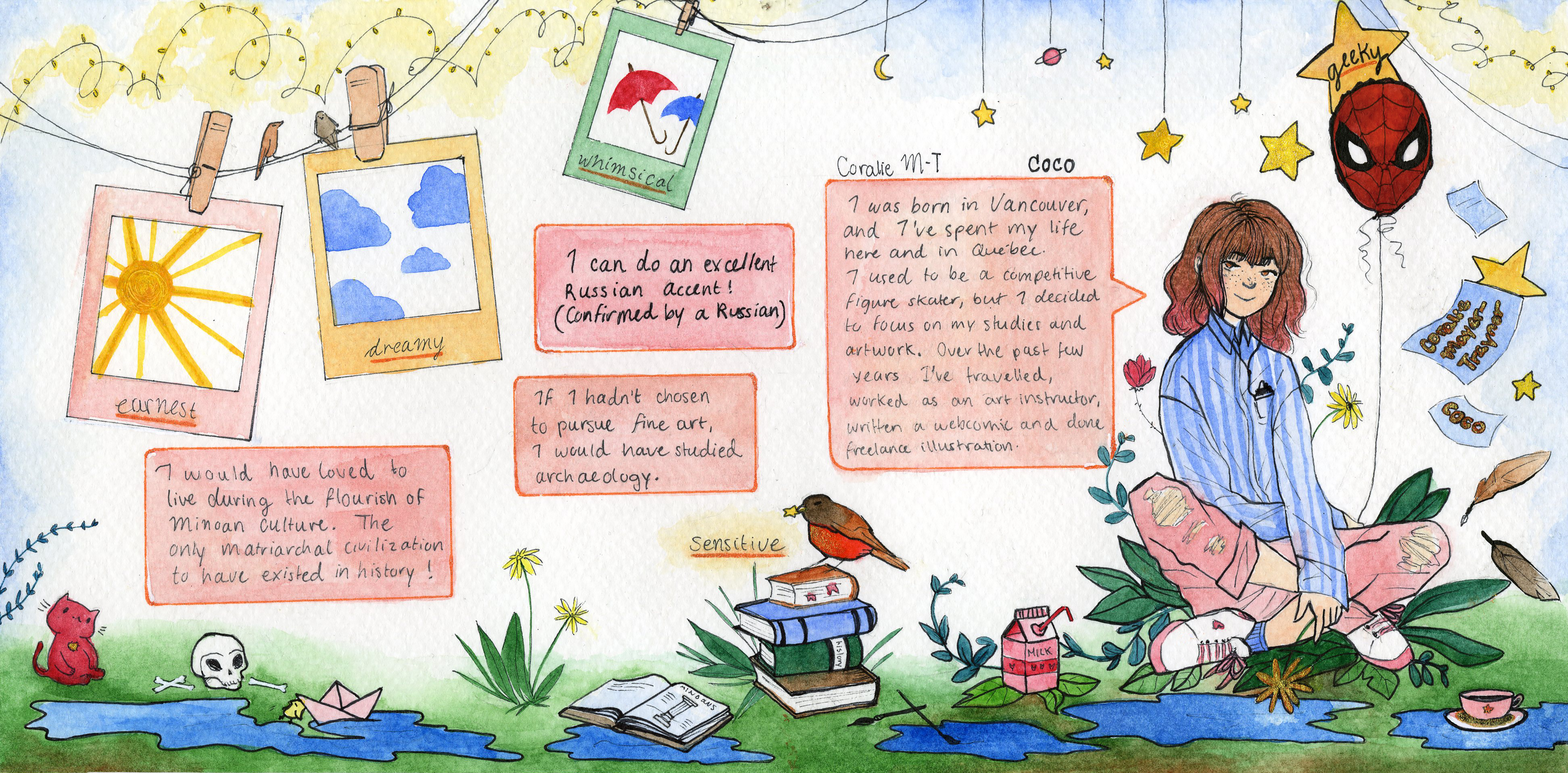
My yearbook spread is meant to communicate the essence of who I am. In the layout, I chose to create a busy and somewhat cluttered environment to represent my variety of interests, experiences, and skills. I used a detailed and illustrative drawing style that is present in both my webcomic and everyday drawings.
In this spread visual communication was my main goal; it needed to be recognizably mine from just a glance at the layout and artwork on the page. Thus, I did not feel the need to put emphasis on my name. The composition of the spread should naturally lead the viewer’s eye to it.
The general colour palette I’ve used in the spread is limited to brights and pastels, and it aims to relate to my personality, interests and visual aesthetic. The background of the spread remains clean and light to attract the viewer’s eye to the drawn elements and the information written out. The written information is placed in comic book-like text bubbles to emphasize my “geekiness” as well as to visually support my aptitude as a webcomic writer and illustrator.
I added specific elements that relate directly to my 5 descriptive words. For the word earnest, I added the image of a sun. The sun radiates genuineness, purposefulness, resoluteness and symbolizes the absence of superficiality. To demonstrate that I’m a dreamer, I’ve illustrated stars, planets and clouds to give the page a “head-in-the-clouds” look. To give the page a whimsical air, I designed it to be appealingly quaint, playful and complete with a bright and pastel colour theme. Hearts are a common pattern in the page, along with delicate flowers, plants and birds to demonstrate my sensitivity and emotional bond with the people and things that surround me.