Final Spread – Last Page Rationale

Last Page – Rationale

Joyce and I decided that we would split the index and the back page between the two of us. While we did work mostly independently from each other, we agreed early on upon a more minimalism-oriented aesthetic. We didn’t want either of the pages to feel too crowded or overwhelming, so making use of white/negative space was paramount.

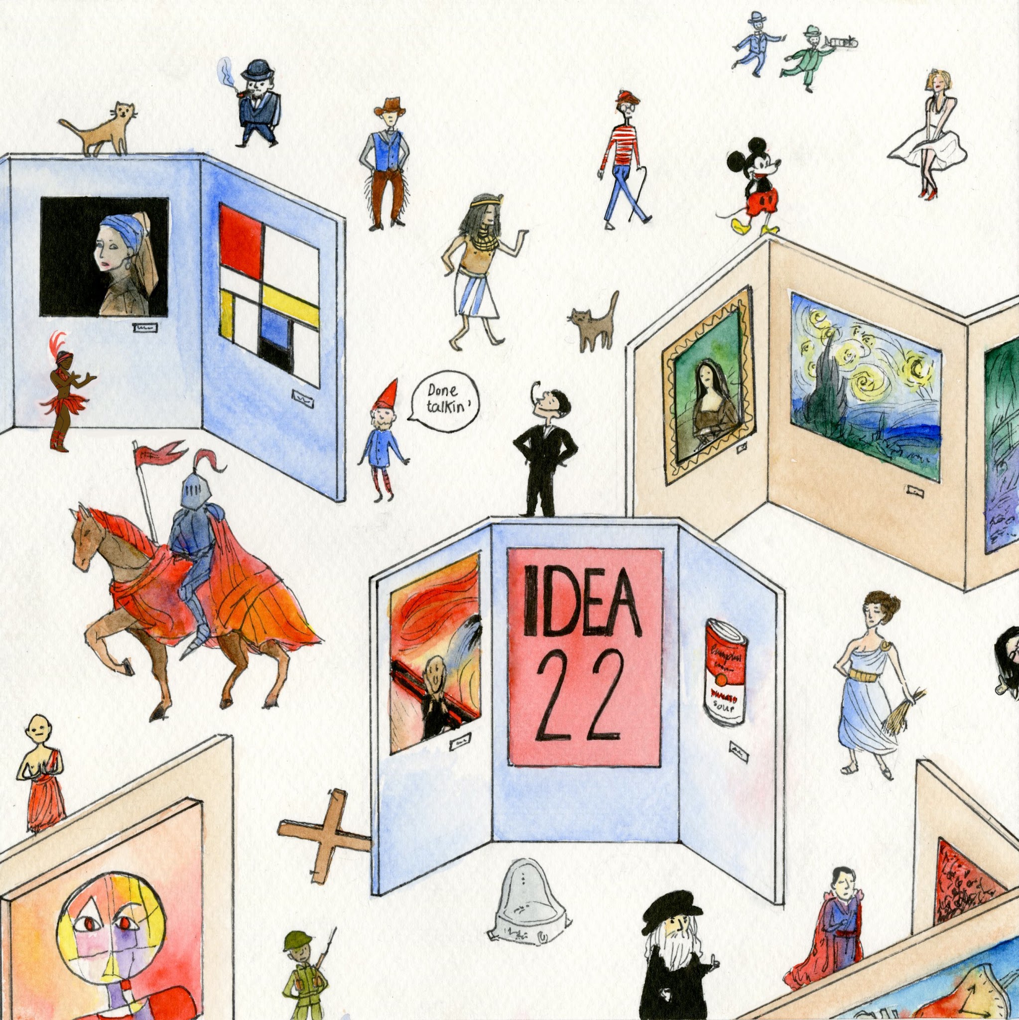
I struggled a bit with finding something appropriate to place on the last page of the book; I wanted to acknowledge the class’ hard work, maybe have some kind of closing note, or design a glossary-type page which would list everyone’s name alongside their respective spreads. Popular opinion was that our instructor should be pictured somewhere as well.

After much sketching and even one prototype, I settled on this idea of having a sort of art gallery displaying famous works of art. Included are “The girl with the pearl earring”, a de Stijl design, The Mona Lisa, “Starry Night”, Monet’s waterlilies, The Scream, Warhol’s Campbell Soup print, Duchamp’s “readymade”, a cubist painting, Dali’s famous clocks and a Pollock action painting.

The idea of having an art gallery was good, but we did much more than research fine art over the course of this term, and so I thought featuring various famous historical figures visiting the gallery would help summarize more fully the content of the book. Some of these are Winston Churchill, King Seti I of ancient Egypt, Josephine Baker, Leonardo da Vinci, Marilyn Monroe, and the Orville brothers. I really wanted to feature some designers we learned about as well, but when I was picking who to feature in the gallery I leaned towards very easily recognizable characters, and I couldn’t think of, off the top of my head, any designers from the time period we studied with unique appearances.

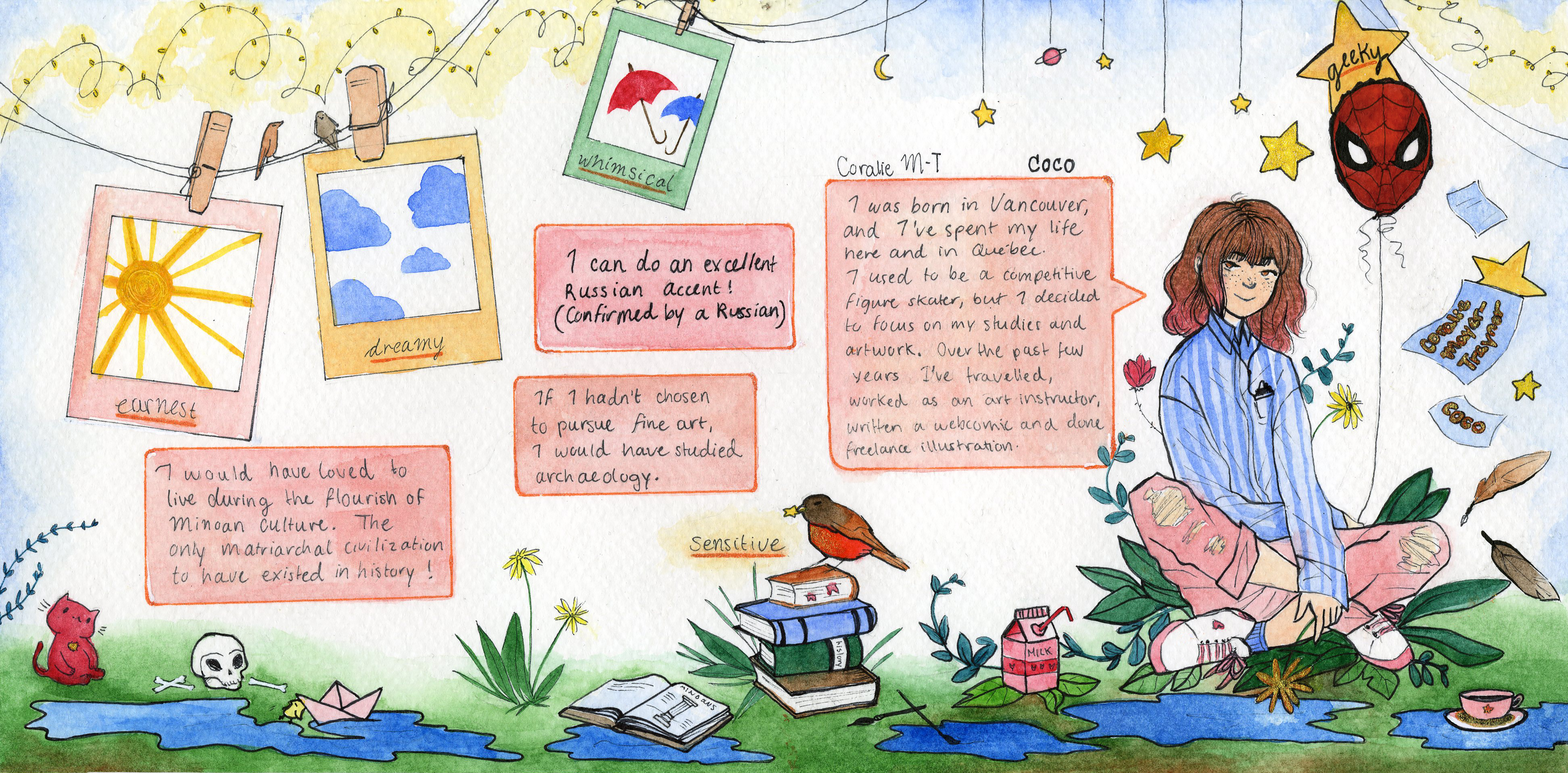
My name isn’t written anywhere in the spread, since the whole idea of the page is to encompass the whole class. However, I do have an unhealthy love and obsession for cats, so I included a couple just to add that extra personal touch.

Finally, just to add a bit more of that “this book is ending” feeling to the spread I included our instructor, Judy, dressed in her gnome costume and saying: “Done talkin’”, as she has written on the last slide of all her survey lectures. A great closing statement.

Survey 7 Spread: Rationale

From 1095 to 1915: The Deutscher Werkbund

Survey 7 Spread

For this survey, my group’s task was to conduct research on objects belonging to the ten years between 1905 and 1915. The Deutscher Werkbund made an important step in modernizing the style and production of objects in everyday life. It was a precursor to the Bauhaus and the true beginning of  modernism.

This artifact is inspired by an actual cookie package produced by the Werkbund. It sports the Association’s logo/symbol on top, and its signature font in front. In addition to this, the text is written in German to make the artifact appear to be more authentic. The background of the photo includes natural materials of wool and cotton, as well as a corner of a cubist painting (a movement of the era).

The pages of the spread themselves sport the same colours and pattern as they appear on the box. I also matched the colour of the font to the blue on the object. The spread is clean and functional to support the ideas of the Werkbund.

I’d probably give myself an 8.5/10 on this one, since I really wanted to incorporate more of the research of my group members but wasn’t able to without making the spread seem cluttered. But other than that, I’m pretty happy with it.

Spread #4 – Rationale

Survey 4 Spread

Photography – It Came In A Flash

This spread covers the hundred years spanning from 1750 to 1850. The focus of our research was on science and technology. While lots happened during this time, photography specifically came to be immensely developed as]fter it’s invention, especially in the last 50 years of the time period. It came to be an essential part of culture back when it first came out, and continues to to be extremely important today.

Since the task was to complete a comparative spread, I chose to compare two different methods of photography that developed side by side at the same time: the daguerreotype and the calotype. On the first page, I have some background information about the earlier invention of photograms which allowed photography to emerge. I have the oldest known photograph framed with a handwritten caption that makes it look authentic, and while it adds an interesting component to the spread it also serves to separate two short bodies of text that would look too long if put together.

‘The transition is easily made from the left page to the right, with the daguerreotype occupying the top section of the right page since it is a slightly older model than the calotype. I wanted the transition and flow,of the spread to be linear and comprehensible. The pictures taken with the two instruments are both captioned and framed in the same way to keep a uniform aesthetic throughout the spread. To take this even further, I also framed the edges of the page in the same way. This is a type of framing technique that began being used right as photography became more widespread, so it also fits within the timeframe!

For the title, I decided to go with an old-fashioned serif type similar to some I’ve seen on posters of the era. And obviously, there’s a pun in the title. I realize as I’m writing this that I forgot to add the time fram on the spread itself, so I should probably add that in.

In terms of the background, I didn’t want it to make it so busy so that it’d obstruct the text or distract from the pictures, but I didn’t want to leave it blank either. I wanted to keep the style authentic, so I was struggling with what to do until I fount out that the watercolour medium was invented during this time frame! I added a nice blue wash to match the colour of the photo frames and some brown because that is actually the colour of the first printed photograph. However, since I couldn’t print in colour, I had to get a little creative.

I’d give myself a nine out of ten on this spread.

Survey 1 – History Spread!

From Pyramids to Ptolemy,

A Brief Political History of Ancient Egypt.


Spread by Coralie Mayer-Traynor, survey 1, Geo-political.


A Worth Reading(?) Rationale:

The Civilization of Ancient Egypt remained fundamentally unchanged for almost 4000 years. The mysterious Ancient Egyptians, with their fascination with eternity, their devout worship, and complex social structure, have been the subject of admiration for generations since their decline. In this spread, I wanted to convey the power and endurance of this civilization by constructing a timeline of key political events occurring in the Dynastic period that influenced the course of Ancient Egypt.

It is important to realize that this great culture never really ceased to exist; it merely evolved, adapted to the new world after years of stagnation as other conquerors took over the land. That is why the Nile river bleeds off the spread; it signifies a change in their government and way of life after centuries of remaining untouched, not the end of their existence.

The timeline begins with the head of a snake to demonstrate the power of the initial unification of Egypt. The Uraeus, or Egyptian cobra, was then used as a symbol of sovereignty, royalty, deity, and divine authority. The empire, not without turmoil, rose and prospered during this time, with the Pharaoh’s power at its peak. As the king’s power diminished and was distributed to viziers, priests and noblemen, the snake dwindles into the Nile river to represent a sort of stability that was gained after the first few centuries of the newly born Egyptian kingdom. While over the next thousands of years the country was often met with conflict and foreign invasion, the essential culture of the people remained the same. Foreign invaders and Pharaohs alike kept alive the traditions of Egypt because of the culture’s strong notion of perpetuity. To give a notion of just how long core Ancient Egyptian culture, ideas and religion lasted, here is a fact many find difficult to believe: Queen Cleopatra, the last pharaoh of Ancient Egypt, was born in 69 BC, and the great pyramid of Giza, that of Khufu, was built in 2566 BC by the fourth dynasty rulers. In fact, Cleopatra was born closer to the time of release of the iphone (2007 AD) than she was to the building of the great pyramids.

The spread ends with the termination of the Dynastic Era of Ancient Egypt –a period that held 31 consecutive dynasties over the span of 2768 years– and the beginning of the Ptolemaic Era in which Ancient Egypt was under the control of the Greek Empire (Hence the name: from pyramids to ptolemy).

PS: My name is included written in hieroglyphics at the end of the snake scale pattern, and is written in english in the river under the “First Intermediate Time” section of the spread.

Yearbook Spread!

My yearbook spread is meant to communicate the essence of who I am. In the layout, I chose to create a busy and somewhat cluttered environment to represent my variety of interests, experiences, and skills. I used a detailed and illustrative drawing style that is present in both my webcomic and everyday drawings.

In this spread visual communication was my main goal; it needed to be recognizably mine from just a glance at the layout and artwork on the page. Thus, I did not feel the need to put emphasis on my name. The composition of the spread should naturally lead the viewer’s eye to it.

The general colour palette I’ve used in the spread is limited to brights and pastels, and it aims to relate to my personality, interests and visual aesthetic. The background of the spread remains clean and light to attract the viewer’s eye to the drawn elements and the information written out. The written information is placed in comic book-like text bubbles to emphasize my “geekiness” as well as to visually support my aptitude as a webcomic writer and illustrator.

I added specific elements that relate directly to my 5 descriptive words. For the word earnest, I added the image of a sun. The sun radiates genuineness, purposefulness, resoluteness and symbolizes the absence of superficiality. To demonstrate that I’m a dreamer, I’ve illustrated stars, planets and clouds to give the page a “head-in-the-clouds” look. To give the page a whimsical air, I designed it to be appealingly quaint, playful and complete with a bright and pastel colour theme. Hearts are a common pattern in the page, along with delicate flowers, plants and birds to demonstrate my sensitivity and emotional bond with the people and things that surround me.