Photography – It Came In A Flash
This spread covers the hundred years spanning from 1750 to 1850. The focus of our research was on science and technology. While lots happened during this time, photography specifically came to be immensely developed as]fter it’s invention, especially in the last 50 years of the time period. It came to be an essential part of culture back when it first came out, and continues to to be extremely important today.
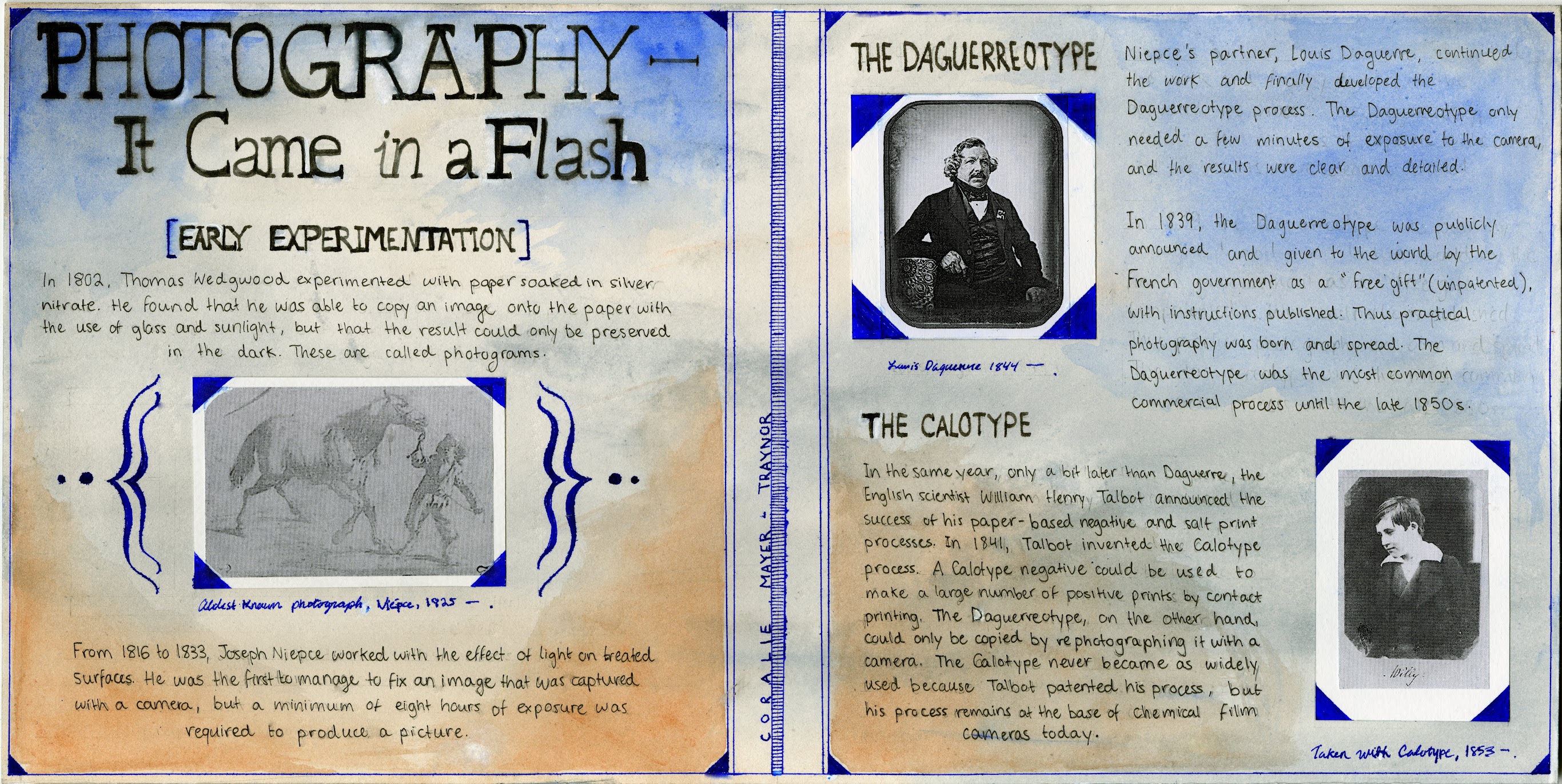
Since the task was to complete a comparative spread, I chose to compare two different methods of photography that developed side by side at the same time: the daguerreotype and the calotype. On the first page, I have some background information about the earlier invention of photograms which allowed photography to emerge. I have the oldest known photograph framed with a handwritten caption that makes it look authentic, and while it adds an interesting component to the spread it also serves to separate two short bodies of text that would look too long if put together.
‘The transition is easily made from the left page to the right, with the daguerreotype occupying the top section of the right page since it is a slightly older model than the calotype. I wanted the transition and flow,of the spread to be linear and comprehensible. The pictures taken with the two instruments are both captioned and framed in the same way to keep a uniform aesthetic throughout the spread. To take this even further, I also framed the edges of the page in the same way. This is a type of framing technique that began being used right as photography became more widespread, so it also fits within the timeframe!
For the title, I decided to go with an old-fashioned serif type similar to some I’ve seen on posters of the era. And obviously, there’s a pun in the title. I realize as I’m writing this that I forgot to add the time fram on the spread itself, so I should probably add that in.
In terms of the background, I didn’t want it to make it so busy so that it’d obstruct the text or distract from the pictures, but I didn’t want to leave it blank either. I wanted to keep the style authentic, so I was struggling with what to do until I fount out that the watercolour medium was invented during this time frame! I added a nice blue wash to match the colour of the photo frames and some brown because that is actually the colour of the first printed photograph. However, since I couldn’t print in colour, I had to get a little creative.
I’d give myself a nine out of ten on this spread.