To thicken or to thin?
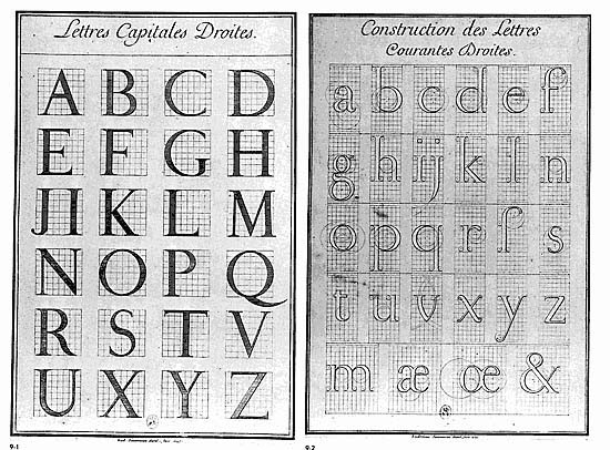
In 1692, type enthusiast French King Louis XIV assembled a group of scholars to develop a new typeface for the Imprimerie Royale (Royal Printing Office). He had ordered it to be designed using scientific principles, which was unheard of at the time. The research would be headed by mathematician, Nicolas Jaugon, and the scholars would begin to dissect alphabets and typefaces of the past.
The new typeface would be synthesized in a grid that measured 64 by 64 units, that would then be further chopped into 36 by 36 units. Totaling in 2394 units. The new design would be inspired by flat pen and chisel rather than calligraphy. Mathematical precision was made possible through thorough measurement and use of drafting tools. The typeface would be iconic with its focus on the contrast between thick and thin strokes, sharp serifs. Even though the typeface was made methodically, final decisions were made with the eye.
The typeface was named Romain du Roi (The King’s Roman). Louis Simonneau and Phillipe Grandjean would respectively go onto engrave the master alphabet on copperplate prints and cut the punches to convert it into type. The typeface could only be used by the Imprimerie Royale and unsanctioned use guaranteed capital punishment. However, many type-founders were quick to emulate Romain du Roi but made sure to make their own creations distinct enough as to not find themselves at the fury of the law. Romain du Roi marked a typographic era known as “transitional roman” where typefaces were transitioning out of calligraphic qualities of the “old style fonts.” This also marked the time when the engineer held greater influence over type than the calligrapher.

Enter the Rococo period. Type measurement was pure chaos. Every foundry had their own measurement systems and nomenclature, Pierre Simon Fournier le Jeune was going to have none of it. He pioneered the first standardization of type by dividing the Pouce (an obsolete french measurement unit) into 12 lines. He then divided the lines into 6 points. Using this system he created “Petit-Romain” size, which is equivalent to a modern 10 point font, and “Cicero” size, which was equivalent to a modern 12 point font.
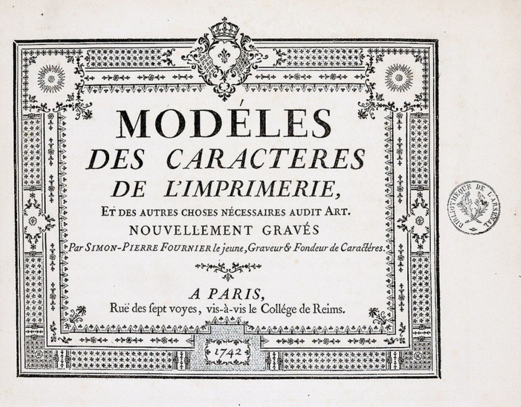
He would also go on to make the first specimen book, Modèles des Caractères de l’Imprimerie (Models of Printing Characters) in 1742. The task took him 6 years as he decided to make them by hand. The specimen book also introduced the idea of font families, where visually compatible fonts could be mixed. It is said that “printing is the artillery of the intellect.” If this is true then Pierre Simon Fournier le Jeune was the arms dealer.
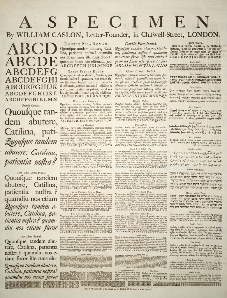
Engraver of gunlocks, barrels, silver chasings, and letter stamps, William Caslon would take up type design and founding in 1720. He would create Caslon Oldstyle which would take England by storm. Rather than being fanciful with his typeface, Caslon would design his fonts for sturdiness and legibility. It would often be described as comfortable and easy on the eye.
He did this by increasing the contrast between thick and thin lines. However unlike Romain du Roi in mainland Europe, which would thin existing strokes, Caslon would thicken strokes instead. The Caslon Foundry would be run by his heirs until the 1960s.
You can find alternative modern versions of these fonts below!
Sources
- Revival Type: Digital Typefaces inspired by the Past by Paul Shaw
- Meggs’ History of Graphic Design 5e by Philip B. Meggs, Alston W. Purvis