Jobbing Printers vs. Arts and Crafts
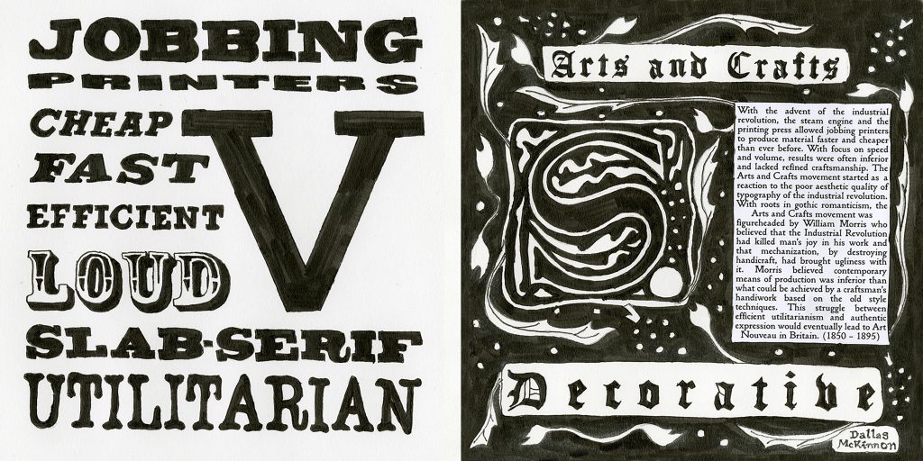
I was tasked to create a typography spread set in 1850-1895. I have opted to cover the conflict between jobbing printers and the Arts and Crafts movement.
I decided to pick this topic because the dichotomy and contrast between the two is striking and bold. I believe it would translate well visually in a spread. The end goal was to have a spread comparing the two styles in a competitive, versus-style layout.
Problems I ran into were:
- Layout of the main information on the arts and crafts side
- Readability vs Faithful to the timeframe of the arts and crafts side
- Size of the S in VS. not matching size of the V
- Forgot to add a dropcap in the arts and crafts side
Things I felt I did well:
- Overall concept and execution
- Selection of what kind of information I would use
- Once again, the placement of my name
I would grade this work an 9/10 as I was not successful matching the S size to the V and the oversight of the dropcap.