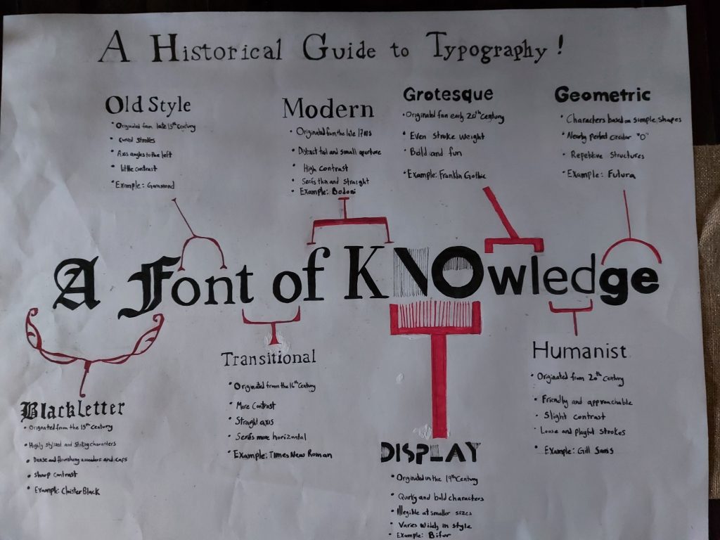
For this last project my concept was to merge my timeline with my title. I thought that a good way to convey type evolving was to see the gradual shift literally! I chose my title “A Font of Knowledge” because of the obvious pun and it had coincidentally sixteen letters so I could dedicate two letters to each type. I really liked my concept this time around! Although, I think my execution was a bit lacking in some places My hands started cramping up when I was writing my notes so I elected to just write in my normal hand writing, which is truthfully atrocious. I think I should have budgeted my time better and paced myself so my hand would be able to deliver better handwriting. I also probably could’ve chose a smaller size of paper, but I was really enthusiastic to make my title giant. I probably should’ve made the top title smaller to not compete with my main title. Another possibility could’ve been to frame my notes in themed frames that match the type! I spent 7 hours on this project and I’d give myself an 8/10.