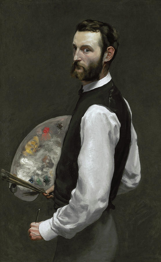
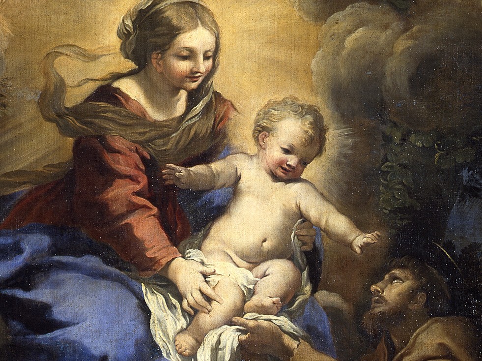
Jean-Frédéric Bazille was an aspiring painter and a largely forgotten member in the friend circle of notable impressionist painters such as Monet, Renoir, and Sisley. They’ve been noted to travel, work, and share studios together. Although Bazille is not often recalled in art history, he played a large part in the formation of the impressionist movement as he was active in the centre of it all.
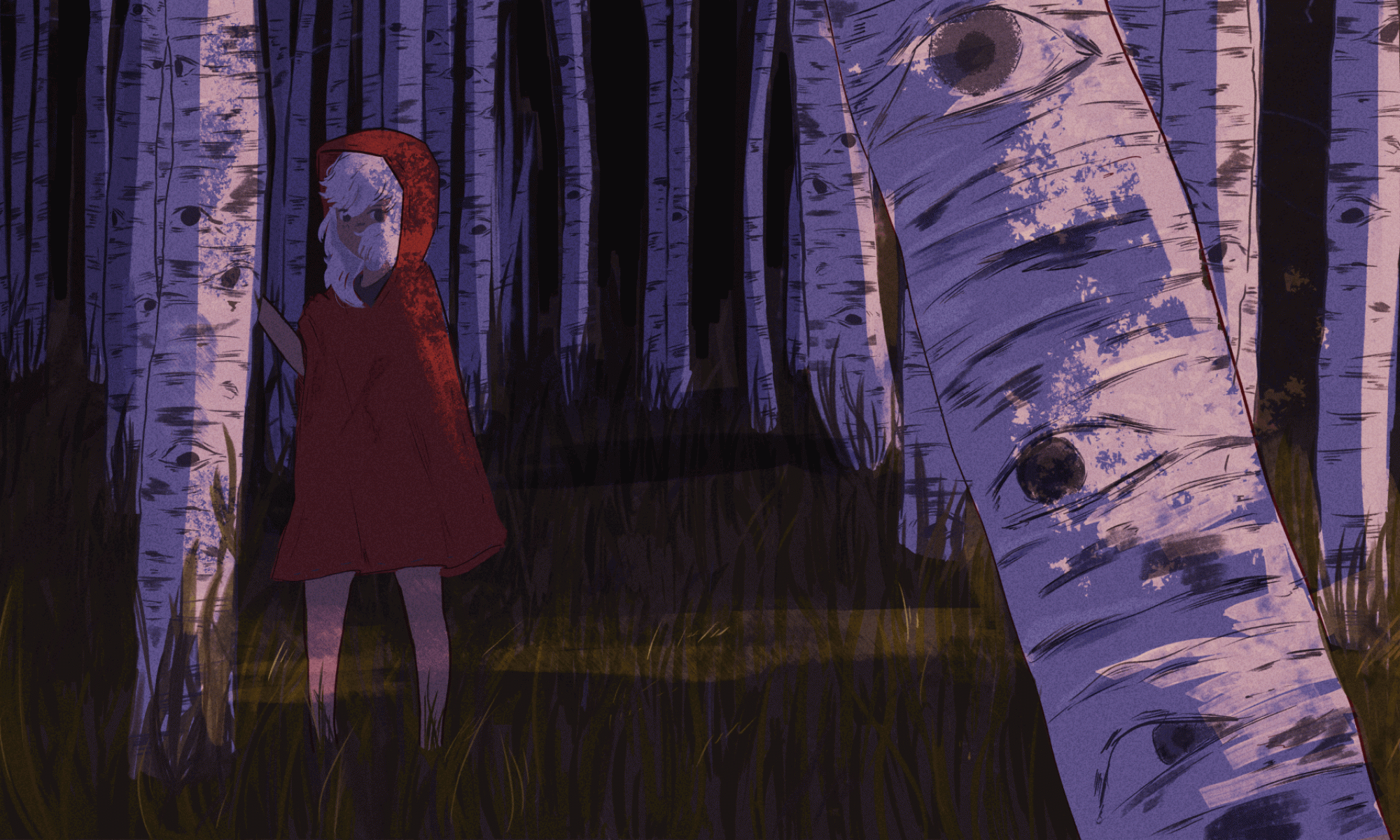
“The Improvised Field Hospital” This painting depicts Monet recovering from a leg injury with his leg propped up under the instruction of Bazille himself, because of his medical knowledge Bazille took leadership of the situation.
Bazille was born in 1841 in a city in France called Montpellier. He was born into a wealthy but strict family which would play a large part in his ethos as an artist. His father forced him into medical school which made Bazille miserable. The depressed Bazille attended med school until 1864 where he failed his exams and promptly dropped out. Monet was elated with this development while his father predictably was less amused. His father relented to letting Bazille pursue his dream as a painter but kept control of his finances.
“The Family Gathering” Bazille’s strict father can be seen reclining in the chair with a grumpy expression.
My personal favorite aspect of his art is his intuitive sense of colours and eye for texture. It’s most prominent in his nature focused art where he uses vivid hues and delicate but loose brush strokes.
Flowers, 1868Nature morte au héron, 1867
Tragically, in 1870 Bazille died in the Franco-German war, three months after one of his paintings, “Summer Scene Bathers” finally got into the Paris Salon. He only painted for seven years before dying at the young age of twenty-eight. His friends would later move on to lead the next movement impressionism, but Bazille never had the chance to flourish with them. His life was cruelly cut short when he just started succeeding in art and overcoming the hurdle of his unsupportive parents.
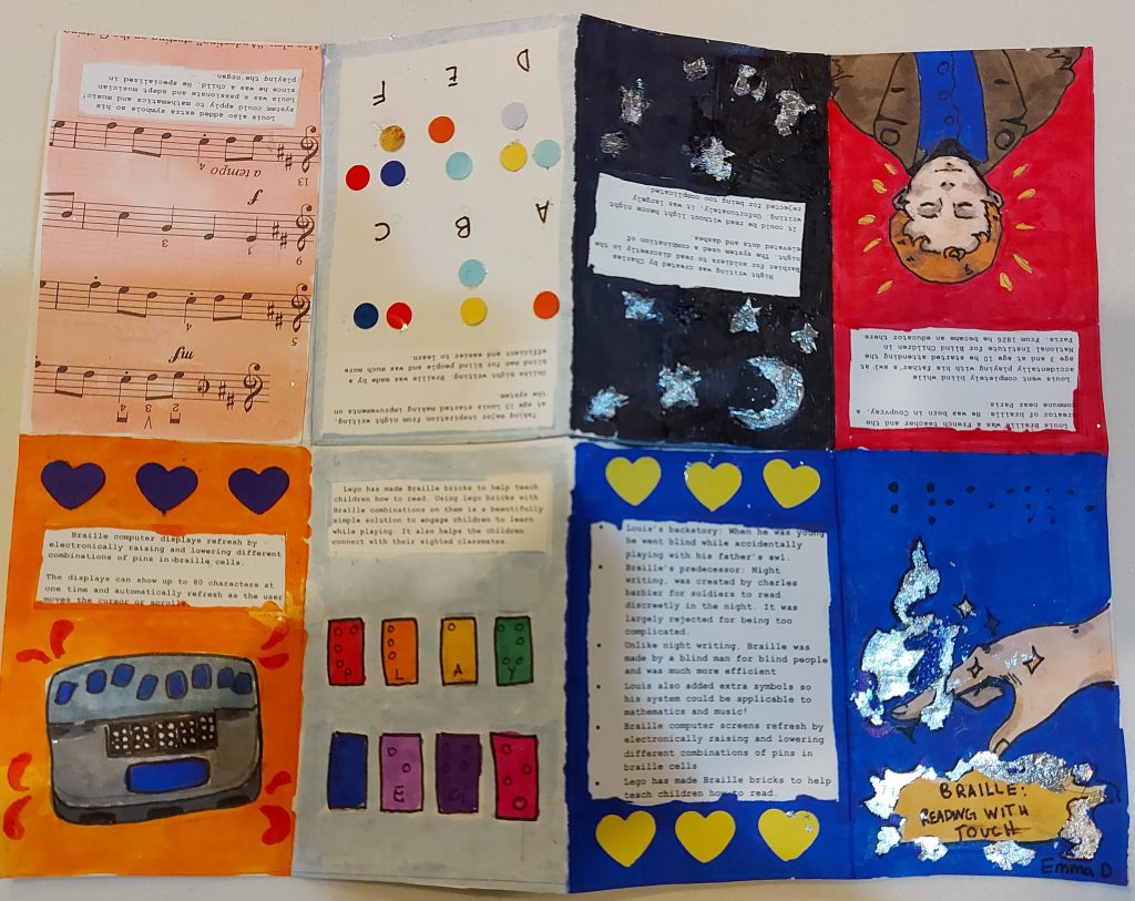
For my typography zine, I researched the history and modern-day uses of braille. I’d like to first say I’m happy with the research I did, and I think I logically organized the zine. First tackling the origins of braille then more modern examples like computers and Lego. For this project, I mainly used markers and some foil to add some sheen. It was my first time using foil, so it came out a lot messier than I wanted but I’m glad I pushed myself to experiment. Next time I do a zine I’d like to cut a larger size of paper I tend to write a lot so on the smaller size (8.5×11”) it’s hard to read my paragraphs. I also think some pages look emptier than other ones making them look lazy. I’ll aim to also be neater next time! I spent around 7 hours on this project, and I’d give myself an 8/10.
Reference
Encyclopædia Britannica, inc. (n.d.). Louis Braille. Encyclopædia Britannica. Retrieved October 27, 2021, from https://www.britannica.com/biography/Louis-Braille.
Johnson, T. (2020, August 12). Free lego® braille bricks released by the Lego Foundation. New Elementary: LEGO® parts, sets and techniques. Retrieved October 27, 2021, from https://www.newelementary.com/2020/08/free-lego-braille-bricks-released-by.html.
Refreshable Braille displays. The American Foundation for the Blind. (n.d.). Retrieved October 27, 2021, from https://www.afb.org/node/16207/refreshable-braille-displays.
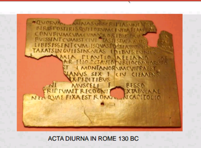
Believe it or not, the predecessor of newspaper predates when paper became widely available in the west. The ancient Romans, under the orders of Julius Caesar, devised a way to announce happenings to the public. This proto newspaper was called “Acta Diurna” which directly translated into “daily acts”. These notes were carved into stone or metal and placed in public spaces for citizens and traders to read. After an Acta Diurna became obsolete, they were taken down and stored as a public record.
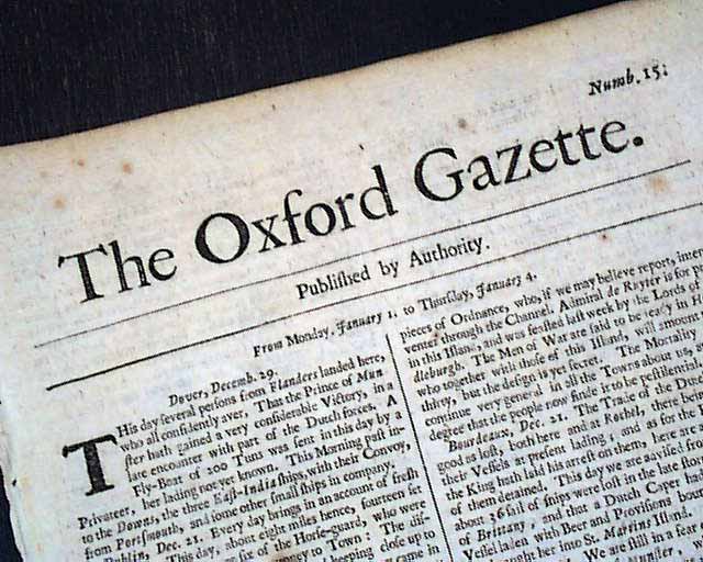
Fast forward to a century after the printing press was invented. The first appearance of newspapers as we know them today started in Europe in the 1620s where people would spread the news through foreign journals called “corantos”, though they weren’t produced frequently, and few were printed. Newspapers truly became widely circulated and streamlined when the civil war arose during 1640 and demand for information became insatiable. Many news outlets began popping up including the “Oxford Gazette”, now known as the “London Gazette”. This newfound influence of newspapers did not go unnoticed, the government and royalists started mistrusting newspapers. In retaliation, the government enforced a licensing system, where only papers approved by the royalists could circulate. Shortly after the London Gazette started only publishing official news and pieces from the government. This sanitization led to more distrust and discourse than the actual spread of information. The public at the time was growing wary of royalists. This pushed printers to risk printing unlicensed papers, following people’s yearning for a more authentic news source.
I think it’s truly fascinating that as soon as newspapers got popular, it didn’t take long for people to fight to take control of it. The power of who controls the agenda that spreads can never be underestimated, and that has stayed true to this day. It’s truly staggering and bleak that as soon as a platform for free speech arises; it can be quickly corrupted with propaganda and taken over by people in power.
Cannon, J. A., & Crowcroft, R. (2015). newspapers. In J. Cannon, & R. Crowcroft (Eds.), Oxford quick reference: The Oxford companion to British history (2nd ed.). Oxford University Press, Inc. Credo Reference: https://ezproxy.capilanou.ca/login?url=https://search.credoreference.com/content/entry/oupoxford/newspapers/0?institutionId=6884
newspaper. (2018). In P. Lagasse, & Columbia University, The Columbia encyclopedia (8th ed.). Columbia University Press. Credo Reference: https://ezproxy.capilanou.ca/login?url=https://search.credoreference.com/content/entry/columency/newspaper/0?institutionId=6884
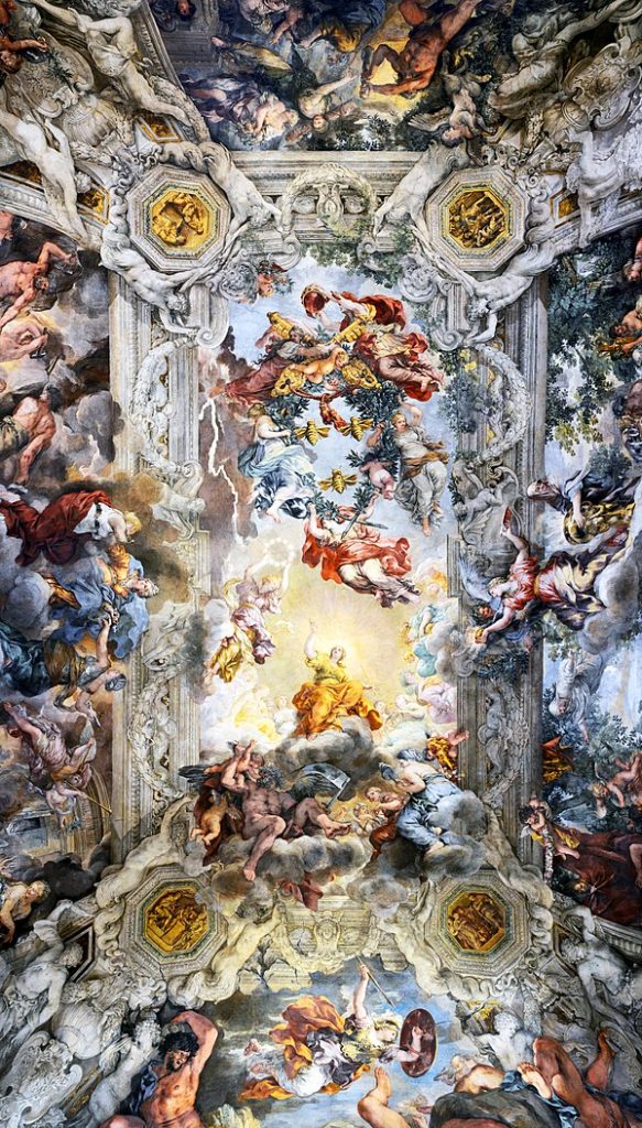
A man of many talents, Pierre de Cortone was an Italian decorator, architect, and painter. Living as a multifaceted creative person through the Baroque period, Pierre was best known for designing a church called “Santi Luca e Martina” and his work on a ceiling fresco at Barberini Palace.
Allegory of Divine Providence and Barberini Power
Pierre was born in a town in Italy called Cortona, and studied under his father who was a stonemason during his childhood. He then moved to Florence to train as a painter with the Florentine painters Andrea Commodi and Baccio Ciarpi as teachers. His main artistic influence was Raphael’s work.
Trionfo della Divina Provvidenz
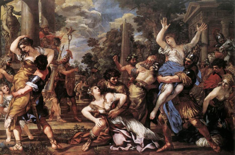
One of his first notable works was a commission for the Sacchetti family titled “Rape of the Sabine Women”. The piece itself has a high level of energy and frantic movement, perfectly capturing the horrible event. The expressions on the women juxtaposed to the unempathetic look of the men twists a knife in my chest.
Rape of the Sabine Women
Pietro was known by his contemporaries for his strong sense of colour and a strong sense of perspective. Pietro also held firmly on a philosophy that a history painting should use as many figures needed to give it a dramatic atmosphere, something that one of his rivals Sacchi Andrea vehemently disagreed with.
My favourite piece of his is “Venus as Huntress Appears to Aeneas”. I love the naturalistic colour and style. I think you can get an understanding of Pietro’s acute sense of colour from this painting. The muted colours of the surrounding characters contrasting against Aeneas’s brilliant red cloak draws your eyes to him. I am also fond of the atmosphere the scenery creates, it reminds me of the beginning of autumn.
Venus as Huntress Appears to Aeneas
Pietro also was appointed head of the Academy of St. Luke in Rome, where he taught many students but his most notable student was Romanelli Giovanni Francesco. Pietro passed on his energetic compositions and love of colour, which is evident in Francesco’s work.
Vision of St Francis
Reference
Encyclopædia Britannica, inc. (n.d.). Pietro da Cortona. Encyclopædia Britannica. Retrieved October 17, 2021, from https://www.britannica.com/biography/Pietro-da-Cortona.
Pietro Da Cortona (Pietro Berrettini) (1596 – 1669). (1996). In S. West (Ed.), The Bloomsbury Guide to Art. Bloomsbury. Credo Reference: https://ezproxy.capilanou.ca/login?url=https://search.credoreference.com/content/entry/bga/pietro_da_cortona_pietro_berrettini_1596_1669/0?institutionId=6884
For this assignment, I tried to connect three events that in my opinion gave rise to modern design. I’m not focusing on the application of modern design necessarily, I wanted to explore the technological advancements and culture surrounding the art. Art and culture change in tandem, because art reflects the people creating it. I was first surprised to learn that the Lumiere brothers didn’t see the potential of film, even though the invention of the cinematograph is their most notable work looking back. I was also surprised to learn how increased Japanese communication influenced Art Nouveau, my favourite movement. Furthermore, Japanese culture continued to impact western design through the move to minimalism. I think I garnered a deeper appreciation for minimalist design by researching Plakastil. I’m an illustrator at heart and admittedly have a bias favouring more detailed art styles, but I can see how Bernhard’s designs were so eye-catching and revolutionary at the time. I spent around 6 hours on this assignment, and I’d give myself an 8.5/10. I wish I didn’t cut it so close to the due date so I could crop all my pictures, so they’d fit together aesthetically. I think I chose a good subject to base my project on, but my events should’ve been a bit more cohesive. But I am proud of the amount I’ve written for each event and commentary on each photo.
It’s nigh impossible to imagine a world without paper. Paper is something that is a constant in our daily life and has shaped our entire history, it has directly contributed so much to the spread and retention of knowledge, and has had a very great impact on art. The earliest form of written documentation we have discovered was on clay tablets created by the ancient Sumerians. The method of this ancient writing was imprinting the symbols into the wet clay with papyrus reeds. This script extended to help create the first written laws, Hammurabi’s Code in which the cuneiform symbols were carved into stone detailing the relationship between different crimes and their corresponding punishments. Another predecessor to paper was parchment which was a writing surface made from animal skin. The earliest example of parchment being used was in Egypt in the second millennium, but it was never more popular than the more convenient papyrus. Parchment was much more popular in Europe during the Hellenistic period.
Hammurabi’s Code
From Pulp to Enlightenment
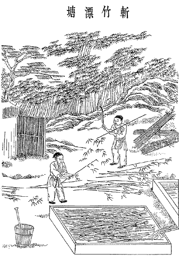
Early forms of paper were created in China during the second century BCE. Their main motivation towards the creation of paper was to make a writing surface that was more accessible than silk, but also more convenient than bamboo. These early papers were made mostly out of hemp but then later evolved to a pounded blend of different vegetable fibres and shredded cloth rags. This blend has been come to known as paper pulp. The paper pulp is then soaked in water and dried individually to create paper. Ancient Chinese people quickly adopted paper in their lives, two examples of some uses aside from writing were toilet paper and wrapping. Even though paper making was attempted to be kept a secret, it was spread to the middle east by Chinese prisoners who were kept in the Battle of Tales.
Process of Making Paper
A World Without Paper: The Sequel
Here is where I’ll state my opinion on the importance of this medium and the future it has with humanity. There has been a common opinion that humans will move to an entirely paperless future, with the rise of digital media. I do want to move steps closer to a greener future, but I do think paper has a sustainable and important place in the future. Most People retain information better by writing down notes, and even with the rise of digital painting, there is a need for traditional artists or printing pictures. I also think paper can achieve being more eco-friendlier easier than its digital counterpart because you can make pulp from recycled materials. But even if paper becomes nothing more than a novelty in the future, the traces of the art remain everywhere, like for example how in emails “cc” stands for carbon copy and how pages are laid out. We write and draw, making marks on paper and in return paper has definitely left its mark on humanity.
Britt, K. W. (n.d.). Papermaking. Encyclopædia Britannica. Retrieved October 5, 2021, from https://www.britannica.com/technology/papermaking.
B., R. S. (1999). Parchment. In G. W. Bowersock, P. R. L. Brown, & O. Grabar (Eds.), Late antiquity: a guide to the postclassical world. Harvard University Press. Credo Reference: https://ezproxy.capilanou.ca/login?url=https://search.credoreference.com/content/entry/hupla/parchment/0?institutionId=6884
Cartwright, M. (2021, October 3). Paper in ancient China. World History Encyclopedia. Retrieved October 5, 2021, from https://www.worldhistory.org/article/1120/paper-in-ancient-china/.
Paper. (2012). In M. Bird, 100 ideas that changed art. Laurence King. Credo Reference: https://ezproxy.capilanou.ca/login?url=https://search.credoreference.com/content/entry/lkingaijn/paper/0?institutionId=6884
Wendorf, M. (2019, April 25). The history of paper. Interesting Engineering. Retrieved October 5, 2021, from https://interestingengineering.com/the-long-and-complex-history-of-paper.
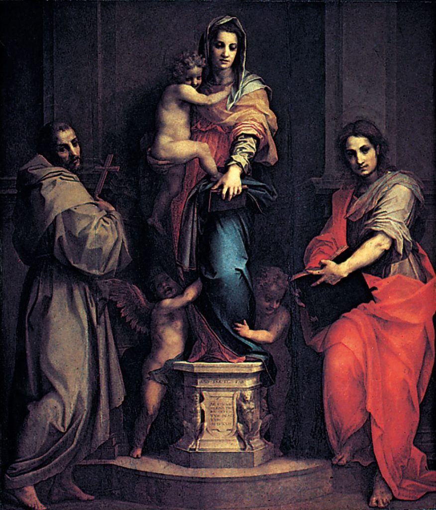
Andrea del Sarto was a strictly religious painter who lived through the thick of the High Renaissance. He was an excellent draftsman and his work exhibited characteristics that were popular during the movement. Sarto was well known for his fine detailing, sophisticated colours and dramatic composition. Notably, his art has been said to not photograph well because of the subtlety of his details. Another key aspect of his art was the natural expressions and twisting forms; his style largely influenced the next movement: Mannerism. Sarto’s two most notable pieces were “Madonna of the Harpies” and “Nativity of the Virgin”. He was called “The Faultless Painter” after completing five monochrome frescos depicting the life of St. John for the Servites. Sarto’s most notable student was the great mannerist painter Pontormo, a testament to how influential his work was to the next movement.
Olly Moss in this piece uses continuity to tie two images in this piece. The tiger stripes slowly transition into tree branches that create the forest scenery. This naturally combines the two main subjects in this illustration attractively and cleverly. His use of continuity is quite captivating and just simply fun to take in. Perfect for this piece because his client is Disney, and his main demographic would be children. Olly moss continues to be a huge inspiration to me, not only for his attractive technique and colours, but his ingenious problem solving and talent for visual communication.
This piece by Eiko Ojala cleverly makes use of the gestalt principle: closure. He utilizes multiple silhouettes of heads and arranges all of them to imply the shape of a side profile without actually outlining a head. This piece made me stop and look for a while to take in Ojala’s ingenuity. This illustration may just be an exercise in closure for Ojala but I like to hypothesize that the deeper meaning is how everyone in our lives influences our thoughts. One day, I hope I can achieve this level of creativity and clean execution in my own illustrations.
This poster was done for the 2014 Godzilla movie. The artist used size dramatically to capture the grandiose scale of Godzilla compared to the soldiers. The artist achieves this by having three subjects, the soldiers, the buildings, and Godzilla, this is necessary because size is relative. The scaling is so dramatic that the soldiers look like toy figurines! Godzilla is also a lot more detailed because of the size, and my eyes are instinctively drawn to the monster first. The point I’ll take away from this poster to apply my art is that to achieve a sense of size I must always have at least 2 subjects.