Visual Research: Shape – Art by Law Kok Yew and Gigi Lee (Y&R Malaysia)

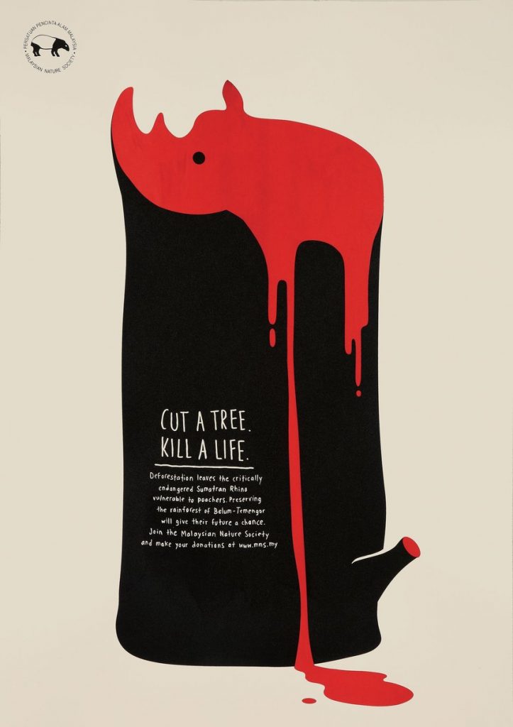
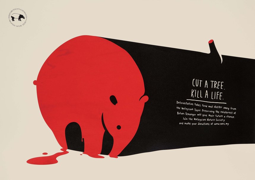
             This illustration was made to inform people of the effects of deforestation in Malaysia. The shape of the animal is framed within a cut-down tree with blood pooling out. The artists used the shape to convey the relationship between the trees and the endangered animals. If you cut down the forest you are harming the animals. I love how at one glance the shapes delivers all the information so simply. What I want to take away from this illustration to apply to my art is to always strive for a simple, easy on the eyes design and an easily readable message.

Visual Research: Colour – Art by Olly Moss

This piece was made for “A Life Well Wasted” a podcast discussing the video game industry. This piece is based off the iconic first stage in Sonic. In this Illustration, the artist playfully uses muted but expressive colours to convey a tone of 90’s childhood nostalgia. Something that stands out to me is that the word “work” is used as the colour palette of the piece, the artist never strays far from the pure colours they used in the title. Though arguably it might be more of a shape element, I love the yellow “O” becoming the rings from foreground to background. I think the main thing I’d like to take away from this poster is the use of a limited and attractive colour palette.

My Yearbook Spread

For this assignment I tried to find a concept that most accurately represented myself for the yearbook spread. Some of my first concept included pasting origami stars or fish around the spread. In the end, I felt that pressed flowers best reflected myself in both my hobby of gardening and love of plants. In this assignment, I used watercolour to texture and colour the entire page, pencil for the illustrations and words and lastly pressed flowers from my garden. Doing mixed media and traditional like this is new to me because I’m a very digital centric creator typically. I chose to try to sketch the five words in different fonts to make the words more expressive and stand out. If I were to rate my work, I would give myself an 8/10, two marks off because I didn’t give myself time to play with more textures like newsprint to give a more field journal look. I also am unsatisfied with my messy handwriting.