Advertising Art Director

Henry Wolf

Henry Wolf, a graphic designer and art director born in Vienna, Austria, in 1925, continues to amaze us even after his passing in 2005. Wolf was born into a Jewish Family and grew up fleeing from the Germans from Country to Country until 1941, when his family settled in the United States.

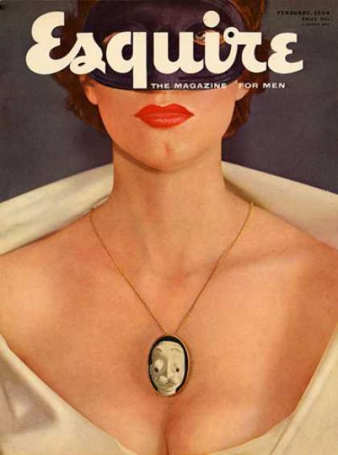
Before starting his photography studio in the Upper East Side of Manhattan, Wolf would work with photographers such as Richard Avedon, Melvin Sokolsky, and Art Kane. Later in 1952, Wolf would work as the Art Director for the magazine Esquire, kick-starting his career as his designs became more sophisticated and bold. Six successful years later, Wolf would follow in Alexey Brodovich’s footsteps and work as the Art Director for Harper’s Bazaar. While at Harper’s Bazaar, Wolf would work with the talented Richard Avedon and Man Ray. After Wolf worked for many organizations, companies, and magazines, in 1971, he finally opened Henry Wolf Productions, a studio dedicated to photographers, film makers, and designers that he continued to work on for the next three decades. I personally find Wolf’s work to be very interesting and captivating and I find inspiration in his style often. 

Citations

Henry Wolf. 12 Aug. 2020, en.wikipedia.org/wiki/Henry_Wolf.

Biography by Milton Glaser  March 1. “1976 AIGA Medalist: Henry Wolf.” AIGA, www.aiga.org/medalist-henrywolf.

“Pioneer: Henry Wolf.” Communication Arts, 7 Jan. 2007, www.commarts.com/features/pioneer-henry-wolf.

Lisa Yuskavage

Abstract Expressionism & Pop Art, Contemporary, Post Modernism, & Women in Art

Lisa Yuskavage, a 58-year-old American Artist, located in New York City, and is known for surprising all with her bold, daring, and erotic artwork. Lisa was born on May 16, 1962, in Philadelphia, Pennsylvania, and later she would attend Tyler School of Art at Temple University, receiving her BFA in 1984. After receiving her Bachelor, Lisa would receive her MFA from the Yale University School of Art in 1986. Since then, she has produced hundreds of pieces, ranging from detailed paintings to a handful of sculptures. 

A common theme that one can see in every piece of Lisa’s is a figure or many that are nude or at least sensuous and suggestive. Her artwork is buttery and soft with a mix of bright colors that blend well into her figures and landscapes. In an interview, Lisa once said that she was told “Don’t” her whole life, which inspired her to paint the figures she does, to break away from the rules, and to finally see something in galleries, like her work, that has never been seen before. Most are shocked by Lisa’s artwork as it is borderline pornographic and extremely risky and daring. Her work is similar to Gustave Courbet’s L’Origine du monde.

Some of her many paintings include Faucet(1995), NorthView(2000), Travellers(2008), Nel’zah’s(2012), and Hippies(2013).

Written Citations

Bio. yuskavage.com/bio/.

ArtforumInt. “Miz Cracker Visits: Lisa Yuskavage.” YouTube, YouTube, 15 Jan. 2020, www.youtube.com/watch?v=gJgBkGG3B78.

Photograph References

“Faucet.” Lisa Yuskavage, yuskavage.com/artwork/3756.

“Northview.” Lisa Yuskavage, yuskavage.com/artwork/3987.

“Travellers.” Lisa Yuskavage, yuskavage.com/artwork/4061.

“Nel’zah’s.” Lisa Yuskavage, yuskavage.com/artwork/4269.

“Hippies.” Lisa Yuskavage, yuskavage.com/artwork/4144.

Animation & Russian film

Survey 9

Science and tools

With the new and improved invention of animation, the world of moving pictures was at peak take off. In 1833, the stroboscopic disc’s invention came to life, creating one of the critical components of animation history and the start of cinematography as we know and love today. Not until later, in 1928, would the one and only Walt Disney take inspiration from the animation masters, that being Émile Cohl and Eadweard Muybridge. Disney had already begun to draw out the first concept sketches of the infamous Mickey Mouse but truly made them shine when producing his first animation named Steamboat Willie.

Design

At the uprising of the new and fascinating invention, cinematography, commonly known as moving pictures, so was soviet artwork, more specifically the Stenberg Brothers. Vladimir and Georgii Stenberg worked together to design Russian film posters. You can see in the brother’s artwork the influence in Plakastil poster design mixed with photography. Their posters had many many visual elements and perspectives, causing you to sit and think, but don’t stare at them for too long as you might start to feel light-headed or dizzy. Most if not all of the brother’s poster designs included bold, eye-catching colours that can also be seen within Plakastil posters.

Written Citations

History of Animation. 8 Dec. 2020, en.wikipedia.org/wiki/History_of_animation.

“Mickey Mouse.” Wikipedia, Wikimedia Foundation, 6 Dec. 2020, en.wikipedia.org/wiki/Mickey_Mouse.

“Stenberg Brothers Movie Posters.” Movie Posters, www.cinematerial.com/artists/stenberg-brothers-i918.

Stenberg Brothers (Vladimir, 1899-1982; Georgi, 1900-1933) THE GHOST THAT ISN’T RETURNING. 5 Aug. 2015, thecharnelhouse.org/2015/08/05/the-stenberg-brothers-and-the-art-of-soviet-movie-posters/stenberg-brothers-vladimir-1899-1982-georgi-1900-1933-the-ghost-that-isnt-returning/.

Photography Reference

Films, Old Hollywood. “- Find & Share on GIPHY.” GIPHY, GIPHY, 15 July 2019, giphy.com/gifs/animation-walt-disney-mickey-mouse-l2JhL0Gpfbvs4Y07K.

“Poster, The Ghost That Isn’t Returning, 1929.” Cooper Hewitt, Smithsonian Design Museum, collection.cooperhewitt.org/objects/68724321/.

The Faces of Typography

Typography Infographic

I decided to create an infographic focusing on the first focal figures of typographic history. The first step was to create a rough ‘mood-board,’ so I could generate ideas for my design and come up with a layout that pleased me. From the beginning, I knew that my focal point would be the first figures of design, focusing on the ones who designed their own fonts that would later gain high amounts of popularity.

Once I had come up with a colour pallet, a layout, and an overall theme, I created a rough draft, mainly to give me the chance to play with colour and mediums. Within this step of my process, I realized I wanted the aesthetic to portray the gritty feeling of an old, vintage piece of paper that one would want to hold on to because of its importance. As for the colour, Orange/ tan tend to create a feeling of age. Plus, I decided to use ink and stamps solely for writing out the information to add even more of an element of age. I was to give myself a grade, I would give myself a 7.5 out of 10 because I struggled to figure out what information to include and how much to write beside the portraits. If I had to change anything about my finished piece, it would definitely have to be the information layout. But overall, I enjoyed this project and found it very interesting.

References

Flask, Dominic. Type Classification : Design Is History, www.designishistory.com/1450/type-classification/.

Tracy. “A Brief History of Typography & Typefaces.” Ashworth Creative, 21 Dec. 2018, www.ashworthcreative.com/blog/2014/07/brief-typography-typefaces/.

“The History of Typography and Its Journey Through Art.” Widewalls, www.widewalls.ch/magazine/typography-history-art.

Lectures from 1 to 7