
For this assignment, I spent about 2 weeks planning and putting it all together. I spent the first week gathering the research I needed, as well as, made multiple sketches for the layout of the poster. The second week was spent putting the poster together and getting all the information down.
The research part of this assignment was quite easy and I was able to gather the information rather quickly. When it came to figuring out the layout of my poster and the sketches, I had a bit of trouble with it. I knew from the start that I wanted to do a pop art theme for my poster, but I struggled to come up with good design layouts at first. I ended up creating three sketches for potential layouts I could use for my poster. When it came to putting the poster together, I didn’t end up using any of my sketch designs, but I did take one element from the third sketch. I didn’t like any of the sketch designs I did.
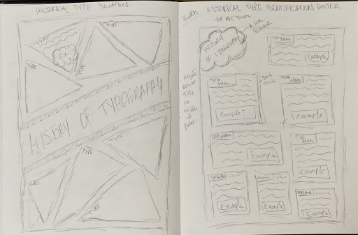

For the poster layout, I was influenced by an image of someone smoking and decided that I would make the type in the smoke that was coming out of the cigarette. I wanted it to have a bold, colourful look, so I decided to have a pop art theme for my poster. Also, I love pop art, so I wanted to add that element to my assignment. For the most part, I enjoyed the process of making the poster. The only complaint I have was that I didn’t like inserting the descriptions of the types onto the poster. Since we had to do everything by hand, writing down the information was time-consuming. I would have preferred typing out the descriptions of each typeface. Other than that I enjoyed doing everything else. I ended up working on a 22″x28″ poster board, so I would have more space to work with. One thing I did struggle with was the material of the poster board. It was not paper, the poster was glossy, making it harder for me to use the markers on it. Unfourtuanlety, there are a few smudges on it, but I’m pretty happy with the way it turned out.
For this assignment, I would give myself an 8/10. I think there are parts of this assignment where I could have done better. In certain parts, my handwriting is messy and a bit hard to read. I also made a few mistakes when writing down the information, but since it’s in fine line marker, there’s not much I could do. The colouring is also a bit uneven, but I blame that on the material of the poster. Other than that, I think the layout’s pretty good and appealing. Overall, I am satisfied with the result and I enjoyed doing this assignment.
Leave a Reply